Create Dashboard in Excel to transform raw data into actionable insights with just a few clicks. This powerful tool enables businesses and individuals to visualize trends, monitor performance, and make informed decisions efficiently. By leveraging Excel’s robust features, you can customize your dashboards to fit specific needs, ensuring that key metrics are always at your fingertips. Embrace the art of dashboard creation in Excel to elevate your analytical capabilities, streamline your reporting processes, and drive your strategic objectives forward with confidence and clarity.
Most importantly, it’s time to study how to create an interactive, dynamic Excel dashboard step by step.
This Tutorial Covers:
- What is an Excel Dashboard?
- Difference between Report and Dashboard
- What are the uses of Excel Dashboard
- Before creating a dashboard – what should you know
- Steps to create Excel Dashboard
- Create layout of the dashboard
- Get your data in Excel
- Clean your raw data
- Use Excel Table and Filter the data
- Analyze, Organize, and Validate your data
- Choose the right visualization charts
- Select data and create charts
- Create the dashboard
- Best Practices for creating a visually effective dashboard in Excel:
- Dos and Don’ts of Excel Dashboard
- Examples of Excel Dashboard
1. What is an Excel Dashboard?
Let’s start with the fundamentals first. A dashboard can be thought of simply as a visual representation of data.
Looking at raw data can be challenging. Yes, the crucial numbers are present. However, it is frequently impossible to absorb and comprehend all those rows and columns.
Dashboards are useful in this situation. By producing a variety of charts, tables, and other visual elements that provide you with a high-level overview of the data, they transform data into information (yes, those are two entirely separate things!).
Your spreadsheet’s normally complex data is simplified by a dashboard and turned into something visually appealing that is much simpler for you to understand and use.
Dashboards are obviously useful for a variety of tasks, including project management, budgeting, and reporting on sales or marketing.
2. Difference between Report and Dashboard
The differences between dashboards and reports require to be explicitly mentioned.
Excel Report
Tables and text make up reports in Excel, which typically go over one page due to the increased amount of data they contain. The primary focus of a report is typically one particular aspect of business, such as sales, marketing, or investment activity. These are often submitted via email and cannot be accessed in real time. As a result, writing one may take longer than using a dashboard.
Excel Dashboard
Dashboards are useful for compiling reports and keeping track of significant data. A dashboard offers a comprehensive picture of a whole process across numerous company departments. As you submit the data, they also provide you with real-time performance updates. Dashboards, as opposed to reports, make the data accessible in a single application. This implies that different managers can quickly review the pertinent data when making crucial decisions.
3. What are the uses of Excel Dashboard?
Flexibility
Excel can readily adapt to changes in a dashboard’s visual style. For instance, adding more metrics, graphs, and charts is simple. It’s also easy to replace aesthetic elements like font and chart color to increase contrast. Since Excel is a part of the Office Suite, which enables more interaction across the products in this line, it is also simpler to import charts and graphs.
Data visibility
Dashboards provide precise, up-to-date data that can be used to modify how you approach your goals. You might observe a rise in investments for one product or a fall in sales for another in a dashboard project. You can quickly access the most precise data because these update each time you refresh the page, making the information always current.
Saving of time
Dashboards enable the consolidation of numerous, related reports into a single document. As a result, you don’t have to spend as much time producing numerous reports on a single topic. Instead, your team may gather all the information and upload it to the dashboard, where it can be regularly updated.
Greater productivity
Excel provides the data numerically when used with dashboards to track performance. Employees may more easily see their overall output and time spent on a project thanks to this. Taking care of these problems may inspire improvement. Additionally, because the data is clear to observe, they can quickly determine which region needs the most work.
System simplification
In a dashboard, it is simpler to streamline intricate and dispersed data. You may identify which regions are growing (green arrow) and which are struggling (red arrow) by using tools like a green and red arrow system (green arrow). It becomes simpler to address issues, such as sales data, that may have decreased or to commend personnel for improvements in certain areas.
4. Before creating a dashboard – what should you know
Use some of the following advice when you eventually create your own dashboard to maximize the accuracy and accessibility of critical data:
- Utilize interactive elements. Excel offers users interactive tools that can complement dashboard actions. For instance, tools like scrollbars, drop-down menus, and checkboxes might help colleagues access data sets from a quiet spot in the dashboard.
- A backup dashboard should be made. Instead of retaining additional data in the dashboard’s workbook, it is best to establish an entirely new backup dashboard. In this manner, the dashboard display is clearer and less cluttered with data, improving the overall appearance and enabling you to acquire data as needed.
- Put data charts in order. Simply numbering data sets, cells, and dashboard sections improve the dashboard’s organization. By doing this, the information is very simple to find and comprehend, which reduces confusion in general.
- Combine data visualizations. To save space and make the material more readable, combine graphics, such as bullet points and comparison charts. Dashboards are frequently disorganized and have an excessive number of data displays, which can hinder readability and make it more challenging to retrieve data.
- Get rid of any unnecessary details. Data variables entered into the dashboard that are unrelated to the KPIs you are measuring are examples of how dashboards are meant to present the most important information in an easily accessible manner. Make sure to remove any data that doesn’t entirely relevant to the general goal of your dashboard so that only the most helpful information is left in the document.
5. Steps to create Excel Dashboard
Excel dashboards should be created with your main goal in mind.
This tutorial will help you create an Excel dashboard to track Profit. Your goal is to show the Profit based on items according to Buyer on your main charts.
- Create a layout of the dashboard
Make a good draft! Although you can design mockups with paper and pencil, we recommend using Microsoft Excel.
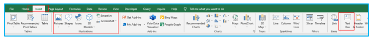
The “Illustrations” section can be found under the “Insert” tab, where you can add shapes, icons, and pictures as needed. You can also type text by pressing the “Text Box” option.
Finally, create a wireframe using the following font styles, color schemes, and patterns.
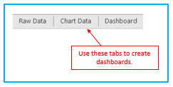
How can you design a workbook organization that makes sense? What does that imply? Create three sheets in an Excel workbook by opening it.
Components of the structure of the workbook: For an Excel dashboard, three spreadsheets are often used.
Data: These tables can be used to hold raw data.
Chart Data: Where the filtered data is located
Dashboard: The primary dashboard tab Worksheet
Your structure and wireframe are complete. Let’s begin building an Excel dashboard!
Your structure and wireframe are prepared.
Let’s continue building a dashboard from Excel!
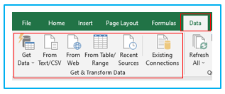
- Get your data in Excel:
You must decide on data sources before you can develop an Excel dashboard. If the data is in Excel, you are in luck and can move on to the following stage. Otherwise, you must use outside data sources.
Pick an import option by going to the Data tab. Data can be easily imported into an Excel file.
- Clean your raw data:
In Excel, we have our raw data. You can now begin the data purging procedure. To clean and condense data, there are numerous methods.
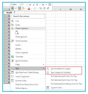
Sort the data to find the highest and lowest points.
Use Excel’s basic sorting to discover faults! Finding the peaks in a range requires the use of sorted data (highest and lowest). Select the ‘Sort Largest to Smallest’ option from the context menu by performing a right-click on the first cell.
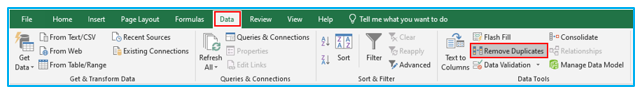
To prevent mistakes, remove duplicates.
Click “Remove Duplicates” under the “Data Tools” category on the “Data” tab after selecting any single cell within the data set.
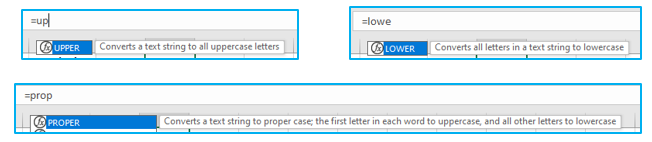
Adjust the text’s case to lower, upper, or proper
The case of the text can be changed using an excel formula to lower, upper, or proper.
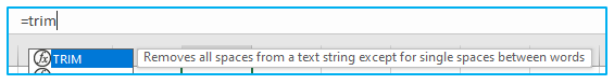
Eliminate the leading and trailing spaces.
Apply the TRIM function from the Formula bar. Now write down the formula. To avoid problems and clean your data more quickly and easily, employ data cleansing add-ins.
- Use Excel Table and Filter the data:
In this stage, you don’t have cleansed input, but you do have data on a worksheet. What will happen after that?
The first thing you need to do is make sure the necessary data is in a tabular format. Every piece of information in a tabular format, such as the name, address, or phone number of a city, is included within a single cell. You should convert it to an Excel table and choose the data range if it is in a tabular format.
Select a table from the “Insert” Tab or press Ctrl + T to quickly insert a table.
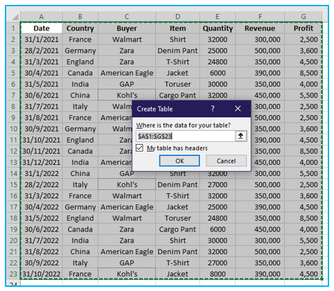
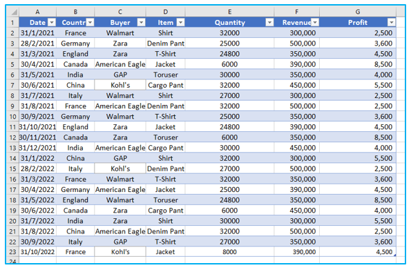
After that, the table looks like this.
- Analyze, Organize, and Validate your data:
You walked you through the process of transforming unstructured data into a framework that can be used to create a dashboard.
Think about it:
Does it have to be displayed all at once?
Is the deletion of certain data required?
You can assist us in moving forward by using various techniques and Excel formulas. To create a usable dashboard, creativity might be more helpful than mastering all the formulas, though.
Therefore, you’ll utilize the following Excel tools and functions to create the Excel Dashboard: XLOOKUP, IF, SUMIF, COUNTIF, ROW.
Excel provides excellent auditing capabilities to assist in identifying and resolving Workbook or Worksheet errors.
To see which cells in your worksheet, contribute to a formula error, use Microsoft Excel Inquiry. The time required for the typical validation procedures should be reduced by this step.
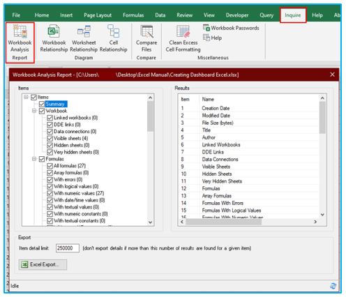
Therefore, you must verify the facts before we can begin to create a graphic. Use the Quick Analysis Tool to swiftly evaluate your data.
- Choose the right visualization charts
The time has come to select the appropriate chart now that your data set has been cleansed, sorted, and error-free.
Without the ability to visualize it, data is meaningless. Strike a balance between an attractive Excel Dashboard’s appearance and its purpose. To start, you can decide which graphs work best for certain objectives.
You should concentrate on the various chart kinds that Excel provides you with, such as:
Bar chart: Compare values on a graph using a bar chart.
Waterfall chart: View the progression of an initial value’s growth and decline in a waterfall chart to see how it changes over time to become an end value.
Gauge chart: Data are shown in a dial using a gauge chart. Likewise called a speedometer chart.
Pie chart: emphasize proportional data and percentages.
Gantt chart: monitor project development.
Dynamic chart: Automatically update a data range in a dynamic chart.
Pivot chart: compile your data into a statistics-filled table.
- Select data and create charts:
You are now prepared to start creating your chart because you only have the information you require.
The procedure of selecting and creating charts:
Step 1: To insert a chart, pick the “Insert” button from the toolbar, click the “Dashboard” tab of your worksheet, and then choose the desired chart type from the drop-down menu. We’re going to employ a clustered column chart in this instance.
The box will be empty when you insert the chart. You haven’t messed anything up, so don’t worry. In the following step, we’ll discuss how to get your data to show up there.
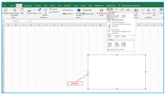
Step 2: It’s time to get some data in now that you have that blank box in your workbook’s “Dashboard” tab.
To perform this, right-click of mouse on that box and select “Select Data.”
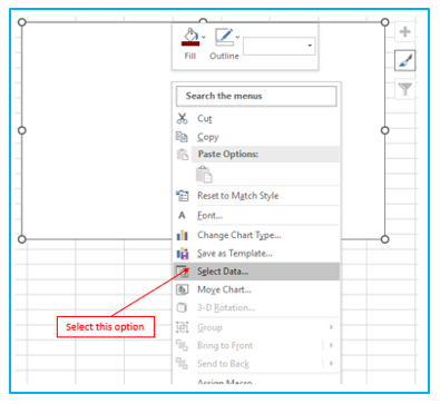
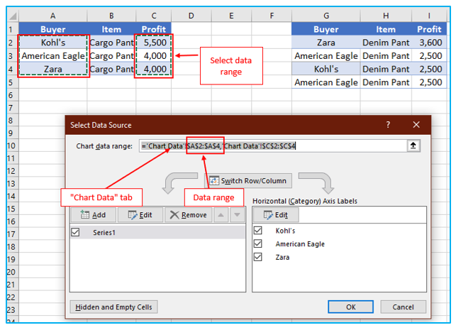
After that, a dialog will appear named “Select Data Source”.
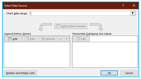
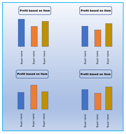
Step 3: Then go to your “Chart Data” tab, which is where your filtered data is located, and select all of the data you wish to display, excluding the column headers. Since the goal of my chart is to illustrate the amount of profit we make on an item from each buyer, we’re choosing the “Buyer” and “Profit” variables in this scenario. When you’re finished, click “OK” after pressing the “Enter” key on your keyboard.
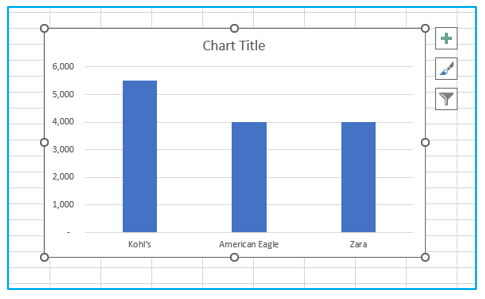
After that, the result looks like this.
- Create the dashboard:
After creating a dashboard, you are already created a part of the dashboard!
Your data have now been fitted to a chart. Although it looks fantastic, you can still upgrade your Excel dashboard.
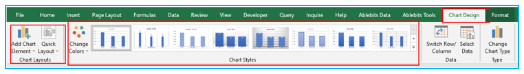
By double-clicking on the chart area and then selecting the options in the toolbar (there are buttons up there for everything from “Add Chart Element” to “Change Colors”), you can refine your chart by changing the colors to match your brand or adding labels, titles, units, or any other information that is necessary.
Thus, you can design dashboard excel.
Apply the same procedure to other data.
True Excel dashboards display data using a variety of charts and gauges. Therefore, in this example, we’ll go back and repeat each of those procedures for the other budget line items on our dashboard.
One thing to keep in mind is that since the data in your “Chart Data” tab is what fuels your charts, you don’t want to erase any of it.
Therefore, rather than deleting and replacing them inside that tab, be careful to put the new data sets below each other when creating your other charts.
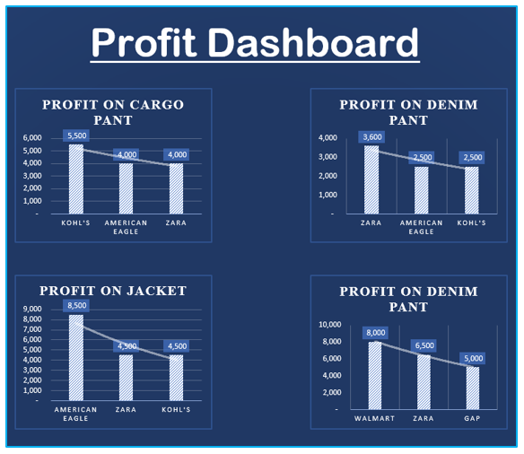
After you have completed all procedures, your dashboard will look like this:
Additionally, use a dynamic graphic if you want to create an interactive dashboard.
An Excel chart that is dynamic automatically changes its data as you switch data sources.
Uses for interactive Excel features include:
Automate repetitive activities with macros (you may have to learn Excel VBA for this)
Drop-down menus: they make data entering quick and simple.
Slicers: allow for data filtering on a pivot table
6. Best Practices for creating a visually effective dashboard in Excel
- When designing one-page dashboards, a drop-down list is a useful space-saving technique. Data validation can be used to limit the kind of information or values that users enter into a cell. The alternatives are typed on a worksheet to create the list. This technique can be used on a different worksheet or the page with the drop-down menus.
- The best option for highlighting cells based on any condition or rule is conditional formatting. However, aside using colors, there are obviously more options. For instance, using icons, bars, shapes, color scales, indicators, and ratings, you can produce wonderful outcomes.
- Named ranges: You can give any name to a set of chosen cells. Start by highlighting a data-containing range. Then type the name you’ve decided on, “sales,” in the name box. From this point, dealing with cells or ranges will take less time.
- To save space on your Excel dashboard, add a scroll bar.
- Limit what users can enter in a single cell using data validation. Just picture ten people entering phone numbers into ten Excel worksheets. When combining the spreadsheets, there may be errors if the format of the phone numbers is not restricted with the use of data validation.
- Using user form and VBA for data entry Manual data entry is prone to mistakes. Use the user form instead, and create a brief macro for it. You can design an adaptable form that is user-friendly. Playing with the chart is suggested by active report components like form controls or pivot table slicers.
- The most effective tool in Excel for handling enormous data sets is the pivot table. With only a few clicks, we can quickly summarize data and drill it down into any structure we choose.
7. Dos and Don’ts of Excel Dashboard
Let’s now look at some Do’s (or best practices):
- Chart/Section Numbering: Your dashboard is not merely a collection of charts and data points at random. Rather, it is a narrative in which one thing leads to another. It is best to number these since you need to make sure your audience follows the instructions in the correct order. When someone uses your dashboard later or prints it out, it’s a big assistance even though you might be able to direct them when you’re presenting live.
- Preventing movement near the dashboard: To prevent the user from unintentionally scrolling away, hide all rows and columns.
- Freeze Important Rows/Columns: Use freeze panes when you want certain rows or columns to always be visible on the dashboard.
- Making Charts/Shapes Stick: Make sure your charts, interactive controls, and shapes don’t disappear or change size when the cells are hidden or resized. Charts and tables can also be captured with the Excel Camera tool and added to the dashboard; these images are dynamic and change whenever the underlying chart or table is updated.
- Provide a User Guide: It’s a good idea to make a separate worksheet and underline the procedures if your dashboard is complicated. Even without you there, it will make it easier for users to use your dashboard.
- Save Worksheet Space with Combination Charts: To save space on your worksheet, use combination charts (such as thermometer charts, bullet charts, and actual vs. target charts).
- Implement symbols and conditional formatting: Use conditional formatting and symbols (such up/down arrows or checkmarks/cross marks) to give an additional layer of analysis to your dashboard, but don’t go overboard.
Let’s now look at a few don’ts:
- Don’t Clutter Your Dashboards: It doesn’t necessarily mean that data and charts belong in your dashboard just because you have them. Keep in mind that the dashboard’s goal is to assist in problem identification or decision-making. Therefore, keep it pertinent and take out anything unnecessary. I frequently ponder whether a particular item is merely nice to have or an absolute necessity. I proceed to get rid of all the nice-to-haves after that.
- Don’t apply formulas that are volatile: As a result, the calculations will take longer.
- Don’t keep extra information in your workbook: Make a copy of the dashboard and preserve it as a backup if you require that data.
8. Examples of Excel Dashboard
Sales Dashboard
The Sales Dashboard is an Excel dashboard that displays the revenue broken down by product category, region, monthly growth, and other related indicators.
Human Resource Excel Dashboard
Utilize an HR Dashboard to track business operations; establish measures, such as turnover, hiring, and retention, that demonstrate whether specific objectives have been reached. An all-activity dashboard is available on one page.
Marketing KPI Dashboard
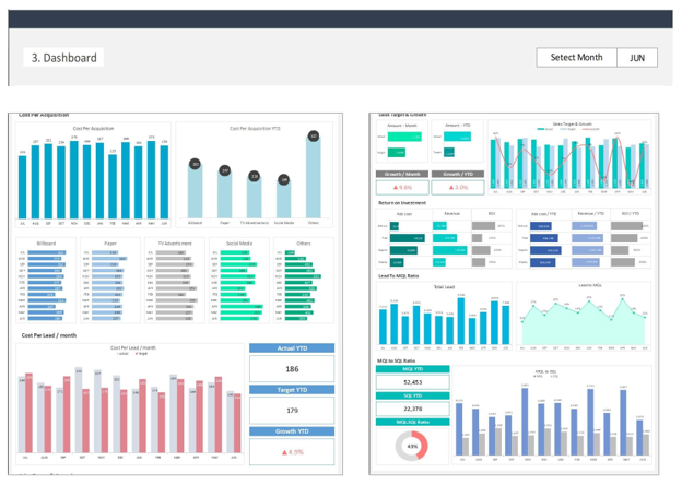
The marketing KPI dashboard assists the sales and marketing department with measurable metrics for achieving the company’s goal as well as maintaining growth. The marketing KPI Dashboard is the most effective tool to define the right metrics and track the actual results against the target.
Social Media Dashboard
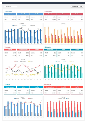
An instrument to manage your clients’ online and social presence across several platforms is a social media dashboard. It increases the effectiveness of your agency’s ability to keep track of several accounts and give them the most polished updates on their development.
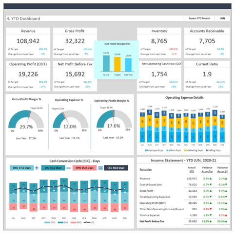
Financial Dashboard
The finance and accounting teams can view, track, and report on financial KPIs using a financial dashboard, which is a business intelligence tool. By using financial analytics to combine diverse financial and accounting data, modern dashboards go beyond simple visualization and reporting. This enables analysts to study the data and uncover insights that can lower costs and increase profitability more thoroughly.
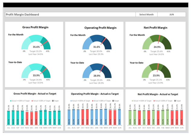
Product Margin Dashboard
Profit Margin Dashboard is an Excel Template that will assist you in effectively visualizing major profitability indicators in one place and communicate the most important profitability information to your team in a simple and beautiful way.
Application of Create Dashboard in Excel
- Performance Monitoring: Assemble key performance indicators (KPIs) in one place to monitor business or project performance regularly, allowing for real-time decision-making and strategy adjustments.
- Financial Reporting: Consolidate financial metrics and summaries to create an interactive financial dashboard for tracking revenues, expenses, profits, and other critical financial data.
- Sales Analysis: Develop a sales dashboard to visualize sales trends, customer behavior, and performance metrics, aiding in identifying opportunities for growth and areas needing improvement.
- Inventory Management: Create a dashboard to track inventory levels, orders, and supply chain metrics, ensuring optimal stock levels and efficient inventory turnover.
- Project Management: Compile project timelines, milestones, budgets, and resource allocations into a comprehensive dashboard to oversee and manage project progress effectively.
- Customer Service Insights: Develop a dashboard to monitor customer service metrics, such as response times, satisfaction rates, and common issues, helping to improve customer service strategies and outcomes.
You may be interested:
