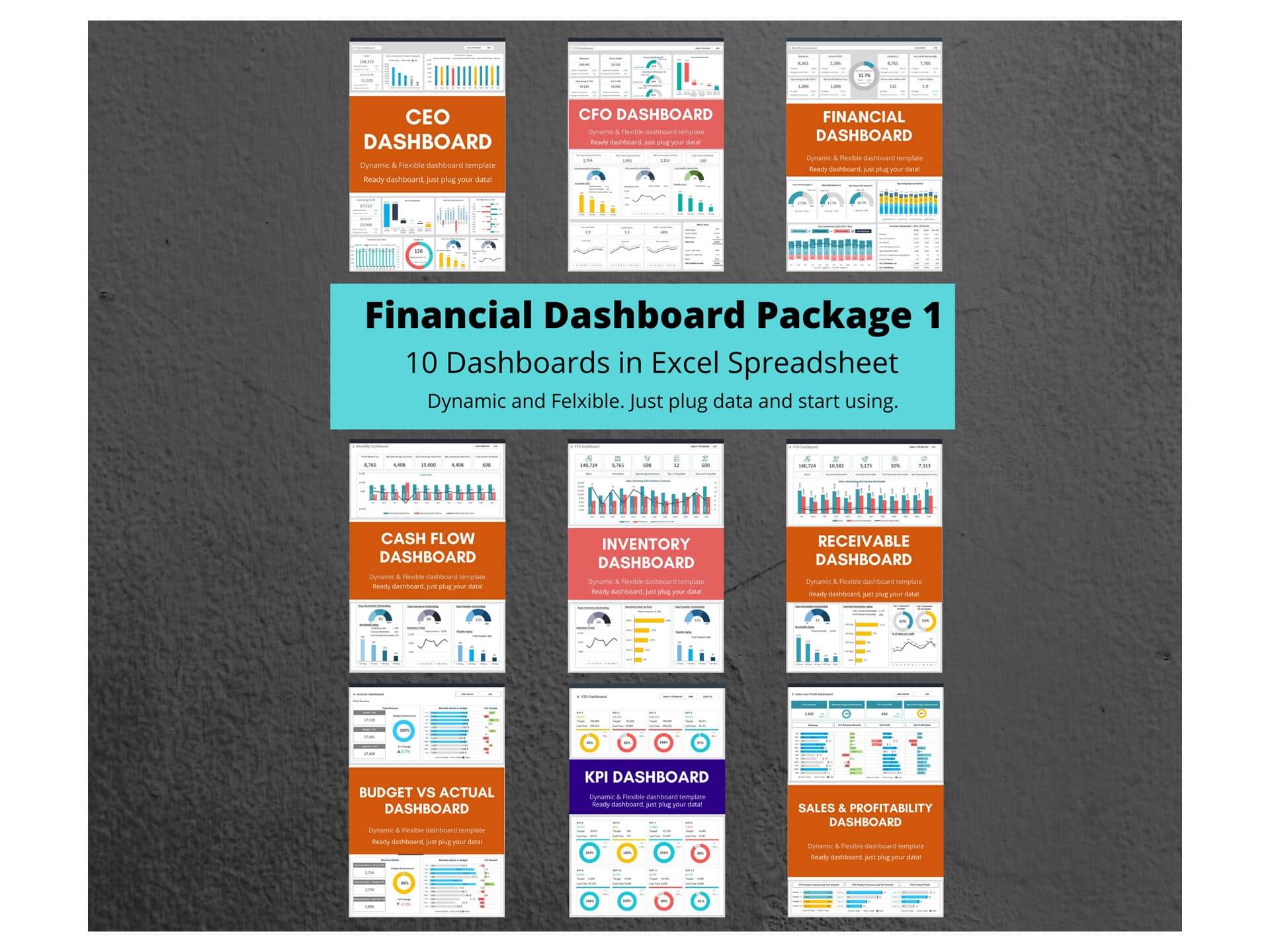
Profit Margin Dashboard Template in Excel
Introduction to Profit Margin Dashboards in Excel
What Is a Profit Margin Dashboard and Why Use Excel?
A Profit Margin Dashboard is an analytical tool used by finance teams and data analysts to monitor business profitability using key performance indicators (KPIs). This type of dashboard is an Excel-based solution that brings together raw data such as revenue, cost of goods sold, and net profit into one interactive excel spreadsheet. Excel remains a popular choice because it’s flexible, widely used, and offers powerful functions like pivot tables, sparklines, and slicers. Whether you’re a small business owner or a seasoned financial controller, using Excel allows for easy dashboard creation and customization. Plus, with many free templates and examples available, getting started doesn't require expert-level skills.
Benefits of Using Excel Templates for KPI Tracking
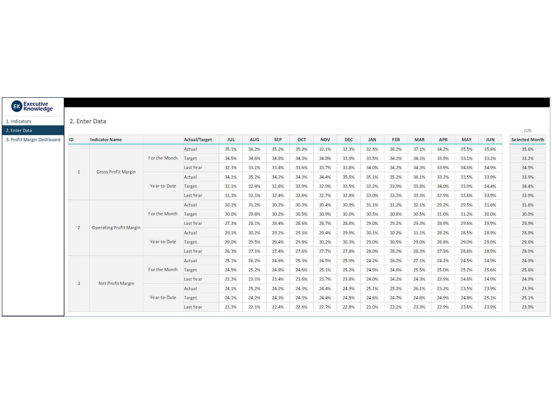
Using an Excel dashboard template significantly reduces the risk of errors in dashboard creation and speeds up the process of getting actionable insights. These templates typically include formulas, charts, and layout designs that allow users to populate data with a click of a button. Excel also enables data validation to control input quality and uses pivot tables to sort and summarize complex datasets. For anyone learning how to build a KPI dashboard and finance dashboard, templates offer a roadmap to best practices while saving time. Excel dashboards also support integration with Google Sheets or Power BI dashboards when scaling beyond the spreadsheet.
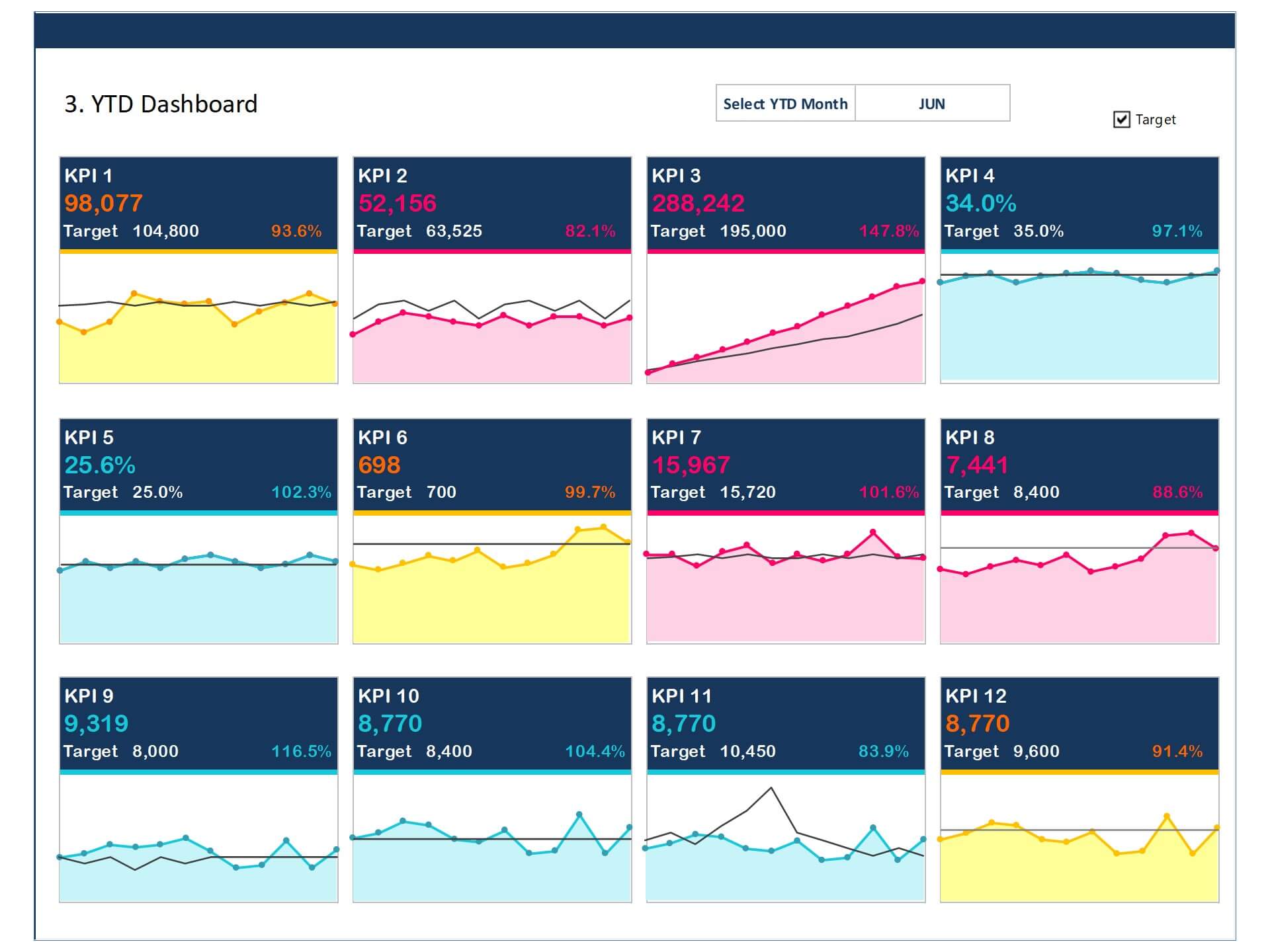
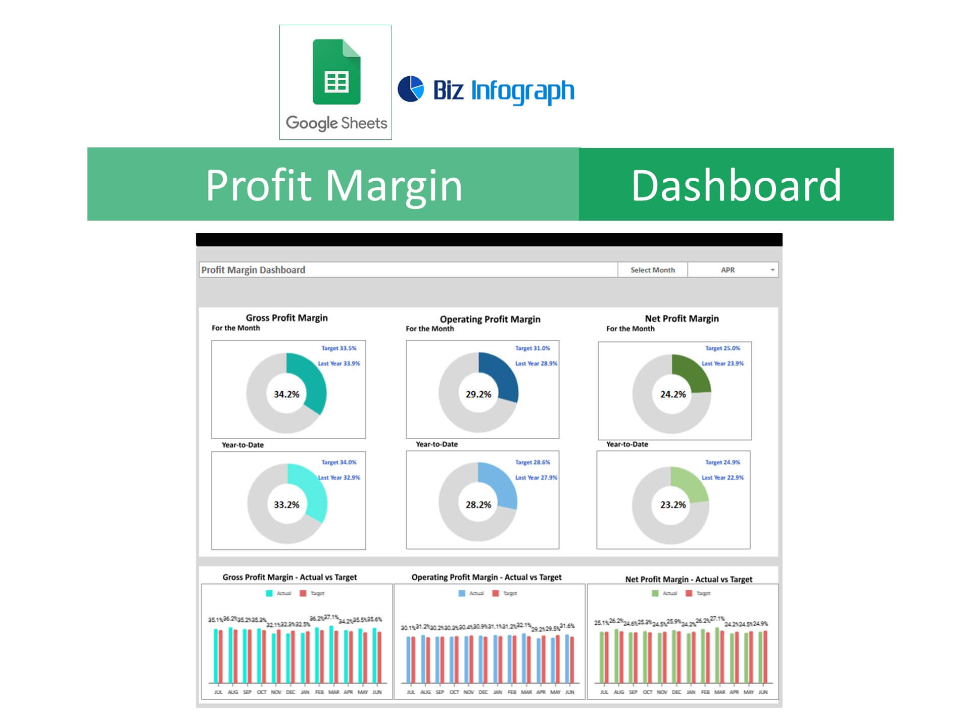
Overview of Profit-Related KPIs for Financial Analysis
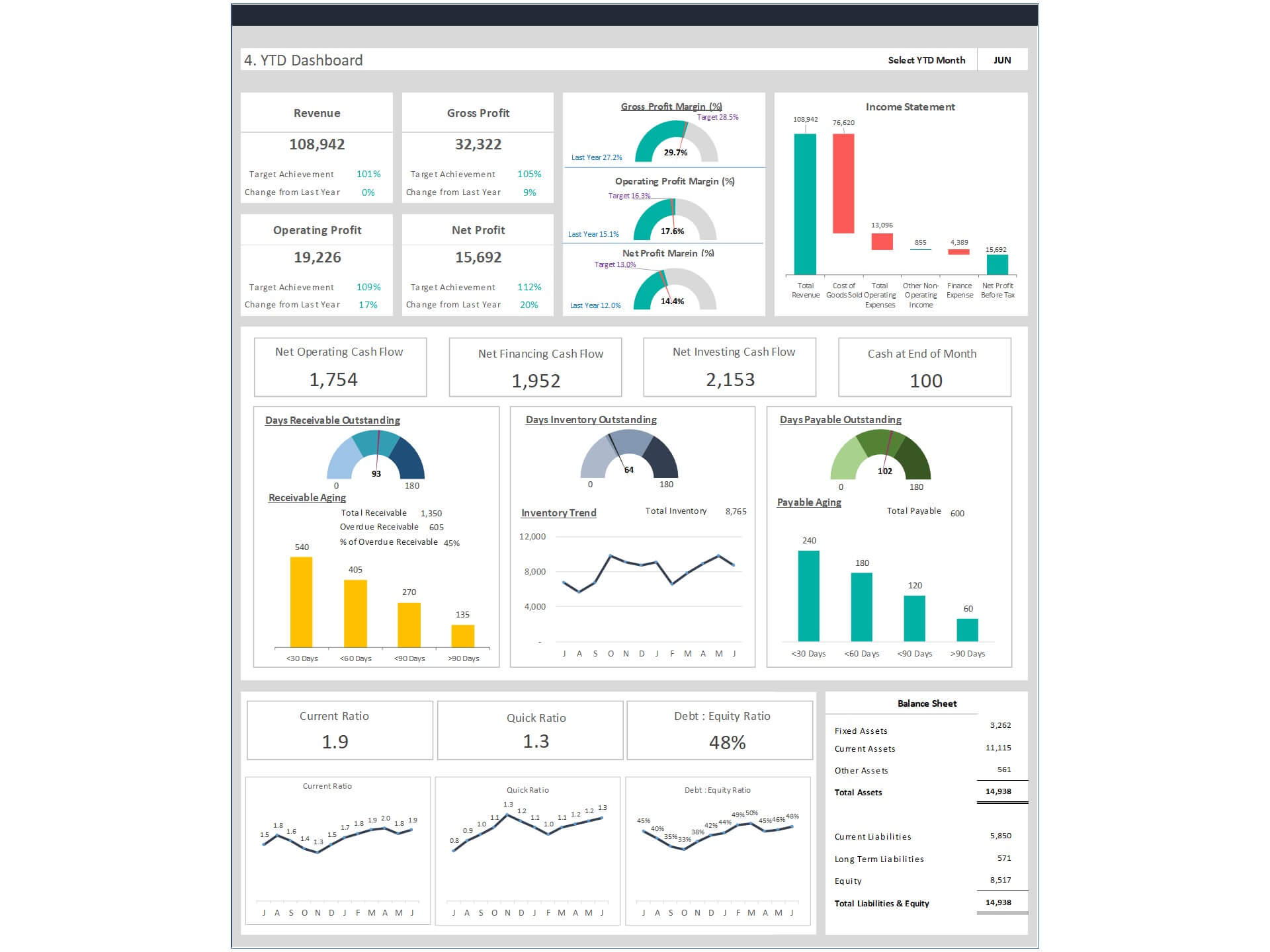
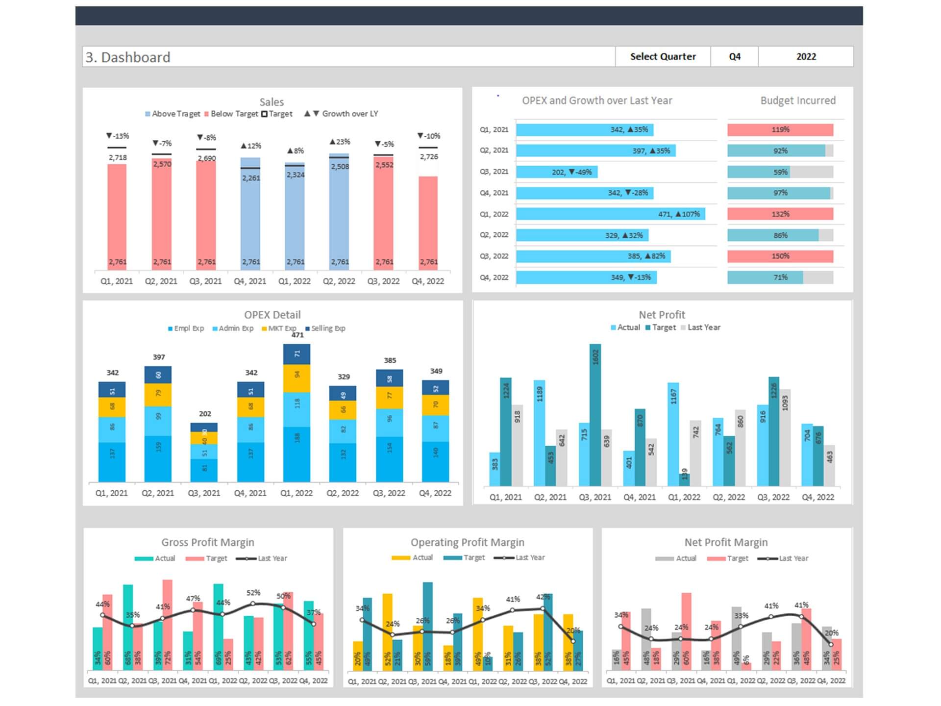
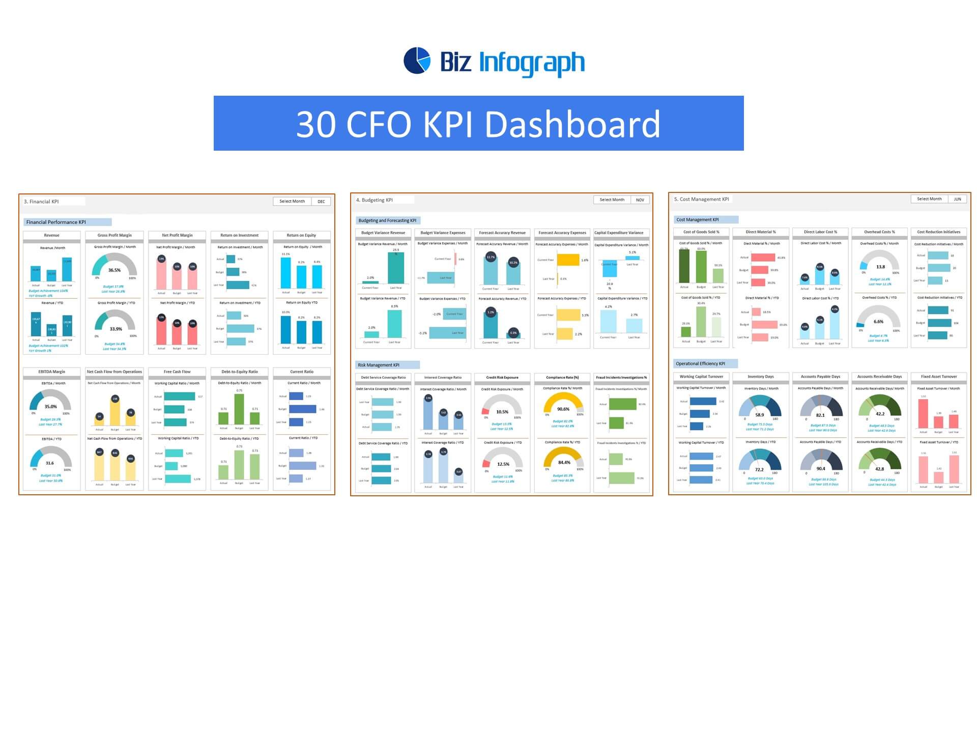
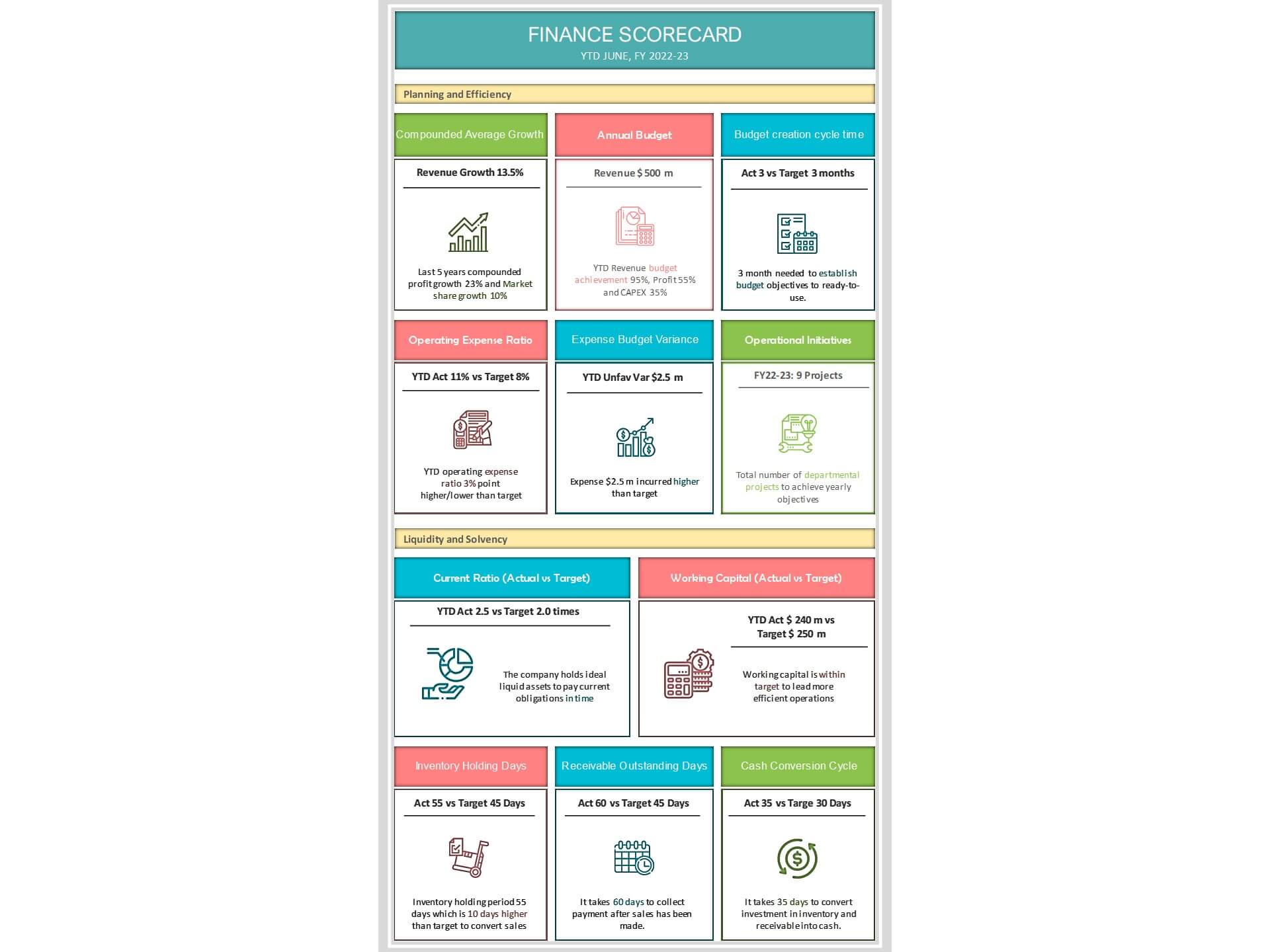
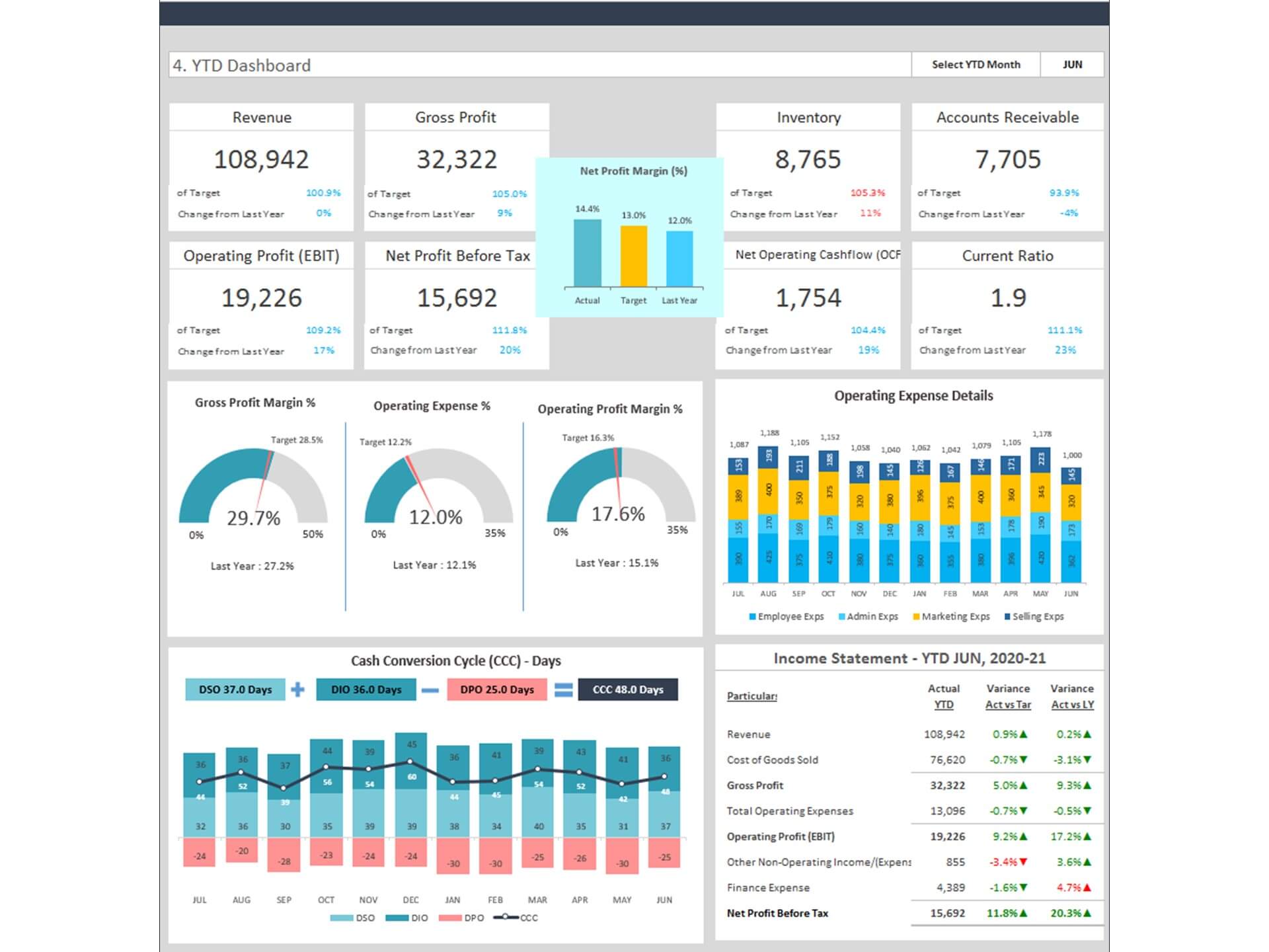
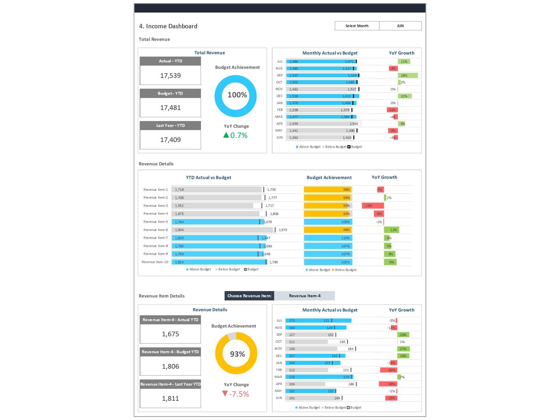
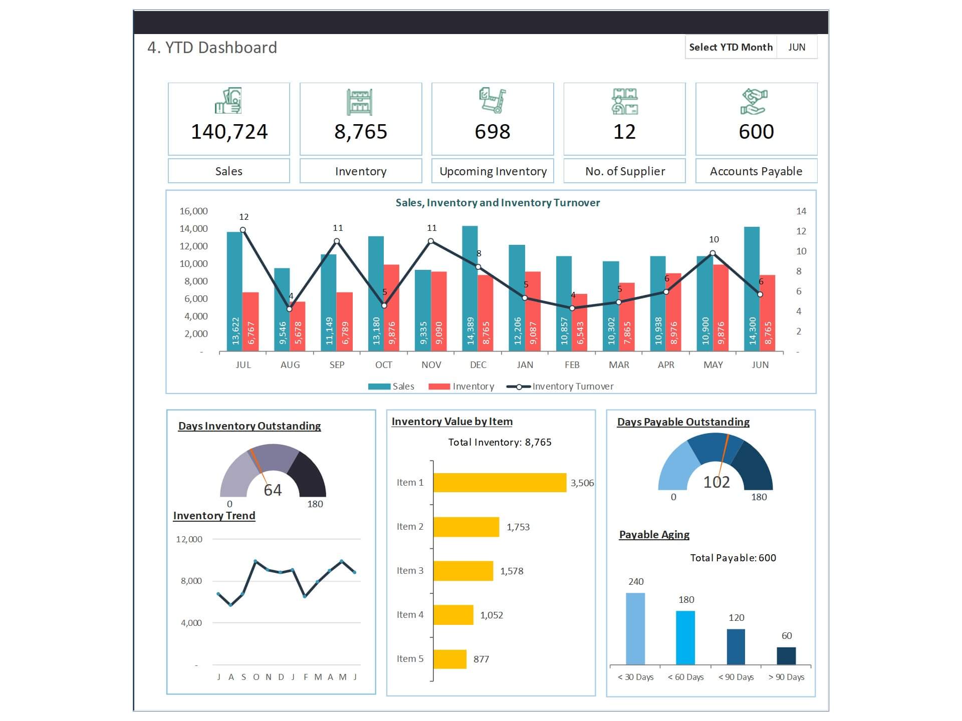
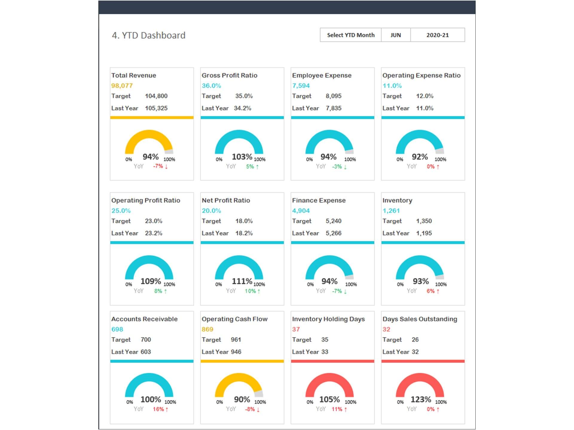
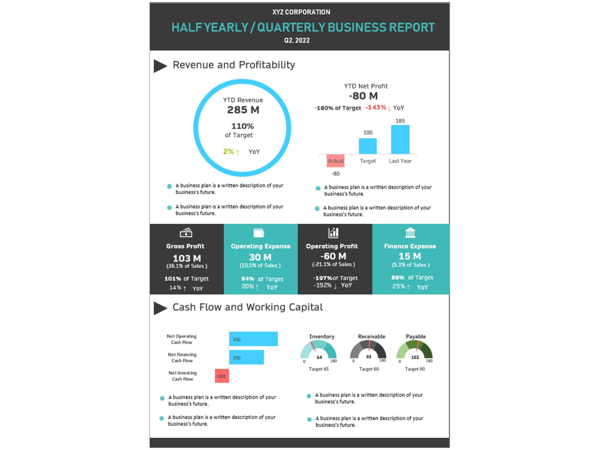
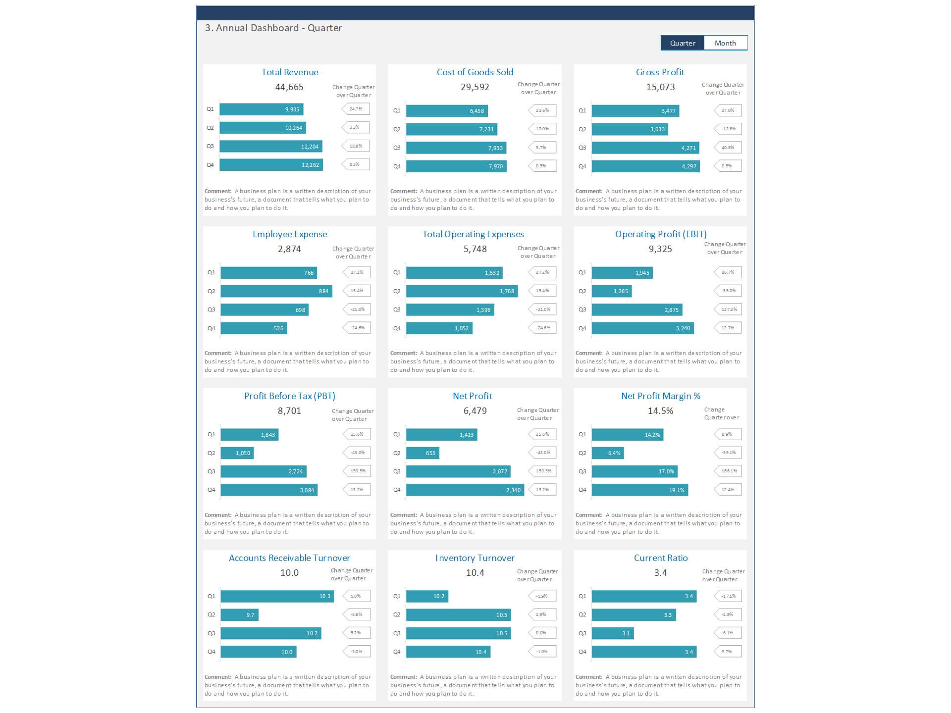
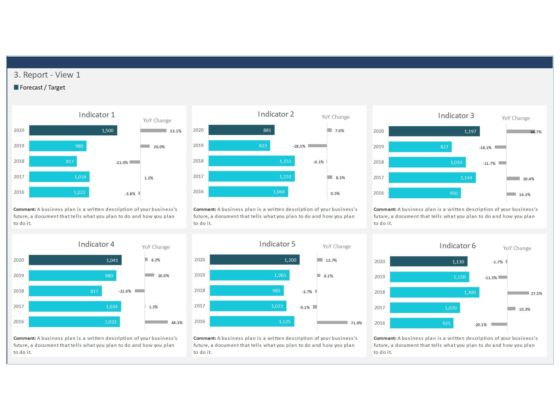
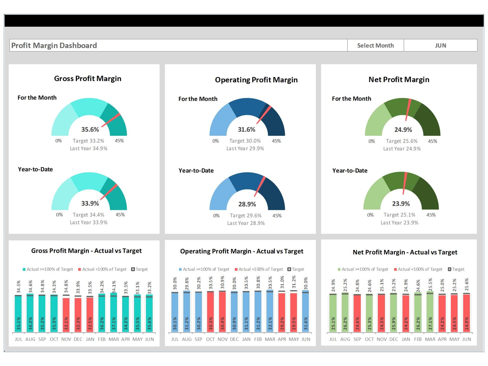
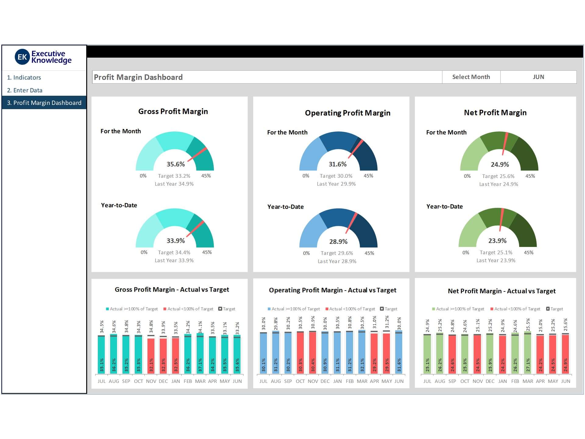
Profit margin dashboards focus on key metrics such as gross profit margin, net profit margin, revenue, and operating costs. These key performance indicators reveal the financial efficiency and health of a company. By aggregating data points from sales and operations into an Excel workbook, you get a comprehensive view of where the business stands. Dashboards can highlight margin trend over the periods, giving stakeholders a better understanding of profitability fluctuations due to seasonality or pricing shifts. A well-designed kpi dashboard in excel ensures that both leadership and analysts can make informed decisions using real-time insights.
Key Metrics to Include in a Profit Margin Dashboard
Gross Profit Margin vs Net Profit Margin: What to Track
The foundation of any profit-focused dashboard starts with understanding gross profit margin and net profit margin. Gross margin highlights profitability after deducting cost of goods sold, while net margin reflects final earnings after all expenses. These two key metrics form the baseline for most excel kpi dashboards, and they provide early indicators of business efficiency. When presented using graphs or trend over time visuals, such as sparklines, these metrics allow you to quickly identify operational issues or pricing problems. Excel helps organize and visualize this data in a way that’s both insightful and actionable for finance teams.
Essential KPIs for a Profit Margin Dashboard in Excel
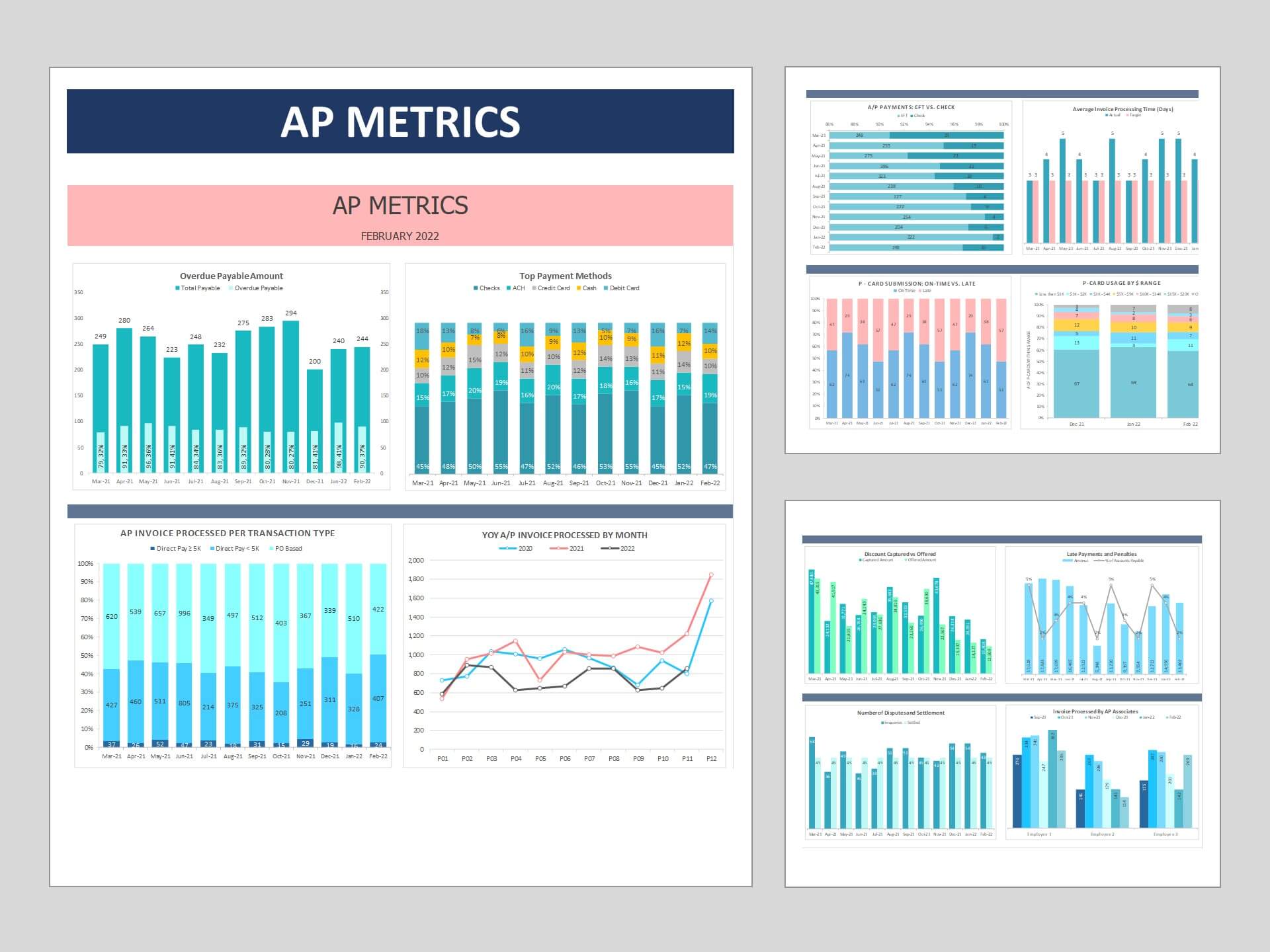
Aside from gross and net margin, your dashboard should track metrics such as overall sales, operating margin, EBITDA, and return on investment (ROI). These metrics help in tracking margin trend over the periods and provide deeper insights into profit generation. Excel enables users to visualize these metrics using pivot tables and slicers to drill into specific time periods, regions, or product lines. A strong dashboard allows multiple levels of analysis on a single page, creating clarity from even complex data sets. Excel also supports conditional formatting and data validation to help ensure your underlying data remains reliable and up-to-date.
Using KPI Dashboards to Monitor Profitability Trends
Tracking margin performance over time is essential to maintaining financial health. An excel dashboard can display monthly or quarterly trend over time visuals to show how profit margins evolve relative to cost pressures or revenue growth. These visuals help identify both risk and opportunity areas. When you create dashboards using Excel dashboard examples or free Excel templates, make sure they allow easy filtering and real-time updates. This helps stakeholders like CFOs or department heads evaluate whether current efforts are meeting financial goals. The dashboard to help organizations avoid shortfalls and align strategies more closely with fiscal targets.
Building a Profit Margin KPI Dashboard in Excel
Choosing the Right Dashboard Template for Excel
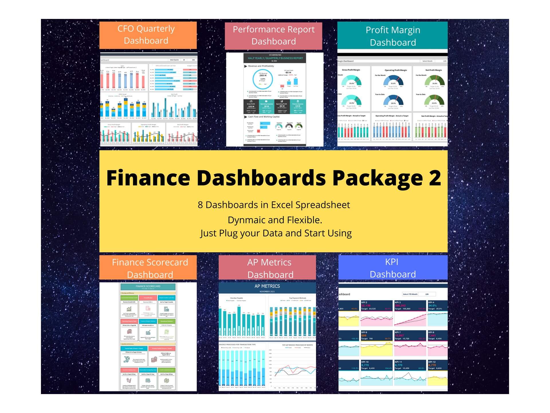
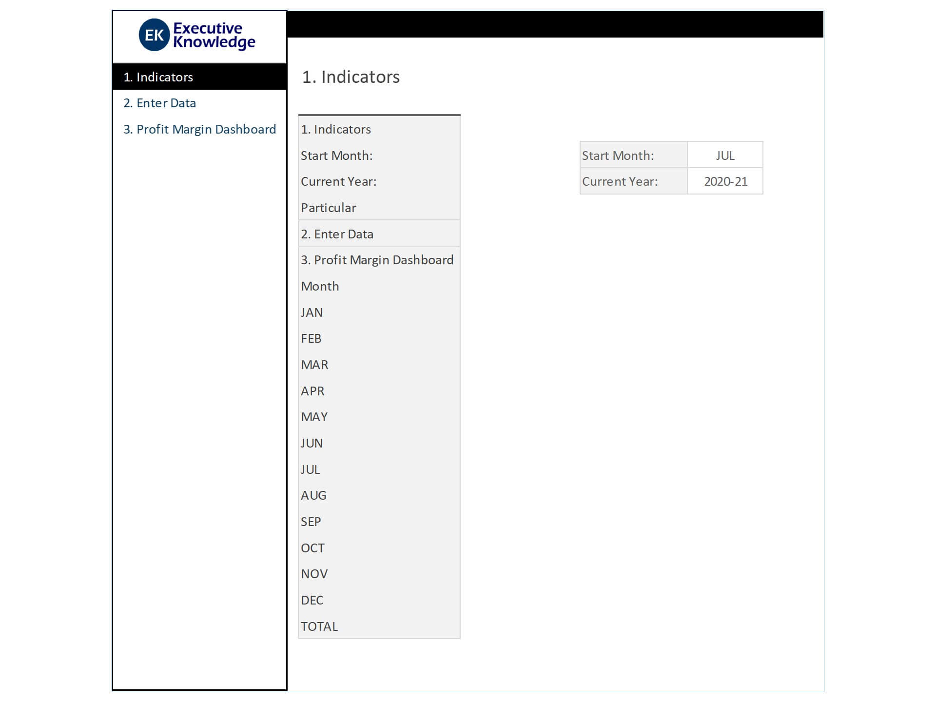
Selecting an appropriate dashboard template is crucial to effective analysis. The best templates include labeled sections for gross profit, net profit, and visualizations like charts and bars. Templates also provide built-in formulas for standard KPIs and help standardize dashboard creation across reporting cycles. Look for free dashboards or download the Excel file examples that match your industry or scale. Whether you’re building a dashboard from scratch or using a spreadsheet with a predefined structure, the goal is clarity, interactivity, and consistency. Having a reusable excel dashboard template also simplifies onboarding for new analysts or department heads.
Best Practices for Creating a KPI Dashboard in Excel
To create a KPI dashboard that delivers value, you need to follow key design principles. Keep layouts intuitive—use labeled tabs, clearly defined KPI blocks, and limit visual clutter. Implement data validation to prevent input errors and use formulas like =IFERROR, =INDEX, or =MATCH to improve data resilience. Group metrics logically to create narrative flow across visuals. A clean and well-labeled workbook makes it easier for stakeholders to interpret results and for analysts to update data efficiently. Consider using free templates to accelerate development and avoid common formatting pitfalls.
Free Excel Dashboard Examples and Spreadsheet Layout Tips
There are countless Excel dashboard examples available online that can help you get started with profit margin tracking. Many include predefined layouts, dynamic visuals, and instructions on how to populate data fields. Examples often contain sections for gross profit margin, net profit, and customizable graphs for historical comparisons. The layout of your Excel workbook should support real-time updates and contain clear paths for importing new data. Ensure your dashboard looks clean and maintains consistent formatting across metrics. These small details make a big difference in long-term usability and adoption across teams.
You may be interested: