Bar chart with bubble in top is a type of chart that combines the features of both a bar chart and a line chart with the marker. They are an effective tool for displaying data in a way that is easy to understand and can provide more information than a traditional bar chart. In this article, we will provide you with a step-by-step guide on how to create a bar chart with bubbles at the top in Excel.
Uses of bar chart with bubble:
- Bar charts with bubbles at the top are commonly used in business and finance to represent data such as market share, revenue, and profits. They can be used to compare data across different time periods or product lines and can also show additional information such as the number of units sold.
- They are also useful in scientific research to represent data such as experimental results, survey data, and demographic information. Bar charts with bubbles in the top can be used to compare data across different groups and can also show additional information such as the sample size.
- Bar charts with bubbles in the top can also be used in project management to track progress toward specific goals or milestones. They can be used to represent data such as project timelines, resource allocation, and budget expenditures and show additional information such as the percentage completion.
How to make a bar chart with bubble in top?
In order to make bar chart with bubble, do the following steps:
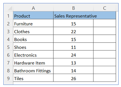
- Take sample data, here we take one more addition column for calculation.
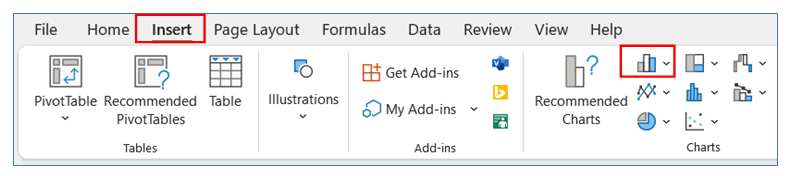
- Go to ribbon and select Insert and select your chart type from the chart group.
3. Select your Chart type 2-D stacked column.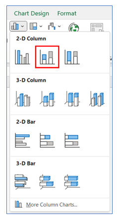
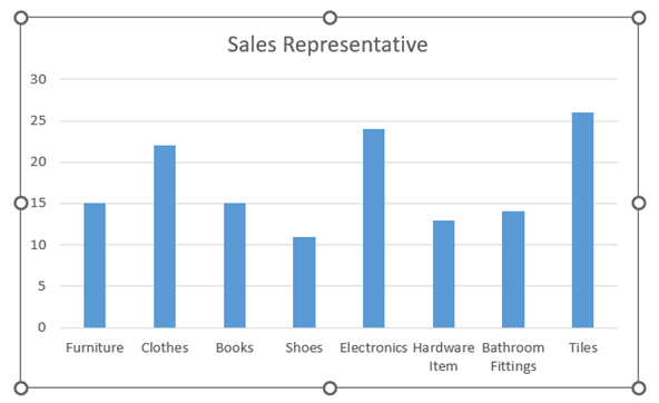
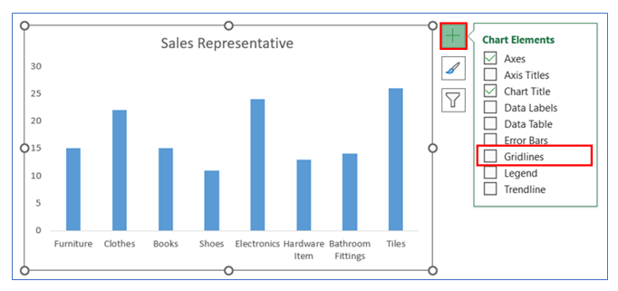
4. The chart looks like below.
5. To remove Gridline, click on the chart then select the + button, and uncheck the Gridline.
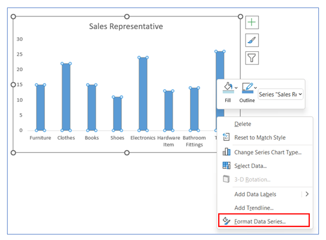
6. To change the Gap width, right-click on Chart and select Format Data Series.
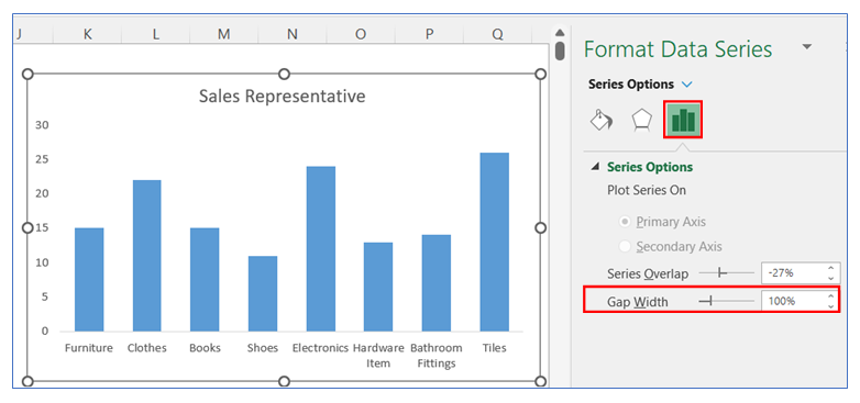
7. After selecting Format data series go to the series Option and change the Gap width to 100%.
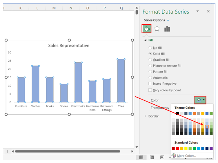
8. To change the color in the bar, right-click on the chart and select Format Data, in Format Data Series select Fill and choose your color.
9. To add the second data series, right-click on the chart and click Select Data.
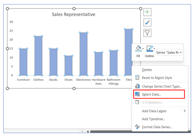
10. After that select Add to add new data.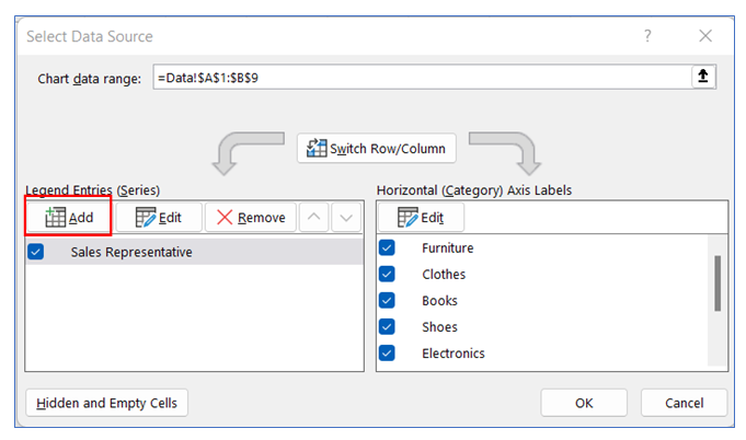
11. Select the Series name.
12. Select Marker range.
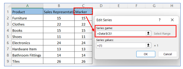
13. Select EDIT, shown below.
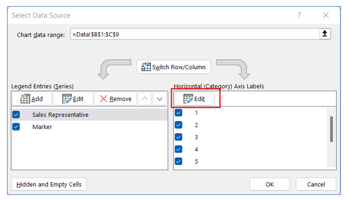
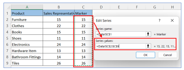
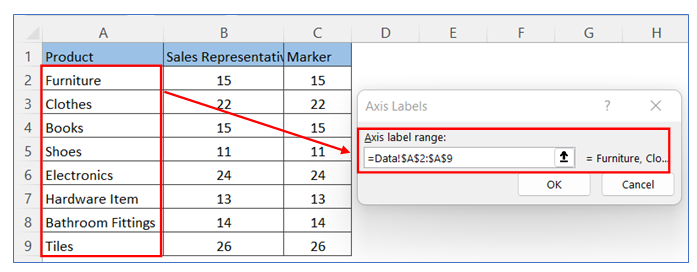
14. Select product Range then select OK.
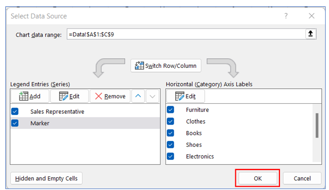
15. Select OK.
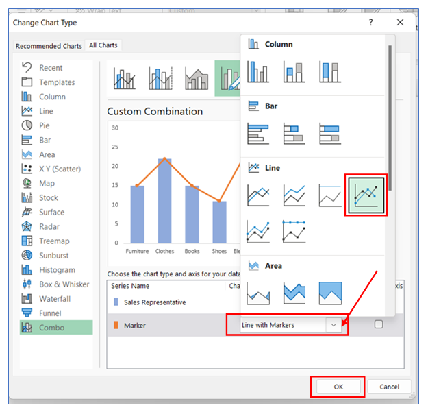
16. For changing the Stacked chart to a line chart, Click the right button and select Change Series Chart Type.
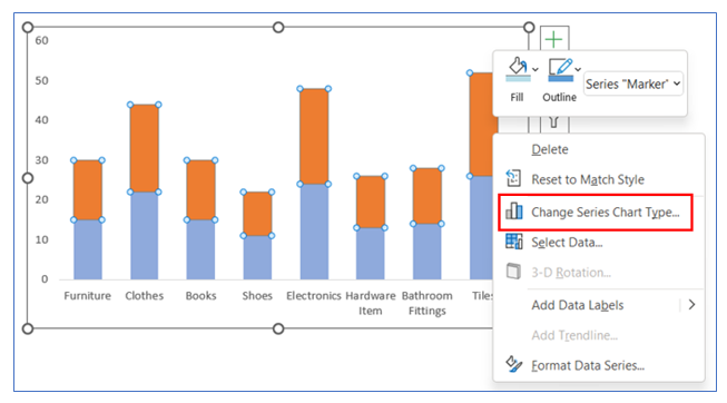
17. Select the line change chart and click OK.
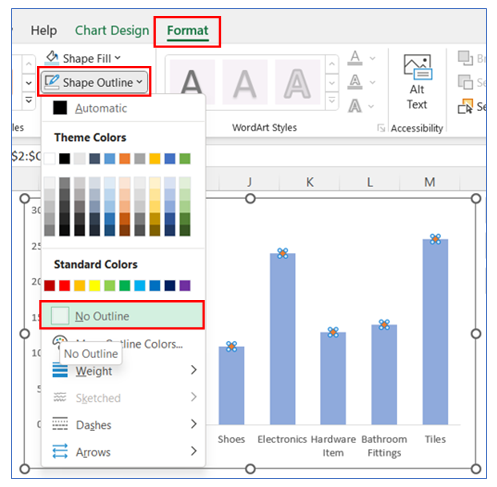
18. To remove the line from the line chart, go to Format in the ribbon then select shape outline and choose No Outline.
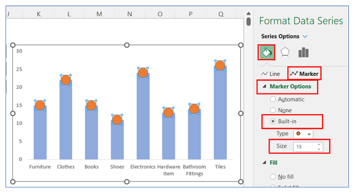
19. After that increase the Marker size, go to Format Data Series, select Marker Options, and change the marker size to 15.
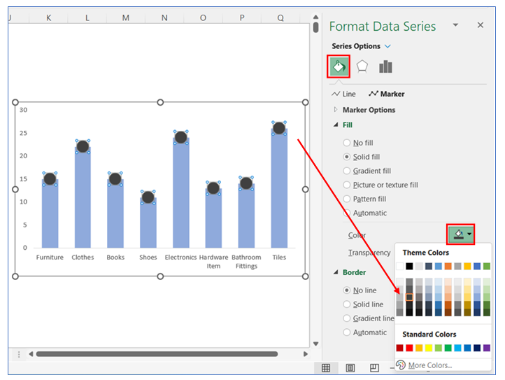
20. To change the Marker color, right-click on the chart and select Format Data, in Format Data Series select Marker Option then click Fill and choose your color.
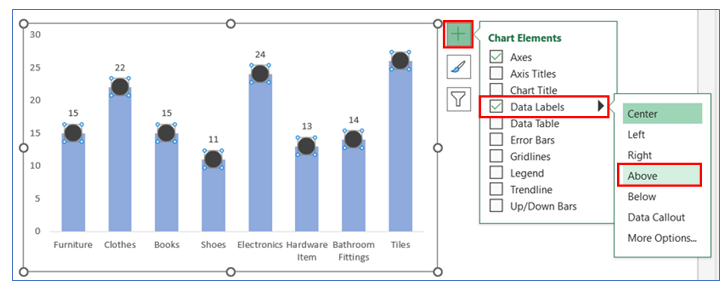
21. To give Data Labels in the chart click on your chart and select the + button to give your Data labels. Select Data labels and click on Above or any other option.
22. To change the Label position in the chart, right-click on the label and select Format Data Labels, in Format Data Labels select label Option then click Center.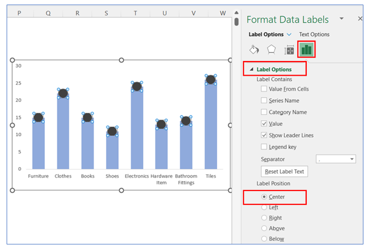
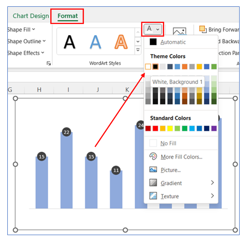
23. To change the data Labels color, go to Format in the ribbon then select Text color and choose white.
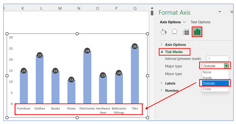
24. To give Tick Mark on the horizontal Axis, right-click on the chart and select Format Axis, in Format Axis select Axis Option and click Outside in the Tick Marks option.
25. To change the Tick Marks line color, right-click on the Horizontal axis and select Format Axis, in Format Axis select Axis Option and choose a color from the Line option.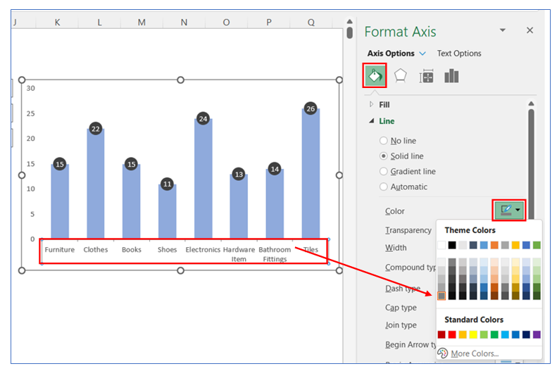
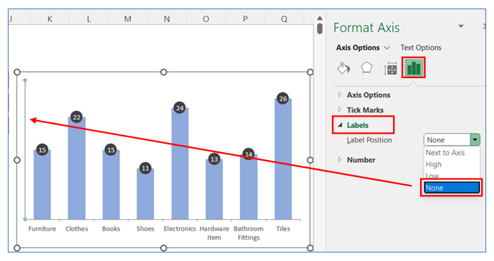
26. To remove the vertical Axis, right-click on the vertical axis and select Format Axis, in Format Axis select Axis Option and select Labels, and choose None.
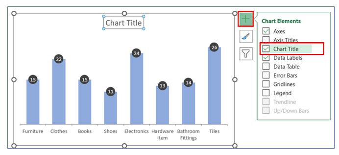
27. To give Chart title, click on chart then select + button and check the Chart Title.
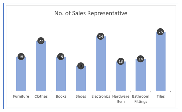
28. The chart looks like below.
Application of Bar Chart with bubble on top in Dashboard Reporting
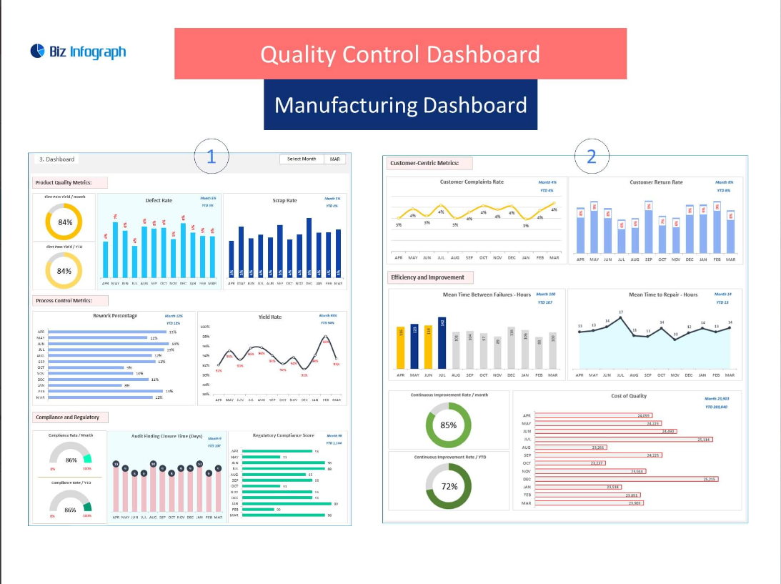
Here are six uses of a Bar Chart with a Bubble in Top in dashboard reporting:
- Highlighting Maximum or Minimum Values:
- Places a bubble at the top of the highest or lowest bar to draw attention to the maximum or minimum value in a data set, such as highlighting the best-selling product or the least populated region.
- Combining Two Data Sets:
- Uses the bar to represent one set of data (e.g., total sales) and the bubble to represent another related metric (e.g., profit margin), providing a two-dimensional view of performance metrics.
- Emphasizing Data Outliers:
- Places a bubble on bars that represent outlier values, making it easier to spot and analyze anomalies or exceptional data points in a dataset, such as unusually high sales in a specific month or a sudden drop in website traffic.
- Indicating Trend or Change:
- The bubble can represent the rate of change or trend for the data point in the bar, such as the growth rate of sales or the percentage change in customer satisfaction scores, providing a snapshot of dynamic data.
- Displaying Additional Categorical Data:
- The bubble can hold categorical information (e.g., product rating, risk level) related to the bar it tops, offering a quick visual reference for qualitative assessment alongside quantitative measurements.
- Segmenting Data Further:
- For each bar, the bubble can represent a segment of the data related to the bar’s total value, such as the proportion of sales from a new product in the total sales figure, enabling a compact and informative data presentation.
This type of chart can be particularly effective when you want to provide a clear visual emphasis on specific data points or to integrate an additional data dimension without cluttering the visual presentation. The use of bubbles draws the viewer’s attention and can convey supplementary information at a glance.
For ready-to-use Dashboard Templates:
