A line chart is a type of chart that is useful for displaying trends and changes over time. This type of chart consists of a series of data points connected by a line, where each data point represents a value or measurement taken at a specific time. In this article, we will provide you with a step-by-step guide on how to create a line chart in Excel.
Uses of line chart:
- In the worlds of business and finance, line charts are a common visual representation of metrics like sales, revenue, and profits. They can be used to monitor fluctuations in sales from month to month and help spot problems or opportunities for expansion.
- They can also be used in the medical and health sciences to represent information such as the outcomes of clinical trials and experimental data. Changes in data over time, like those seen in blood pressure or cholesterol readings, can be tracked using line charts to better understand the impact of an intervention or treatment.
- In the classroom, line charts can be used to monitor students’ development and growth. They can be used to illustrate data like test scores and grades over time, and they can point to problem areas so that teachers can provide extra help.
How to Create Line Chart in Excel?
In order to excel line chart, do the following steps:
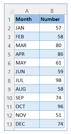
- Take sample data.
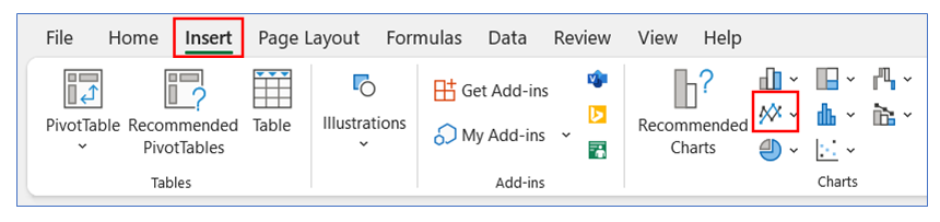
- Go to the ribbon, select Insert, and select your chart type from the chart group.
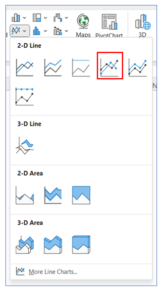
- Select Chart type as 2-D line.
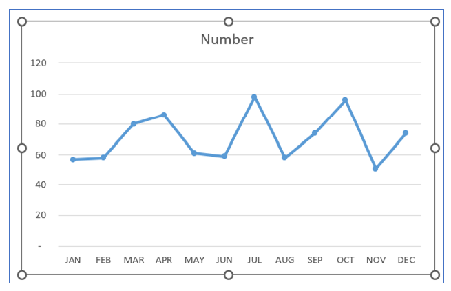
- The chart looks below.
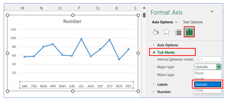
- To give Tick Mark in the horizontal axis, right-click on the axis and select Format Axis.
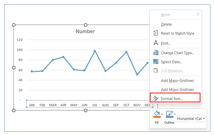
- Select Tick Mark Outside or another option from the Axis option.
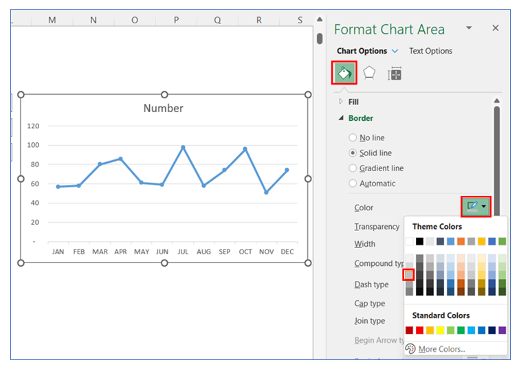
- To change the Tick mark color, in the Format Chart Area, select Fill, and choose your color.
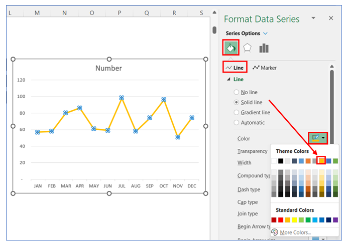
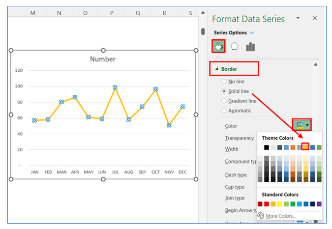
- To change the Line color, right-click on the chart and select Format Data Series.
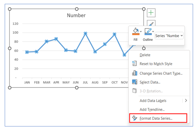
- After that select Line Option and choose your color.
- To change the Marker Fill color, select the Marker Fill Option and choose white color.
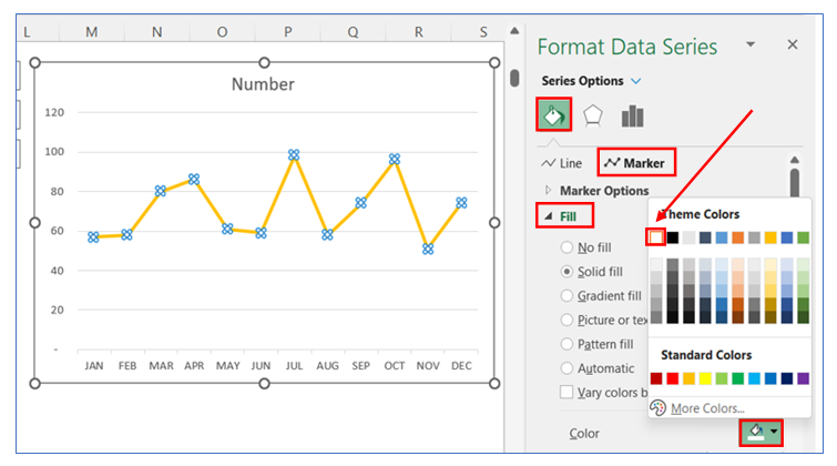
- To change the Marker border color, select the Marker border Option and choose your color.
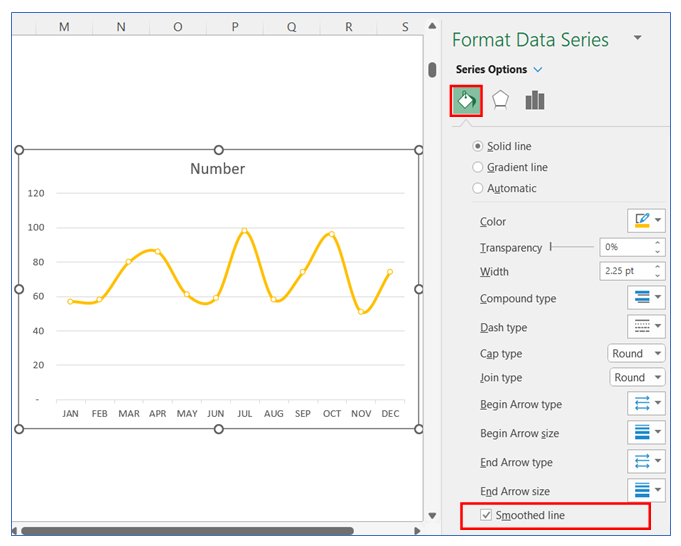
- To smooth the Line, in Format Data Series select Series Option and tick the smoothed line box.
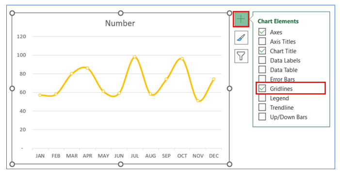
- To Remove Gridline, click on the chart then select the + button, and uncheck the Gridline.
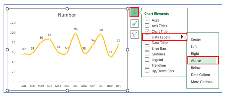
- To give Data Labels click on your chart and select the + button to give your Data labels. Select Data labels and click on Above or any other option.
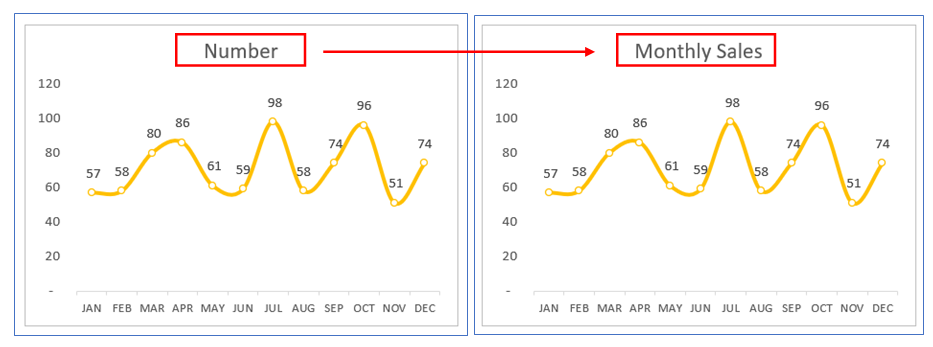
- To change Chart Title, click on the title and give your appropriate name.
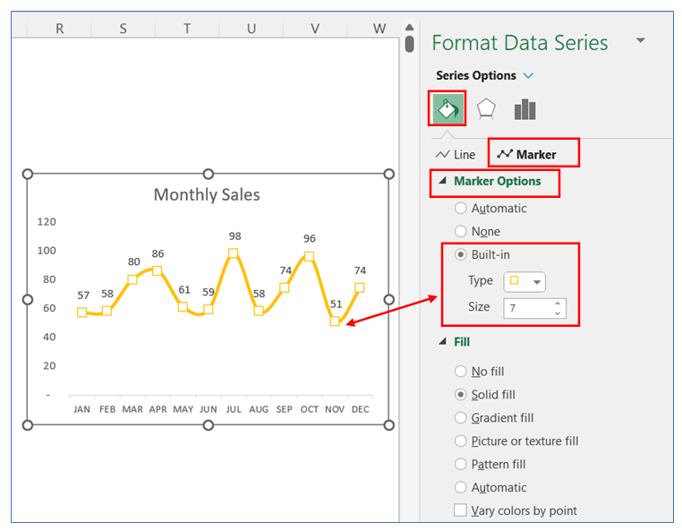
- You can change the marker size and type. Right-click on the chart and select Format Data Series. Select Series Option and choose Marker Option, here you can change Marker Type and Size.
Application of line chart in Excel in Dashboard Reporting

For ready-to-use Dashboard Templates:
