Understanding how to properly give an axis in chart in Excel is a fundamental skill for anyone looking to create meaningful and insightful data visualizations. The ability to customize and manipulate the ‘Axis in Chart’ is crucial for accurately representing data, enhancing readability, and making your charts more informative. This guide will take you through the essential steps and tips to effectively set up and adjust axes in Excel charts, whether you’re dealing with simple bar graphs or complex scatter plots. By mastering axis manipulation, you’ll be able to present your data in a way that’s both visually appealing and easy to interpret, making your Excel reports and presentations stand out.
Why axis is an important element in the Chart?
- Clarifies Data Representation: The axis in a chart provides a clear reference framework, helping viewers to quickly understand the scale and context of the data being presented.
- Enables Accurate Data Interpretation: Properly defined axes ensure that data is accurately interpreted, preventing misunderstandings and misrepresentations of data trends and values.
- Facilitates Comparison: Axes are essential for comparing different data sets within the same chart, allowing for easy and effective analysis of relationships and differences.
- Enhances Readability: Well-labeled and scaled axes improve the readability of a chart, making it easier for the audience to follow and comprehend the data story.
- Customization for Specific Data Needs: Axes can be customized (e.g., log scale, time intervals) to suit specific types of data, enhancing the chart’s relevance and effectiveness in conveying complex information.
How to maneuvering axis in chart?
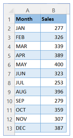
- Take sample data.
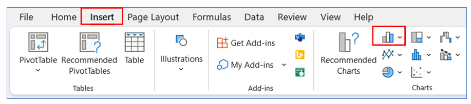
2. Select data from the sample data, then go to the ribbon, select Insert, and select your chart type from the chart group.
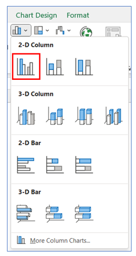
3. Select Chart type a 2-D column.
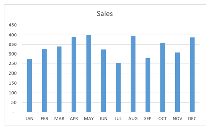
4. The chart looks like below.
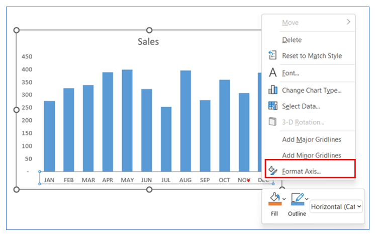
5. To give Tick Mark on the horizontal Axis, right-click on Axis and select Format Axis.
(To remove gridline and gap width to see our column chart)
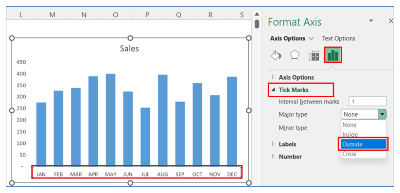
6. After that go to Axis Option and click tick marks, select outside or any other option.
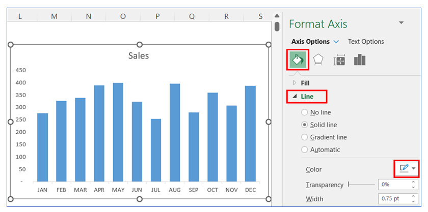
7. To change the Tick marks line color, right-click on the Axis and select Format Axis, in Format Axis select Line and choose your color.
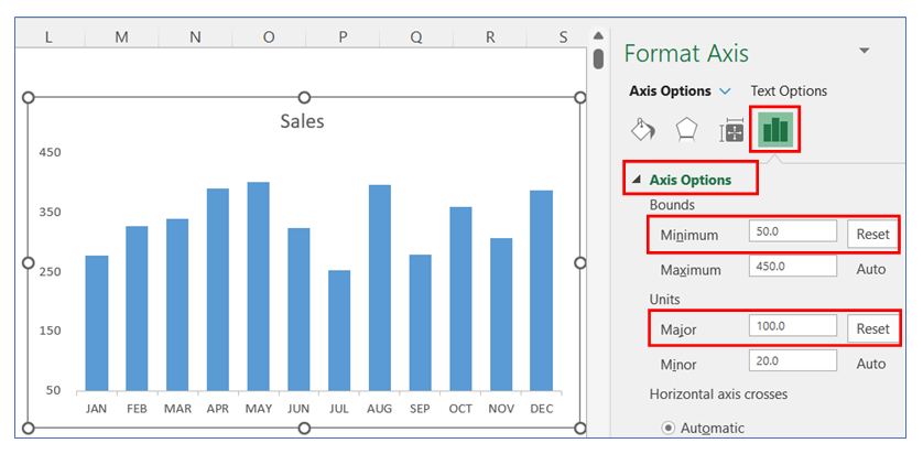
8. To change axis Bounds and Units, right-click on the Axis and select Format Axis, in Format Axis select the Axis option then change Bounds minimum to 50.0 and Units Major to 100.0.
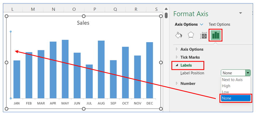
9. To remove the Vertical axis, right-click on the Axis and select Format Axis, in Format Axis select the Axis option and select None from Label Option.
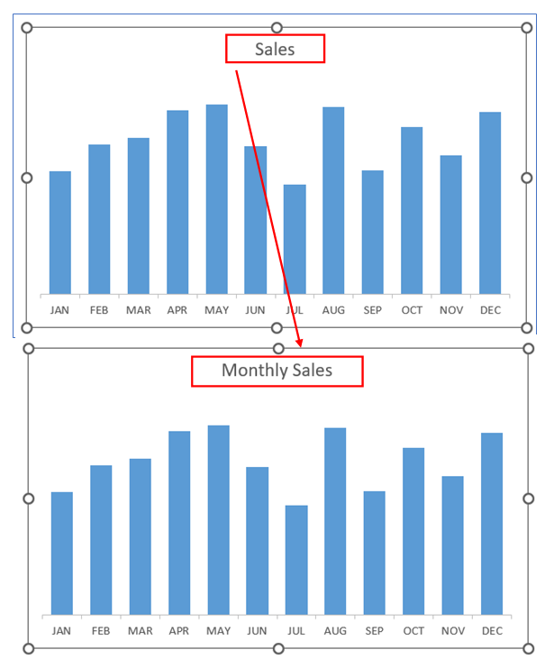
10. To give an appropriate chart title, select the title and write your desired title.
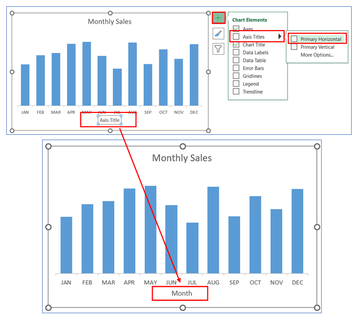
11. To add primary Horizontal axis titles, click on the chart then select the + button and select Axis Titles then select Primary Horizontal and write your desired title.
12. You can change primary Vertical axis titles, just click right button, and select Axis Titles.

Application of Axis in Chart in Dashboard Reporting:
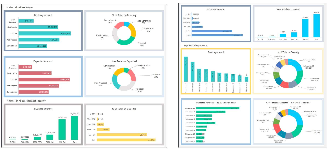
Axis in charts play a crucial role in dashboard reporting, enhancing the effectiveness and clarity of data visualization. Here are six applications of axis in chart in dashboard reporting:
- Facilitating Data Comparison:
- Axes in charts provide a standardized scale for comparison, essential in dashboards where comparing metrics like sales, expenses, or performance across different time periods or categories is vital.
- Enhancing Trend Analysis:
- The horizontal (X-axis) typically represents time intervals, while the vertical (Y-axis) represents the data values, enabling clear visualization of trends over time. This is particularly useful in dashboards tracking sales trends, stock prices, or customer growth.
- Improving Data Interpretation Accuracy:
- Properly scaled and labeled axes ensure that data is interpreted accurately, which is crucial in decision-making dashboards. For example, correctly scaled axes can accurately reflect financial growth or decline in a revenue dashboard.
- Customizing to Specific Data Types:
- The ability to customize axes (like using a logarithmic scale on the Y-axis) allows for effective representation of varied data types, such as exponential growth in a user acquisition dashboard.
- Facilitating Multi-Variable Analysis:
- Secondary axes can be used for comparing different variables on the same chart, useful in dashboards where correlating different types of data (like temperature and sales) is necessary.
- Aiding in Data Segmentation Visualization:
- In dashboards focusing on segmentation, such as market segments or customer demographics, axes help in categorizing and visualizing these segments clearly, making the data more accessible and understandable.
For ready-to-use Dashboard Templates:
