Excel’s Mirror Bar Chart feature is helpful for displaying two sets of data side by side in a format that’s both aesthetically pleasing and straightforward to compare. An example of a mirror bar chart would be a graph in which two bars, each representing a different set of data, are joined at the centre. In Excel, there are specific procedures that must be followed in order to produce a mirror bar chart. Follow along as we show you how to make a mirror bar chart from scratch.
Uses of mirror bar charts in Excel:
- Comparing two sets of data side-by-side
- Showing the difference between two values within a larger dataset
- Highlighting changes in data over time
How to make a mirror bar chart in excel?
In order to create mirror bar chart excel , do the following steps:
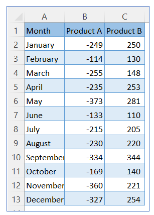
- Take sample data. We take Product A data with a (-) sign and Product B data with a (+) sign.
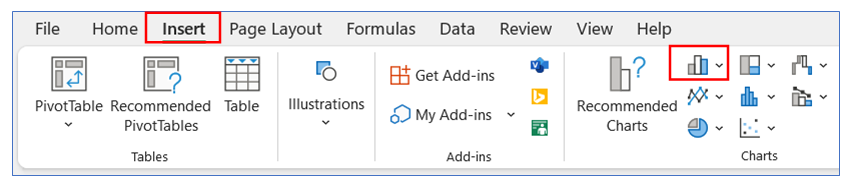
- Go to the ribbon, select Insert, and select your chart type from the chart group.
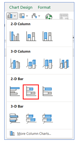
- Select Chart type as 2-D Bar.
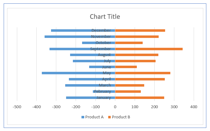
- The chart looks below.
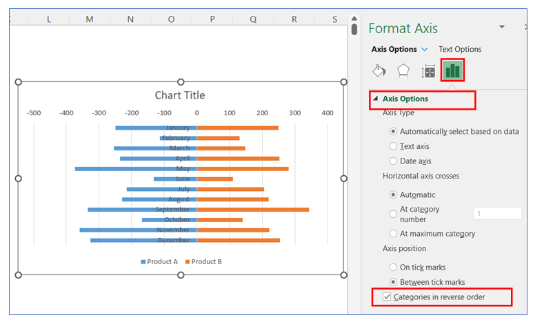
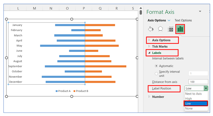
- To change the category in reverse on the vertical axis, right-click on the axis and select Format Axis.
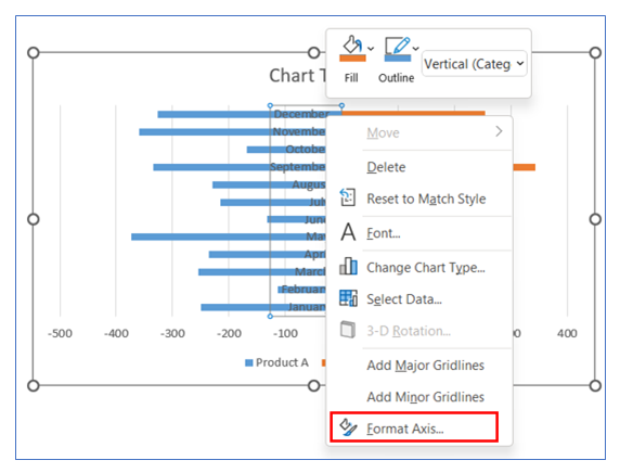
- After that in the Axis Options give a checkmark on the ‘Categories in Reverse Order’ box.
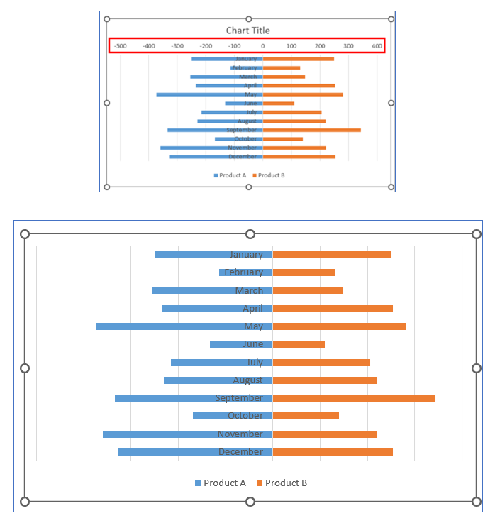
- To remove the horizontal axis, click on Axis and press the Delete option.
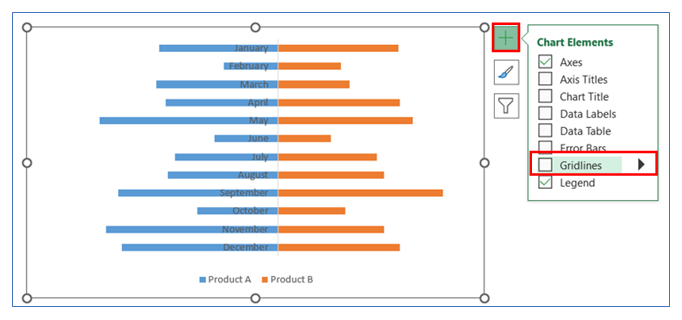
- To Remove Gridline, click on the chart then select the + button, and uncheck the Gridline.
- To change the axis label position, right-click on the Axis and select Format Axis, in Format Axis select Axis Option and choose Labels. Here click Low in the Label Position.
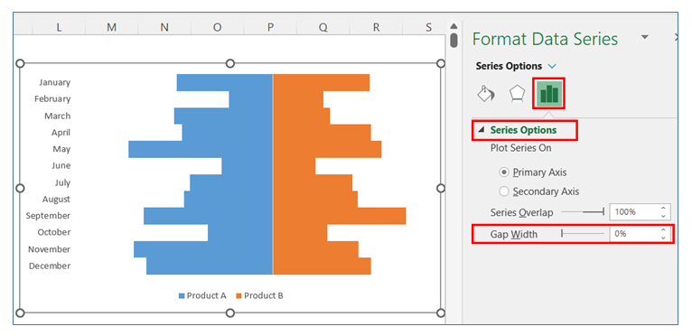
- To change the gap width in the bar, right-click on the chart and select Format Data, in Format Data Series select Series Option and change the gap width to 0%.
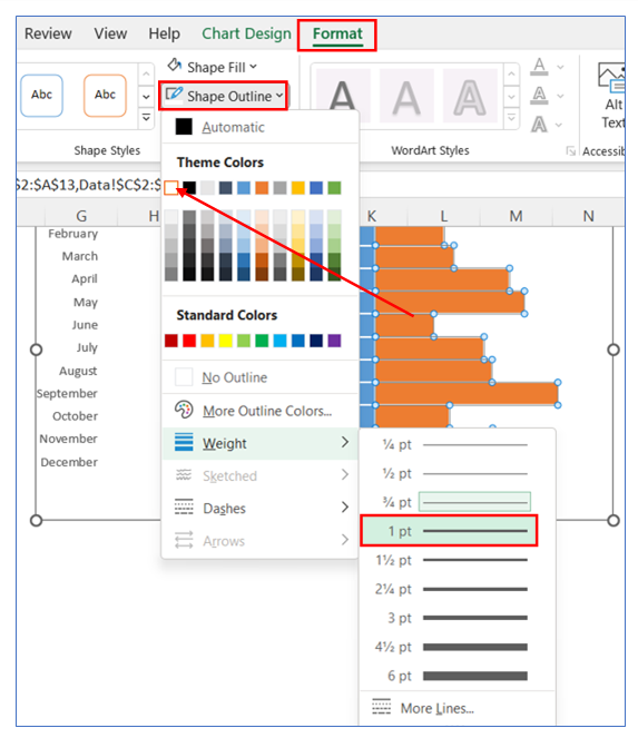
- Now we give a white outline in the bar to distinguish one bar from another. Select the bar, go to Format ribbon, choose shape outline as white and weight as 1pt.
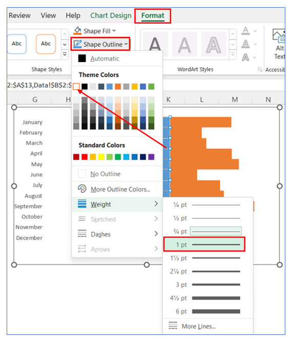
- Do the same step for the other side of the bar Select the bar, go to Format ribbon, choose shape outline as white and weight as 1pt.
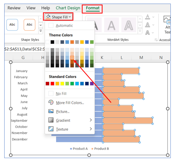
- To change the color, select the bar, go to Format in the ribbon, click Shape Fill, and choose your color.
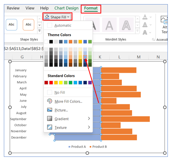
- Follow the same step to change the color of the other part of the chart. Select the bar, go to Format in the ribbon, click Shape Fill, and choose your color.
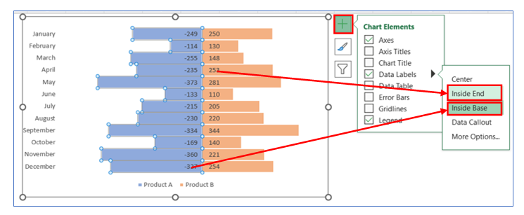
- To give Data Labels click on your chart and select the + button to give your Data labels. Select Data labels and click on Inside End for the first chart and Inside Base for the second chart or any other option.
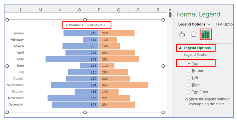
- To change the legend position, right-click on the chart and select Format Legend, in Format Legend select Legend Option and choose Top.
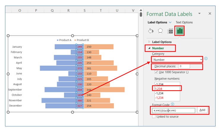
- Change 2nd data label Number Format and color, follow the below steps. Choose Number Category, Decimal places, negative number color, and Format code as highlighted in the image.
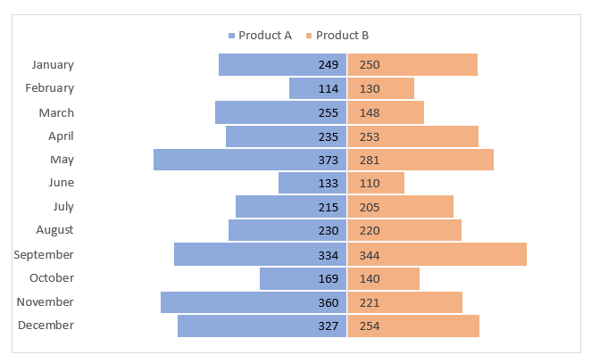
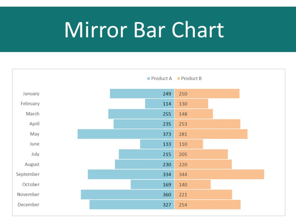
- The chart looks below.
Application of Mirror Bar Chart in Excel in Dashboard Reporting
Here are some uses of Mirror Bar Charts in dashboard reporting:
- Comparing Positive and Negative Values:
- Ideal for showcasing data that have inherent positive and negative aspects, such as profits and losses, assets and liabilities, or revenue and expenses, highlighting the balance or disparity between them.
- Gender Comparison in Demographic Studies:
- Useful for comparing demographic data, such as population, education level, or income, between genders, with one direction representing male and the other representing female.
- Before and After Analysis:
- Compares metrics before and after a specific event or intervention, such as customer satisfaction, employee productivity, or sales figures, before and after a new policy or campaign.
- Opinion Polls or Survey Results:
- Displays the results of opinion polls or surveys, contrasting agree vs. disagree, satisfied vs. unsatisfied, or recommend vs. not recommend responses.
- Product or Service Comparison:
- Compares two products or services based on various attributes or performance metrics, making it easy to assess strengths and weaknesses side by side.
- Competitor Analysis:
- Visualizes a company’s performance metrics against a key competitor’s, across different areas like market share, growth rate, customer satisfaction, or product quality.
Mirror Bar Charts are particularly effective for these scenarios as they provide a straightforward visual comparison that emphasizes the relationship or contrast between two sets of data, making the differences and similarities immediately apparent.
For ready-to-use Dashboard Templates:
