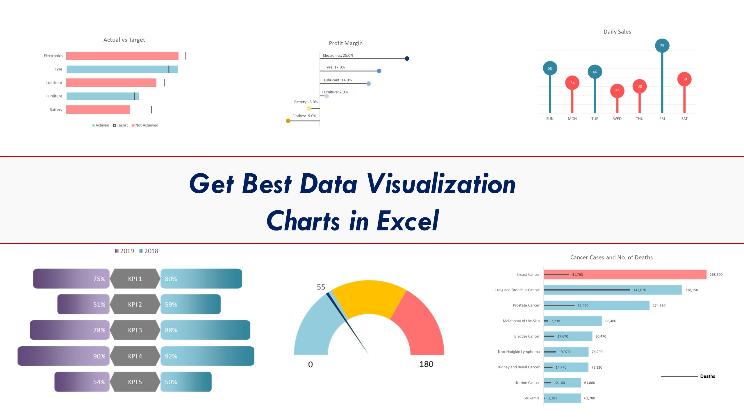
Excel Data Visualization Chart Package includes charts to help you create professional presentations very easily. These charts are designed to maximize visual impact and to effectively communicate your message. Every business professional must have these charts to make their presentation standout.
- Wide range of advanced and dymanic visualization charts
- Video tutorial for each chart
Data visualization is a term that is often heard in the business world, but what does it actually mean? Simply put, data visualization is the presentation of data in a graphical or pictorial form. It can be used to help individuals understand large amounts of data more easily or to identify patterns and relationships that might not be apparent from looking at the data in table form.
There are many reasons why data visualization is important. Perhaps the most obvious is that it makes it easier to see trends and patterns in the data. This can be very helpful when trying to make decisions about what actions to take based on the information. Data visualization can also help people understand complex concepts or relationships that might be difficult to grasp by just reading numbers and statistics. Additionally, when data is presented in a visually appealing way, it can help capture people’s attention and communicate ideas more effectively.
Types of charts and when to use them
There are many types of charts and graphs, and each has its own purpose. Some are used to show trends over time, while others are used to compare data. Here is a breakdown of the most common types of charts and when to use them.
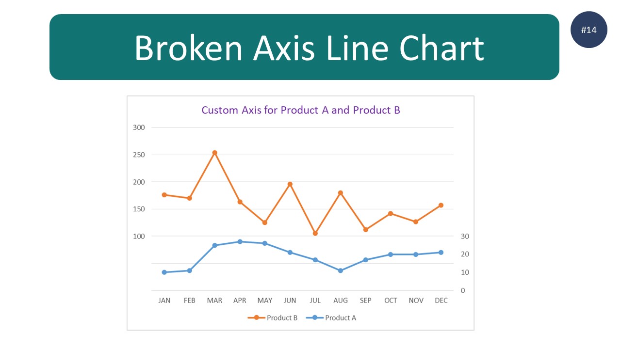
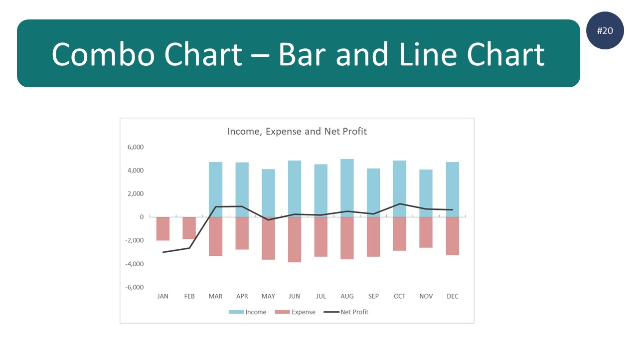
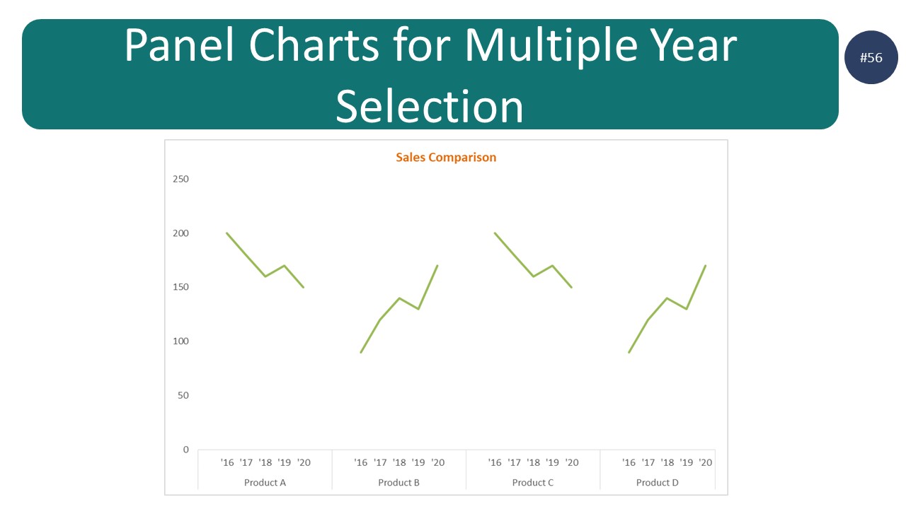
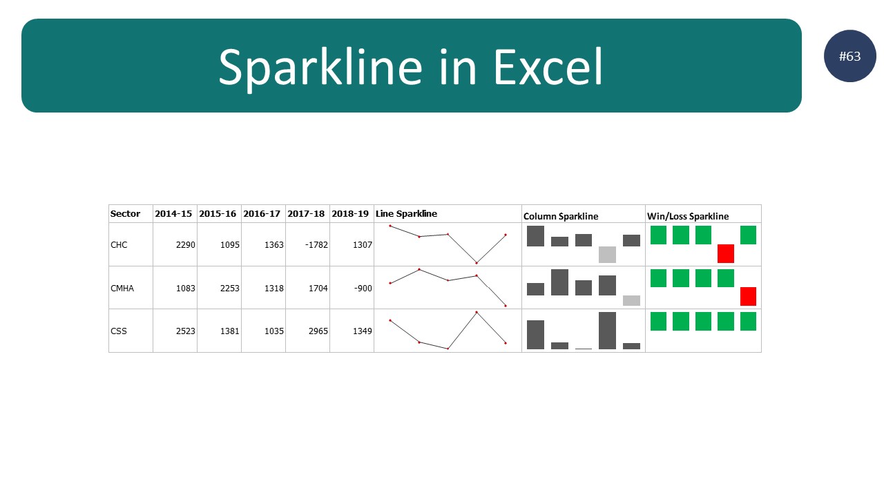
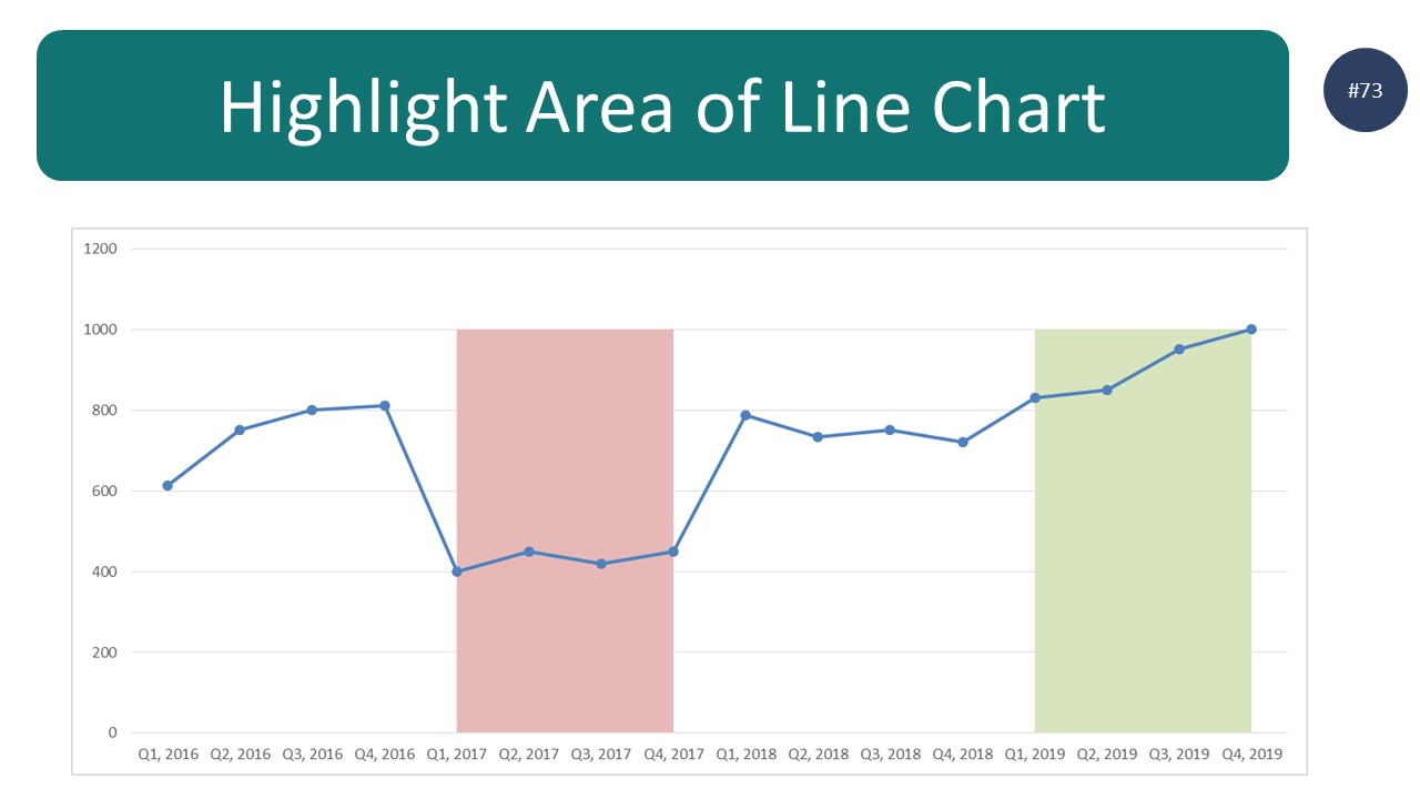
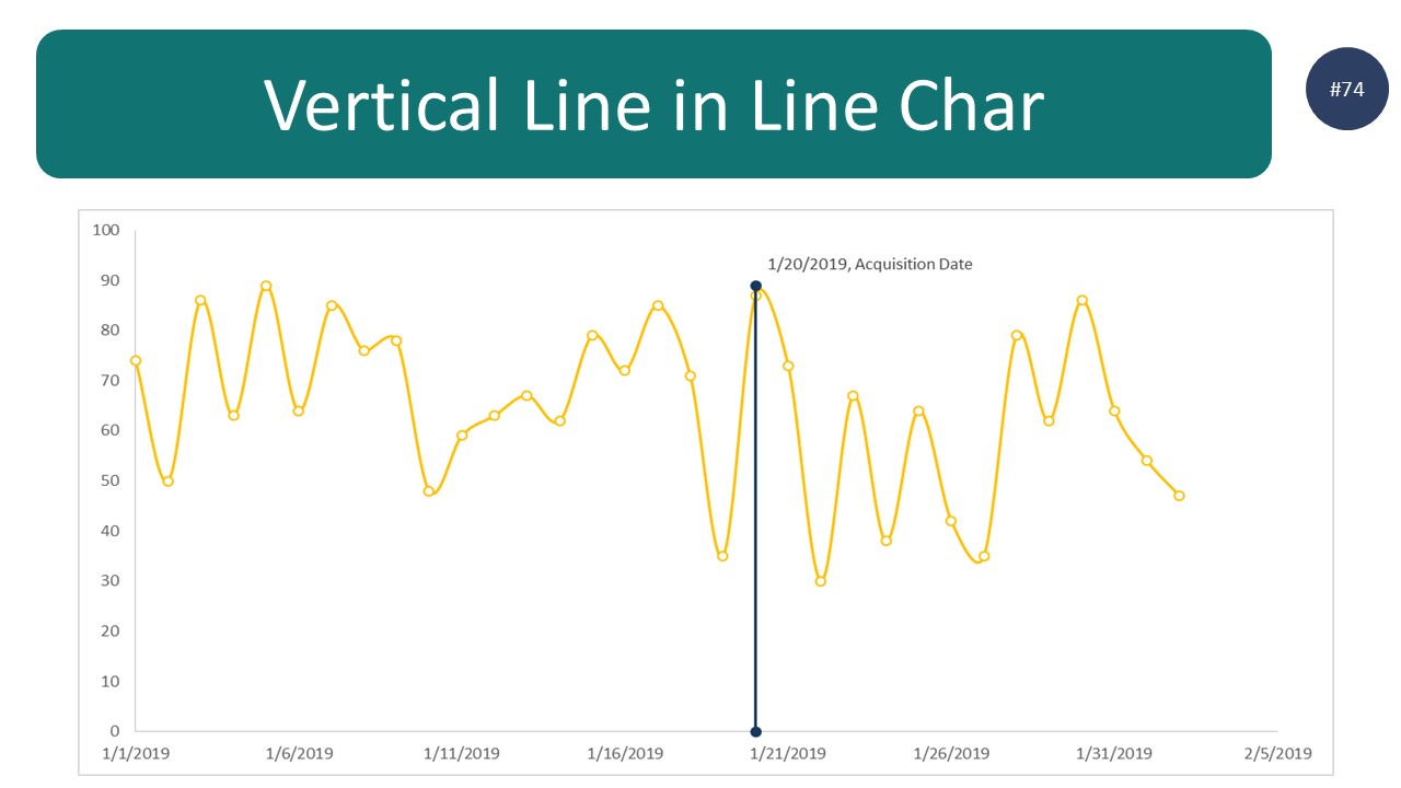
- Line graphs are used to track changes in data over time. They can be used to show how something changes over a period of days, weeks, months, or years.
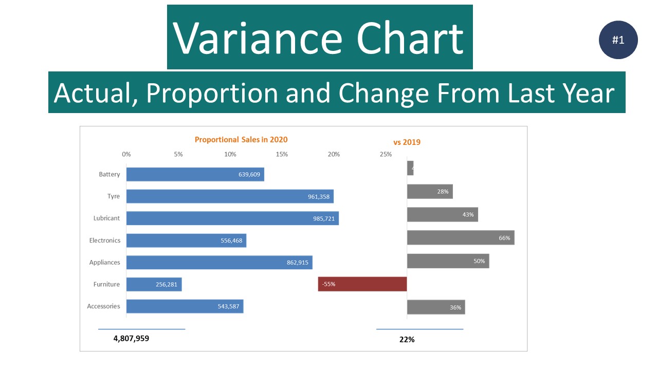
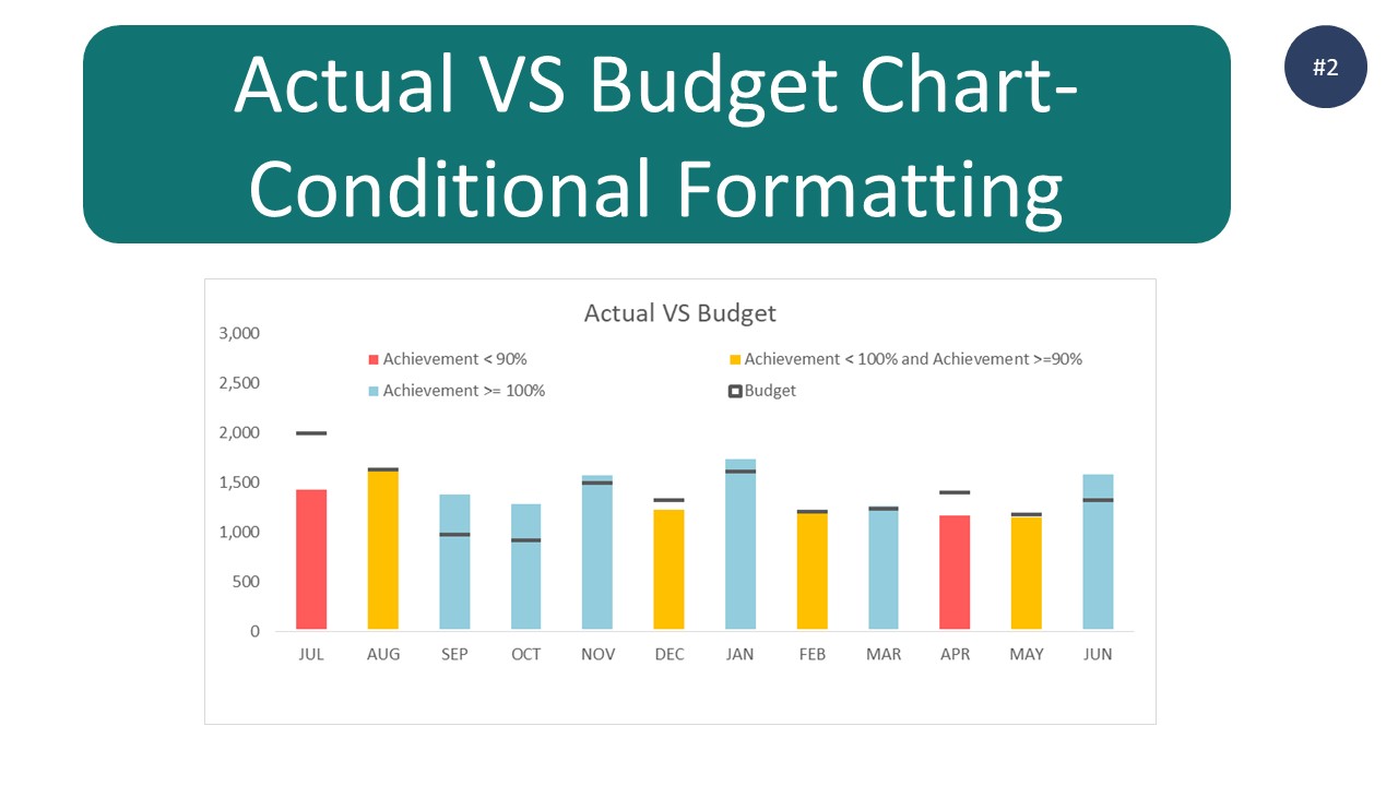
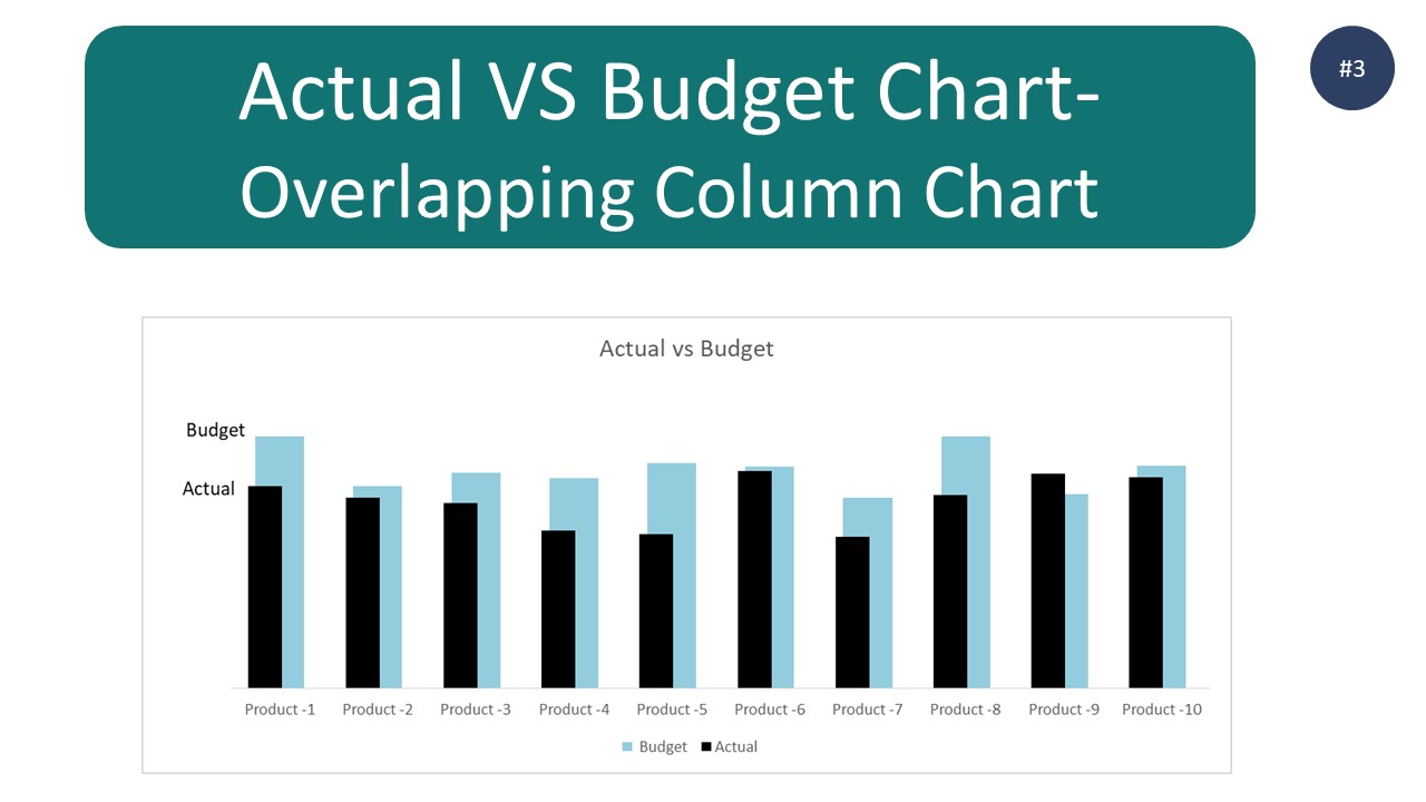
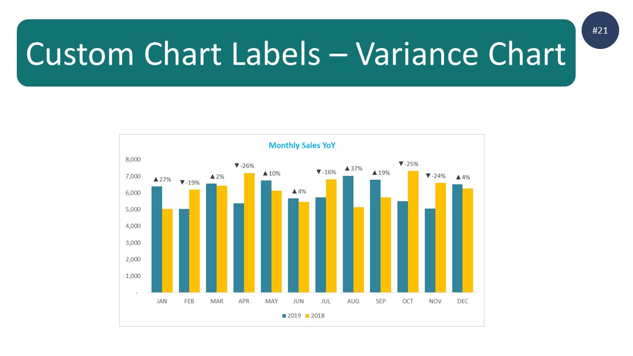
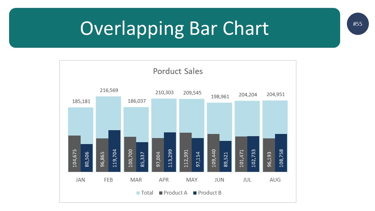
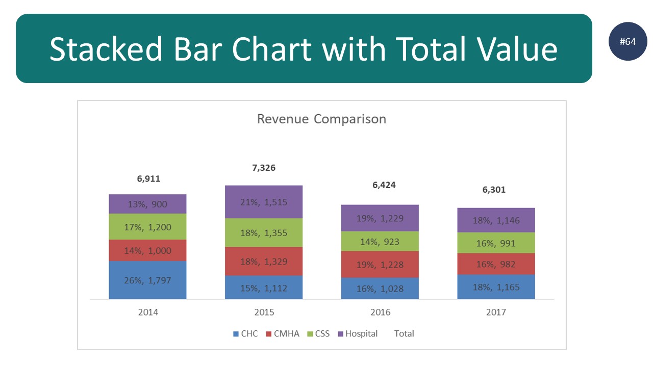
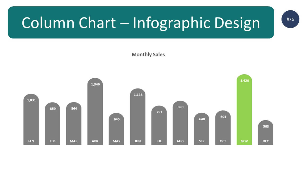
- Column charts are used to compare data between different categories. For example, you could use a column chart to compare the sales figures for different products.
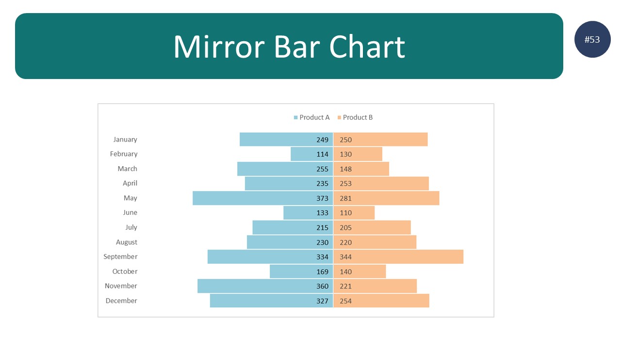
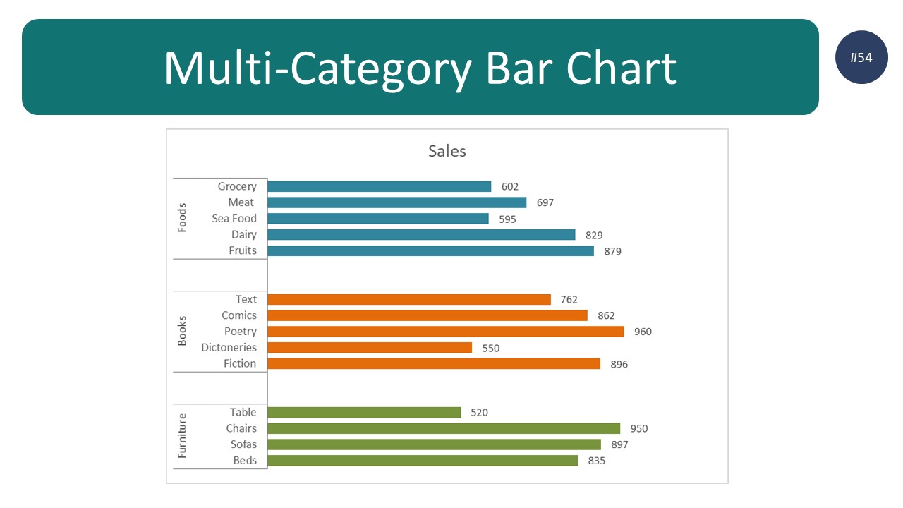
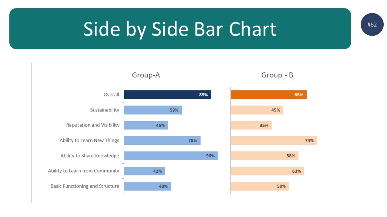
- Bar graphs are similar to column charts, but they use bars instead of columns to compare data. This makes them ideal for comparing data that has multiple categories.
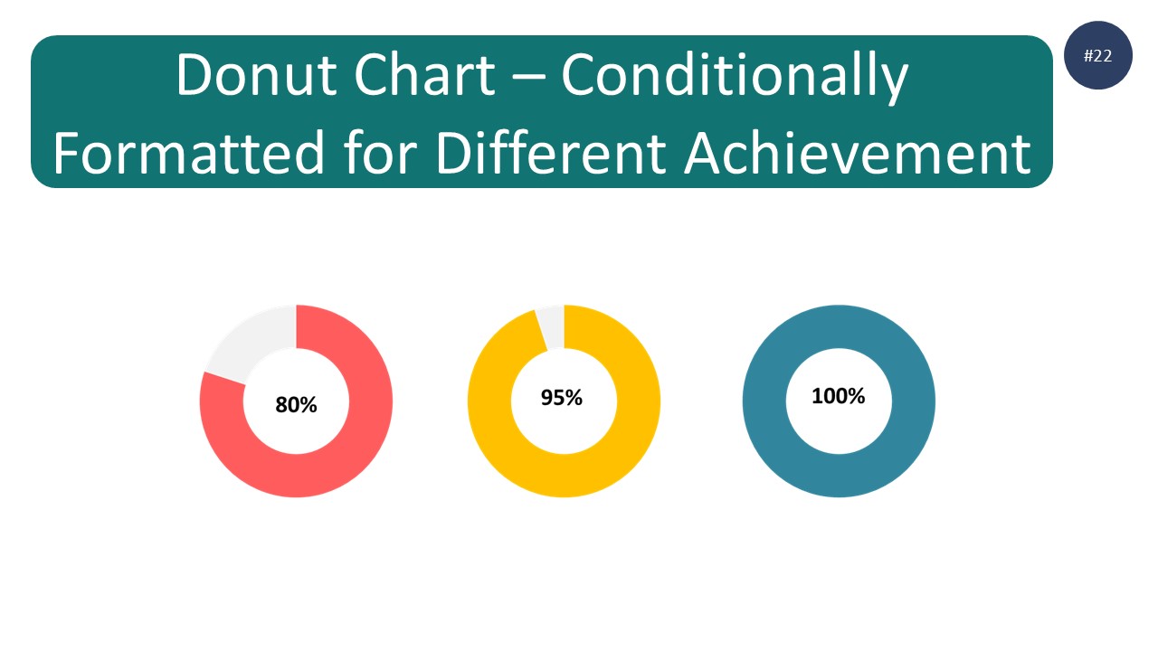
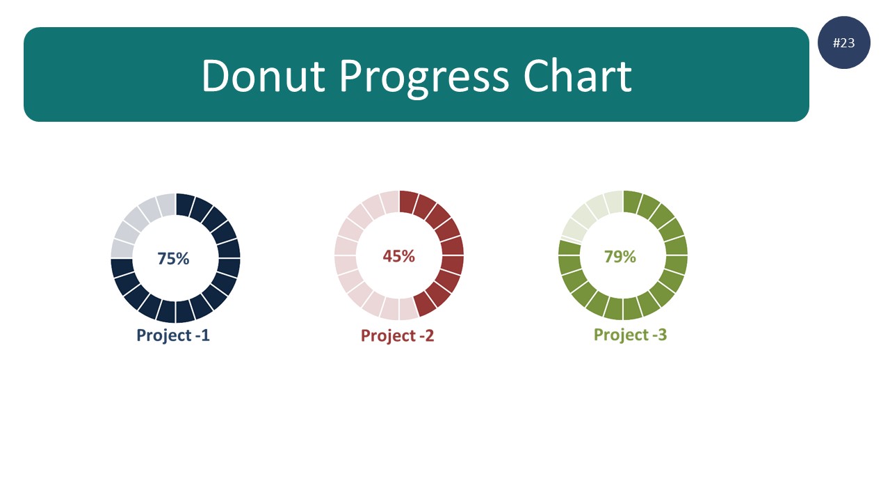
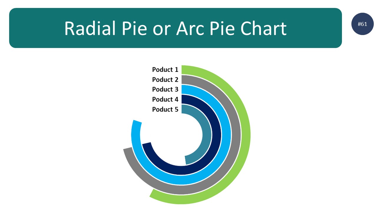
- Pie charts are used to show how a whole is divided up into parts.
Effective data visualization tips
- Keep it simple
- Use colors sparingly
- Use shapes to your advantage
- Don't overcrowd your visuals
- Make use of labels and legends
- Keep your data up-to-date
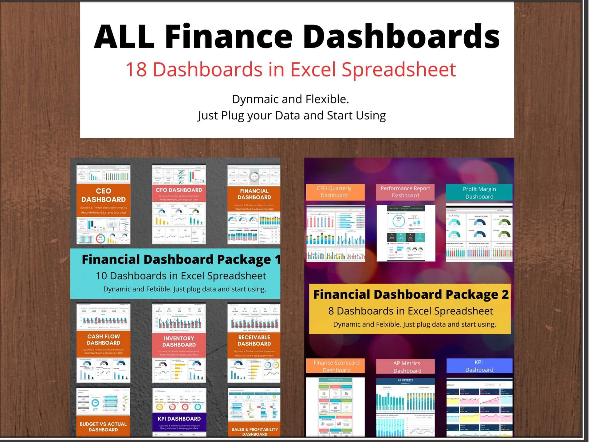
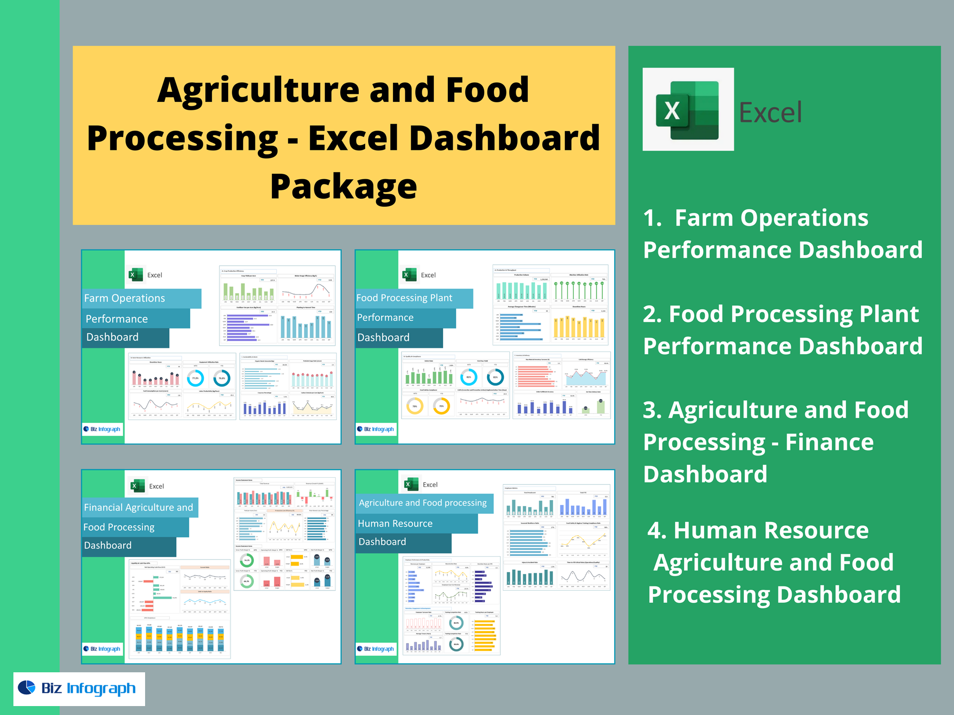
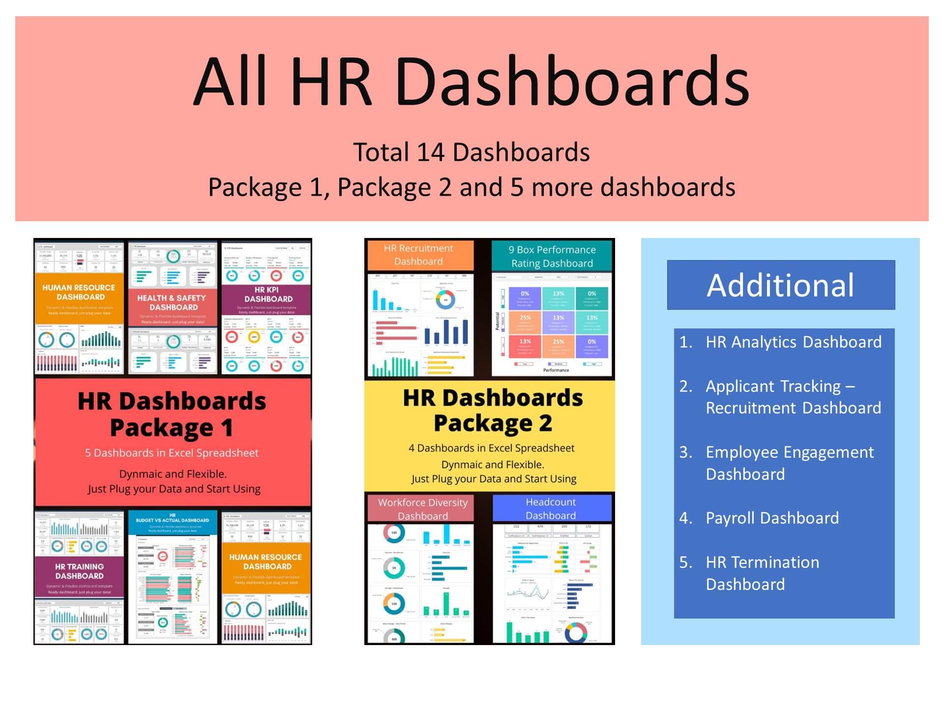
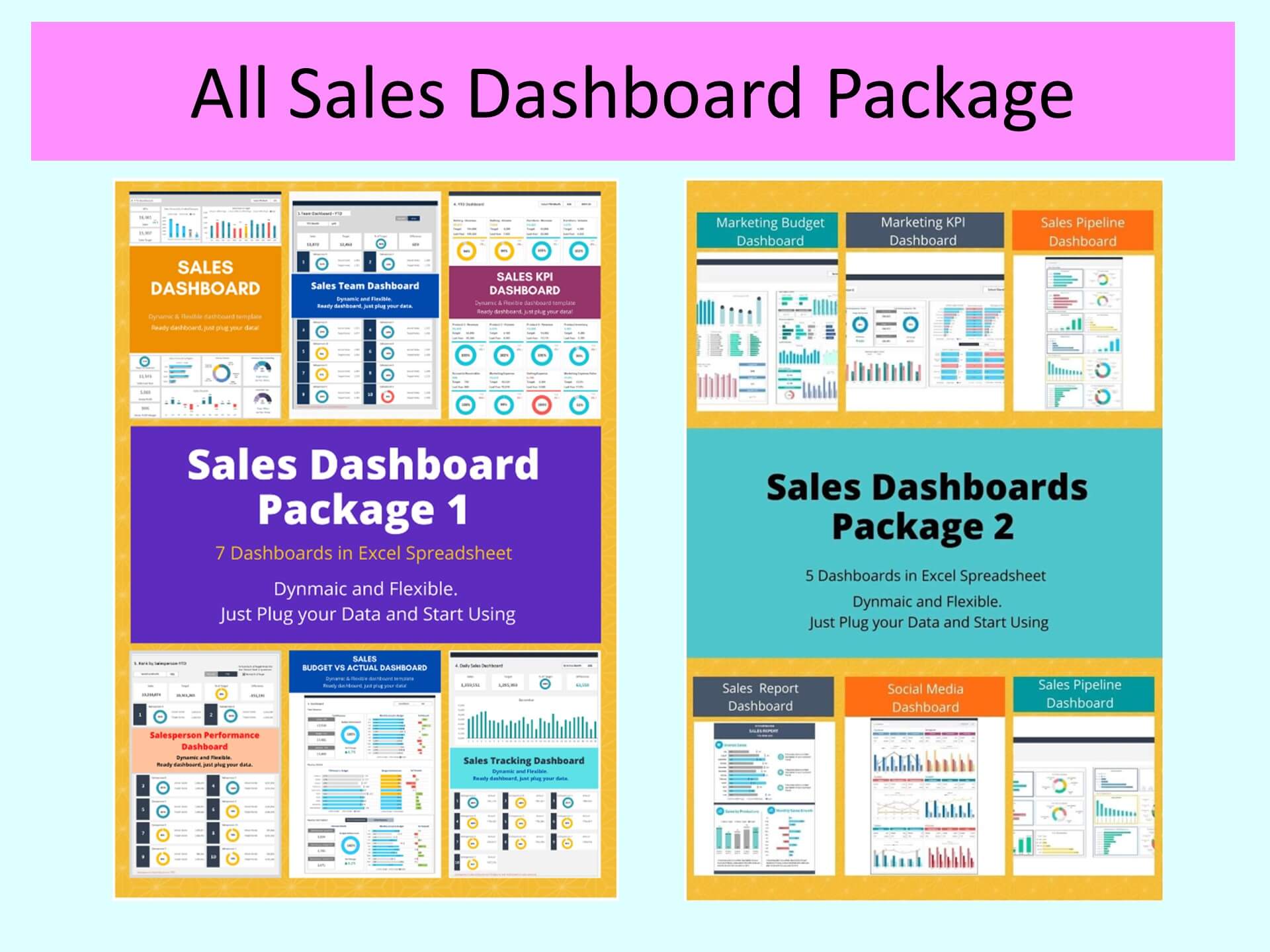
You may also be interested in: