A thermometer chart in Excel to plot specific data based on actual and target values. It can be used in a variety of scenarios, such as showing a horse’s past performance in a horse race or the global temperature and its changes over decades.
This content covers:
- What does a thermometer chart mean?
- How to Make an Excel Thermometer Chart?
- Things to keep in mind with Excel Thermometer Chart
1. What does a thermometer chart mean?
A thermometer chart is a type of visual representation used to exhibit data like to a thermometer. It is frequently used to describe moving forward toward a goal, purpose, or value. Graphs typically consist of vertical bars or columns with partially filled colors to represent the current status or level of performance.
The main elements and meanings associated with the thermometer graph are:
- Vertical Bar:
The main component of a thermometer chart is a vertical bar that resembles the shape of a thermometer. This bar can be segmented or divided into different sections, with one section representing each unit or measurement interval.
- Color Fill:
The vertical bar is partially filled with color to indicate the current level or progress toward the goal. The amount of bars filled with color is proportional to the data represented. Color fills typically start at the bottom and increase as the value or progression increases.
- Target or Goal:
A horizontal line, often referred to as a “target line” or “target line,” is typically inserted into a chart to represent a desired or target value. Targets are usually marked with labels or numbers.
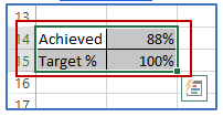
- Numbers:
Charts can contain numbers that indicate the current data point or data level. This value is often displayed at the top of the graph or near the thermometer. Thermometer charts are often used in fundraising campaigns, fundraisers, and financial reports to visually track progress toward fundraising or budget goals. As it progresses, the colored fill increases toward the finish line, making it quick and easy for people to understand how close a project or campaign is to its goal.
2. How to Make an Excel Thermometer Chart?
Take the data given below and you want to create a chart to show the actual value along with its position relative to the target value. The above % Achieved is calculated using the Target values. The target percentage is 100% for all time.
Here is some data of Year and sales.
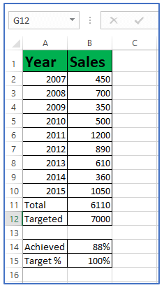
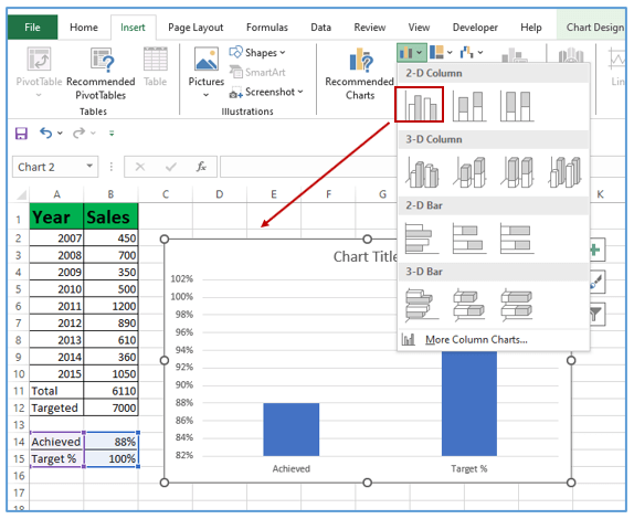
Step 1: Choose data points like the above picture.
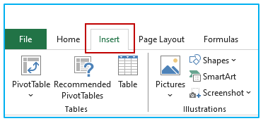
Step 2: Click on the insert tab above as shown.
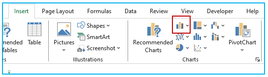
Step 3: Now, click the “Insert Column or Bar Chart” icon as marked.
Step 4: Select the “2D” button In the drop-down list. Group column chart and it will insert a Cluster chart using 2 bars (as shown below).
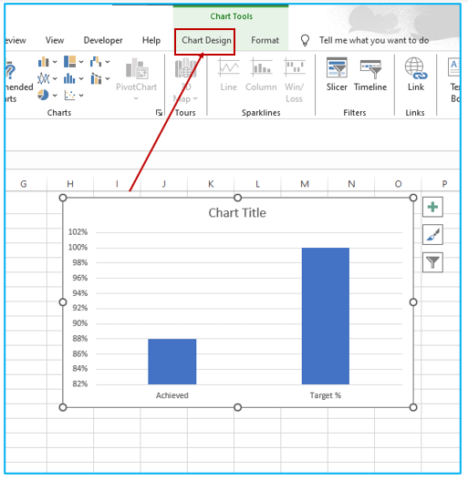
Step 5: After selecting the chart now click on Chart Design tab.
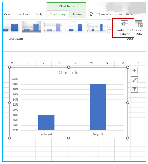
Step 6: Tick on the Switch Row/Column option and you will get the resulting chart as below.
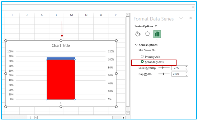
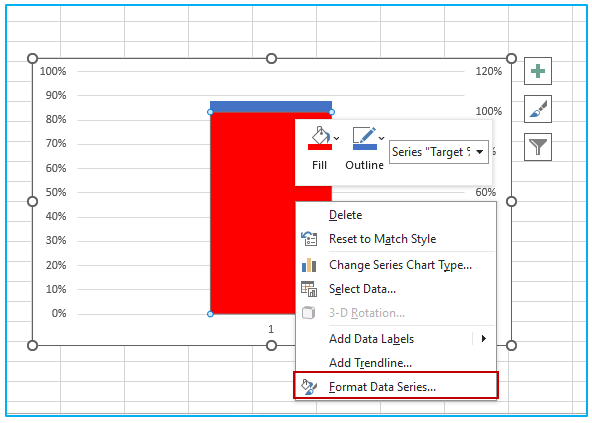
Step 7. Right-click the second column (Red column in this example) and select data series format as shown.
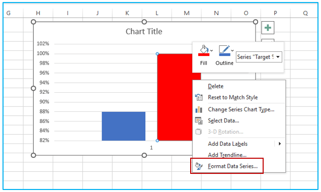
Step 8: Here you can see Format the Data Series.
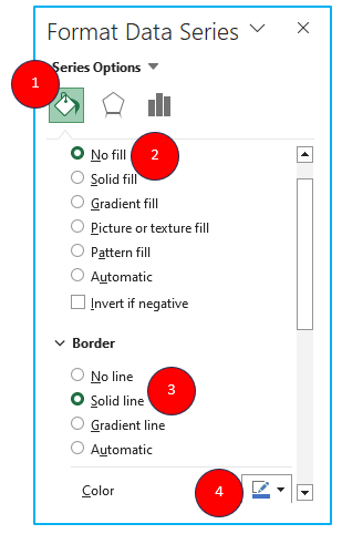
In the format Data series task pane (or dialog box if you are using Excel 2010 or 2007), select Secondary Axis under Series Options. This will align the two bars together.
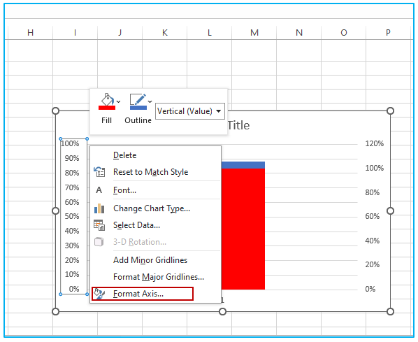
Step 9: There are two vertical axes (left and right), with different values. Do Right-click on the left vertical axis and choose the format axis.
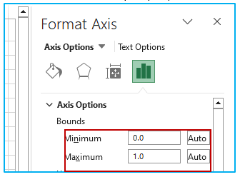
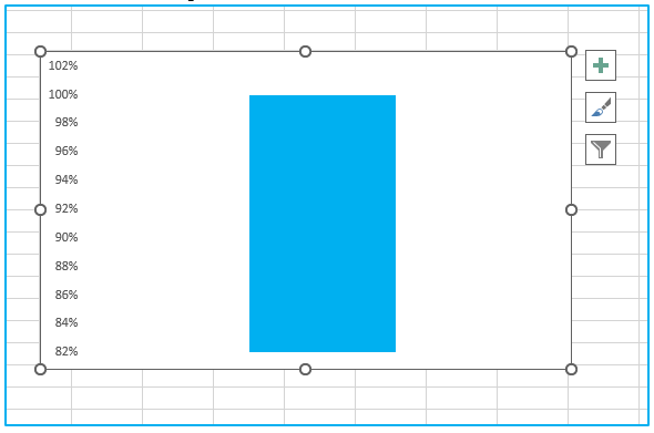
Step 10: change the maximum limit value to 1 and the minimum limit value to 0. Note that even if the value is already 0 and 1 in the Format Axis task pane, However, you need to modification it manually for you (see Reset button on the right).
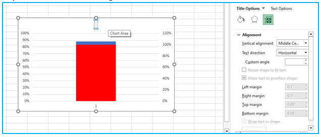
Step 11: Delete the axis on the right and chart title.
Step 12: After formatting axis now click on the right column visible in the chart, and select format data series as shown below.
Step 13: Select the chart border, right-click, and choose Format Chart Area. .
In the task pane, make the following selection
Fill:
- No fill
Border:
- No line
Following the above instruction in the below image:
Step 14: After doing the format data series work. Now, Delete gridlines, right vertical axis, horizontal (category) axis, and legend.
After deleting gridlines, right vertical axis, horizontal (category) axis, and legend the chart will be like the below image.
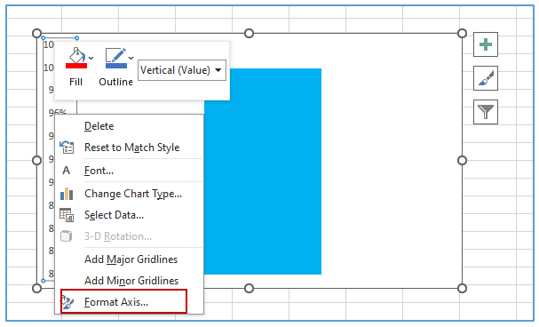
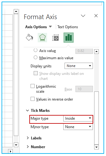
Step 15: In the image here is Selecting the vertical axis on the left, right-clicking on it and selecting ‘Format Axis’.
Step 16: Go to Format Axis task pane, then you will get Major Tick Mark. Select major tick mark Type as Inside as shown below.
Step 17: Go to chart outline, right-click and select Format Chart Area.
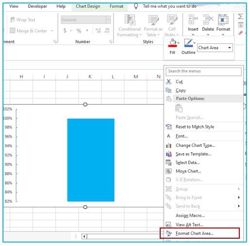
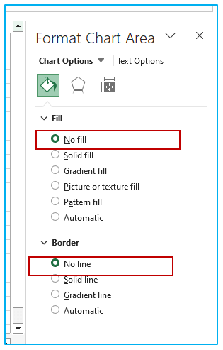
Step 18: Go to the pane, choose selection.
- Fill: No Fill
- Border: No Line
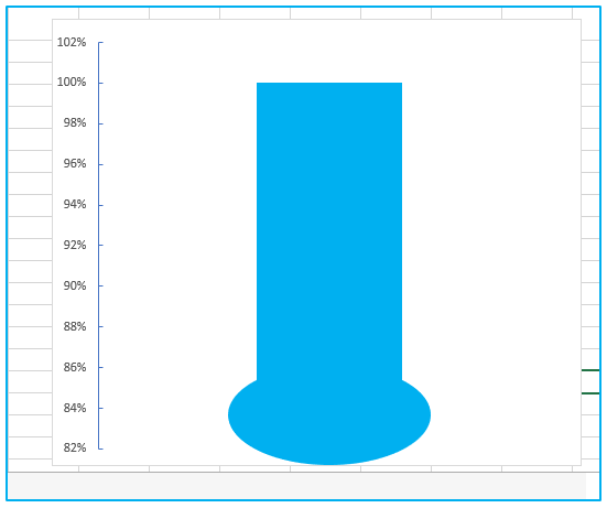
Step 19: Go to the Insert tab and insert a circle in the Shape drop-down list. Make it the same color as the thermometer chart and align it down.
After following the above instructions you wil get a result like this:
3. Things to keep in mind with Excel Thermometer Chart
Creating an Excel thermometer chart can be a useful way to represent data visually and track progress toward goals. Here are some important points to keep in mind when working with Excel thermometer charts:
- Data Structure:
Make sure your data is structured correctly. You typically need two data points:
the current value or level and the target or target. You can create a simple two-column table for this data.
Select data:
Highlight the data you want to include in the chart. This data must include the current value and the target value.
Chart type:
Select the correct chart type. In Excel, you can use a stacked bar chart to create a thermometer chart. This involves using two tuples:
one for “current” and one for “remainder” (which will be the target minus the current).
Format:
Be careful with formatting. You’ll want to format the graph to look like a thermometer. This may involve hiding the X and Y axis labels and formatting the data series to have a thermometer-like shape.
- Axis labels:
Add any necessary labels, such as current value and target, near the chart.
- Data labels:
Add data labels if needed to display actual values, especially if your chart does not include axis labels.
- Target Line:
Includes a target line that represents the target value or target. Format this line to make it easily distinguishable from the rest of the chart.
- Chart title:
Give your chart a clear, descriptive title so viewers understand what it represents.
- Data validation:
Make sure your data is accurate and updated regularly, especially if your chart is intended to track progress over time.
- Customization:
Excel allows for great customization. Experiment with different chart elements, styles, and layouts to make them more attractive and effective.
- Explanation:
Depending on your audience, it may be helpful to provide an explanation or caption to ensure viewers understand the meaning of the image.
- Accessibility:
Consider accessibility; ensure that the chart is comprehensible to all potential viewers, including those with visual impairments.
- Documentation:
If the chart is part of a report or presentation, be sure to document what the chart represents, its source, and any assumptions or limitations.
Excel thermometer charts are a great tool for visualizing progress and goals, but it’s important to make sure they are clear, accurate, and well-formatted for your specific needs and audience.
Application of Thermometer Chart in Excel in Dashboard Reporting
Here are some uses of thermometer charts in dashboard reporting:
- Goal Progress Tracking:
- Represents the progress towards a target or goal (e.g., sales target, fundraising goal), showing the amount achieved in comparison to the total goal.
- Resource Utilization:
- Displays the level of resource usage, such as budget spent, capacity used, or inventory levels, helping in resource management and planning.
- Performance Measurement:
- Visualizes performance metrics like employee productivity, machine efficiency, or customer satisfaction scores, allowing for quick assessment against predefined benchmarks.
- Project Milestone Achievement:
- Illustrates the completion status of different phases or milestones in a project, providing a clear picture of the project timeline and current status.
- Temperature or Climate Data Representation:
- Ideal for representing actual temperature readings or climate-related data against expected or historical ranges, useful in environmental or agricultural dashboards.
- Survey or Poll Results Display:
- Summarizes the results of surveys or polls, such as customer feedback or employee engagement levels, making the data accessible and straightforward for stakeholders.
You may be interested:
