Box and Whisker Plot in Excel offers a versatile and intuitive way to visualize and interpret data distributions. With its ability to display key statistical measures and identify outliers effectively, the Box and Whisker Plot in Excel is an invaluable tool for data analysis across various industries and applications. By incorporating this feature into your Excel toolkit, you can enhance your data visualization capabilities, gain deeper insights into your datasets, and make more informed decisions. Whether used for quality control analysis, financial modeling, or scientific research, the Box and Whisker Plot in Excel provides a clear and concise representation of data variability and trends. Embrace the power of the Box and Whisker Plot in Excel to streamline your data analysis workflows and unlock new possibilities for understanding and leveraging your data effectively.
This Tutorial Covers:
- What is a Box and Whisker Plot in Excel
- The parts of a box and whisker plot
- How to create a box and whisker plot in Excel
- Utilizing Box and Whisper Plot
- Using Stacked Column Chart
- How to Transform a Box Plot Chart into a Box and Whisker Plot
- How to Format a Box and Whisker Plot Chart in Excel
- Edit or Change the Appearance of the Box and Whisper Plot
1. What is a Box and Whisker Plot in Excel?
The box and whisker graphic is an example of data modeling that makes it easier to see how numbers are distributed in a dataset. A box and whisker plot uses its shape to communicate information instead of a bar or line graph to represent data.
A box and whisker plot makes it simple to locate the central value, the variability of the distribution, and the highest and lowest values, which is why many data analysts use it to compare various data sets and interpret their findings.
Many firms employ box and whisker plots to assess various KPIs, including:
- Financial audits
- Sales performance
- Customer trends
- Product performance
- Team productivity
- Other various demography
Knowing how to produce and analyze a box and whisker plot will be essential for people working in business analytics as the market for business intelligence continues to expand.
2. The parts of a box and whisker plot:
The distinctive shape of a box and whisker plot, which includes a rectangular box with attached lines or whiskers, enables analysts to uncover valuable insights from the data. This plot can be oriented either vertically or horizontally while preserving the integrity of the data. For simplicity, we will focus on a horizontal orientation for our examples.
Understanding the key elements of a box and whisker plot is essential to interpret the information it presents. These elements are straightforward to comprehend once you grasp their significance.
There are five essential components that contribute to the construction of a box and whisker plot:
Minimum:
Represented by the leftmost whisker, the minimum value is the starting point when reading the plot from left to right. It displays the dataset’s lowest value.
First Quartile:
Positioned at the left end of the box, where the minimum whisker connects, the first quartile corresponds to the 25th percentile. This value signifies the threshold below which 25% of the data falls.
Median:
Marked by a line within the box, the median represents the central value of the numerical data. It splits the dataset in two equal portions.
Third Quartile:
Located at the right end of the box, where the maximum whisker attaches, the third quartile signifies the 75th percentile. It denotes the point at which the top 25% of the data begins.
Maximum:
The largest value in the dataset is depicted by the rightmost end of the whisker on the right side of the box.
However, it is important to note that not all data conforms neatly to a precise distribution. Occasionally, datasets may include outliers, which are values that significantly deviate from the rest of the data. Outliers can be regarded as anomalies that may be attributed to errors or unusual circumstances. Despite their distinctiveness, outliers hold valuable information within the dataset.
When outliers are present, the box and whiskers extend to 1.5 times the interquartile range, rather than reaching the minimum or maximum values. Outliers are typically represented by small circles, with unfilled circles indicating suspected outliers and filled circles denoting confirmed outliers.
3. How to create a box and whisker plot in Excel?
In Excel, there are two distinct methods to create a box and whisker plot with multiple series, each offering a clear understanding of the process. This tutorial section covers both the box and whisker plot method as well as the stacked column chart method. Both approaches are user-friendly and yield accurate results.
-
Utilizing Box and Whisper Plot:
You must first build up a dataset for this plot, then insert the box and whisker plot, and finally edit it to have better representations to construct a box and whisker plot in Excel with multiple series.
The steps to create a box and whisker plot in Excel by utilizing Box and Whisker Plot are described below:
Step 1: First, create a dataset with numerous entries for a single record.
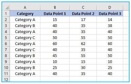
Step 2: Then choose the cells A1 to D11 range.
Select the “Insert” tab from the ribbon afterwards that.
Then, choose “Insert Statistic Chart” icon from the “Charts” group.
Click the “Box and Whisker” chart option.
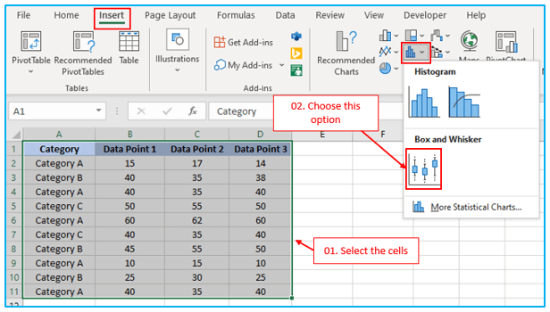
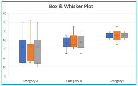
As a result, you will obtain the chart below. See the image below.
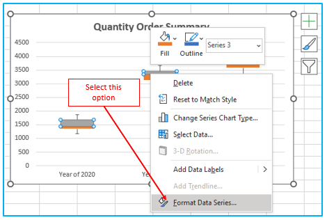
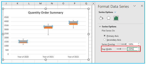
Step 3: Double-click the box and whisker icon after that.
The “Format Data Series” will launch.
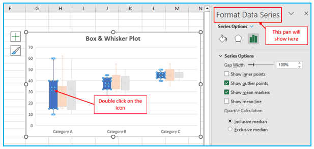
The Format Data Series dialog box provides several options for customization. These options include:
Gap Width:
Adjusts the spacing between the categories in the box and whisker plot.
Show Inner Points:
Enables the display of data points that fall within the range between the lower whisker line and upper whisker line.
Show Outlier Points:
Shows the outlier data points that are located below the lower whisker line or above the upper whisker line.
Show Mean Markers:
Displays markers indicating the mean values of the selected series.
Show Mean Line:
Shows the line connecting the box meanings in the chosen series.
Inclusive Median:
Includes the median value in the calculation if the number of values in the data (N) is odd.
Exclusive Median:
Excludes the median value from the calculation if the number of values in the data (N) is odd.
These options allow users to customize the appearance and behavior of the box and whisker plot to suit their specific needs and preferences.
-
Using Stacked Column Chart:
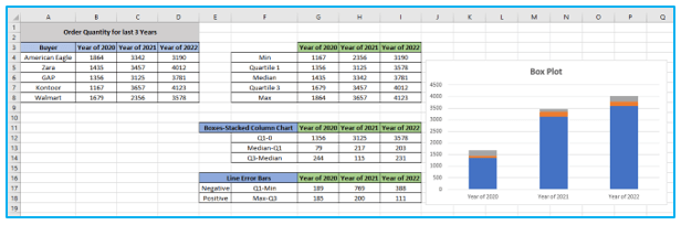
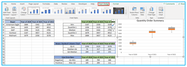
In this technique, we’ll make a box and whisker plot in Excel with numerous series using the stacked column chart. The min, max, median, quartile 1, and quartile 3 must first be determined using the MIN, MAX, MEDIAN, and QUARTILE functions. Afterward, plot it using the stacked column chart.
The steps to make Box and Whisker using stacked column Chart in Excel are described below:
Prepare Dataset:
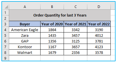
Step 1: First, prepare the data for a single record that contains numerous entries. We will generate additional data for the box and whisker graphic using this dataset.
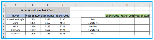
Calculate Box and Whisker Plot Components:
Then, we must determine the minimum, maximum, median, first quartile, and quartile. In this step, we’ll create a few additional columns and insert the necessary component values into them.
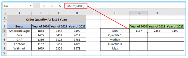
Step 2: Enter the formula below in cell G4 and move the Fill Handle icon to cell I4.
=MIN(B4:B8)
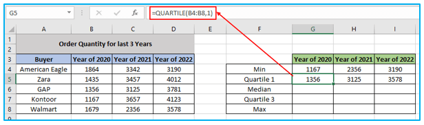
Step 3: Enter the formula below in cell G5 and move the Fill Handle icon to cell I5.
=QUARTILE(B4:B8,1)
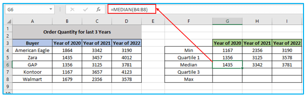
Step 4: Enter the formula below in cell G6 and move the Fill Handle icon to cell I6.
=MEDIAN(B4:B8)
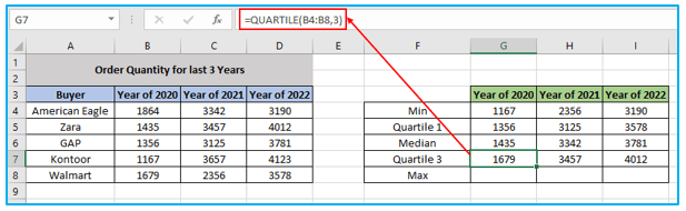
Step 5: Enter the formula below in cell G7 and move the Fill Handle icon to cell I7.
=QUARTILE(B4:B8,3)
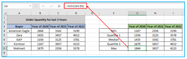
Step 6: Enter the formula below in cell G8 and move the Fill Handle icon to cell I8.
=MAX(B4:B8)
Create Dataset for Stacked Column Chart:
Then, in order to operate as the box in a stacked column chart, we want to generate a dataset.
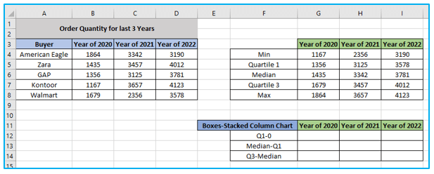
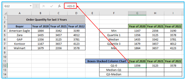
Step 7: Enter the formula below in cell G12 and move the Fill Handle icon to cell I12.
=G5-0
Step 8: Enter the formula below in cell G13 and move the Fill Handle icon to cell I13.
=G6-G5

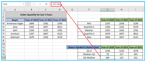
Step 9: Enter the formula below in cell G14 and move the Fill Handle icon to cell I14.
=G7-G6
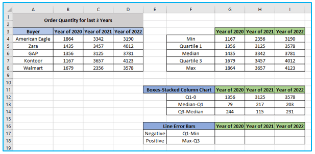
Create Dataset for Whisker:
The next step is to establish a dataset for whisker creation. Here, we make a whisker using error bars.
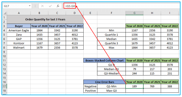
Step 10: Enter the formula below in cell G17 and move the Fill Handle icon to cell I17.
=G5-G4
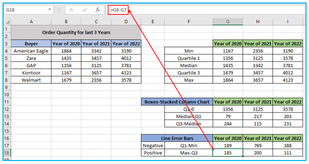
Step 11: Enter the formula below in cell G18 and move the Fill Handle icon to cell I18.
=G8-G7
Insert Stacked Column Chart:
Now, we utilize the dataset when creating the stacked column chart.
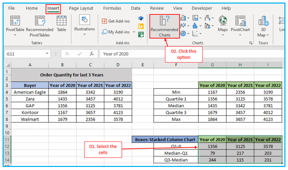
Step 12: Select the cells G11 to I14 to make a stacked column chart.
Afterward, select the “Insert” tab from the ribbon. Pick “Recommended Charts” from the “Charts” group.
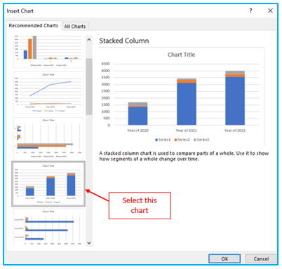
Step 13: Then, pick the “Stacked Column” chart option. Finally, press OK.
The outcome will be as follows. See the image below.
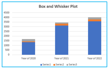
The blue box on the chart has to be taken out.
Step 14: Double-click the blue box first. The “Format Data Series” will open.
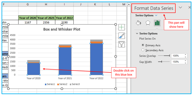
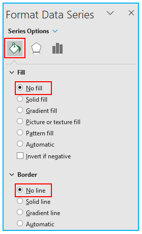
Step 15: Next, choose the “Fill & Line” tab from the top menu. Select “No fill” from the “Fill” option after that. After that, choose “No line” in the “Border” box.

The blue box will no longer be present on the chart. See the image below.
Create Box and Whisker Plot:
Now, we will make the whisker by utilizing the error bar. Here, we use the dataset that has been prepared for the whisker plot.
Follow the below steps for Box and whisker plot creation:
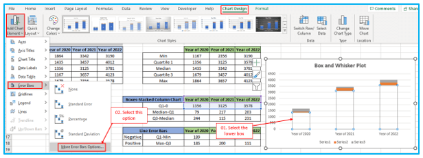
Step 16: Selecting the lower box will first reveal the “Chart Design” tab. Visit the “Chart Design” tab in the ribbon after that.
Within the “Chart Layouts” section, locate the “Add Chart Element” option. To continue, select “Error Bars” from the drop-down option.
Choose “More Error Bars” options from there.
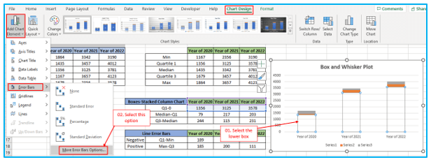
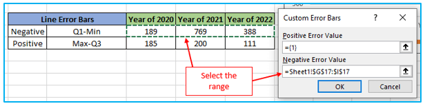
Step 17: Change the direction of the “Vertical Error Bars” to “Minus”.
Following that, choose “Custom” under “Error Amount”.
Following that, click “Specify Value”.
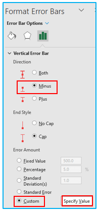
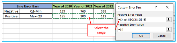
Step 18: “Custom Error Bars” dialog box will be presented on your screen.
Choose the error value range that is negative. Finally, press OK.

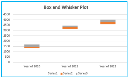
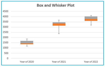
The result will be a whisker-shaped error bar.

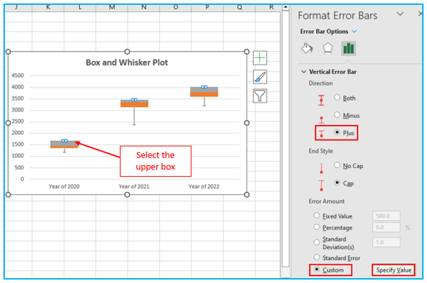
Step 19: Select the upper box to add a whisker that points upward. Then once more select the “Chart Design” tab. Select the “Error Bars” option from there. “Vertical Error Bars” orientation should be set to “Plus.” Following that, choose “Custom” under “Error Amount”. Select “Specify Value” after that.
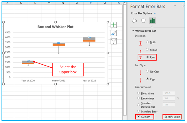
Step 20: “Custom Error Bars” dialog box will be presented on your screen.
Choose the error value range that is positive. Finally, press OK.
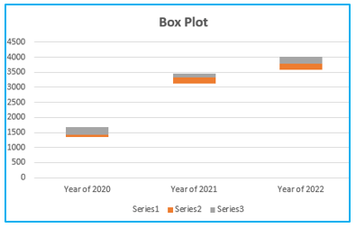
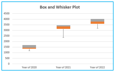
Our expected chart, which resembles a box and whisker plot with many series, is obtained as a result. See the image below.
4. How to Transform a Box Plot Chart into a Box and Whisker Plot?
Starting with a stacked column chart in Excel 2013 or Excel 2010, convert it into a box and whisker plot chart.
In Excel, first create a simple box plot chart before including the whiskers.
The steps to transform a Box Plot chart into a Box and Whisker Plot in Excel are described below:
Step 1: Double-click the blue box first. The “Format Data Series” will open.

Step 2: Next, choose the “Fill & Line” tab from the top menu. Select “No fill” from the “Fill” option after that. After that, choose “No line” in the “Border” box.
The blue box will no longer be present on the chart. See the image below.
Step 3: Selecting the lower box will first reveal the “Chart Design” tab. Visit the “Chart Design” tab in the ribbon after that.
Within the “Chart Layouts” section, locate the “Add Chart Element” option. To continue, select “Error Bars” from the drop-down option.
Choose “More Error Bars” options from there.
Step 4: Change the direction of the “Vertical Error Bars” to “Minus”.
Following that, choose “Custom” under “Error Amount”.
Following that, click “Specify Value”.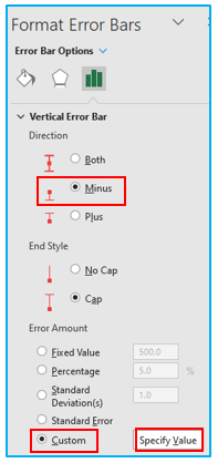
Step 5: “Custom Error Bars” dialog box will be presented on your screen.
Choose the error value range that is negative. Finally, press OK.
The result will be a whisker-shaped error bar.
Step 6: Select the upper box to add a whisker that points upward. Then once more select the “Chart Design” tab. Select the “Error Bars” option from there. “Vertical Error Bars” orientation should be set to “Plus.” Following that, choose “Custom” under “Error Amount”. Select “Specify Value” after that.
Step 7: “Custom Error Bars” dialog box will be presented on your screen.
Choose the error value range that is positive. Finally, press OK.

Our expected chart, which resembles a box and whisker plot with many series, is obtained as a result. See the image below.

5. How to Format a Box and Whisker Plot Chart in Excel?
For formatting box and whisker plot in Excel, use Excel’s chart formatting tools after creating the chart.
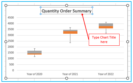
Enter the title you want to appear for the chart under Chart Title.
To launch the “Format Data Series” window, right-click one of the chart’s boxes and select “Format Data Series”.
To adjust how far apart the boxes are from one another, change the “Gap Width”.
Except for these, you can also make various formatting changes, including:
- To display the data points between the two whisker lines, choose Show Inner Points.
- To display outliers below or above the whisker lines, choose Show Outlier Points in the Format Data Series box.
- To view the data series’ mean marker, choose Show Mean Markers.
- To display the line linking the means of the boxes in the data series, select Show Mean Line.
- Choose a method for calculating the quartiles:
- If the number of values in the data is odd, inclusive median is considered in the calculation.
- If the number of values in the data is odd, exclusive median is not included in the calculation.
In the “Format Data Series” window, select the following box in your plot chart to customize it. Repeat for any more boxes.
6. Edit or Change the Appearance of the Box and Whisper Plot:
Depending on the version of Excel you are using, choose any part of the chart, then click “Chart Design” or “Design Tools” on the “Chart Tools” tab. This will allow for Box and whisker plot customization.
Use the techniques outlined above to change elements like the chart’s layout, style, or colors.
We have presented two distinct approaches to creating a box and whisker plot in Excel with multiple series. Our tutorial encompasses the utilization of both a box and whisker plot and a stacked column chart, offering effective solutions for visualizing data. We have thoroughly covered all essential aspects of creating, formatting, and editing the appearance of the chart. Our comprehensive tutorial aims to provide you with a valuable resource for mastering the creation of box and whisker plots in Excel with multiple series. We trust that this guide will be beneficial to you in your data visualization endeavors.
Application of Box and Whisker Plot in Excel
- Data Distribution Visualization: Box and Whisker Plot in Excel provides a visual representation of the distribution of data, allowing users to identify patterns and outliers easily.
- Statistical Summary Display: It displays key statistical measures such as median, quartiles, and outliers, providing a concise summary of the dataset’s central tendency and variability.
- Comparison of Data Sets: Users can compare multiple datasets using Box and Whisker Plots, enabling quick analysis of differences in distribution and variability.
- Quality Control Analysis: In quality control processes, Box and Whisker Plots help identify variations in data and assess whether they fall within acceptable limits.
- Identifying Trends and Patterns: By visualizing data distribution, Box and Whisker Plots aid in identifying trends, patterns, and potential relationships between variables.
- Outlier Detection: Box and Whisker Plots highlight outliers in the dataset, which may signify anomalies or errors requiring further investigation.
You may be interested:
