A statistical method called linear regression can be used to find and measure the relationship between variables. Microsoft Excel provides an easy platform to perform linear regression analysis using built-in functions. In this tutorial, we will guide you through the process of performing linear regression analysis in Excel, covering the basics of setting up data, using Excel’s regression tool and interpreting the results . Whether you’re a student or a professional, this tutorial will provide you with the necessary skills to perform linear regression analysis in Excel.
This Tutorial Covers:
- What is Excel Linear Regression
- How to Include a Data Analysis Tool for Linear Regression in Excel
- Run Regression Analysis
- Interpret Regression Analysis Output
- Summary Output
- ANOVA
- Coefficients
- RESIDUAL OUTPUT
- Regression Graph In Excel
1. What is Excel Linear Regression?
An Excel statistical tool called linear regression is used to examine the relationship between two sets of data or variables as part of a predictive analysis model. Using this analysis, we can estimate the link between two or more variables. As an illustration, consider two independent and dependent variables.
- The variable we are attempting to estimate is the dependent variable.
- The element affecting the dependent variable is known as the independent variable.
Therefore, by utilizing Excel linear regression, we can determine which variable has a true mathematical impact by seeing how the dependent variable changes as the independent variable changes.
2. How to Include a Data Analysis Tool for Linear Regression in Excel?
Excel has a hidden tool called “Analysis Toolpak” that includes a linear regression function. This is accessible via the “Data” tab.
Until the user turns on this feature, this tool is hidden. Take the actions listed below to enable this:
/How to add Excel Linear Regression is shown below:
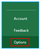
Step 1: choose “Options” from the “File” menu.
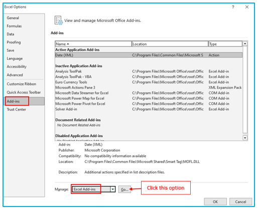
Step 2: Next, select “Add-ins” from the list of “Excel Options.” In Excel, choose “Excel Add-ins” from the “Manage” menu list, then click “Go.”
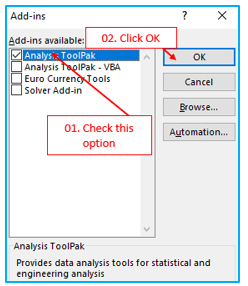
Step 3: In the “Add-Ins” dialog window, choose the “Analysis ToolPak” checkbox. then press OK.
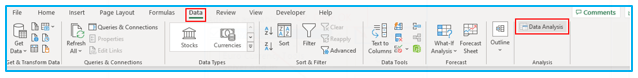
Now, the “Data Analysis” option should be visible under the “Data” tab. We have numerous “Data Analysis” options available to us with this option.
3. Run Regression Analysis
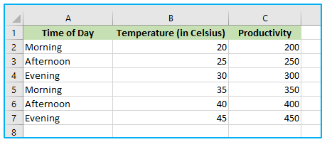
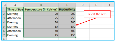
Suppose a manufacturing company wants to determine the relationship between the temperature of a machine and its productivity. They can collect data on the temperature of the machine, the corresponding productivity levels, and the time of day the data was collected, and create a table like the one below:
The steps to run regression analysis are described below:
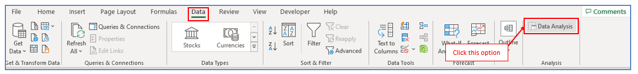
Step 1: Go to the “Data” tab. Then under “Analysis” group, click “Data Analysis”.
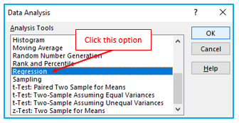
Step 2: Click on Regression, then OK.
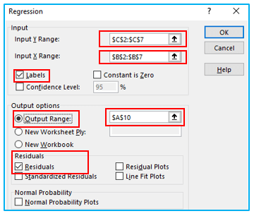
Step 3: A new argument window will appear. Select the Input Y Range as the productivity and Input X Range as the temperature (in Celsius). Check “Labels” and “Residuals” Click OK after determining the output range, in this example output range is in cell A10.
The output will be as follows:
4. Interpret Regression Analysis Output
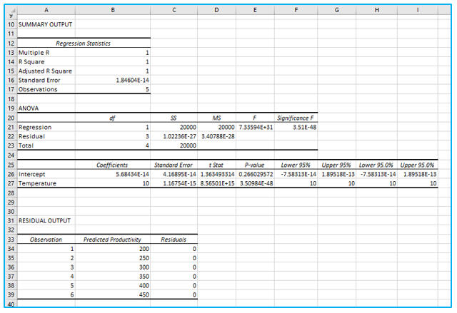
Let’s now clarify what each of the phrases in the output means. In order to better understand the result, we will divide it into four main sections.
- Summary Output:
Your data source’s linear regression equation’s ability to fit it is indicated in the summary result.
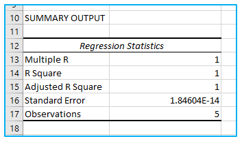
The multiple R, also referred to as the correlation coefficient, measures how linearly connected two variables are.
The link is stronger the higher the absolute value.
- 1 indicates a highly favorable association.
- -1 denotes a very adverse association.
- 0 indicates that there is no link at all.
The Coefficient of Determination, or R Square, denotes the goodness of fit. The number of points that fall on the regression line is indicated.
R square in our example is 1, which represents a very good fit. In other words, the independent variables’ (x-values) explanation of the dependent variables’ (y-values) is a perfect one.
The modified R square known as adjusted R square adjusts for factors that are not important to the regression model.
Another indicator of the accuracy of your regression analysis is standard error, which is a measure of goodness-of-fit.
- ANOVA:
Analysis of Variance is referred to as ANOVA. It provides details regarding the degrees of variability present in your regression model.
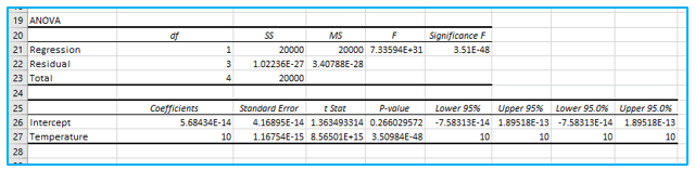
- Df represents the total number of degrees of freedom related to the sources of variance.
- SS stands for square sum. The better your model fits the data, the smaller the Residual SS in comparison to the Total SS.
- MS stands for mean square.
- F is the null hypothesis’s F statistic or F-test. It can be used to test the overall model significance quite successfully.
- Significance F is the P-value of F.
Examine Significance F (3.51E-48). You’re fine if this number is less than 0.05. It’s usually best to discontinue using this set of independent variables if Significance F is higher than 0.05. Rerun the regression until Significance F falls below 0.05 and then remove any variables with a high P-value (higher than 0.05).
P-values should generally or universally be less than 0.05. This is the situation in our scenario.
- Coefficients:
This section offers detailed information on the elements of your analysis:
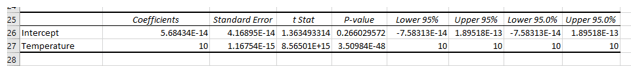
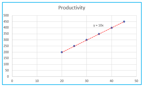
The regression line is: y = Productivity = 10*Temperature. In other words, for each unit increase in temperature, productivity increases with 10 units.
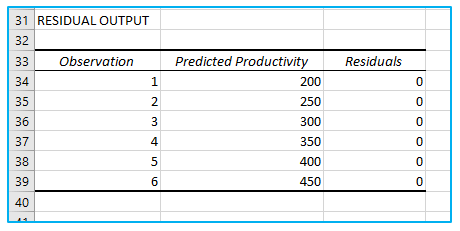
- RESIDUAL OUTPUT:
The residuals display the deviation between the actual and anticipated data points (using the equation). For instance, the first data point has a value of 200. The expected data point, according to the equation, is 20*10 = 200, while the residual is 200-200=0.
The actual and predicted data are concise and accurate.
5. Regression Graph In Excel
Create a linear regression chart if you need to rapidly see the relationship between the two variables. That’s so simple!
The steps to create a linear regression chart in Excel are described below:
Step 1: Choose the two columns that include all of your data, including headers.
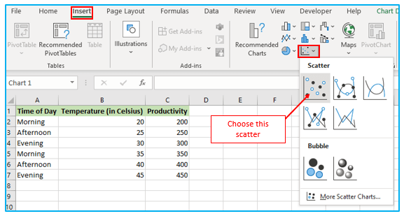
Step 2: Click the “Scatter chart” icon in the “Charts” group on the “Insert” tab, and choose the Scatter thumbnail (the first one), as shown:
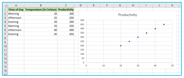
Your worksheet will now contain a scatter plot similar to this one.
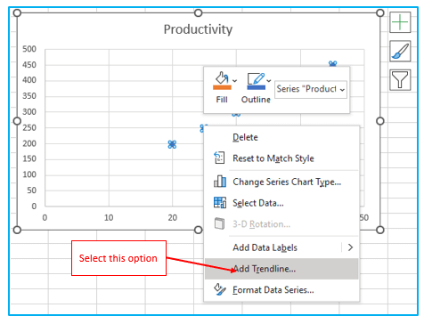
Step 3: The least squares regression line must now be drawn. Right-click any point and select “Add Trendline…” from the context menu to complete the task.
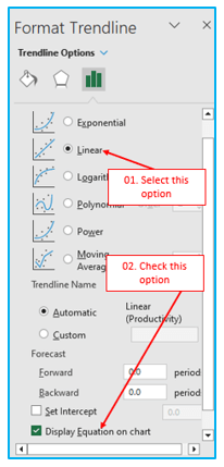
Step 4: To obtain your regression formula, choose the “Linear” trendline shape in the right pane and, if desired, tick the box next to “Display Equation on Chart”:
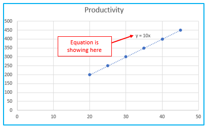
As you may have noticed, the linear regression formula we developed using the Coefficients output and the regression equation Excel generated for us are the exactly the same.
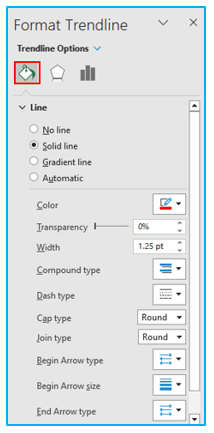
Step 5: Make your desired changes to the line by selecting the “Fill & Line” tab.
Your graph currently approaches an excellent regression graph:
For ready-to-use Dashboard Templates:
