Make Scatter Plot in Excel to unlock the full potential of your data analysis. This powerful tool allows you to visualize complex datasets, identify underlying trends, and pinpoint outliers with ease. By integrating scatter plots into your Excel toolkit, you can enhance your understanding of variable relationships, improve your decision-making processes, and present your findings in a clear, compelling manner. Start leveraging scatter plots today to transform raw data into meaningful insights and drive your projects forward with confidence.
This Tutorial Covers:
- What is Scatter Plot
- Scatter Plot in Excel – when You Should Use It
- Create a Basic Scatter Plot Chart
- Add Data Labels to Scatter Plot
- Scatter Plot with Smooth Lines
- Scatter Plot with Smooth Lines and Markers
- Scatter Plot with Straight Lines and Markers
- Create Bubble Chart in Excel
- How to add trendline in Scatter Plot Chart
1. What is Scatter Plot?
Excel defines plots as graphs that correspond to the information supplied in the two columns. Plots are nothing more than scatter diagrams or scatter charts from Excel that are used to add up the data sets in two columns. Two-dimensional XY charts demonstrate the connection between the two variables and provide multiple perspectives of the data. Finding the ideal scatter plot to use for data analysis is simple.
2. Scatter Plot in Excel – when You Should Use It
You could be unsure whether an X-Y graph in Microsoft Excel is a scatter plot or a line graph. The data representation along the horizontal (X) axis is the only difference between the two.
To visualize quantitative data, a scatter chart has two value axes. One set of numerical data is represented by the horizontal (X) axis, while another is represented by the vertical (Y) axis.
However, the Excel line graph shows numerical values on the vertical (Y) axis and all category data on the horizontal (X) axis.
You may visualize and compare numerical values obtained from statistical and scientific research by creating a scatter plot graph in Excel. You ought to employ a scatter plot rather than a line graph in the following instances:
- To investigate the relationship between two sets of quantitative values. The X and Y chart will resemble a diagonal layout in appearance.
- To investigate any favorable or unfavorable patterns in the variables.
- To enlarge the (X) axis’s horizontal scale.
- To make outliers, clusters, linear and non-linear trends visible in a big data set.
- To contrast a sizable number of temporally unrelated data points.
3. Create a Basic Scatter Plot Chart
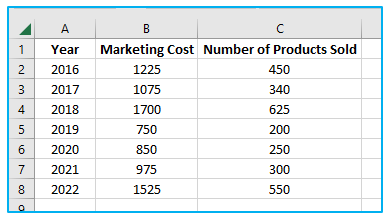
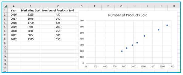
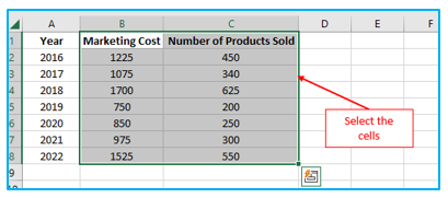
The data should be organized into two columns, as seen in the screenshot, to make the basic scatter plot excel.
Procedure of creating a basic Scatter Plot chart in Excel:
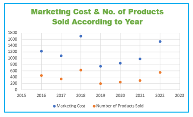
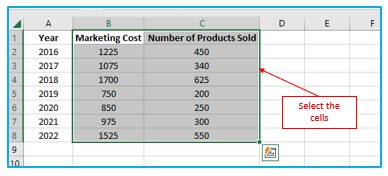
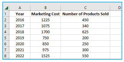
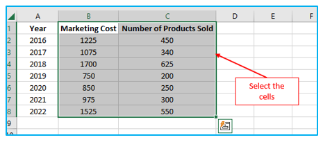
Step 1: Pick the data first, including the two columns, such as Marketing Cost and Number of Products Sold.
In this situation, the range of data is B1:C8.
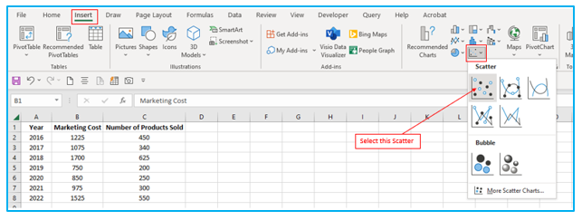
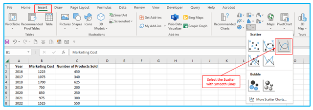
Step 2: Go to the “Insert” tab, click “Scatter Plot” symbol under “Charts” section. Then select the “Scatter” plot after clicking the symbol to show how the two data sets are related, outlined in Red below.
The scatter plot is created, as seen in the picture below.
4. Add Data Labels to Scatter Plot
Follow these instructions to add Data labels to Scatter Plot:
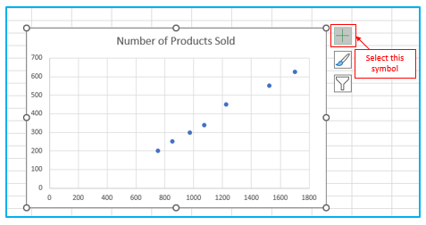
Step 1: After making Scatter Plot, select the Chart Elements by clicking on any of the chart’s empty spaces (looks like a plus icon).
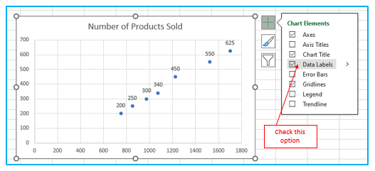
Step 2: After that select the “Data Labels”, outlined in Red below. When you choose, the outcome appears right away.
5. Scatter Plot with Smooth Lines
Procedure of creating a Scatter Plot with Smooth Lines in Excel:
Step 1: To produce a simple scatter plot with smooth lines, divide the data into two columns.
Step 2: Choose the information, including the two columns with the advertising costs, the quantity sold, and the column headers. The data range in this instance, for instance, is
Step 3: Go to the “Insert” tab, click “Scatter Plot” symbol under “Charts” section. After clicking the symbol, choose the “Scatter with Smooth Lines” representing the relationship between the data sets, outlined in Red below.
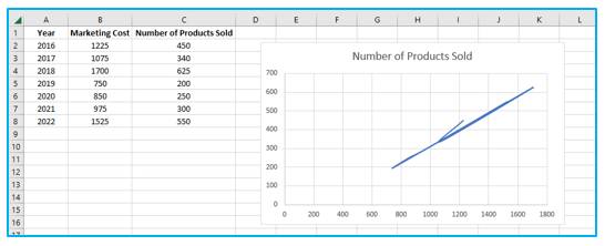
The scatter plot is created, as seen in the picture below.
6. Scatter Plot with Smooth Lines and Markers
The procedure of creating a Scatter Plot with Smooth Lines and Markers in Excel:
Step 1: To produce a simple scatter plot with smooth lines, divide the data into two columns.
Step 2: Choose the information, including the two columns with the marketing costs, the quantity sold, and the column headers. The data range in this instance, for instance, is B1:C8.
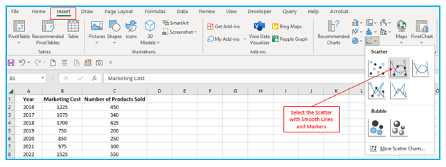
Step 3: Go to the “Insert” tab, click “Scatter Plot” symbol under “Charts” section. After clicking the symbol choose the “Scatter with Smooth Lines and Markers” representing the relationship between the data sets, outlined in Red below.
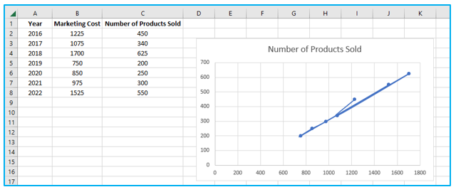
The Scatter with Smooth Lines and Markers is created, as seen in the picture below.
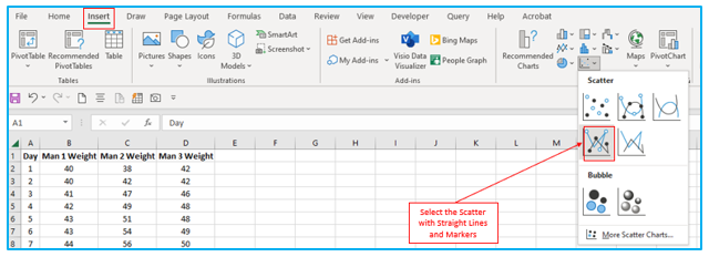
7. Scatter Plot with Straight Lines and Markers
Procedure of creating a Scatter Plot with Straight Lines and Markers in Excel:
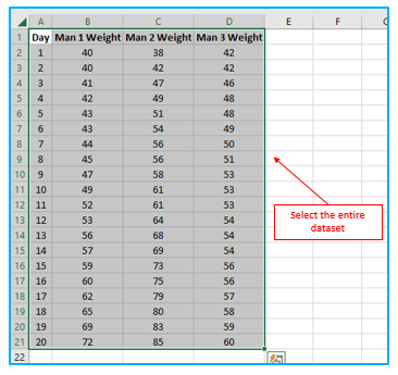
Step 1: Select the entire dataset.
Step 2: Go to the “Insert” tab, click “Scatter Plot” symbol under “Charts” section. After clicking the symbol choose the “Scatter with Straight Lines and Markers” representing the relationship between the data sets, outlined in Red below
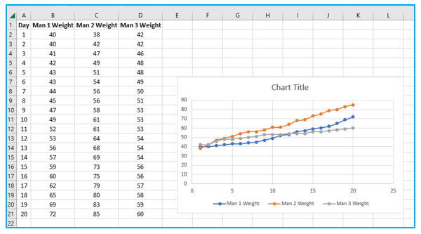
The Scatter with Straight Lines and Markers is created, as seen in the picture below.
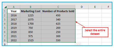
8. Create Bubble Chart in Excel
Procedure of creating a simple Bubble Chart or Bubble Plot in Excel:
Step 1: Select the entire dataset. In this situation, the range of data is A1:C8.
Step 2: Go to the “Insert” tab, click “Scatter Plot” symbol under “Charts” section. After clicking the symbol choose the “Bubble” plot representing the relationship between the data sets, outlined in Red below.
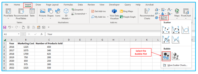
The Bubble Chart or Bubble Plot is created, as seen in the picture below
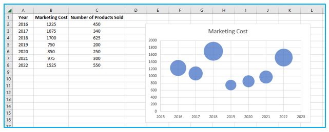
The size of bubbles determines the value of “Number of Products Sold”.
9. How to add trendline in Scatter Plot Chart?
You may learn how to add a trendline to an Excel Scatter Plot chart. By utilizing this example, I will demonstrate this.
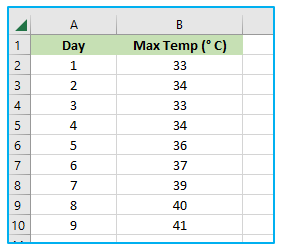
Procedure of adding trendline in Scatter Plot Chart:
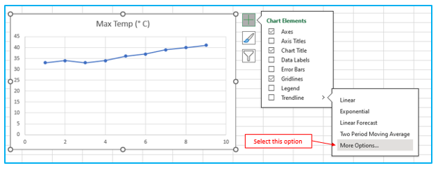
Step 1: Select the Scatter Plot Chart. On the right side of the chart, click the Add button. Next, select “More Options” by clicking the arrow next to “Trendline”.
Step 2: A pane called Format Trendline displays. Decide on the Trend/Regression type. Toggle Linear. Choose how many periods to include in the prediction. In the Forward box, enter 3. Ensure that both “Display Equation on Chart” and “Display R-squared value on Chart” are checked.
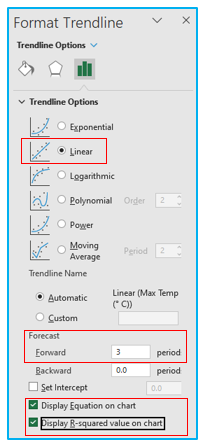
The result looks like below.
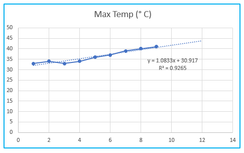
Explanation: Excel uses the least squares approach to determine which line fits the points the best. R-squared = 0.9265, which indicates a strong fit. The line fits the data more accurately the closer it is to 1. Maximum temperature 44˚ Celsius is anticipated by the trendline for period 12. The equation can be used to prove this. y = 1.0883*12+30.917= 43.91.
Application of Make Scatter Plot in Excel
You may be interested:
