How to create Sparklines in Excel? Excel Sparklines.
Sparklines in Excel are a powerful tool to visually encapsulate and present trends or variations within your data directly in a cell, providing a compact and intuitive graphical representation. Whether you’re a business analyst monitoring sales data trends, a health professional tracking patient statistics, or an educator illustrating academic performance, incorporating sparklines can significantly enhance the interpretability of your data. This guide will introduce you to creating and customizing sparklines in Excel, enabling you to use sparklines charts. By mastering sparkline tools, you can make your spreadsheets more informative and visually engaging, ensuring your data tells a compelling story.
What is sparklines in Excel?
A single cell has a miniature graph is called a sparkline. Sparklines are frequently referred to as “in-line charts” since the objective is to display a visual representation to the original data without taking up too much space.
Types of Sparklines in Excel?
Sparklines come in three varieties in Microsoft Excel: Line, Column, and Win/Loss.
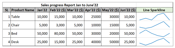
1. Line sparklines in Excel
These sparklines closely resemble short, straightforward lines. They can be created with or without markers, just like a conventional Excel line chart. You have the option to alter the line style, as well as the markers’ and lines’ colors. Line Sparkline outlined below:
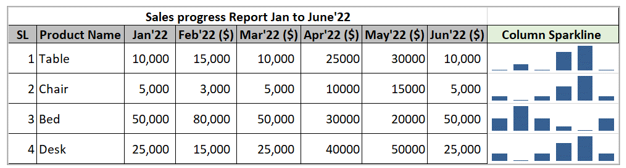
2. Column Sparkline Chart in Excel
Column sparklines graphs appear as vertical bars. Positive data points are located above the x-axis and negative data points are located below the x-axis, much like in a traditional column chart. Zero values are not shown; instead, a blank area is left where a zero data point should be. The greatest and smallest points can be highlighted, and you can choose any color you like for the positive and negative micro columns. Column Sparkline outlined below:
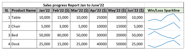
3. Win/Loss Excel Sparklines Chart
Win/Loss is a type of sparkline that is similar to a column sparkline, with the exception that it does not display the magnitude of a data point. Instead, all bars, regardless of the original value, have the same size. The x-axis is represented with positive numbers (wins) above it and negative values (losses) below it. Win/Loss Sparkline outlined below:
How to Add a Sparkline in Excel? Create Sparklines.
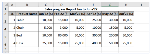
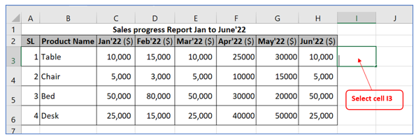
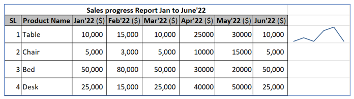
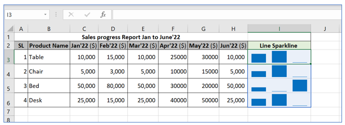
Step-1: To add sparklines in Excel first prepare a data table with the information as outlined below:
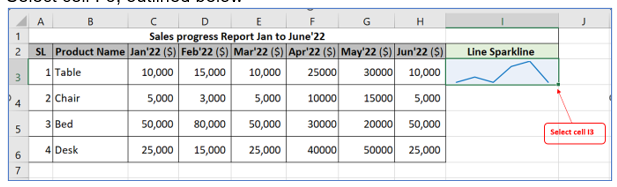
Step-2: Select cell I-3, outlined below
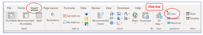
Step-3: Follow the below process to create a Sparkline:
- Select the cell where you want to insert tiny charts (Select Cell I3).
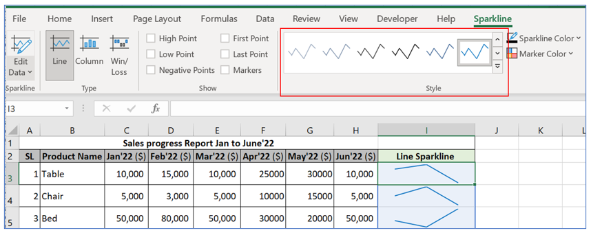
- Go to the Insert tab and pick the desired sparkline type. Select Line Sparkline outlined below
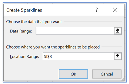
Sparkline dialog box will appear, outlined below
- In the Create Sparklines dialog box, select all the source cells for Data Range (Select C3 to H3 in Data Range filed)
- Make sure Excel displays the correct Location Range where your sparkline are to appear (Select Cell I3 in Location Range filed). Outlined below
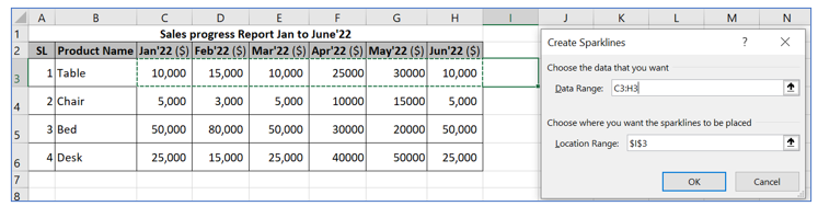
- Click OK.
Result outlined below (Line Sparkline)
Add Sparklines in multiple cells in Excel
Follow the below process to add sparklines in multiple cells in Excel:
Option-1:
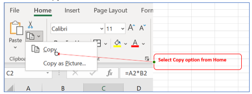
- Select cell I-3, outlined below
- Press CTRL + C to quickly copy Sparkline formula
Or Select copy from home menu, outlined below
- Click the cell where you want to paste the formula. Select Cell I4 to I6
- To quickly paste the Sparkline chart, press CTRL+ V.
Or Select paste option from home menu. Result outline below
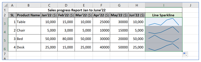
Line Sparkline created in cell I4 to I6 with value from row-4 to row-6
Option-2: Position the cursor to the lower right corner of the cell I3, wait until it turns into the plus sign, and then double-click the plus, result outlined below

How to edit dataset sparklines excel?
Follow the below process to edit data set in sparkline.
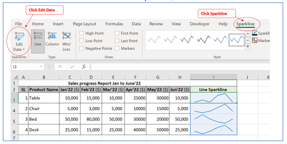
Select Sparkline cell (Select Cell I3). Outlined below:

Go to the Insert tab and clink Edit Data dropdown, outlined below
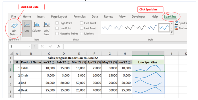
Click the Edit Single Sparkline’s Data option in this drop-down, Excel opens the Edit Sparkline Data dialog box, outline below
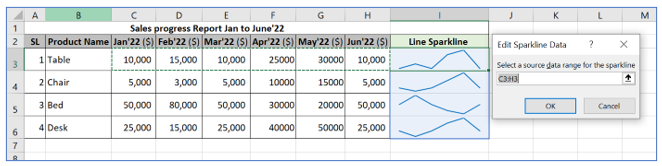
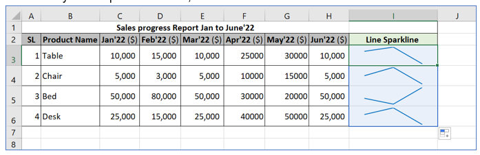
Change data range F3:H3 from C3:H3, Sparkline chart will be show data only from April to June’22, outlined below
You can select Edit Group Location and Data from Sparkline Edit data dropdown to change all Sparkline range showing in cell I3 to I6. After select Change data range F3:H6 from C3:H6.
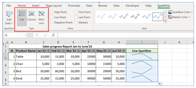
How to change the Excel Sparkline type?
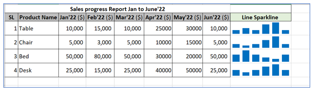
To quickly change the type of an existing sparkline, do the following:
- Select one or more sparklines in your worksheet.
- Switch to the Sparkline tab.
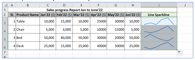
In the Type group, select Column, result outline below
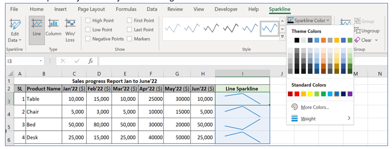
How to edit Sparklines excel color style?
To change the color and other appearance of your sparklines, use the style and color options on the Sparkline tab, in the Style group, outlined below:
- To use one of the predefined sparkline styles, simply select it from the gallery highlighted in above red box. To see all the styles, click the More button in the bottom-right corner.
If you don’t like the default color of Excel sparkline, click the arrow next to Sparkline Color and pick any color of your choosing. Outlined below
How to handle hidden and empty cells in sparkline – Format a Sparkline chart?
Follow the below process to handle hidden and empty cells in sparkline
Select Sparkline cell (Select Cell I3). Outlined below:
Go to the Insert tab and clink Edit Data dropdown, outlined below
Click the Hidden and Empty Cell Settings option in this drop-down, Excel opens the Hidden and Empty Cell Settings dialog box, outline below
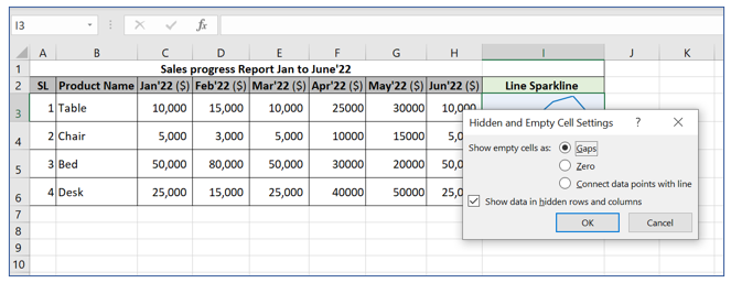
- Select Show data in hidden rows and columns option and click ok. Sparkline chart will show hidden column information.
How to add axis in Sparkline?
Excel sparklines are drawn without axes and coordinates. Follow the below process to add axis in sparkline:
- Select your sparklines.
- On the Sparkline tab, click the Axis button.
- Under Vertical Axis Minimum Value Options, pick Custom Value…
- In the dialog box that appears, enter 0 or another minim value for the vertical axis that you see fit.
- Click OK.
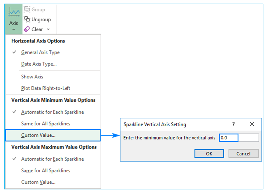
The below image shows the result – by forcing the sparkline chart to start at 0, we got a more realistic picture of the variation between the data points
Please take special care when customizing the axis when your data contains negative integers because doing so will make all negative values vanish from the sparkline.
How to Group – Ungroup Sparklines, Clear – Delete a Sparkline?
When you insert multiple sparklines in Excel, grouping them gives you a big advantage – you can edit the whole group at once.
- To group sparklines, this is what you need to do:
- Select two or more mini charts.
On the Sparkline tab, click the Group button or Ungroup and Clear / delete option. Outlined below:
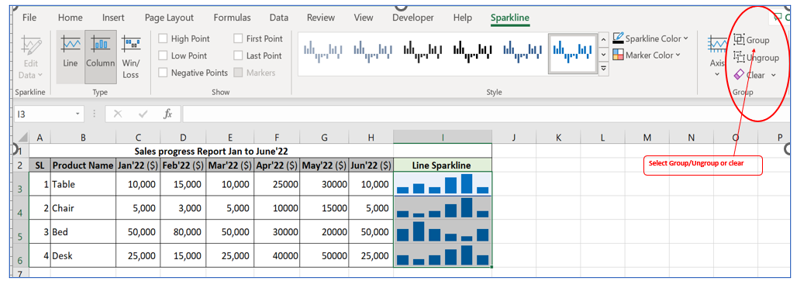
Sparkline will be marge as Group or became ungroup or clear / delete basis on the selection.
For ready-to-use Dashboard Templates:
