Creating a Side by Side Bar Chart in Excel is an invaluable skill for anyone looking to visually compare and present data across different categories or time periods. Whether you’re a market analyst comparing product sales, a human resources manager assessing employee performance, or a student presenting research findings, mastering this type of chart can transform your data into a compelling, easy-to-understand visual story. This guide will provide you with step-by-step instructions on how to effectively create and customize Side by Side Bar Charts in Excel, ensuring your data presentation is not only insightful but also visually appealing.
Uses for side by side bar chart:
- Comparing two or more sets of data side by side
- Showing the relationship between different data sets
- Highlighting changes in data over time and how they compare to each other
Step by step guide to create a side by side bar chart in Excel
In order to make excel side by side bar chart, do the following steps:
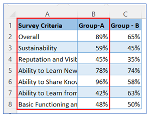
- Take sample data as below, we create first bar chart based on Col B data initially.
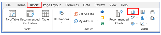
2. Select data of Col A and Col B then go to the ribbon, select Insert, and select your chart type from the chart group.
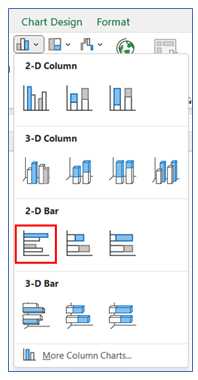
3. Select Chart type as 2-D Bar.
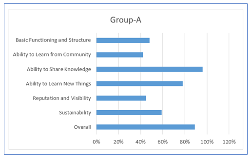
4. The chart looks below.
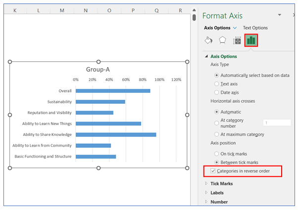
5. To change the category in reverse on the vertical axis, right-click on the axis and select Format Axis.
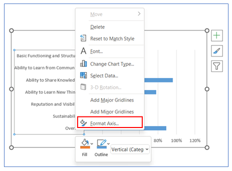
6. After that in the Axis Options give a checkmark on the ‘Categories in Reverse Order’ box.
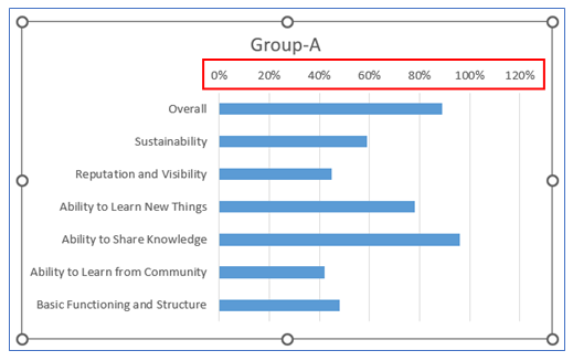
7. To remove the horizontal axis, click on Axis and press Delete.
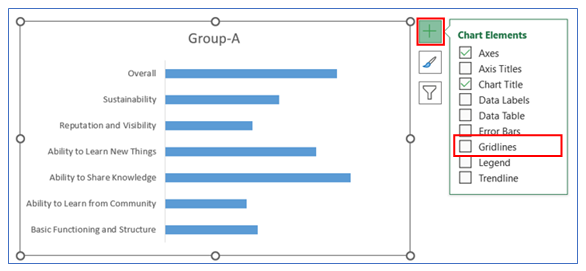
8. To Remove Gridline, click on the chart then select the + button, and uncheck the Gridline.
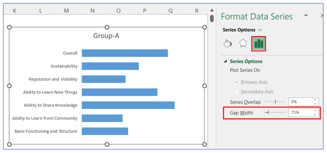
. To change the gap width in the bar, right-click on the chart and select Format Data, in Format Data Series select Series Option and change the gap width to 75%.
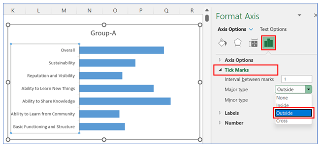
10. To give Tick Mark on the vertical Axis, right-click on the chart and select Format Axis, in Format Axis select Axis Option and click Outside in the Tick Marks option.
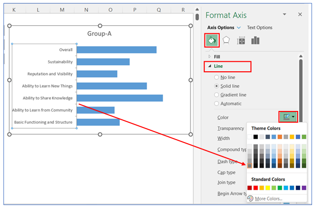
11. To change the Tick Marks line color, right-click on the vertical axis and select Format Axis, in Format Axis select Axis Option and choose a color from the Line option.
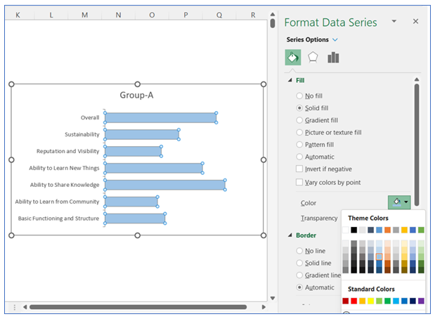
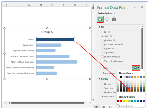
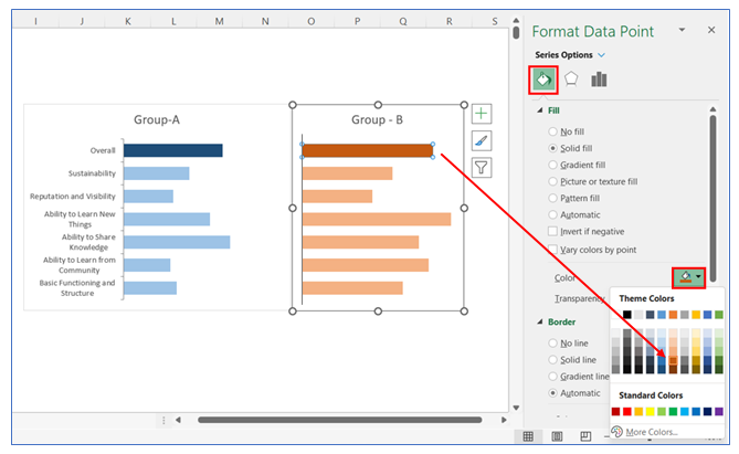
12. To change the color in the bar, right-click on the chart and select Format Data, in Format Data Series select Fill and choose your color.
13. To change the color in the first bar, right-click on the chart and select Format Data, in Format Data Series select Fill and choose your color.
14. Make a copy of this Chart and paste beside of it, make sure both charts are in same horizontal position.
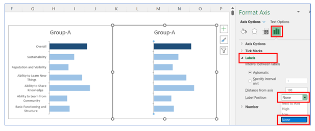
15. To remove the category of the vertical Axis from the second chart, right-click on the axis and select Format Axis, in Format Axis select Axis Option and click None in the Labels option.
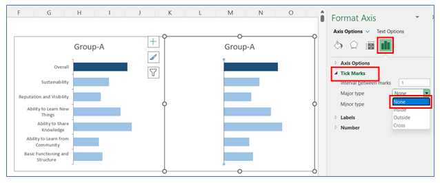
16. To give Tick Mark on the vertical Axis in the second chart, right-click on the axis and select Format Axis, in Format Axis select Axis Option and click Outside in the Tick Marks option.
17. To change the second data series, right-click on the second chart and click Select Data.
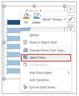
18. To add the second Data, go to the Edit option, shown below.
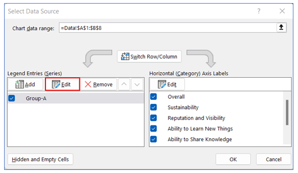
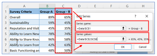
19. Select the Series name and series values from the sample data table.
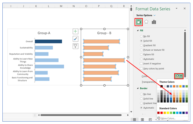
20. To change the color in the second chart bar, right-click on the chart and select Format Data, in Format Data Series select Fill and choose your color.
21. To change the color in the first bar in the second chart bar, right-click on the chart and select Format Data, in Format Data Series select Fill and choose your color.
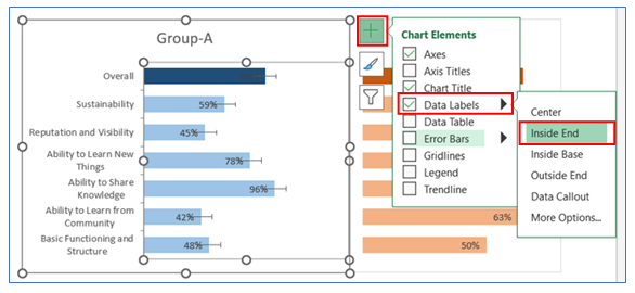
22. To give Data Labels in the first chart click on your chart and select the + button to give your Data labels. Select Data labels and click on Inside End or any other option. Do the same thing for the second chart.
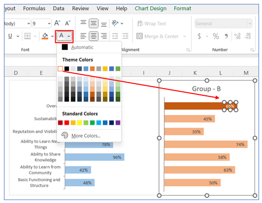
23. Change the first bar data labels colors on both charts, go to ribbon select the text color change option and choose white.
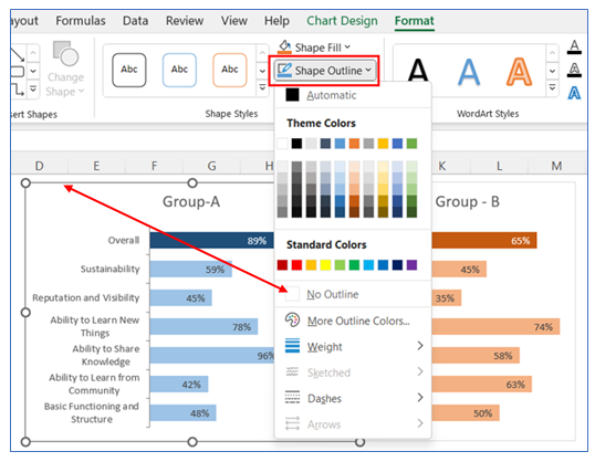
24. To remove Chart Outline, select Format in the ribbon, click Shape Outline, and choose No Outline.
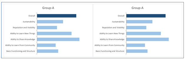
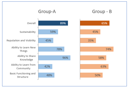
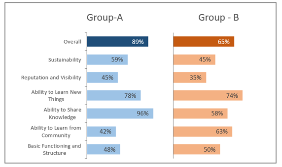
25. The chart looks below.
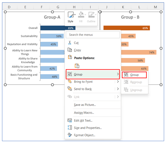
26. To make Group select two charts and right-click on the chart then select Group.
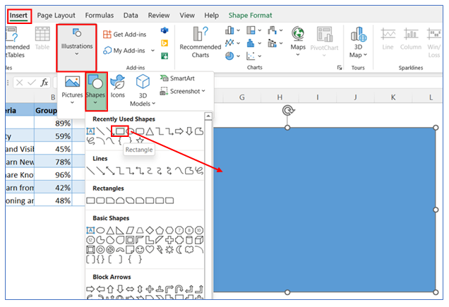
27. To give a boarder in the back of two charts, we insert a shape. Follow the below steps. Draw the shape and place in back of two charts.
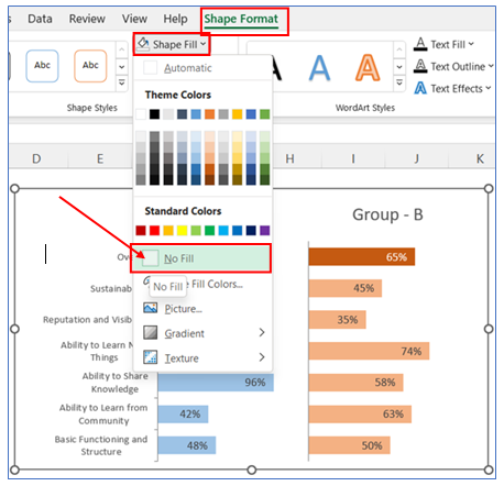
28. To remove Shape fill, select Format in the ribbon, click Shape then choose No Fill.
29. To give Shape Outline, select Format in the ribbon, click Shape Outline, and choose Outline color.
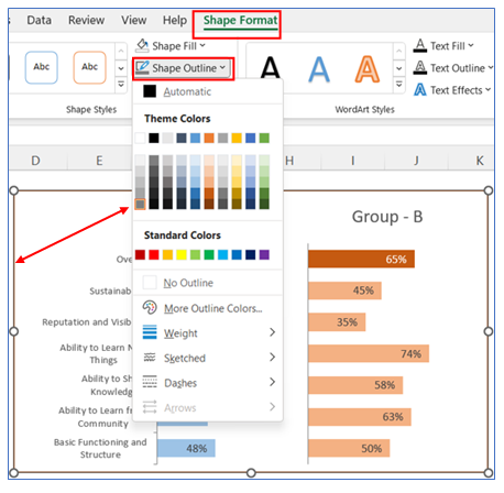
30. The Chart looks below.
Application of Side by Side bar chart in Dashboard Reporting:
Side by Side Bar Charts, also known as clustered bar charts, are a useful tool in dashboard reporting. They offer a clear and comparative visual representation of data. Here are six applications of Side-by-Side Bar Charts in dashboard reporting:
- Direct Comparison Between Groups:
- These charts excel at comparing different groups or categories side by side. For instance, you can compare sales figures of different products across several regions. Each group of bars represents a region, with individual bars showing sales for each product, facilitating an easy comparison.
- Performance Analysis Over Time:
- They are great for analyzing the performance of different categories over specific time periods. For example, you can track and compare quarterly revenue of multiple departments over a year, with each cluster representing a quarter.
- Demographic Data Representation:
- Side-by-Side Bar Charts can effectively represent demographic data, such as age or gender distribution across different regions or groups, allowing for easy visualization of demographic composition.
- Market Research Insights:
- In market research, these charts can compare consumer preferences, behaviors, or satisfaction levels across different product categories or brands, providing clear insights into market trends.
- Survey Results Display:
- For survey data, side-by-side bars can compare responses to different questions or the same question across different respondent groups, making it easier to spot differences and similarities in opinions or experiences.
- Resource Allocation Comparison:
- They can be used to compare resource allocation, such as budget or manpower, across different projects or departments. This visual representation helps in identifying areas of high or low resource investment relative to others.
