Here are some uses of pie charts in dashboard reporting:
- Market Share Visualization:
- Displays the distribution of market share among competitors, showing each company’s proportion in the market, making it easier to understand competitive dynamics.
- Budget Allocation:
- Visualizes how a budget is allocated across different departments, projects, or expenditure types, helping stakeholders understand financial distribution and resource allocation.
- Product Sales Mix:
- Shows the contribution of different products or services to total sales, enabling a clear view of which products are performing well and which are not.
- Customer Segmentation:
- Illustrates the breakdown of customers into various segments, such as age groups, income levels, or buying behaviors, providing insights into market segmentation and customer demographics.
- Inventory or Asset Composition:
- Represents the proportion of different types of inventory or assets within the total, aiding in the management and optimization of inventory or asset portfolios.
- Survey or Poll Results:
- Summarizes the results of surveys or polls, displaying responses to a particular question in percentage terms, which makes understanding public opinion or feedback straightforward.
- Project Resource Allocation:
- Illustrates how resources, such as time, budget, or manpower, are allocated across different project components, ensuring balanced resource distribution.
- Traffic Source Overview:
- Summarizes different sources of website traffic, such as direct, referral, paid, or organic, helping in the analysis and strategy planning of digital marketing efforts.
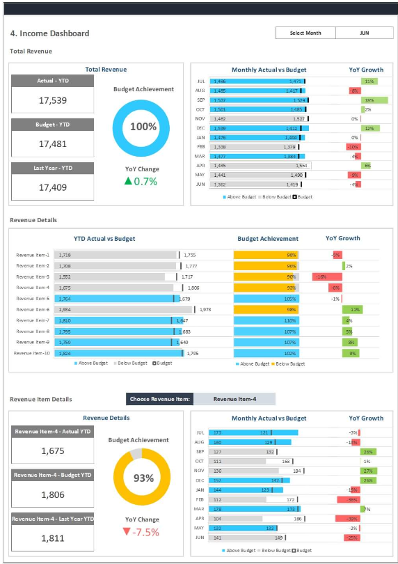
- Revenue Breakdown:
- Visualizes the contribution of different revenue streams or product lines to total revenue, helping in understanding which areas are driving the most income.
- Expense Distribution:
- Displays how total expenses are spread across different categories, such as salaries, utilities, and marketing, aiding in budget analysis and financial planning.
Pie charts are particularly effective for these uses because they provide a quick, intuitive way to understand the proportional distribution of parts within a whole, making them a popular choice for displaying composition in dashboard reports.