Heat Map in Excel is a powerful tool for transforming complex data sets into visual masterpieces, enabling clearer communication and more effective data analysis. By leveraging this feature, you can highlight patterns, identify trends, and make informed decisions based on intuitive color-coded representations. Whether you’re analyzing market trends, financial portfolios, or research data, incorporating a heat map into your Excel strategy enhances readability and insight. Start using Heat Map in Excel today to elevate your data presentation and discover the stories hidden in your numbers.
This Content Covers:
- What is a Heat Map?
- How to Create a Heat Map
- Using Conditional Formatting
- Create a Heatmap with a Custom Color Scale
- Create a Heat map Without Numbers
- Create a Heat Map in Excel Pivot Table
- Create a Dynamic Heat Map using Checkbox
1. What is a Heat Map?
Excel heat maps are a sort of representation that allows us to compare vast amounts of data in accordance with the requirements. Another name for the Excel heat map is a data visualization method. Technically speaking, a heat map is a visual representation of data that shows a comparison of data.
2. How to Create a Heat Map
There are several ways you can create a heat map in your Excel sheet. Some of the most used and useful techniques will be shown in this tutorial today.
2.1 Using Conditional Formatting
Step1: Select the cells containing data with which you want to create heat map. Now go to Home tab>>Conditional Formatting>>Color Scales.
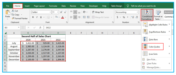
Step 2: From Color Scales box Chose the first one or you can choose any of the options you want
2.2 Create a Heatmap with a Custom Color Scale
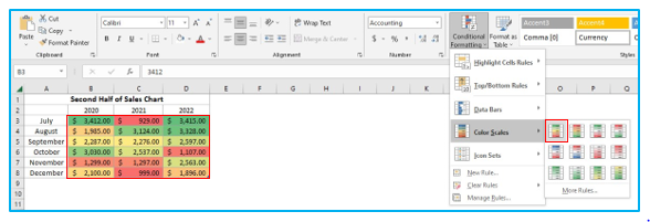
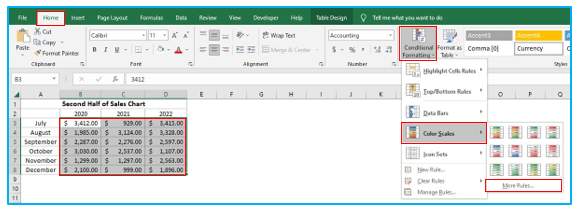
Step 1: Select the range and click Home tab>>Conditional Formatting>>Color Scales>>More Rules.
Step 2: From New Formatting Rule dialogue box Chose Format all cells based on their values. Select the Format style to 3-Color Scale. Now select Number under Minimum and Maximum from the boxes labeled as Type. In the Value boxes type the minimum and maximum value based on your sheet’s data.
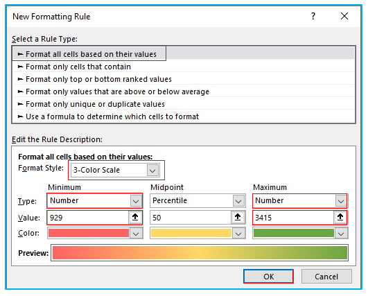
Step 3: Click OK and the formatting will be applied on your sheet.
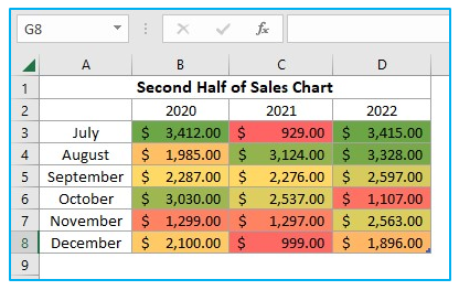
2.3 Creating a Heat map Without Numbers
You can use custom number formatting to hide the cell values without deleting them from the document.
Step 1: Select the cells containing heat map and use CTRL+1 command.
Step 2: From Format Cells dialogue box select Number>>Custom and type three semicolons ( ;;; ). Click OK. The numbers will be hidden from the chart.
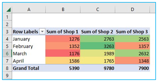
2.4 Create a Heat Map in Excel Pivot Table
To create a heat map using this pivot table follow the steps below.
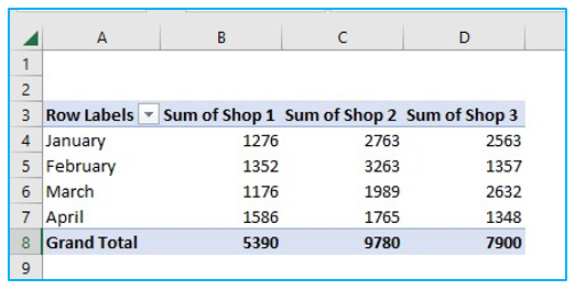
Step 1: Select the range B4:D7. Go to Home>Conditional Formatting>>Color Scales.
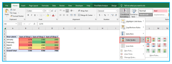
Step 2: Select any of the color scales and it will be applied on your chart data.
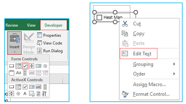
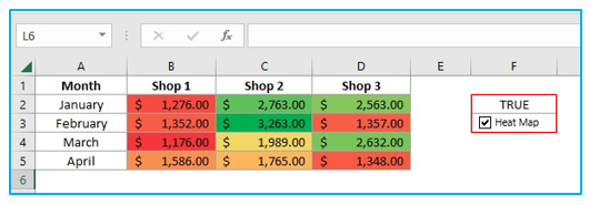
2.5 Create a Dynamic Heat Map Using Checkbox
Step 1: Go to Developer>>Insert and select the checkbox. Now click anywhere on the worksheet to insert the checkbox and rename it by right-clicking on it and selecting the Edit Text option.
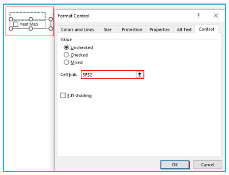
Step 2: Right click on the checkbox again and select Format Control. From the dialogue box select a cell address by clicking on it or typing it inside Cell Link box to link it with the checkbox.
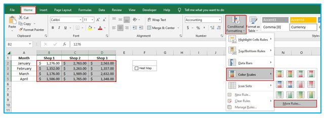
Step 3: Select the data range then go to Home>>Conditional Formatting>>Color Scales>>More Rules.
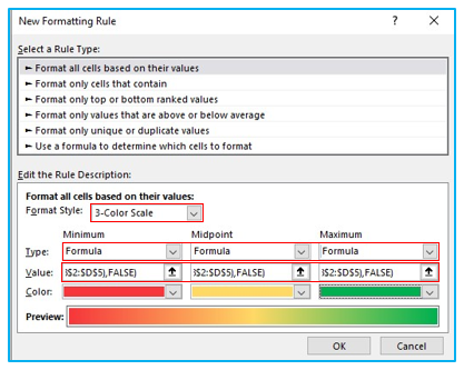
Step 4: Inside New Formatting Rule dialogue box, Select 3-Color Scale from Format Style. Choose Formula from Type box for Minimum, Midpoint and Maximum range. Insert these three formulas given below inside three of the boxes named as Value and click OK.
=IF($F$2=TRUE,MIN($B$2:$D$5),FALSE)
=IF($F$2=TRUE,AVERAGE($B$2:$D$5),FALSE)
=IF($F$2=TRUE,MAX($B$2:$D$5),FALSE)
Step 5: Now whenever you check the box the heat map will be applied on your chart.
Application of Heat Map in Excel
- Performance Analysis: Use heat maps to compare the performance metrics of different entities, such as sales by region or employee productivity, highlighting areas of high and low performance.
- Risk Assessment: Apply heat maps to assess and visualize risk levels across various factors or scenarios, aiding in prioritizing risk management strategies based on the severity indicated by colors.
- Financial Data Visualization: Create heat maps to display financial data like profit margins, expenses, or revenue growth across different time periods or product lines, identifying financial health and trends.
- Website Traffic Analysis: Utilize heat maps to analyze website traffic data, showing which areas of a website are most and least engaged with by users.
- Market Research: Employ heat maps for market research data, such as customer satisfaction or demographic distributions, to easily identify patterns and areas of interest.
- Health and Medical Data Interpretation: Use heat maps to visualize medical or health-related data, such as the prevalence of certain conditions across regions or patient outcomes, facilitating quick identification of critical areas.
