
Through a half circle KPI chart is a visually appealing and easily understandable format to present Key performance indicators (KPIs). KPIs are represented by colored sections of a half circle, and the status of each KPI is shown by a pointer within the chart. This article will show you how to make an Excel KPI chart in the shape of a half circle.
Reasons to Use a Half-Circle Key Performance Indicator Chart:
- Key performance indicator (KPI) charts in the shape of a half circle are frequently used in the business and financial worlds to depict metrics like sales volume, revenue, and profits. They can be used to keep tabs on how far along a project is, or how close it is to reaching a certain milestone; for example, monthly sales goals.
- They can also be used in project management to keep tabs on how far along the team is in achieving their stated goals. Data such as project duration and cost can be visualised using half-circle charts to help anticipate and address problems that could delay or even derail the project’s completion.
- Half-circle key performance indicator charts can also be used in the classroom to monitor students’ development and growth. They can be used to visualise information like test scores and attendance rates, providing insight into where students may benefit from additional guidance or intervention.
How to create half circle KPI Chart in Excel?
In order to half circle chart excel, do the following steps:
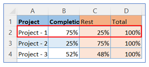
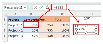
- Take sample data. Select data for Project-1 as indicated below.
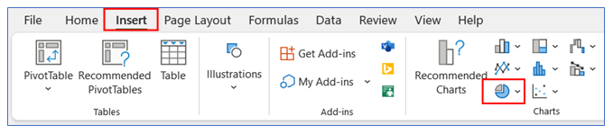
2. Go to the ribbon, select Insert, and select your chart type from the chart group.
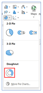
3. Select Chart type as Doughnut.
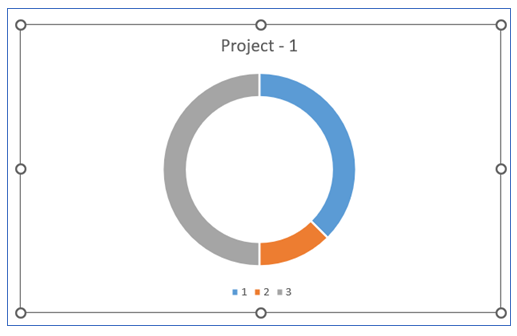
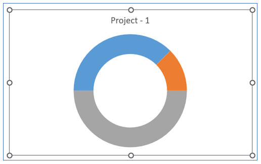
4. The chart looks below.
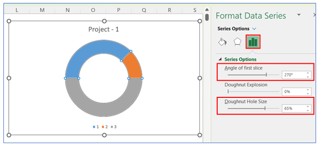
5. For changing the angle and the doughnut hole size, Right click on the chart and select Format Data Series.
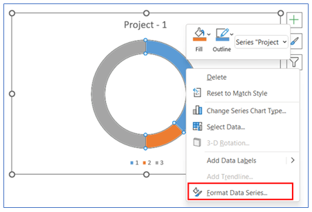
6. Change the angle size and the doughnut hole size from the Series Option.
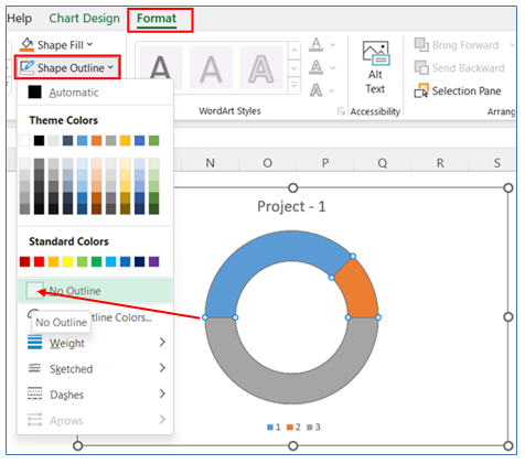
7. To remove the outline from the chart, select Format in the ribbon, click Shape Outline, and Choose No Outline.
8. To Remove the legend at the bottom, select the legend and delete it.
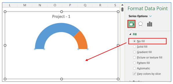
9. To make the full circle into a half-circle, Right click on the bottom part of the chart and select Format Data Series.
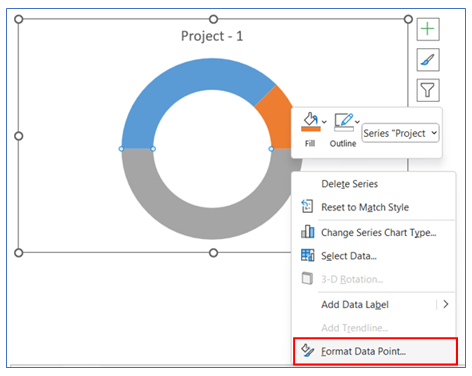
10. Then go to the Series Option, and click No Fill.
11. In the following steps we will customize the arc of the pie/circle as below:
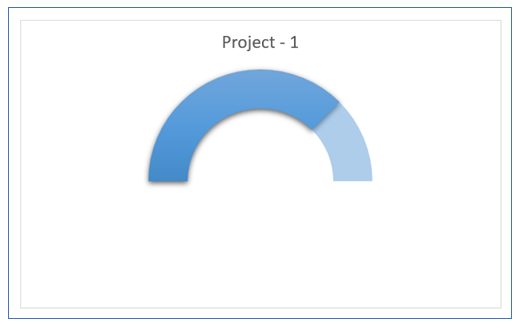
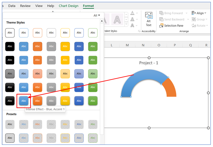
12. For changing the Theme style of the pie/arc of the circle – select the pie and – go to Format in the ribbon. Click the drop-down arrow in the Shape Styles Group.
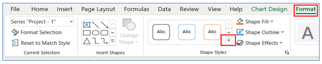
13. Choose the theme color of the First part of the chart.
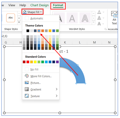
14. To change color in the second part of the chart, select Format in the ribbon, click Shape Fill and choose a color.
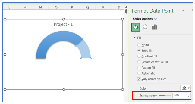
15. To change color transparency in the second part of the chart, right-click on the chart to go to Format Data Series Select Series Option, and change the transparency level.
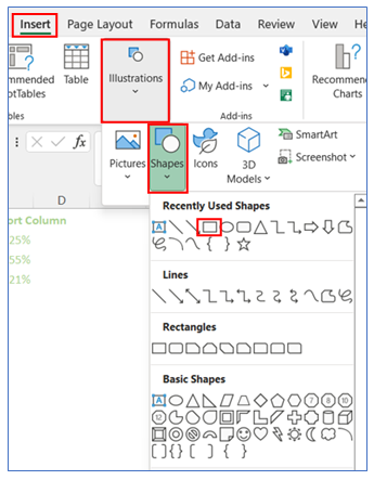
16. To show Data Label in the middle of the circle, we need to insert a rectangular share. Select Insert in ribbon, click Shape from Illustrations, and Choose a shape.
17. Select the shape and link the data cell in the formula bar. Format the shape as no outline and drag it to the center of the chart.
18. The chart looks below.
Application of Half Circle KPI Chart in Dashboard Reporting:

Half Circle KPI (Key Performance Indicator) Charts, also known as semi-circle or half donut charts, are a visually striking and effective way of displaying progress towards goals in dashboard reporting. Here are six applications of Half Circle KPI Charts in dashboard reporting:
- Performance Against Targets:
- These charts are ideal for showcasing progress towards specific targets or goals, such as sales targets, production goals, or customer satisfaction levels. The semi-circle visually represents the percentage of the target achieved, making it easy to understand at a glance.
- Resource Utilization:
- In financial or resource management dashboards, Half Circle KPI Charts can depict the utilization of resources like budget, manpower, or materials. For instance, showing how much of the annual budget has been spent.
- Project Completion Status:
- For project management, these charts can indicate the completion status of a project or its phases. It helps in quickly communicating how much of the project is completed versus what remains.
- Customer Engagement Levels:
- In marketing or customer service dashboards, these charts can be used to represent customer engagement or satisfaction levels, giving a quick visual cue on customer relationship health.
- Operational Efficiency Metrics:
- Operational dashboards can employ Half Circle KPI Charts to show efficiency metrics like machine uptime, on-time delivery rates, or inventory turnover, providing a snapshot of operational performance.
- Financial Health Indicators:
- Visualizes key financial metrics such as liquidity ratios, debt-to-equity ratio, or profit margins, providing a snapshot of the financial health or stability of an organization.
- Sales Target Achievement:
- Illustrates sales performance against targets, providing a clear and immediate visual cue for how close the sales figures are to reaching or exceeding the set goals.
- Health and Safety Compliance:
- In environments where health and safety are critical, these charts can track compliance or incident rates, displaying how well a team or company is performing against health and safety benchmarks.
Half Circle KPI Charts are particularly effective for these uses as they provide a clear and immediate visual cue on performance or status, making it easy for stakeholders to gauge how a particular metric stacks up against expected levels or thresholds.
For ready-to-use Dashboard Templates:
