Dual axis chart is a type of chart that combines two different sets of data on a single chart. They are an effective way to display data with different units of measurement or scales and can help identify patterns and trends that may not be apparent from a single chart. In this article, we will provide you with a step-by-step guide on how to create a dual-axis chart in Excel.
Uses of dual axis chart:
- Dual-axis charts are commonly used in business and finance to represent data such as revenue and expenses over time. They can be used to compare data on different scales, such as sales figures in dollars and profit margins in percentages, and can help to identify correlations between the two.
- They are also useful in scientific research to represent data such as temperature and precipitation over Dual-axis charts can be used to compare data on different scales, such as temperature in degrees Celsius and precipitation in millimeters, and can help to identify patterns and trends that may not be apparent from a single chart.
- Dual-axis charts can also be used in project management to track progress toward specific goals or milestones. They can be used to represent data such as project timelines and budget expenditures and can help to identify potential issues or delays that may impact the project’s completion.
How to make a dual axis chart in excel?
In order to to create dual-axis chart in Excel , do the following steps:
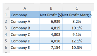
- Take sample data.
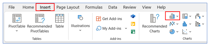
2. Go to ribbon, select Insert Tab and choose your chart type from the chart group.
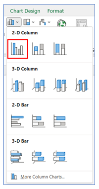
3. Select your Chart type as 2-D Column.
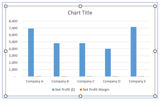
4. The chart looks like below.
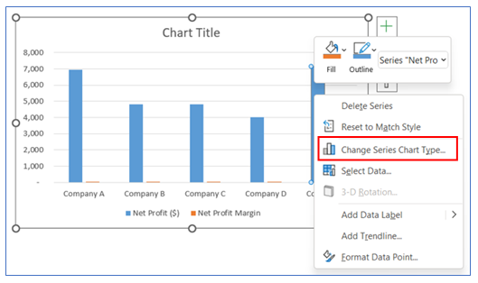
5. Now change 2nd column (here Net Proft Margin). Right-click on the second column and select Change Series Chart Type.
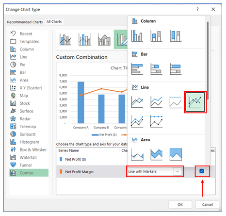
6. In this step we will create the dual axis for the chart. We take 2nd chart as line chart and place the secondary axis.
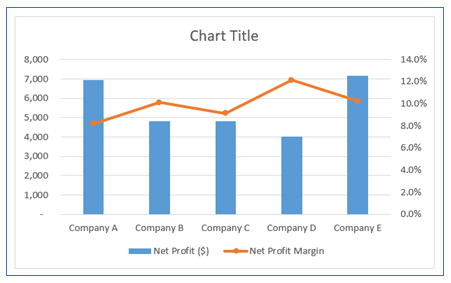
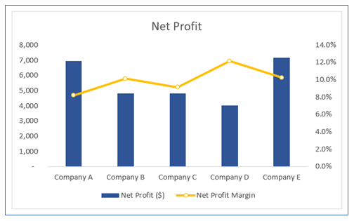
7. The chart looks like below
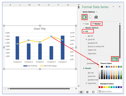
8. For changing the column chart color, right-click on the chart to Format Data Series then go to the fill to choose your color.
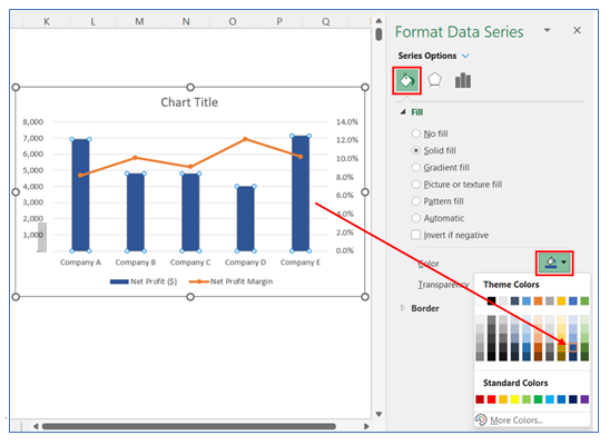
9. For changing the Line chart color, right-click on the chart to Format Data Series then go to the fill and choose your color.
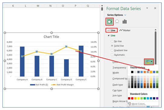
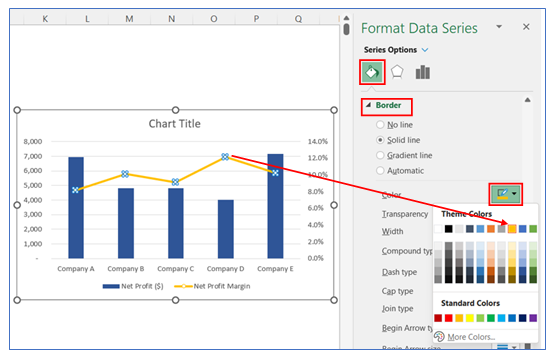
10. To change the Marker fill color, right-click on the chart to Format Data Series then go to the fill and choose your color.
11. To change the Marker border color, right-click on the chart to Format Data Series then go to the Border and choose your color.
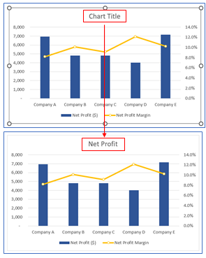
12. Change chart title. Click on the Chart Title and give your desired chart name.
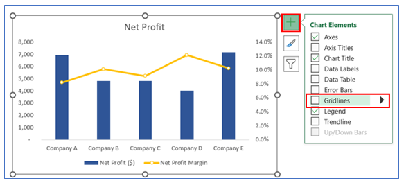
13. To remove Gridline click on the chart. Click the + button, and remove the tick of gridline box.
14. The chart looks like below.
Application of Dual Axis Chart in Dashboard Reporting

Here are some uses of Dual Axis Charts in dashboard reporting:
- Comparing Different Units of Measure:
- Useful for displaying two variables with different units of measure on a single chart, like sales revenue (in dollars) and units sold, enabling a direct comparison of related but differently scaled data.
- Analyzing Trends and Volumes:
- Ideal for comparing a trend with its corresponding volume, such as website traffic (line chart) against the number of conversions (bar chart), providing insights into the relationship between the two metrics.
- Performance Against Target:
- Visualizes actual performance (e.g., sales, production) on one axis and the targets or benchmarks on the other axis, clearly showing the variance between actuals and goals.
- Cost and Revenue Analysis:
- Displays costs on one axis and revenues on another, making it easy to analyze profit margins and the cost-revenue relationship over time or across different categories.
- Weather Data Visualization:
- Useful for displaying two different weather-related data points, like temperature and precipitation levels over time, offering a comprehensive view of weather patterns.
- Market Analysis:
- Combines different but related market indicators, such as stock price (line chart) and trading volume (bar chart), to provide a multi-dimensional view of market behavior and investor sentiment.
Dual Axis Charts are particularly effective for these uses because they allow for the comparison of two different datasets in a single cohesive visual, making it easier to understand the relationship and impact of one set of data on the other.
For ready-to-use Dashboard Templates:
