Creating a Bell Curve, or normal distribution curve, in Excel is a pivotal skill for anyone delving into statistical analysis, quality control, or performance appraisal processes. This bell-shaped curve is not just a representation of data distribution but also a cornerstone in understanding the variability and standardization in a dataset. Whether you’re a statistician analyzing population samples, a quality manager assessing product consistency, or an HR professional evaluating employee performance, this guide will provide you with a detailed, step-by-step approach to construct a Bell Curve in Excel. Mastering this technique will not only enhance your analytical capabilities but also empower you to present your findings in a clear, visually compelling manner.
Potential uses for a bell curve in Excel:
- Visualizing the distribution of test scores or other academic performance data
- Analyzing the spread of employee salaries in a company to better understand the pay structure
- Identifying patterns in stock market performance data to inform investment strategies
- Assessing the likelihood of a certain event occurring based on historical data
This Tutorial Covers:
- Excel Normal Distribution Graph (Bell Curve)
- Why do we need the bell curve
- Understanding the Bell Curve
- How to Make a Normal Distribution Graph in Excel
- Things to Remember About Normal Distribution Graph in Excel
1. Excel Normal Distribution Graph (Bell Curve):
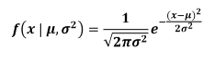
A continuous probability function is a graph of the normal distribution. Probability is a tool used to estimate the likelihood that phenomena or variable will occur. A function used to determine an event for a variable is called probability distribution. Discrete and continuous probability distributions are the two different types.
In the summary above, the fundamental concept of a normal distribution is described. A normal distribution is the degree of uniformity with which the data are dispersed. Any phenomenon’s real-time occurrences are calculated using a continuous probability distribution. The equation for a probability distribution in mathematics is as follows:
So complicated, huh? However, because Excel contains a built-in function for the normal distribution, it has made it simpler for us to calculate normal distribution. Therefore, we must enter the following formula in any cell:
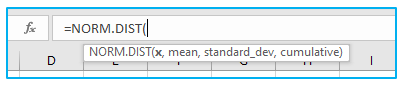
To calculate the normal distribution in Excel, there are three key things to consider:
X: The value for which we want to determine the normal distribution is denoted by the letter X.
Mean: The data’s mean is different from its average.
Standard_Dev: A function to determine a data set’s variance is the standard deviation. (The value must be positive.)
We generate a normal distribution graph using these data. It’s also referred to as a bell curve. The bell curve: what is it? A bell curve is a typical distribution for a variable, or how evenly dispersed a set of data is. It has a few. The graph we create can be a smoothed line or scatter graph.
2. Why do we need the bell curve?
The bell curve has many characteristics, applications, and implications, some of which are listed below:
- Because they simulate a lot of real-world data, like test results and employee performance reviews, it is significant in the field of statistics.
- The mean and median are congruent with the bell curve’s one mode. The bell curve’s highest point is this mode, which is located in its middle.
- The bell curve can be folded in half along a vertical axis, and the two halves are mirror images of one another. The symmetry is demonstrated by this.
- Exactly 68.2% of the data for a bell curve is within one standard deviation of the mean.
- Exactly 95.5% of the data for a bell curve falls within the two standard deviations of the mean.
- Exactly 99.7% of the data for a bell curve is within three standard deviations of the mean.
- When measuring the same piece of equipment repeatedly, the bell curve graph is helpful.
- The bell curve graph can be used to measure biological properties.
- When coins are flipped repeatedly in statistical experiments, the bell curve is also relevant.
- The bell curve can be used to determine a student’s height within a certain grade level in a school.
3. Understanding the Bell Curve:
Consider a class of 100 students that show up for the exam. Anyone who earns a grade of at least 80 out of 100 according to your system receives an A. However, because the exam was so simple, most of the students received an A and scored above 80.
This type of grading system is currently acceptable. But with it, you can’t tell the difference between someone who scored 81 and someone who scored 95. (As both would get the A grade).
A bell curve is frequently used to evaluate performances in order to keep comparisons fair and maintain the competitive atmosphere (at least, that’s how it was in college).
Students who score higher on tests are on the right side of the curve, while those who score poorly are on the left (with most of the students being in the middle around mean score).
Now, you must be familiar with two metrics in order to comprehend the bell curve:
Mean: It is the average value across all data points.
Standard Deviation: It measures how far the dataset deviates from its mean.
If your dataset is normally distributed, your bell curve will conform to the guidelines listed below:
- The mean of the data point is where the bell curve is located (also the highest point in the bell curve).
- The range (Mean – Standard Deviation to Mean + Standard Deviation) contains 68.2% of all the data points.
- The range (Mean – 2*Standard Deviation to Mean + 2*Standard Deviation) contains 95.5% of the total number of data points.
- The range (Mean – 3*Standard Deviation to Mean + 3*Standard Deviation) contains 99.7% of the total number of data points.
4. How to Make a Normal Distribution Graph in Excel?
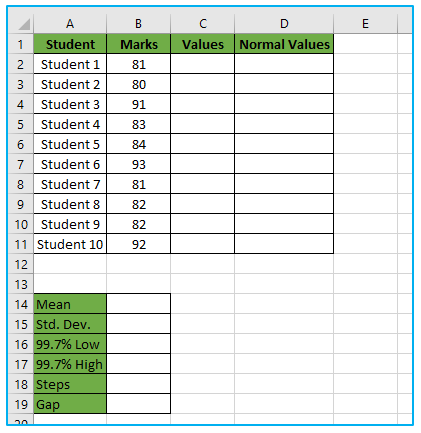
This dataset will be used to generate an Excel Bell Curve. To get the mean and standard deviation of our dataset, we’ll utilize the AVERAGE and STDEV.P functions. This information will then be used to generate data points for our Bell Curve. Finally, in order to complete our Curve, we will use the NORM.DIST to locate Normal data points.
How to make a normal distribution (bell curve) in excel is shown below:
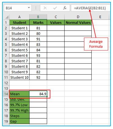
Step 1: First, enter the following formula in cell B14 and click ENTER to determine the distribution’s mean.
=AVERAGE(B2:B11)
The cell range B2 to B11’s mean value will be determined using this function.
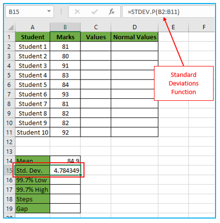
Step 2: Following that, enter the following formula in cell B15 to determine the distribution’s mean.
=STDEV.P(B2:B11)
The standard deviations for the specified cell range will be output by this function.
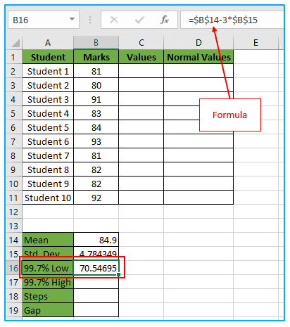
Step 3: As was previously mentioned, 99.7% of the highest and lowest values will fall within three standard deviations.
Then, enter the following formula in cell B16.
=$B$14-3*$B$15
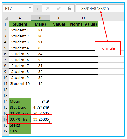
Step 4: Then, enter the following formula in cell B17.
=$B$14+3*$B$15
Step 5: Next, we will enter 9 in cell B18. We put one less than our target value because we want 10 values.
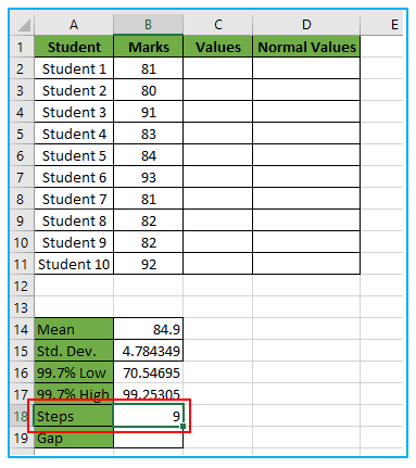
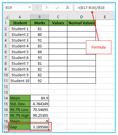
Step 6: Then enter this formula in cell B19.
=(B17-B16)/B18
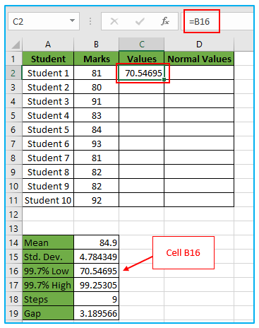
Step 6: We will now add values to column D in the dataset. The initial value will come from cell B16 to start.
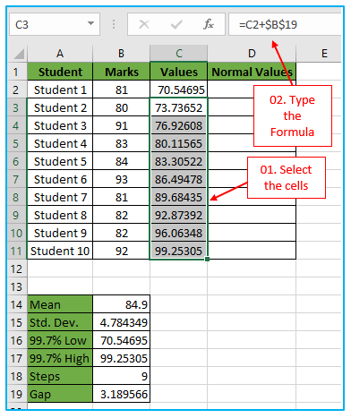
Step 7: Then, choose the cells C3 to C11 and enter this formula.
=C2+$B$19
Press “CTRL+ENTER” on your keyboard when you are finished. The selected cells will have the formula AutoFill.
Utilizing this formula, we can obtain the other values by using the interval value.
Step 8: Next, enter this formula into the cells located in the range D2 to D11.
=NORM.DIST(C2,$B$14,$B$15,FALSE)
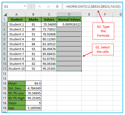
Step 9: The normal distribution for the specified mean and standard deviation is returned by this formula. These values have been set in the code. We’ve also made sure we get the “probability density function” by setting Cumulative to False. Press “CTRL+ENTER” after that.
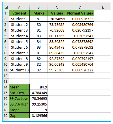
In order to produce a Bell Curve in Excel, we have so prepared our dataset.
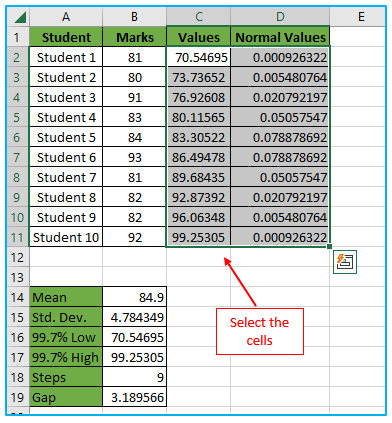
We will now construct the Bell Curve.
The steps are described below:
Step 1: Choose the cells C2 to D11 to start.
Step 2: Next, choose “Scatter with Smooth Lines” under “Charts” on the “Insert” tab.
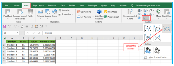
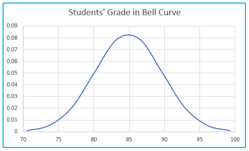
This will be the fundamental Bell Curve.
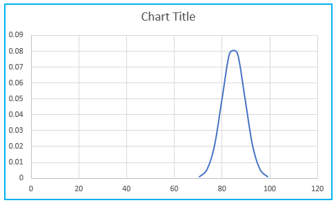
Let’s format our Bell Curve now.
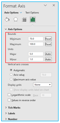
- To open the Format Axis dialog box, first double-click on the horizontal axis.
- Set the “Bounds” after that-
Minimum: 70.00
Maximum: 100.00
- Set the “Units” after that-
Major: 5.0
Minor: 1.0
- Deselect “Vertical Axis” to remove them. By clicking on the Plus symbol, we may see the Chart Elements in this case.
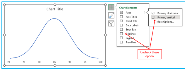
- After that, we’ve added straight lines from Shape to the Curve to indicate the standard deviation. The Bell Curve’s data mean is also represented by the Green
- Then, we’ve given our Curve a Chart Title.
So, here is how the final picture ought to appear.
5. Things to Remember About Normal Distribution Graph in Excel:
- The mean is the data’s average.
- The standard deviation has to be higher.
- The sample count we chose for our data is represented on the horizontal axis.
- The bell curve in Excel is another name for the normal distribution.
