An Actual vs Target chart in Excel is an invaluable tool for visually comparing actual performance with predetermined goals. Ideal for business analysts, managers, and anyone monitoring objectives, this chart type helps illustrate where performance stands relative to targets. It is particularly useful for financial metrics, sales figures, or production levels. By mastering a few straightforward steps in Excel, you can create a dynamic and informative Actual vs Target chart that enhances strategic decision-making and promotes accountability in your organization.
- What is the Actual and Target chart in Excel?
- An Excel target chart typically requires Three sets of data.
- Steps of making an actual vs. target chart in Excel and showing the target value as a column.
- Steps of making an actual vs. target chart in Excel and showing the target value as a line.
- Create a Dynamic Target Line in Excel Bar Chart.
- Chart-specific terminology.
1. What is the Actual vs Target chart in Excel?
In Excel, there is no specific type of chart that is called a “real chart.” However, “real chart” can refer to any chart that displays real or observed data. Charts like histograms, line graphs and scatter plots are among the options available. It all depends on what kind of data you are putting forward and what you want to communicate.
A line chart can be used to display actual sales data for each period when compared across multiple periods. Comparable charts can be utilized to present the real-time sales data of various product types for analysis purposes. To put it simply, a “real chart” in Excel is merely supposition of displaying real data, and the specific type of chart used will vary depending on the type or category of data and analysis.
Target chart in Excel, a “goal chart” usually refers to a visual representation of predetermined goals or objectives. The objective is to compare performance against actual data and target values. While there is no specific chart type in Excel that can be used to show comparisons, charts like histograms (various types), line charts, or bar charts all have their own unique characteristics. this effectively.
2. An Excel target chart typically requires Three sets of data.
Excel’s target chart typically requires two sets of data, one for the actual value and one chosen for identifying the target value. Preparation is necessary.
Choose the right chart type: Choose the chart type that best fits the data and information you want to convey. The comparison of actual values and target values is frequently done using column or bar charts. Draw a chart that includes both actual and target data by inserting them into the selected dataset. The process involves selecting the chart, clicking on the “Design” button, and selecting Data.
Reform the chart: Construct your chart to be visually pleasing and user-friendly. The addition of data labels and axis titles, along with color adjustments, can enhance the clarity of the output.
Add context: Include titles, labels, and captions to provide context and help your audience understand the importance of comparing actual and target values. The steps below are used to generate a target chart in Excel, which can be utilized to effectively convey performance against specific objectives or benchmarks.
3. How to make an Actual vs Target chart in Excel? Show the target value as a column in Excel.
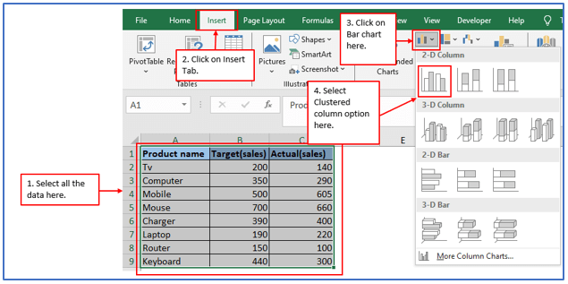
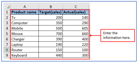
Step 1: Let’s say, you have the following series of data to create an actual vs. target graph as shown below.
All the data has been entered into the Excel sheet.

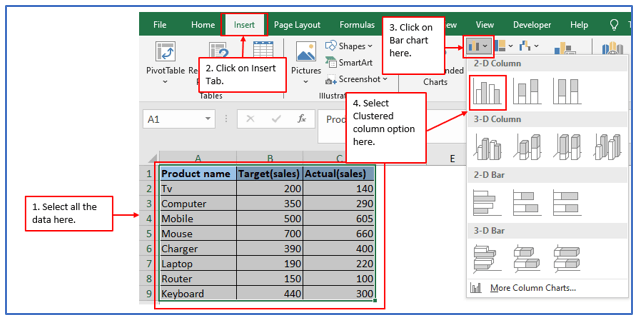
Step 2: Choose all the information from this table and click on Insert > insert column bar > chart > Select Clustered column option.
Followed the above instructions here.
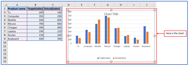
Step 3: After selecting the clustered column option, Afterwards, a chart will be generated and organized in groups as shown in the screenshot below.
Here is the Clustered column chart.
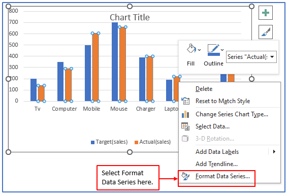
Step 4: From the context menu, click on the actual series (marked in orange) and choose Format Data Series as shown.
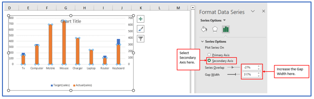
Step 5: In Excel, the new window for formatting data series will open on the right side must be set as follows:
- Choose a “Series Options” option under the second Axis.
- Add more gaps to the actual matrix until it looks like a thinner thin film from the target.
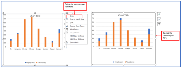
Step 6: Right click on the secondary axis and erase the secondary axis on the chart.
Removing the secondary axis here.
Step 7: Afterwards, you can modify other components of the chart.
- Modify the name of the chart
- Adjust the fill color for serial columns.
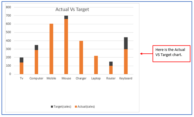
The actual Vs target chart is now complete. The target values are displayed as columns.
4. Steps of making an actual vs target chart in Excel and showing the target value as a line
Step 1: Take the following series of data to create an actual vs. target graph as shown below.
Placed the data here.
Step 2: Choose all the information from this table and click on Insert > insert column bar > chart > Select Clustered column option.
Followed the above instructions here.
Step 3: After selecting the clustered column option, Afterwards, a chart will be created and organized in groups as shown in the screenshot below.
Here is the Clustered column chart.

Step 4: A clustered chart is created here below. Now, do right-click the target series (these are the blue columns), then click Change series chart type in the context menu.
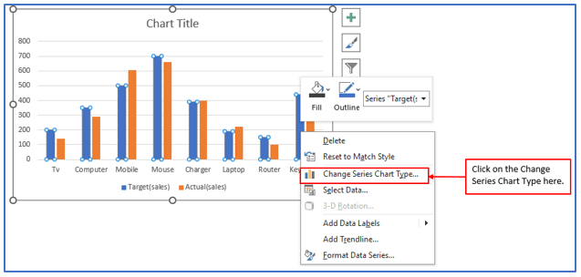
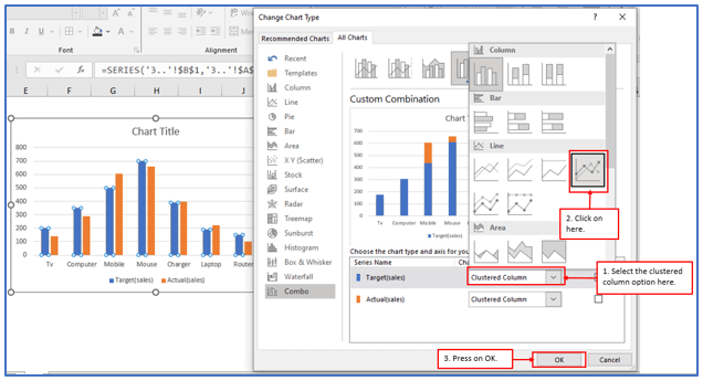
Step 5: To save the changes, select the Line with markers option from the Target row in the Change Chart Type dialog box and click OK.
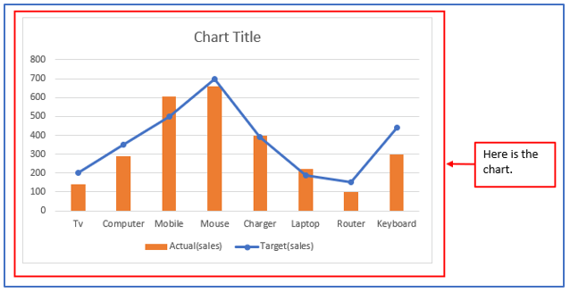
Step 6: The chart now appears as shown in the screenshot below.
Here is the chart.
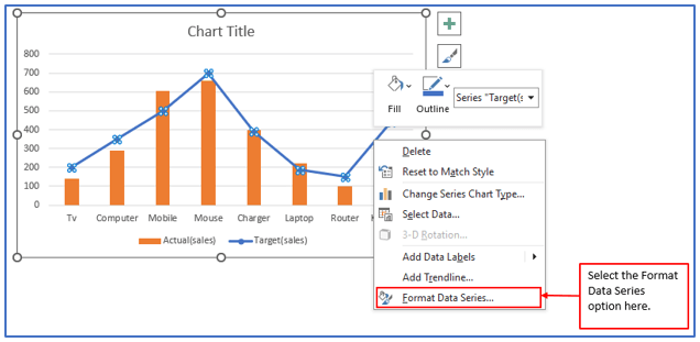
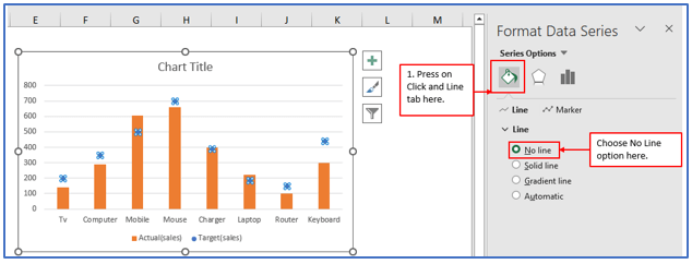
Step 7: Now, Right-click the target series(On the blue line) and select Format Data Series from the context menu.
Followed the above instruction below.
Step 8: In the Data String Format context pane, please configure the following.
- Select the Fill & Line option.
- Choose No lines in the category of Lines.
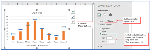
- Select the Marker option;
- Increase marker options;
- Select Integration, choose Type and enter the size number.
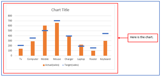
Step 9: See screenshot below. The display chart is shown now.
Here is the chart.
Step 10: You can then adjust other elements of the chart. Such as:
- Modify the name of the chart.
- Alter the color of filling serial columns.
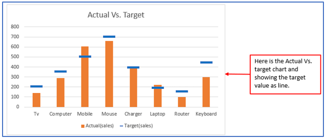
- The actual/target chart is now created in Excel and the target values are displayed as lines.
The actual vs. target chart in Excel and showing the target value as a line is outlined below.
5. Creating a Dynamic Target Line in Excel Bar Chart
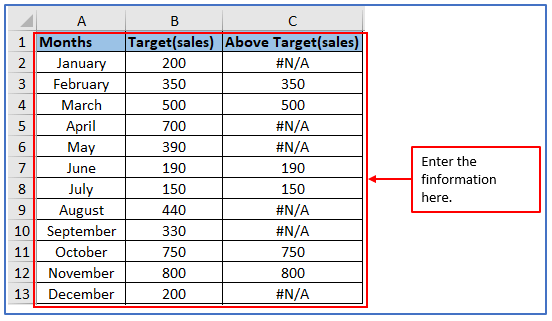
Step 1: Create a data set as shown.
The data has entered here.
Step 2: Select the entire data set and go to Insert -> Graph -> Clustered Column Chart.
Selected the clustered column chart here.

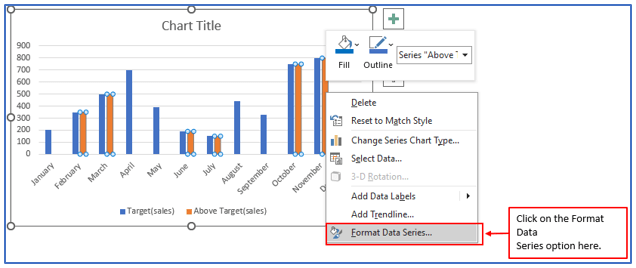
Step 3: Select one of the bars in Value Above Target, right-click, and choose Data Series Format.
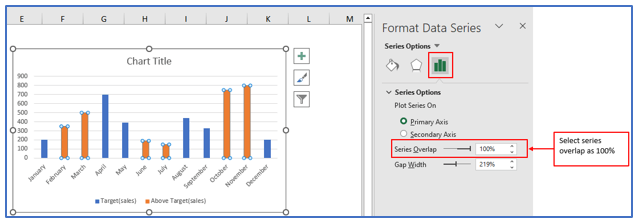
Step 4: When selecting the Series Options, enter 100% for the series overlap value.
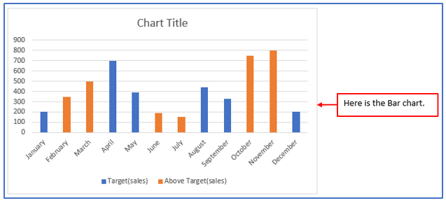
Step 5: The result is a graph where all values exceeding the specified limit are represented by varying colors (this can be verified by changing the target value).
Here is the Dynamic Target Line in Excel Bar Chart.
6. Chart-specific terminology.
Chart vs. Graph: Technically, there is a difference. A graph is essentially any visual representation of two or more variables.
X-Axis: When viewing a graph in either two-dimensional or three-dimensions, the horizontal axis of the X-axis is typically used to indicate an independent variable, such as the duration or category.
Y-Axis: Typically, the Y-axis is a vertical line that denotes primarily an input or output and the data you are tracking.
Legend: Information about the collected data is displayed here. Helps viewers read and understand graphics. Legends (sometimes called keys) are most useful when your chart contains multiple rows.
Plot Area: A plot is a space in which data is displayed.
You may be interested:
