A speedometer chart is a visually engaging way to represent data in Excel. A speedometer chart is also called a gauge chart. It resembles a car speedometer and displays a single value that is compared against a range of values. The gauge chart in excel is often used to show progress toward a goal or to compare performance against a target. If you’re looking to create a speedometer chart in Excel, there are a few key steps you’ll need to follow. In this tutorial, we’ll guide you through the process of creating a speedometer chart in Excel.
Uses for speedometer /gauge chart:
- Tracking progress toward a goal or target
- Comparing performance against a benchmark or industry standard
- Highlighting the level of achievement in a single metric
- Visualizing data in a unique and engaging way
How to make a gauge chart in excel?
In order to make gauge chart excel s, do the following steps:
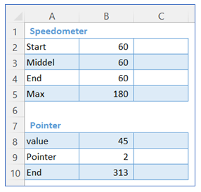
- Take sample data as below, here we take two tables – one for the speedometer and another for the pointer in the chart.
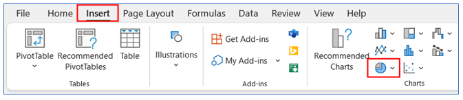
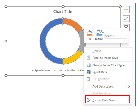
2. Select any cell of the first table then go to the ribbon, select Insert, and select your chart type from the chart group.
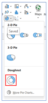
3. Select Chart type as Doughnut.
4. To change the Doughnut position, right-click on the chart and select Format Data Series.
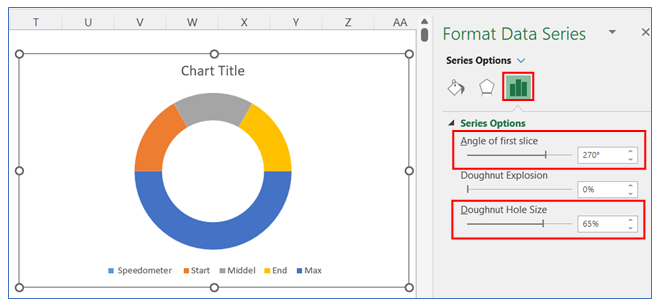
5. To change Doughnut Angle and Hole Size, go to Series Option select Angle to 270, and Doughnut Hole Size to 65%.
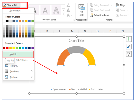
6. To remove the color of the bottom part of the doughnut, select the bottom part then select Shape Fill from Format in the ribbons and choose No Fill.
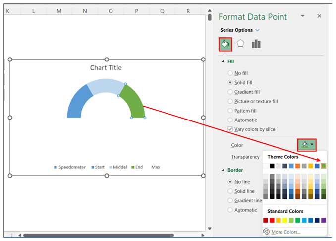
7. To change the first color in the doughnut, right-click on the chart and select Format Data, in Format Data Series select Fill and choose your color.
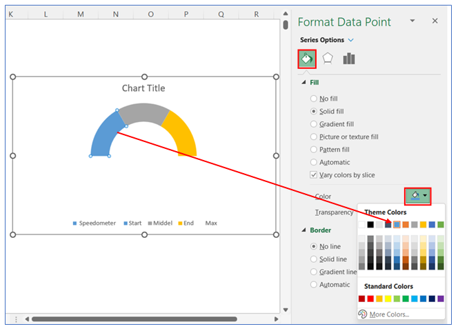
8. To change the second color in the doughnut, right-click on the chart and select Format Data, in Format Data Series select Fill and choose your color.
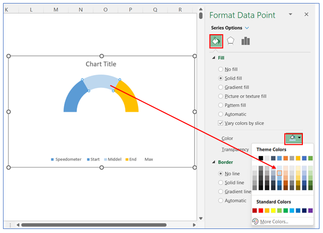
9. To change the third color in the doughnut, right-click on the chart and select Format Data, in Format Data Series select Fill and choose your color.
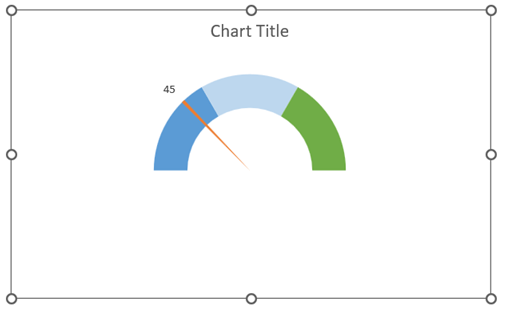
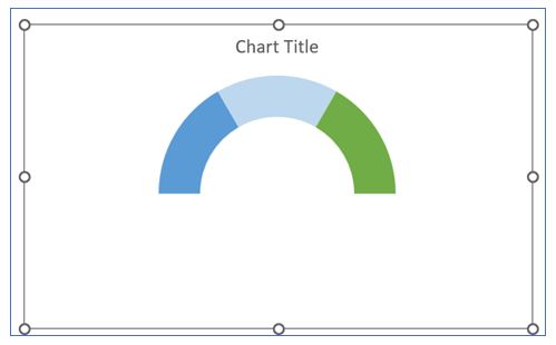
10. The Chart looks below.
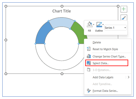
11. To add Pointer, we will add new data set from the second table. Right-click on the chart and click on select Data.
12. To add Pointer select Add, shown below.
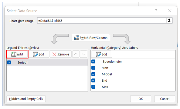
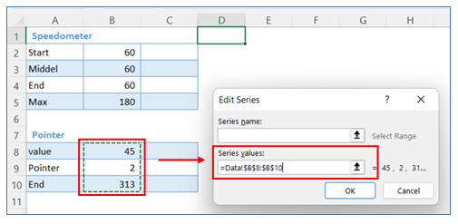
13. Now select series values from Pointer Data.
14. To change the Pointer chart type, right-click on the chart and click on Change Series Chart Type.
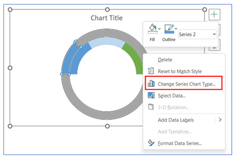
15. After that change the pointer chart doughnut to pie.
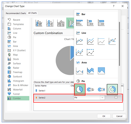
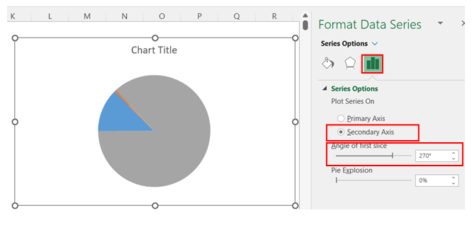
16. To change the Pointer charts axis and Angle, right-click on the chart and select Format Data Series, in Format Data Series select Series Option to choose Secondary Axis and change Angle to 270.
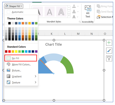
17. To change the color of the rest part in the Pointer Chart, select the chart (other than the pointer part), select Shape Fill from Format in the ribbons and choose No Fill.
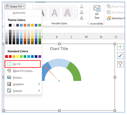
18. To change the other rest of the color of the part in the doughnut, select Shape Fill from Format in the ribbon and choose No Fill.
19. To give Data Labels in the Pointer chart click on your chart and select the + button to give your Data labels. Select Data labels and click on Outside End or any other option.
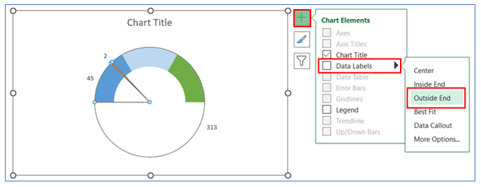
20. We keep here only Pointer data and remove the rest two data labels. Now link the Value (outcome – say, inventory holding days or receivable outstanding days) to the pointer Data label.
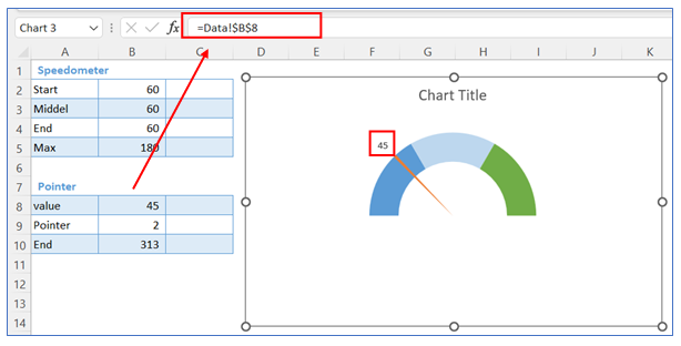
21. The Chart looks below.
Application of Speedometer Chart in Excel in Dashboard Reporting
Speedometer Chart or Gauge Chart in Dashboard:
Speedometer charts, also known as gauge charts, are used in dashboards to visually represent performance metrics or key indicators. Here are some ways they are utilized:
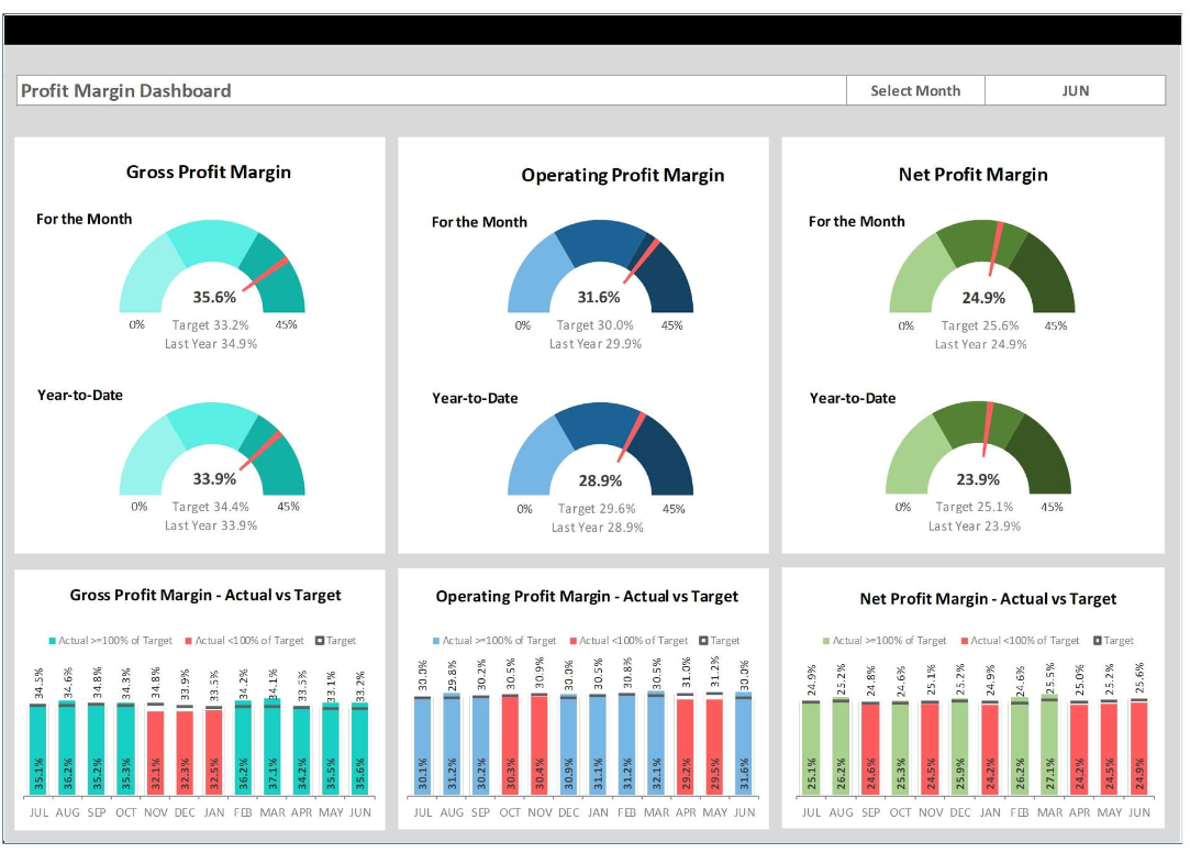
- Performance Measurement: Speedometer charts are effective for showing how a particular value measures up against predefined targets or thresholds. For example, they can display sales performance against quarterly targets.
- Data Visualization: These charts offer a quick, easy-to-understand visualization of data. They can represent metrics like customer satisfaction scores or server performance.
- Progress Tracking: They are used to track progress towards a goal. For instance, tracking the completion percentage of a project or progress in achieving a financial goal.
- Comparative Analysis: By displaying different speedometer charts side by side, one can compare different sets of data or performance metrics.
- Real-time Monitoring: In dashboards that require real-time data monitoring, such as network speed or machine temperature, speedometer charts provide an immediate visual representation of current status.
- Threshold Alerts: They can be designed to change color or trigger alerts when the needle reaches critical zones, making them useful for monitoring situations like inventory levels or financial health.
- Simplicity and Clarity: Their simple and clear format makes them suitable for executive dashboards where quick decision-making is essential.
- Customizable Ranges and Scales: Speedometer charts can be customized to fit the context of the data being represented, with adjustable ranges and scales to suit different metrics.
- Enhanced User Engagement: Their visually appealing design can make dashboards more engaging and easier to interpret for users.
- Limited Data Representation: However, it’s important to note that speedometer charts are best suited for representing a limited range of data points. They are not ideal for complex data sets requiring detailed analysis.
For ready-to-use Dashboard Templates:
