A Dumbbell DNA chart is a type of chart that is useful for comparing two sets of data with a before-and-after comparison. This type of chart consists of two dots or circles connected by a line, where each dot represents a data point and the line represents the difference between them. This article will provide you with a step-by-step guide on how to create a dumbbell or DNA chart in Excel.
Uses of dumbbell DNA chart:
- Sales, income, and profits are just some of the types of information typically represented using dumbbell or DNA charts in the business and finance world. They can be used to examine the effect of a certain event, such as the release of a new product, by comparing data collected before and after the introduction.
- They can also be used to illustrate information gained from scientific studies, including the conclusions of experiments or clinical trials. Data before and after an intervention, like a new drug or treatment, can be compared using a Dumbbell or DNA chart to determine the intervention’s efficacy.
- In education, DNA or dumbbell charts are useful for monitoring development over time. They can be used to see how much of an influence an intervention like tutoring or mentorship has on a student’s grades by comparing data from before and after the intervention was implemented.
How to create Dumbbell Chart in Excel?
In order to create dumbbell or DNA chart in excel, do the following steps:
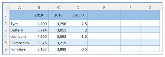
- Take sample data. Here we take 3 more columns for supporting calculation.
2. Go to the ribbon, select Insert, and select your chart type from the chart group.
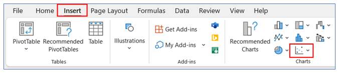
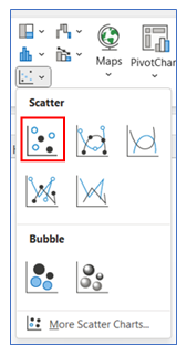
3. Select Chart type as Scatter.
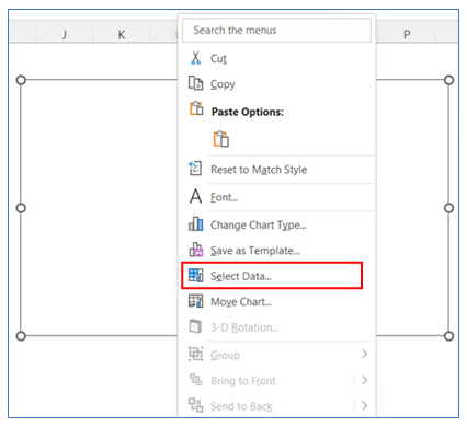
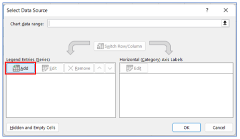
4. To add data in the chart, right-click on the chart and choose Select Data.
5. Select Add option to add data for creating the chart.
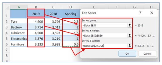
6. Take the first data range values as below.
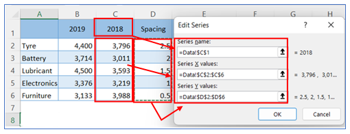
7. Take the second data range values as below.
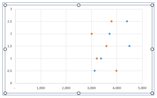
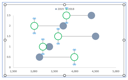
8. The chart looks like below.
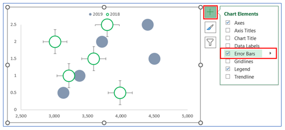
9. For adding Legend – click on the Chart, press + bottom and check the Legend box.
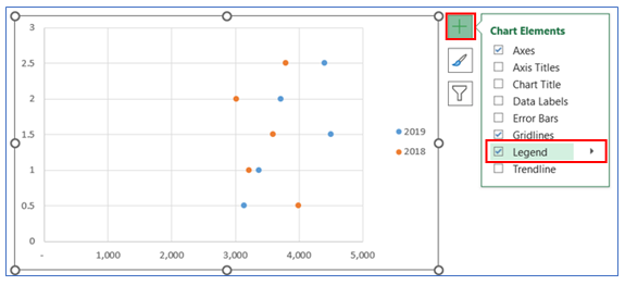
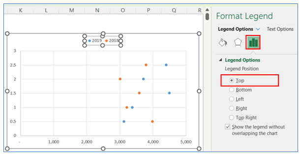
10. After that choose Legend Position On Top.
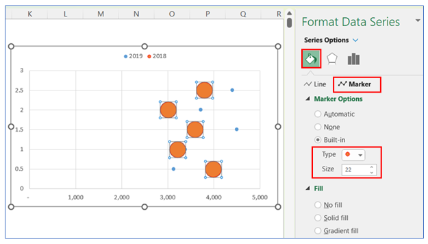
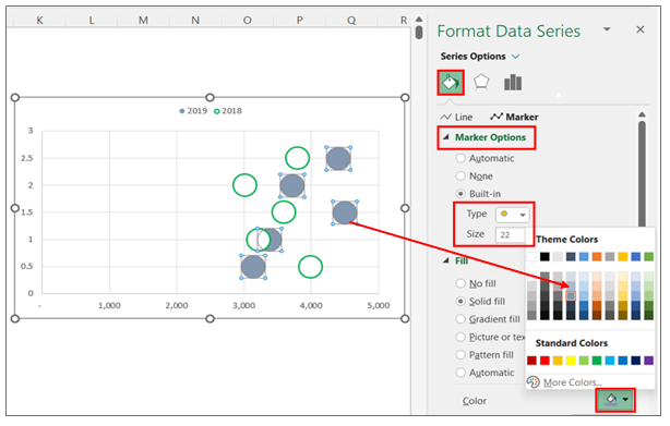
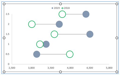
11. For changing the Marker size, right-click on the chart to go Format Data Series then go to the Series Option, and select Marker Option, now change the marker type and size (here 22).
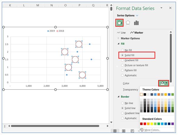
12. To change the first marker fill, right-click on the marker, go to Format Data Series, choose Fill, select Solid Fill, and choose white.
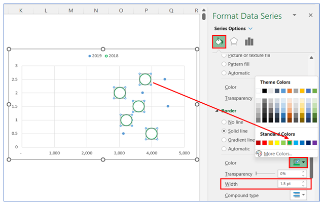
13. To change the first marker border, right-click on the marker, select Format Data Series then go to the border, select Solid line, and choose your color. Change the border width to 1.5.
14. To change the second marker fill, right-click on the marker to go to Format Data Series then go to the Fill, select Solid Fill and choose your color
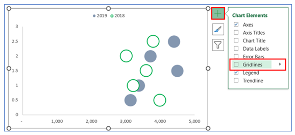
15. To Remove Gridline, click on the chart then select the + button, and uncheck the Gridline.
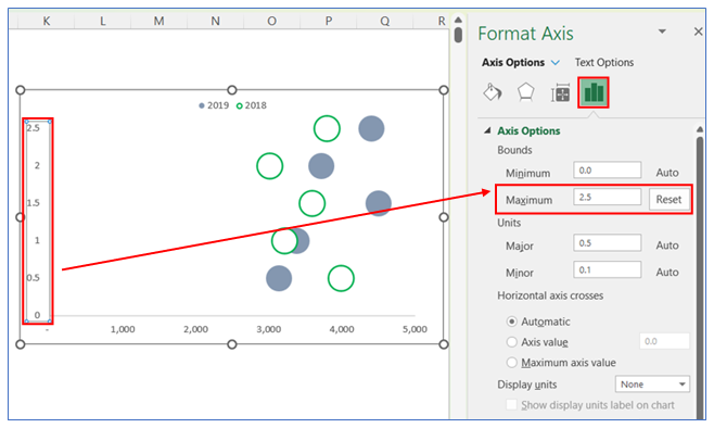
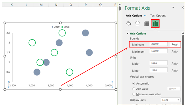
16. To change the Maximum Axis for Left Axis, right-click on the chart to Format Data Series then go to the Axis Option, select Maximum and reset the range.
17. To change the Minimum Axis for the bottom Axis, right-click on the chart to Format Data Series then go to the Axis Option, select Minimum and reset the range.
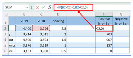
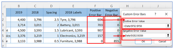
18. Create a formula for the Positive error bar in sample data and copy it down to cells.
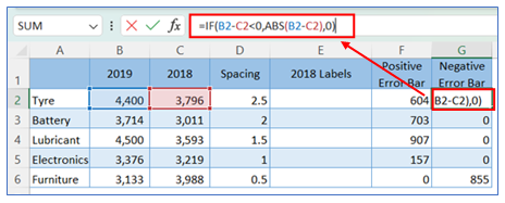
19. Create a formula for the Negative error bar in sample data and copy it down to cells.
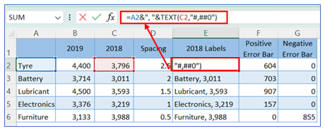
20. Create custom Data Labels through the below formula.
21. To select the error bar, click on the chart then select the + button, and check the Error bar.
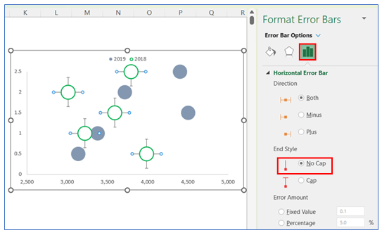
22. To select No cap in the error bar, right-click on the chart to Format error bars then go to the Horizontal error bar Option, and Select No Cap.
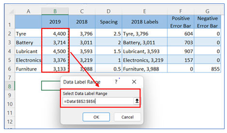
23. After that choose Custom range from the same place.
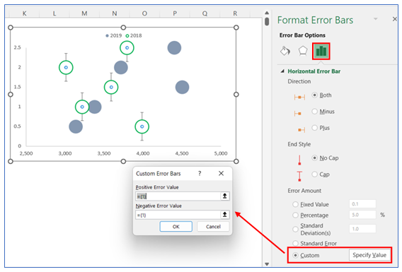
24. Select the positive error bar and negative error bar data range from the sample data table.
25. Remove vertical error bars from the chart. Select the bar and delete.
26. The chart looks below.
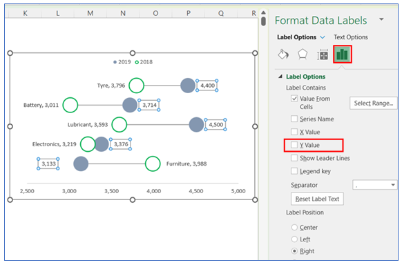
27. To give the first Data Labels (here for 2018), click on the chart then select the + button, and check the Data Labels, select More Option.
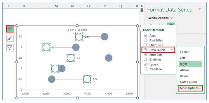
28. After that select Label Option and click Value From Cell.
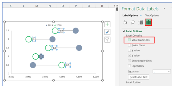
29. Select data range from sample data for the first data label (for 2019).
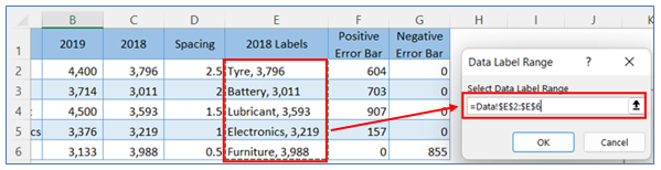
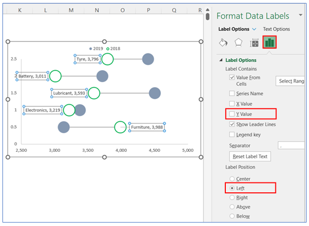
30. Unselect the Y value and change the data label position to the Left.
31. To give second Data Labels (here 2019), click on the chart then select the + button, and check the Data Labels, select More Option.
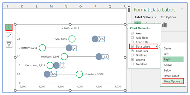
32. After that select Label Option and click Value From Cell.
33. Select data range from sample data for the second data label.
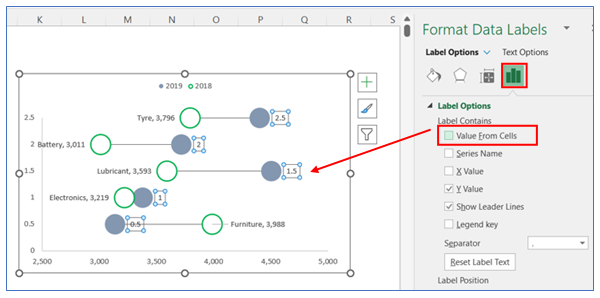
34. Unselect the Y value.
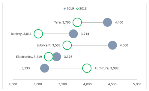
35. The chart looks like below
Application of Dumbbell Chart in Dashboard Reporting
Here are some uses of dumbbell charts in Excel in dashboard reporting:
- Pre vs. Post Comparison:
- Ideal for comparing the performance of different metrics before and after a specific event or intervention, such as sales figures before and after a marketing campaign, or performance metrics before and after a training program.
- Target vs. Achievement Visualization:
- Visualizes the comparison between targets set and actual achievements for different categories or periods, clearly showing where targets have been met, exceeded, or fallen short.
- Year-over-Year or Periodic Change Analysis:
- Compares metrics from different time periods (e.g., monthly, quarterly, yearly) to show growth, decline, or stability, providing insights into trends over time.
- Product or Category Performance Comparison:
- Displays side-by-side comparisons of different products or categories on specific metrics, like comparing the revenue generated by each product or customer satisfaction ratings across services.
- Geographical Data Comparison:
- Compares data points across different geographic regions, such as population growth, average income, or sales figures, highlighting regional variations or growth patterns.
- Health or Environmental Data Monitoring:
- Useful for comparing health or environmental data, such as the change in pollution levels, temperature variations, or health indicators (e.g., pre and post-vaccination infection rates) across different locations or time periods.
For ready-to-use Dashboard Templates:
