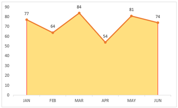
Changes in data over time are often displayed using area charts. You might think of them as line charts with the empty space below the line filled in, making for a more comprehensive and straightforward visual representation of the data. Making an area chart in Excel that does justice to your data only requires a few clicks. This tutorial will show you how to make an area chart in Excel by walking you through each step.
Potential uses of excel area chart :
- Sales, revenues, and profits over time are just some of the many examples of business and financial data that can be represented by area charts.
- They are particularly helpful in scientific study since they graphically display facts over time, such as how the climate has changed, the number of people living in a given area, or the spread of disease.
- The ability to compare various data sets on a single chart is a key feature of area charts, which aids in the discovery of patterns and trends.
Create Area Chart in Excel
In order to create chart area excel, do the following steps:
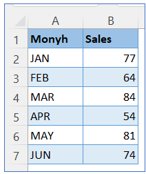
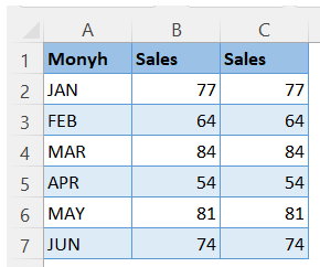
- Select the data range A1:B7 or simply keep cursor in any cell of the data range
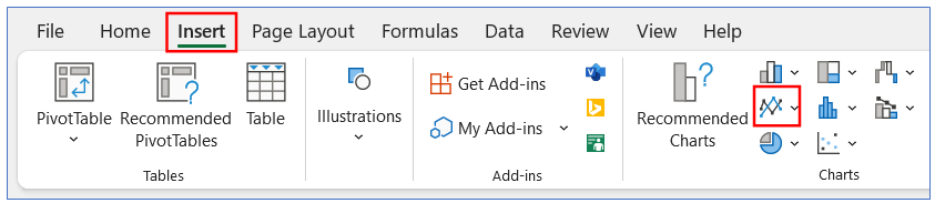
2. Select Insert menu and click on area chart icon as indicated in below image
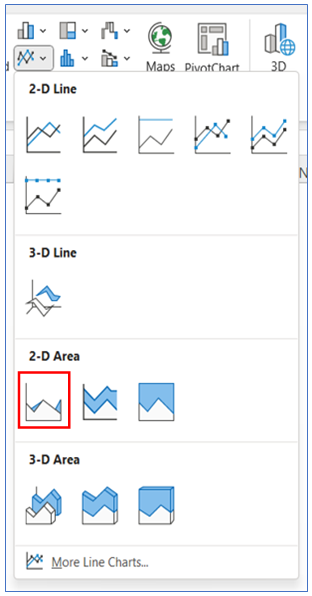
Select 2-D Area chart option
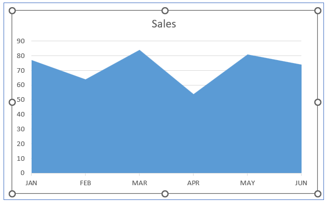
 3. Area Chart looks as per below image
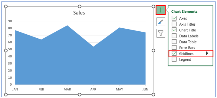
4. In order to Remove the Gridline – click the ‘+’ icon of Chart Elements and uncheck the box of Gridlines
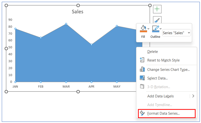
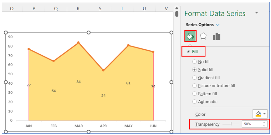
5. To change color of your area chart – right click on the chart and from the pop-up window click on ‘Format Data Series’
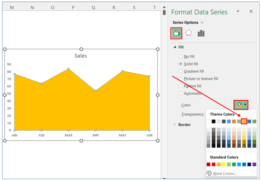
6. From the ‘Format Data Series’ pop-up window – select the desired color
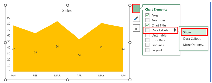
7. To show the data labels in area chart – from Chart Elements tick mark the Data Labels check box or click on arrow and click on Show.
If you want to customize your area chart like below chart i.e. give a deep line on top border of your area chart
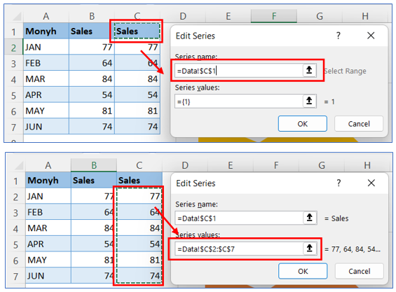
8. Add same data in another column to add line chart
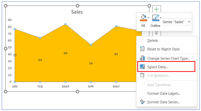
9. Right click on the chart and Select Data option for add new data
10. Add new data series with existing data series. Here we add the same data set again
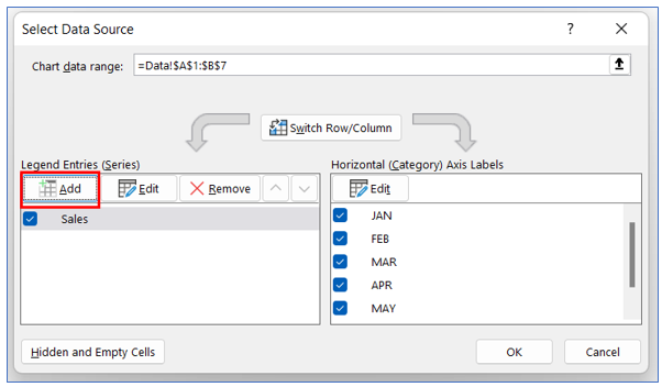
11. Here we add the same data set again. Select new data range
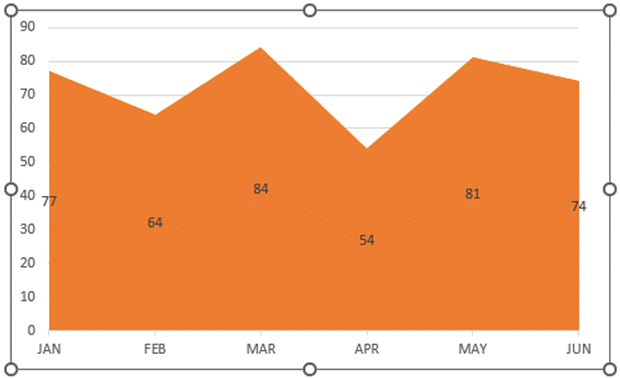
12. New chart will look as below, since the both data series are same – one chart overlaps other
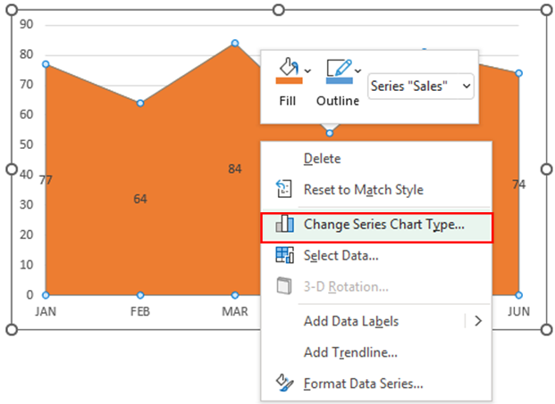
13. In order to make the line for the new data set – execute the following steps
Right click on the chart and select ‘Change Series Chart Type’
14. For second data series, click the down arrow icon and select ‘Line with Marker’ chart
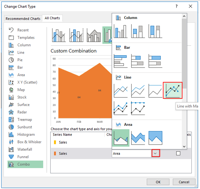
15. Chart looks as below image after Change chart type
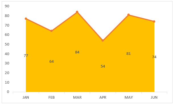
16. From ‘Format Data Series’ you may reduce the area chart transparency to make it light color.
Also change the data labels for the line chart and remove the existing data labels for area chart.
Application of Area Chart in Dashboard Reporting
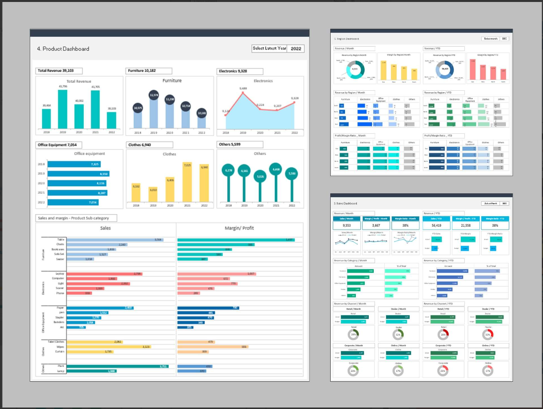
Here are some uses of area charts in dashboard reporting:
- Trend Analysis Over Time:
- Visualizes how a specific data set has progressed over a period, highlighting trends, patterns, or fluctuations, useful for sales, stock prices, or temperature changes.
- Cumulative Totals Display:
- Shows the accumulation of values over time, making it easy to understand the total impact by a specific date, often used for tracking total sales, expenses, or inventory levels.
- Comparing Multiple Categories:
- Compares the trends of different categories or groups over time, stacked together for a clear comparison, suitable for product line sales, website traffic sources, or market share analysis.
- Portfolio or Budget Allocation:
- Represents the distribution of resources or investments among different categories, showing how each part contributes to the whole, used in finance for portfolio diversification or budget allocation.
- Project Phase or Task Progression:
- Illustrates the stages or tasks of a project over time, showing how much of each task is completed and the overlapping of different phases, aiding in project management and scheduling.
- Market or Population Segmentation:
- Displays the size and change of different segments within a market or population, such as age groups, income brackets, or product categories, beneficial for market analysis or demographic studies.
For ready-to-use Dashboard Templates:
