A stacked column chart is a popular chart type used in Excel to display and compare multiple data series. It is particularly useful for showing how each data series contributes to the total value of a category. In this tutorial, you will learn how to create a stacked column chart in Excel. We will walk you through the steps to create this chart type from scratch, as well as provide tips on how to customize and format the chart to best suit your needs.
Potential uses for a stacked column chart in Excel:
- Displaying sales data for multiple products in a single chart to compare their performance over time
- Showing the proportion of each expense category in a company’s budget
- Highlighting the percentage of male and female employees in different departments of a company
How to make stacked chart in excel?
In order to make excel stacked column chart, do the following steps:
Please follow the below steps to create excel stacked column chart:
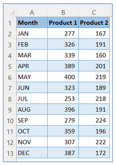
- Take sample data.
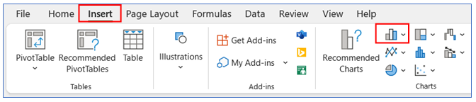
2. Select data from sample data, then go to the ribbon, select Insert, and select your chart type from the chart group.
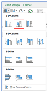
3. Select Chart type as 2-D stacked column.
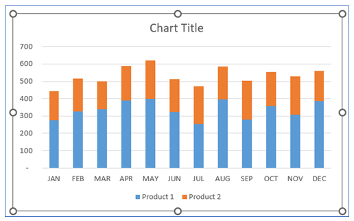
4. Our initial stacked chart in excel looks below:
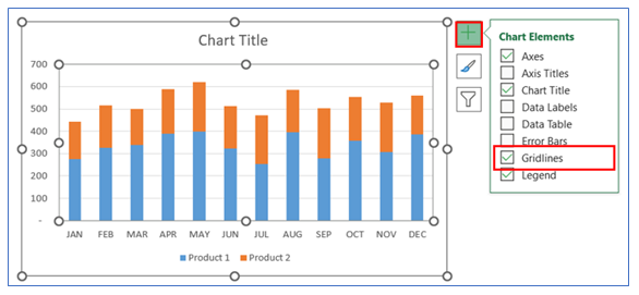
5. To Remove Gridline, click on the chart then select the + button, and uncheck the Gridline.
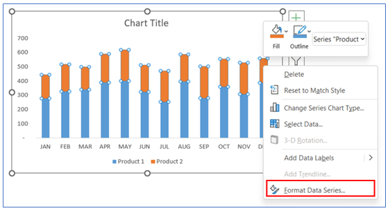
6. To change the Gap width, right-click on Chart and select Format Data Series.
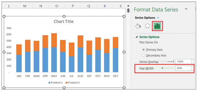
7. Choose the gap width to 60%.
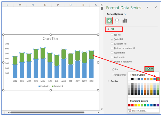
8. To change the first color in the bar, right-click on the chart and select Format Data Series, in Format Data Series select Fill and choose your color.
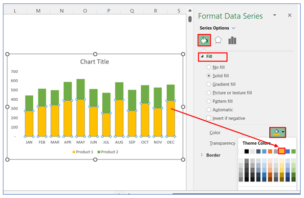
9. To change the second color in the bar, right-click on the chart and select Format Data Series, in Format Data Series select Fill and choose your color.
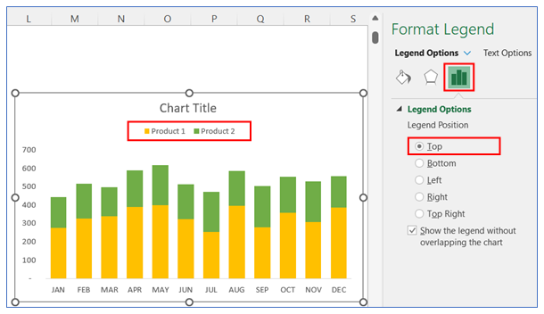
10. To change the legend Option, right-click on the legend and select Format Legend, in Legend Option select Top.
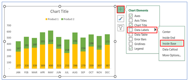
11. To give Data Labels in the chart click on your chart and select the + button to give your Data labels. Select Data labels and click on Inside Base or any other option.
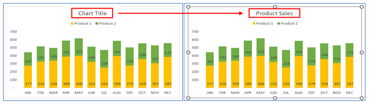
12. To give appropriate chart title, select the title and write your desired title.
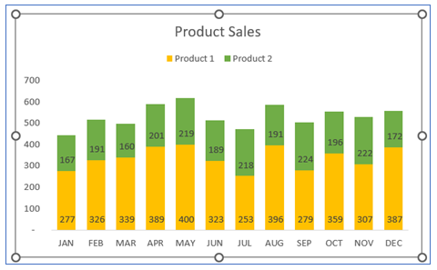
13. The stacked column chart looks below.
Application of stacked column Chart in Excel in Dashboard Reporting
Stacked Column Charts are a valuable tool in dashboard reporting, offering a visually impactful way to present and analyze data. Here are six applications of Stacked Column Charts in dashboard reporting:
- Comparative Analysis Across Categories:
- Stacked Column Charts are excellent for comparing multiple categories across different groups or time periods. For example, you can compare sales figures of different products over several months. Each column represents a time period, and segments within the column represent different products, allowing for easy comparison.
- Visualizing Part-to-Whole Relationships:
- These charts are ideal for showing how individual categories contribute to the total. For instance, in a revenue report, each stack can represent a revenue source, showing how each contributes to the total revenue for a given period.
- Trend Identification Over Time:
- Stacked Column Charts can help in identifying trends over time for multiple categories simultaneously. For example, tracking the monthly performance of various marketing channels can reveal which channels are improving and which are declining.
- Performance Breakdown:
- They are useful for breaking down the performance of a category into its components. In a budget dashboard, for instance, each column could represent total expenditure for a department, with stacks showing how much was spent on different expense types.
- Comparison of Cumulative Totals:
- These charts allow for the comparison of cumulative totals across different categories. This is particularly useful in scenarios where the overall size of each category is important, like comparing total sales generated by different regional offices.
- Highlighting Proportional Changes:
- Stacked Column Charts can highlight proportional changes within each category over time. For instance, in a workforce demographics report, they can show changes in the proportion of full-time vs. part-time employees over several years.
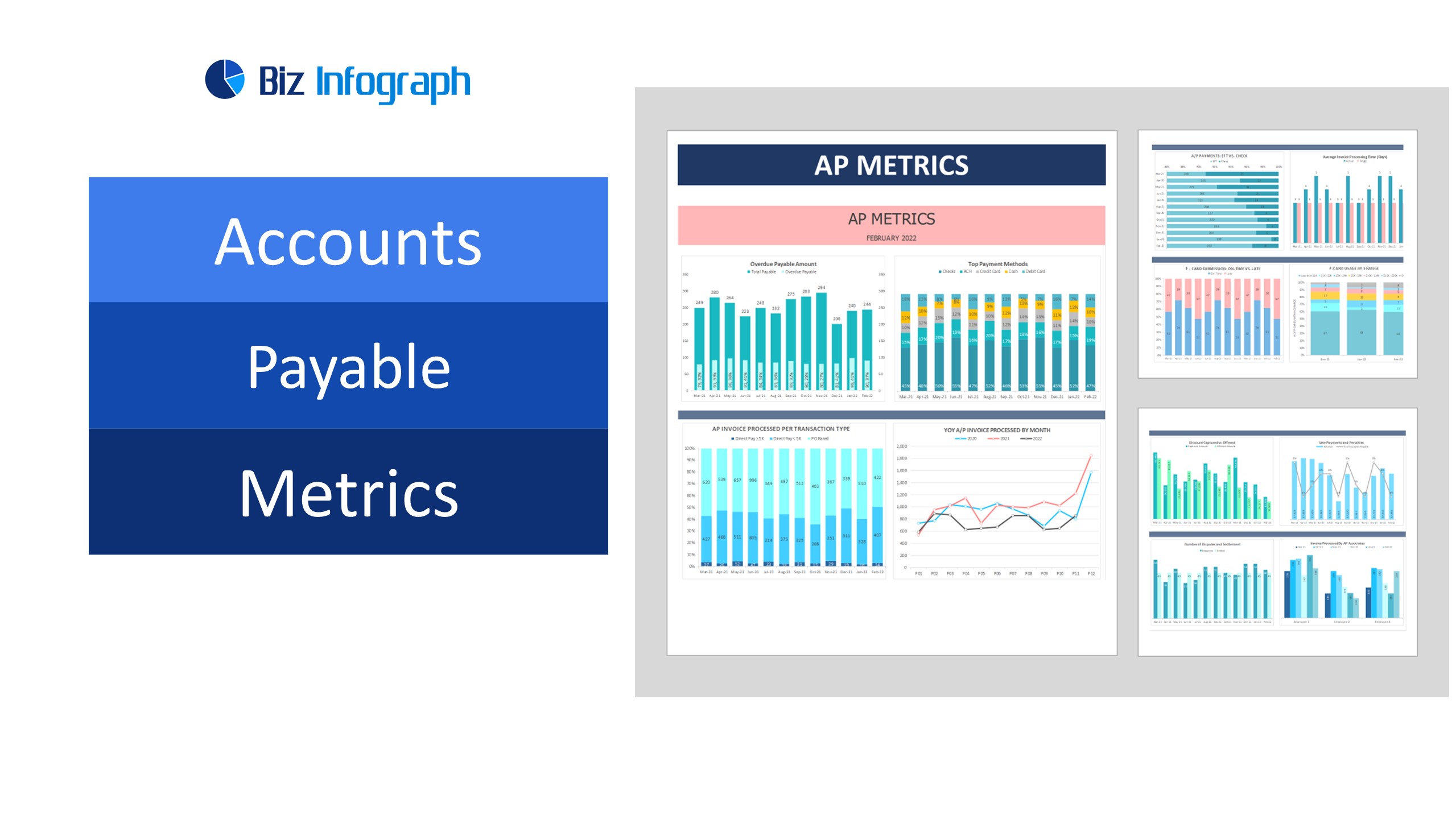
For ready-to-use Dashboard Templates:
