Timeline Chart in Excel is an essential tool for anyone looking to present time-based data in a clear and comprehensible manner. Whether you’re managing projects, tracking historical trends, or planning future events, a timeline chart can provide a visual representation that makes complex information easier to understand. By incorporating this dynamic tool into your Excel arsenal, you can enhance project management, improve communication, and facilitate strategic planning. In this tutorial, we will see how to create timeline chart to display certain dates in chronological order.
Potential uses of Excel timeline chart
- Project management and scheduling
- Historical analysis and visualization
- Planning and forecasting future events
Creating a Timeline Template in Excel
Please follow the below steps to create a timeline in Excel.
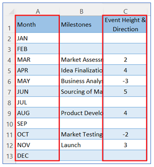
- Take sample data like below table.
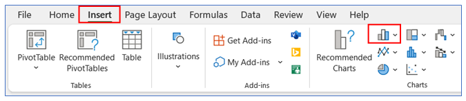
2. Select data of Col A and Col C then go to the ribbon, select Insert, and select your chart type from the chart group.
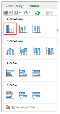
3. Select Chart type as a 2-D column.
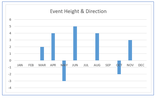
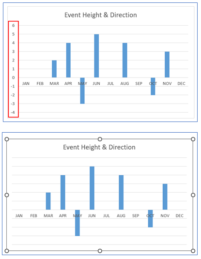
4. Initial timeline graph looks below.
5. To remove the Vertical Axis, Click on Axis then press the delete option.
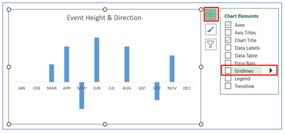
6. To Remove Gridline, click on the chart then select the + button, and uncheck the Gridline.
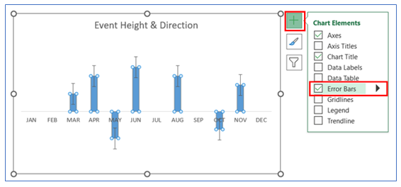
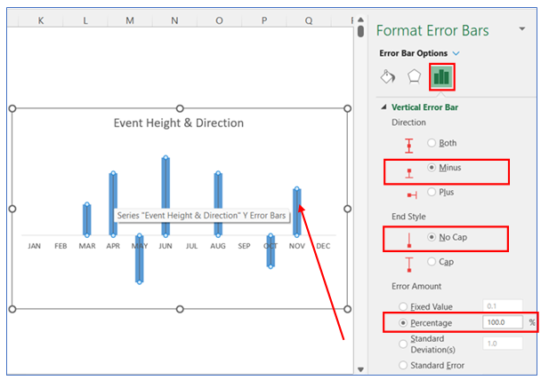
7. To give an Error Bar, click on the chart then select the + button, and check the Error Bar.
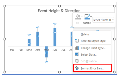
8. To change the error Bar, right-click on Error Bar and select Format Error Bars.
9. Change Error bar options.
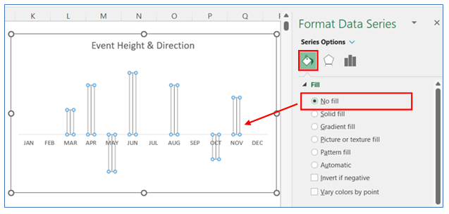
10. To change the color in the bar, right-click on the chart and select Format Data Series, in Format Data Series select Fill and choose No fill.
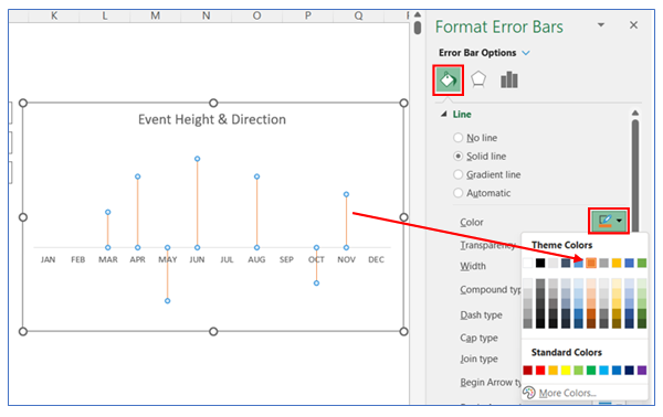
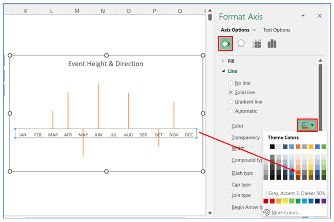
11. To change the Error Bar color, right-click on the error bar and select Format Error Bar, in Format Error Bars select Solid Line and choose your color. Timeline chart excel gets the below shape.
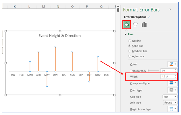
12. After that change the border width to 1.5 pt.
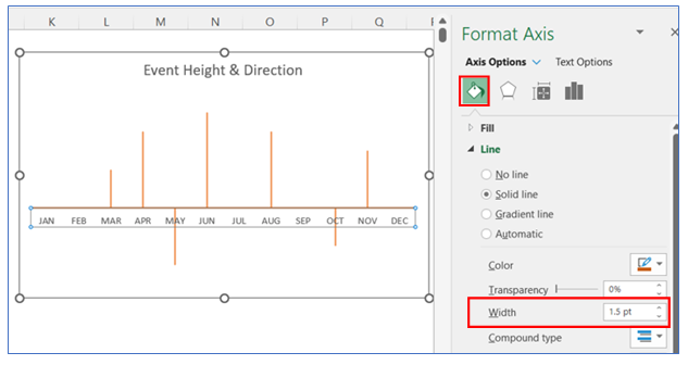
13. To change the horizontal Axis border color, right-click on the Axis and select Format Axis, in Axis Option select Line and choose your color.
14. After that change the border width to 1.5 pt.
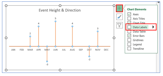
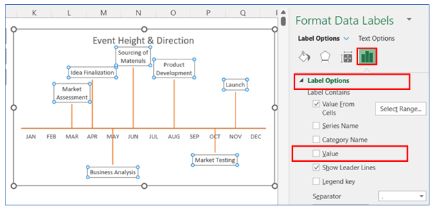
15. To give Data Labels in the chart click on your chart and select the + button to give your Data labels. Select Data labels and click on the More option arrow.
16. After that go to Label Option and Select Value From Cells.
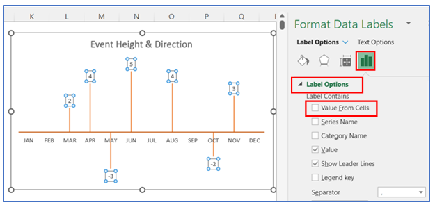
17. Select the data label range (B2:B13) from the sample Data Table.
18. Then uncheck the Value in the Label Option.
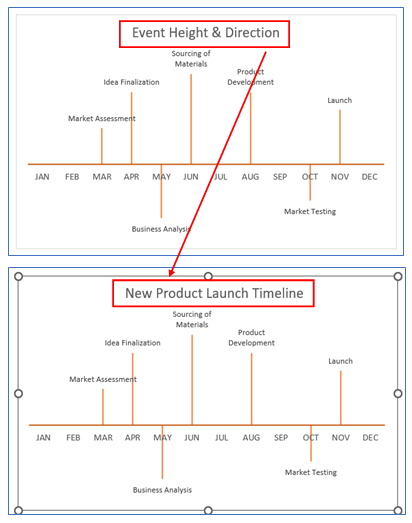
19. To give an appropriate chart title, select the title and write your desired title.
20. To change the horizontal Axis borderline type, right-click on the Axis and select Format Axis, in Format axis select End Arrow Type and choose your arrow type.
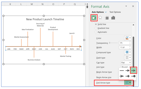
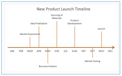
21. The Chart looks below.
To create a timeline chart in Excel, use a Gantt chart for project schedules or a scatter chart with lines to show events over time.
Application of Timeline in Excel
Project Timeline in Excel
Use a timeline chart in Microsoft Excel spreadsheet to visualize project schedules, key milestones, and deadlines, helping teams stay on track and manage time effectively.
Milestone Timeline chart in Excel
- Product Development Tracking: Employ timeline charts to monitor the progress of product development phases, from conceptualization to market launch, ensuring all stages are completed timely.
- Marketing Campaigns: Track the duration and key phases of marketing campaigns with a timeline chart, helping to coordinate various activities and assess their impact over time.
Make a Timeline in Excel for Multiple Purposes
- Educational Timelines: Utilize timeline charts in educational settings to teach historical events, scientific discoveries, or literary timelines, enhancing understanding through visual representation.
- Historical Data Analysis: Create a timeline chart to display historical events or trends over time, providing a clear visual representation of changes and patterns.
- Budget Planning: Visualize budget allocations and financial planning over specific periods using a timeline chart, aiding in fiscal management and forecasting.
For ready-to-use Dashboard Templates:
