

Why are you still spending six hours a week wrestling with cell borders and manual data entry when your peers are finishing their reporting in minutes? It’s a common frustration. You’ve likely felt the sting of a broken formula or the quiet embarrassment of presenting a cluttered, amateurish report to the executive team. We agree that your expertise should be spent on strategic analysis, not on fighting with spreadsheet formatting.
This guide shows you how to reclaim your time and your professional pride. By choosing the right Excel dashboard templates, you can transform raw, overwhelming data into high-impact visual stories that command attention. You’ll discover how to deliver polished, executive-ready reports that update instantly as your data changes, ensuring you always look like the expert in the room.
We’ll explore the latest 2026 features like AI-assisted Copilot analysis and dynamic arrays that make modern reporting effortless. From understanding the shift toward multi-channel data integration to mastering automated charts, this is your roadmap to becoming the productivity partner your organization needs. Let’s turn your data into your greatest professional asset.
Key Takeaways
- Learn how to apply professional visual hierarchy and color theory to guide your audience’s attention toward the most critical KPIs instantly.
- Discover why premium Excel dashboard templates are the ultimate productivity hack, saving you hours of manual formatting while preventing common formula errors.
- Master the specific criteria for selecting high-performance templates that scale with your business data, whether you’re managing hundreds or thousands of rows.
- Follow a streamlined, step-by-step approach to cleaning your data sources and mapping them seamlessly for a polished, executive-ready finish.
- Understand the long-term benefits of using expert-designed tools that offer lifetime updates and automation features to keep your reporting future-proof.
What are Excel Dashboard Templates and Why Do Professionals Need Them?
Imagine walking into a high-stakes presentation with total confidence. You aren’t just showing numbers; you’re telling a compelling story. Many professionals mistake a dashboard for a simple collection of charts, but it’s actually a sophisticated command center. When you use high-quality Excel dashboard templates, you’re adopting a framework designed by experts to guide better business thinking. To truly understand What is a dashboard? from a technical perspective, you have to look beyond the surface. It’s a real-time user interface that bridges the gap between raw data and strategic action.
The “build vs. buy” dilemma often catches people off guard. You might think building a report from scratch saves money, but manual creation is a hidden productivity killer. It’s easy to lose entire workdays to formatting cells and fixing broken links. Pre-made templates eliminate this struggle, allowing you to shine in front of stakeholders with polished, professional-grade visuals. High-quality design signals authority and attention to detail, transforming a standard update into a source of personal pride.
The Core Components of a High-Impact Dashboard
A superior dashboard relies on more than just static images. It uses interactive elements like slicers, timelines, and drop-down lists to create a dynamic reporting experience. This interactivity lets you answer stakeholder questions on the fly by filtering data instantly. A professional template also enforces a strict separation between the data backend and the visual frontend. This keeps your logic clean and ensures your display remains uncluttered. By focusing on specific KPIs, these tools narrow your focus so you can drive meaningful action rather than getting lost in the weeds. If you want to go further with dynamic, stakeholder-friendly reporting, our guide on interactive Excel dashboard templates shows you how to build a three-layered strategic engine that balances data integrity with professional aesthetics.
Efficiency Gains in the 2026 Business Environment
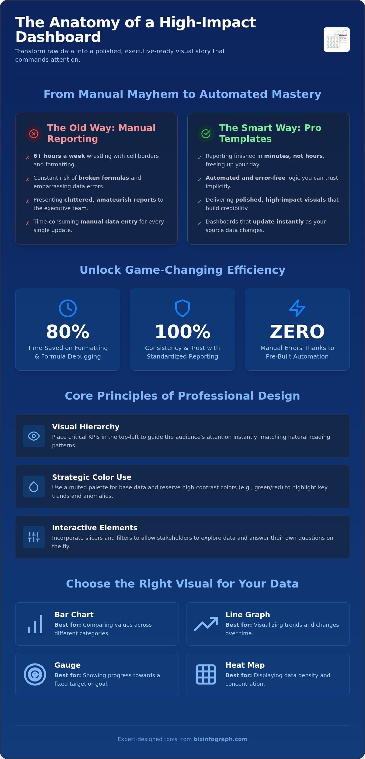
Time is your most valuable asset. Professionals using expert Excel dashboard templates report saving up to 80% of the time they usually spend on formatting and formula debugging. In a fast-paced environment, this efficiency is a total game changer. Standardizing your reporting across different departments ensures everyone is looking at the same version of the truth, which builds organizational trust. For those seeking to integrate these insights into a broader business management framework, you can learn more about Flowgres and its specialized ERP/CRM functions. Because the logic is already automated within the template, you significantly reduce the risk of manual errors. You’ll spend less time fixing cells and more time making the decisions that move your career forward.
The Anatomy of a Professional Dashboard: Design Best Practices
Design isn’t just about making things look “pretty.” It’s about cognitive load. If your audience has to hunt for the point, you’ve already lost them. High-quality Excel dashboard templates prioritize visual hierarchy, ensuring the most critical data points hit the eye first. Usually, this means placing high-level KPIs in the top-left corner, as that’s where western readers naturally start. By structuring your layout this way, you turn a complex spreadsheet into an intuitive presentation tool that drives immediate understanding.
Color theory plays a vital role in signaling trends without creating clutter. Use a muted palette for standard data and reserve high-contrast colors, like a bold red or deep green, to highlight anomalies. This prevents “spreadsheet chaos,” where every cell competes for attention. Professional design follows the “less is more” principle; if a visual element doesn’t help someone make a decision, it shouldn’t be there. This focus on clarity is why many leaders prefer professional dashboard solutions that have been stress-tested for readability.
Choosing the Right Visuals for Your Data
Selecting the wrong chart type is a common pitfall. For example, use Gauges only when you have a fixed target, like a budget or a sales goal. If you need to compare different categories, a Bar Chart is almost always superior. Line graphs are your best friend for visualizing trends over time, provided you keep them clean and avoid overlapping too many data series. When dealing with geographical or density-based data, Heat Maps offer a sophisticated way to show where your business is winning or losing at a glance. To see how these chart types come together in practice, browse our curated professional excel dashboard examples that showcase best-in-class designs across multiple business functions. It just works.
User Experience (UX) in Excel
A great dashboard shouldn’t require a manual to use. Focus on intuitive navigation by grouping your slicers and filters in a dedicated sidebar. This makes it easy for non-technical users to slice the data without accidentally breaking a formula. Consistent labeling and clear legends are non-negotiable; they eliminate the “what am I looking at?” confusion that plagues amateur reports. The Data-to-Ink Ratio is a vital metric for dashboard clarity that measures how much of your visual design is dedicated to actual data versus unnecessary decorative elements. By stripping away redundant gridlines, you ensure the numbers take center stage.
Don’t forget how your work looks on a tablet or a laptop during a remote meeting. Professional templates use scalable layouts that maintain their integrity regardless of screen size. This ensures your hard work looks just as polished on an executive’s widescreen monitor as it does on your own laptop. You’ll feel a sense of relief knowing your presentation is technically flawless across every device.
Evaluating Excel Dashboard Templates: A Buying Guide
Choosing the right tool is the difference between a seamless workflow and a technical nightmare. When you’re browsing for Excel dashboard templates, you need to look beneath the surface. Does the template scale? While Excel supports over 1 million rows per worksheet, many poorly designed templates crawl to a halt after just a few hundred. You need a solution that remains snappy and responsive as your business grows. Automation is another critical factor. You want a “plug and play” experience where you paste your data and the charts update instantly, rather than a tool that requires you to manually rewrite formulas every month.
Customization should be effortless. A professional template allows you to swap in your brand colors and company logo in seconds, ensuring the final report feels like an organic part of your corporate identity. Finally, consider the long-term relationship. Choosing a provider that offers free lifetime updates gives you total peace of mind. It’s a relief to know that as Excel evolves with new features in 2026, your reporting tools will stay current without extra costs.
Key Categories for Business Growth
- Sales and Revenue Dashboards: These are essential for tracking conversion rates and growth against specific targets. They turn abstract numbers into clear visual progress.
- Project Management Dashboards: Use these to visualize milestones and resource allocation. They help you spot bottlenecks before they derail your timeline.
- Operations and HR Dashboards: Monitor departmental health and efficiency. These tools provide the high-level oversight needed to manage a modern workforce effectively. For field-based operations like site inspections, you can also use PHOTO iD to automate photo labeling and organization; click here.
Technical Red Flags to Avoid
Don’t let a beautiful interface mask technical flaws. One major red flag is a locked sheet. If you can’t make minor adjustments to labels or layout, the template will eventually become a cage. You should also be wary of an over-reliance on complex VBA or Macros. These often trigger security warnings in corporate environments, which can be a source of frustration during high-stakes presentations. Finally, check the documentation. If the data structure isn’t clearly explained, troubleshooting becomes impossible when things go wrong. Choosing expert-designed Excel dashboard templates ensures you avoid these pitfalls while maintaining total control over your data story.
How to Implement and Customize Your New Template
Setting up your new reporting tool shouldn’t feel like a coding bootcamp. You want a solution that works right out of the box, without the headache of fixing broken logic. High-quality Excel dashboard templates are built with robust, expert-level formulas, so you don’t have to worry about the errors that often plague low-quality freebies. Implementation is a straightforward, empowering process that moves you from raw numbers to high-impact visuals in just a few minutes. It’s about working smarter, not harder.
Data Cleaning Essentials
Your dashboard is only as good as the information you feed it. Before you import your numbers, take a moment to clean your data source. Start by removing duplicate entries and handling missing values that could skew your averages or totals. Consistency is key here; ensure all dates follow the same format and currency symbols are standardized across the entire set. A smart pro-tip is to always maintain a dedicated “Raw Data” tab in your workbook. This preserves your original records, giving you a safe backup to return to if you need to re-map fields or troubleshoot your logic later.
Mapping your data is where the transformation truly begins. Most professional templates utilize Excel Tables to ensure your data ranges are dynamic and expand automatically as you add new rows. You simply paste your cleaned data into the designated fields and watch your charts populate instantly. Once the data is in place, test the interactivity. Click through your Slicers and Filters to confirm every visual updates as expected. This verification gives you the confidence to know your dashboard will perform flawlessly during a live presentation. If you want to go deeper into building these systems from the ground up, our comprehensive guide on how to create a dashboard in Excel walks you through the complete three-tier architecture of Data, Logic, and Visuals.
The final polish is what makes the report truly yours. Take a minute to add your corporate logo and adjust the color palette to match your company’s branding. This bespoke look transforms a standard spreadsheet into a high-end professional report that you can present with genuine pride. If you’re ready to reclaim your schedule, explore our premium Excel dashboard templates and start delivering executive-ready insights today.
Bridging the Gap to Presentations
Your data stories often need to travel beyond a single spreadsheet. You can easily export your Excel visuals into high-impact slide decks for board meetings or quarterly reviews. By maintaining live data links between Excel and PowerPoint, your slides will update automatically whenever the underlying data changes. This saves you from the tedious “copy-paste” cycle that eats up so much time. To take your visual storytelling to the next level, read our companion piece on High-Impact PowerPoint Infographic Templates: The 2026 Professional Guide. It’s the perfect way to ensure your entire presentation matches the high standard of your data analysis.
Why Biz Infographs is Your Expert Productivity Partner
Why settle for generic spreadsheets when you can command the room with executive-grade visuals? Biz Infographs operates as your dedicated productivity partner, bridging the gap between complex data and clear communication. We understand that your time is better spent making strategic decisions than troubleshooting cell references. Our philosophy is simple: we want to transform your daily data frustrations into a source of genuine professional pride. By providing best-in-class Excel dashboard templates, we empower you to step into the role of an expert facilitator who delivers clarity in every meeting.
Our templates win on both aesthetics and functionality because they’re designed by data visualization specialists, not just spreadsheet hobbyists. We know that many organizations require you to stay within the Microsoft ecosystem for security, preference, or compliance reasons. You don’t need to migrate to a complex new SaaS platform to get high-end results. You just need tools that unlock the full potential of the software you already use every day. With our focus on sophisticated design, your reports will finally match the high standard of your insights.
Software evolves quickly, and your tools should keep pace. In August 2026, as Microsoft 365 continues to roll out new features and builds, you need the assurance that your reporting won’t break. We provide free lifetime updates for all our products, ensuring your investment grows alongside the software. This commitment to excellence means you’ll always have access to the latest automation features and design trends without ever paying for the same tool twice. It’s the ultimate peace of mind for a busy professional.
Beyond the Spreadsheet: A Holistic Visualization Suite
Great data often needs a great stage. While our Excel dashboard templates handle the heavy lifting of analysis, they’re designed to integrate seamlessly with our broader library of resources. You can easily pair your data visuals with our professional infographic templates to create a cohesive narrative across your entire organization. We offer a comprehensive suite of automation tools and specialized business charts that go far beyond standard Excel defaults. This holistic approach ensures that global leaders have everything they need to visualize success at every level of the business. For professionals who want to move beyond static reporting, our in-depth resource on mastering interactive Excel dashboard templates covers how to automate updates and engage stakeholders with dynamic, self-service reporting tools.
Ready to Shine in Your Next Meeting?
There is a specific kind of emotional relief that comes from having your reporting “done and dusted” hours before the deadline. When you aren’t rushing to fix formatting at the last minute, you can focus on your delivery and your message. Using professional templates doesn’t just save time; it elevates your personal brand within your company. You’ll become known as the person who provides the most clear, actionable, and visually stunning updates in the department. Are you ready to transform your workflow? Explore our collection of professional Excel dashboard templates and experience the confidence that comes with expert design.
Transform Your Data into Your Competitive Advantage
Mastering visual hierarchy and choosing the right chart types isn’t just about aesthetics; it’s about making faster, smarter decisions. By automating your reporting process, you reclaim hours of your week and eliminate the stress of manual errors. High-quality Excel dashboard templates provide the framework you need to move from spreadsheet frustration to presentation pride. It’s time to stop fighting with cells and start leading with insights. You’ve already done the hard work of gathering the data; now let it work for you.
You deserve tools that match your professional ambition. We provide professional, executive-ready designs that are available for instant download the moment you need them. Because we offer free lifetime updates, your reporting suite will continue to grow and evolve alongside the latest software builds. This ensures your workflow remains efficient and your visuals stay cutting-edge without any extra effort on your part. For inspiration on what’s possible, explore our excel dashboard examples across ten high-impact business functions to see how leading professionals are transforming their reporting in 2026.
Ready to command the room? Elevate your data with professional Excel Dashboard Templates and experience the relief of effortless, high-impact reporting. You have the expertise to succeed, and we’re here to ensure you shine in every presentation. Step into your next meeting with total confidence.
Frequently Asked Questions
What is the best Excel dashboard template for project management?
The best project management template is one that visualizes milestones, timelines, and resource allocation in a single view. You want a tool that provides a high-level overview of project health while allowing you to drill down into specific tasks. Professional Excel dashboard templates for project management should include automated Gantt charts and status indicators to help you spot bottlenecks before they derail your timeline.
Do I need advanced Excel skills to use professional templates?
You don’t need to be an expert to get professional results. These templates are built by data visualization specialists who handle all the complex formulas and logic for you. Your primary role is to paste your data into the designated fields. This “plug and play” approach allows you to deliver executive-ready reports without spending years mastering advanced spreadsheet functions or VBA coding.
Can I customize the colors and fonts in a pre-made Excel dashboard?
Yes, you can fully customize the aesthetics to match your corporate identity. Professional templates allow you to change colors, fonts, and logos in just a few clicks. This flexibility ensures your reporting feels like a seamless part of your brand. It’s a great way to build professional pride and ensure your work looks bespoke and polished during high-stakes internal presentations. It just works.
How do I update the data in an Excel dashboard template?
Updating your report is a simple, three-step process. First, clear the old records from the “Data” tab. Second, paste your new cleaned data into the same table. Finally, go to the “Data” ribbon and click “Refresh All” to see your charts update instantly. This streamlined workflow saves you hours of manual formatting every month, letting you focus on analyzing the actual results.
Are these templates compatible with both Windows and Mac versions of Excel?
Our Excel dashboard templates are fully compatible with both Windows and Mac versions of Microsoft 365. Since they utilize standard Excel features like PivotTables and Slicers, they maintain their functionality and visual integrity across different operating systems. This cross-platform compatibility ensures that everyone on your team can access and update the reports regardless of the hardware they use for daily tasks.
What is the difference between an Excel dashboard and a Power BI report?
Excel is ideal for flexible, familiar data analysis, while Power BI is built for massive datasets and web-based sharing. Excel remains the go-to choice for many because it’s accessible on millions of computers and doesn’t require extra software licenses for basic reporting. If your organization is ready to scale beyond Excel’s capabilities, exploring Power BI dashboard templates can help you determine the right tool for your reporting needs. If you need a tool that’s easy to customize and widely understood by your colleagues, an Excel-based solution is often the most efficient path.
How do I ensure my dashboard charts update automatically?
Automation is achieved by using Excel Tables for your data source. When you paste new information into a Table, the range expands automatically. To update the visuals, you simply click the “Refresh All” button. This ensures your charts always reflect the most current records without you having to manually adjust chart data ranges or rewrite complex lookup formulas every time your numbers change.
Can I use these Excel dashboards in my PowerPoint presentations?
You can easily integrate your dashboard visuals into PowerPoint by using the “Paste Special” feature. By selecting “Paste Link,” your slide deck remains connected to your Excel file. This means any changes you make in your dashboard will update your presentation slides automatically. It’s a total game changer for quarterly reviews, saving you from the tedious cycle of re-copying and re-pasting charts every single month.
28 replies on “The Ultimate 2026 Guide to Excel Dashboard Templates: Choosing Professional Efficiency”
[…] departments often find themselves bridging the gap between traditional Excel dashboard templates and the dynamic power of BI tools. Modern templates automate P&L statements and balance sheet […]
[…] values, or a gauge chart for a quick pulse check on a single metric. Integrating specialized Excel Charts into your workflow ensures maximum clarity. Remember, the goal isn’t to show every piece of […]
[…] want to move away from manual tracking and embrace professional efficiency, utilizing specialized Excel dashboard templates for project reporting can save your team dozens of hours every month. These tools ensure that […]
[…] process that yields immediate results. You can start by mapping your existing data to Excel dashboard templates for rapid deployment across your sales, HR, or finance teams. For the ultimate executive […]
[…] list automatically. This significantly improves the user experience, especially when using complex Excel dashboard templates where speed is essential. For those on older versions, you can achieve a similar result using the […]
[…] versions simply can’t match. For a comprehensive breakdown on making the right choice, see The Ultimate 2026 Guide to Excel Dashboard Templates to learn how professional efficiency can elevate your reporting […]
[…] or broken links. For a deeper dive into making the right choice for your career, check out our Ultimate 2026 Guide to Excel Dashboard Templates. It offers a comprehensive look at how professional design drives better business […]
[…] Excel dashboard templates demand clean data because excellence shouldn’t be built on a shaky foundation. When you […]
[…] reporting rhythm. You can easily integrate these visuals with data-heavy elements from Excel dashboard templates to create a comprehensive narrative. Whether you’re presenting via a remote screen share or […]
[…] step-by-step. However, when you need to perform deep-dive analysis or complex financial modeling, Excel dashboard templates provide the analytical muscle you require. Excel is the gold standard for ad-hoc analysis, handling […]
[…] modules to track your unique business KPIs. This balance of efficiency and flexibility is why Excel dashboard templates have become the preferred choice for professionals who need high-impact results without high costs. […]
[…] infographics within your spreadsheet to highlight expense trends. Leveraging professional Excel dashboard templates allows you to track P&L performance in real-time. This visual clarity transforms a standard […]
[…] serves as a massive head start. If you’re looking for a baseline of efficiency, our guide on Excel dashboard templates explains how these automated frameworks can transform your daily workflow and eliminate the […]
[…] boardroom discussion. For those moments when you need to perform a granular, deep-dive analysis, Excel dashboard templates remain the gold standard for flexibility and detail. They allow you to manipulate data without […]
[…] you can leverage Excel dashboard templates to create custom financial models that reflect your unique business logic. This offline control […]
[…] remains the global industry standard for operational tracking and deep-dive analysis. High-quality Excel dashboard templates allow for interactive “what-if” scenarios that static slides simply can’t match. […]
[…] PowerPoint wins the pitch, Excel and Power BI win the long-term execution. Using professional Excel dashboard templates allows for monthly tracking of your business plan progress against actual performance. This is […]
[…] current reporting needs. If you’re focused on operational tracking or departmental KPIs, our Excel dashboard templates provide a perfect entry point for mastering data efficiency. From there, you can expand into our […]
[…] You shouldn’t have to rebuild your charts every time the data changes. Using professional Excel dashboard templates allows you to feed your slides with live, accurate data directly from your spreadsheets. This […]
[…] represent the underlying numbers. To achieve this, many of our users link their visuals to Excel Dashboard Templates. This connection allows for real-time updates and ensures your story evolves as your data does. […]
[…] a balanced view of the path ahead. By connecting these qualitative SWOT findings to data-driven Excel dashboard templates, you provide a holistic view of project health. This combination of visual storytelling and hard […]
[…] breaking the underlying grid or alignment. For those managing complex, live datasets, linking your Excel dashboard templates directly to your infographic slides ensures your visuals update in real-time. This saves hours of […]
[…] widths or re-centering text labels. Equipping your departments with professionally engineered Excel dashboard templates guarantees that data-ink ratios, accessible contrast scales, and standardized typography remain […]
[…] provide a specialized range of Excel dashboard templates available for immediate download. These tools are built to handle the complexities of 2026 business […]
[…] Choosing an expertly built mortgage calculator excel template bridges the gap between fast answers and deep strategic modeling. To explore how pre-configured tools transform analytical workflows, check out The Ultimate 2026 Guide to Excel Dashboard Templates: Choosing Professional Efficiency. […]
[…] customer lifetime value. To eliminate the guesswork of configuring complex reporting models, review the ultimate 2026 guide to Excel dashboard templates to see how pre-built layouts automate precise chart selection and ensure clean visual balance […]
[…] Consider a spreadsheet-based option when the team already uses Excel to organize, review, or share reporting data. Before selecting one, check how its source data should be arranged, whether calculations rely on formulas, and whether the file is compatible with the Excel versions your users have. For more comparison criteria, read this Excel dashboard template guide. […]
[…] explore PowerPoint infographic templates. If your next step is a software-based view, consider Excel dashboard templates or Power BI dashboard templates as layout starting […]