

How much of your professional life is currently buried in the repetitive drudgery of copy-pasting cells and fixing broken formulas? It’s a common frustration to spend five or more hours every week on manual data entry, only to realize your reports are outdated the second you hit “send.” You know that being a human bridge between data sources isn’t the best use of your expertise, and the persistent risk of human error in those static reports is a constant source of stress that holds you back from true leadership.
You’re ready for a reporting system that works as hard as you do. This guide shows you how to reclaim your schedule by using a professional automation dashboard template to transform stagnant data into a self-updating powerhouse. We’ll explore how to achieve real-time visibility into your KPIs and leverage the latest 2026 trends, such as task-specific AI agents that are now present in 40% of enterprise applications. By the end of this article, you’ll have a clear path to creating visually stunning dashboards that impress your stakeholders while you focus on the high-impact decisions that actually grow your business.
Key Takeaways
- Learn how an automation dashboard template functions as a pre-structured framework to refresh your visuals automatically the moment your data changes.
- Discover the “Dynamic Update” cycle that uses tools like Power Query and Pivot Tables to eliminate the need for manual chart updates.
- Uncover the hidden costs of manual reporting and how automated systems provide the agility needed to stay ahead of outdated, static reports.
- Identify the essential features of professional templates, focusing on visual clarity and scalable data structures that grow with your business.
- Master a 5-step roadmap to transition your raw data into real-time insights through effective mapping and verification logic.
What is an Automation Dashboard Template?
An automation dashboard template is a pre-structured digital framework that automatically updates its visual elements as soon as your underlying data changes. It’s essentially a pre-built ecosystem designed to handle the heavy lifting of data processing so you don’t have to. While a traditional static report is merely a snapshot of a specific moment in time, an automated dashboard functions as a living document. It reflects the pulse of your business in real-time. In a 2026 business environment where data velocity is higher than ever, relying on manual updates is a recipe for falling behind.
The primary goal of this tool is simple: eliminate the tedious, repetitive design tasks and manual chart updates that eat up your week. By using a standardized framework, you ensure that your Dashboard (computing) remains accurate and professional without requiring a graphic designer for every minor change. It transforms you from a data entry clerk into a strategic analyst who spends time on insights rather than formatting cells.
The Three Pillars of an Automated Template
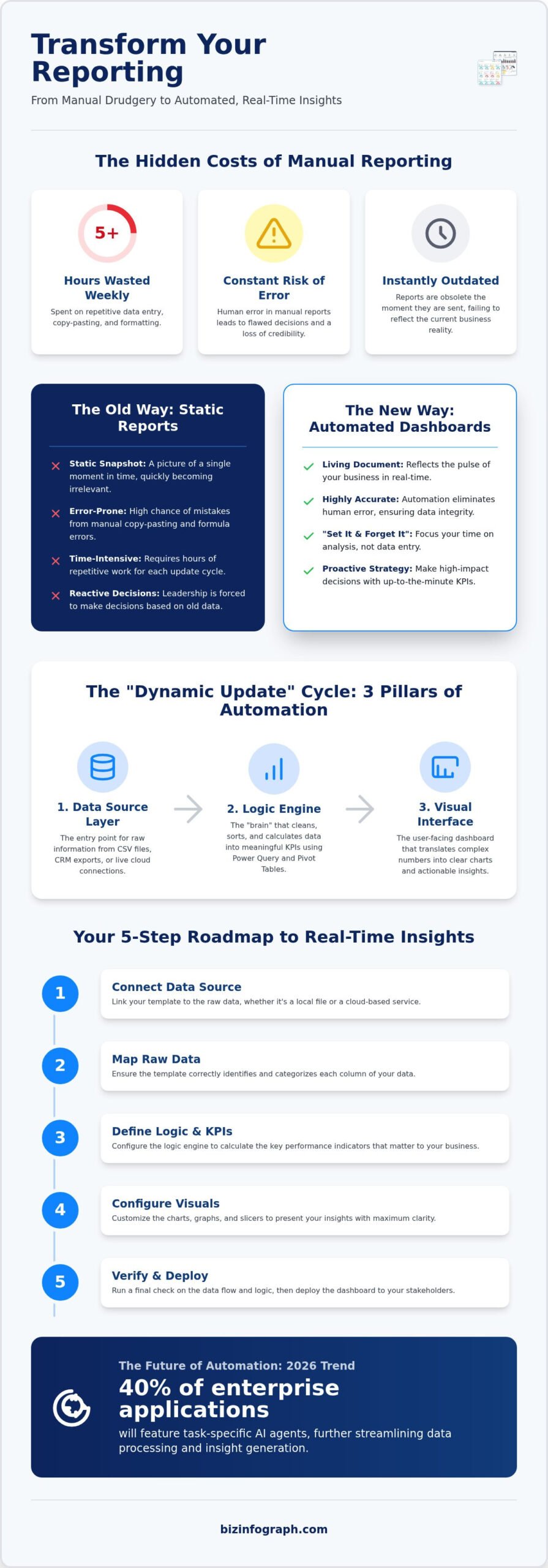
To understand how these tools empower your reporting, it helps to look at their internal structure. Every high-performance automation dashboard template relies on three distinct layers that work in harmony:
- The Data Source Layer: This is the entry point for your raw information. Whether you’re importing CSV exports from your CRM or connecting to live cloud links, this layer ensures the template has the fuel it needs to function.
- The Logic Engine: This is the “brain” of the operation. It consists of hidden formulas, Power Query connections, and pivot tables that clean, sort, and calculate your raw data into meaningful KPIs.
- The Visual Interface: This is the user-facing side that translates complex numbers into actionable insights. It uses professionally designed charts and slicers to make your data easy to digest at a glance.
Why “Template” Does Not Mean “Rigid”
One common misconception is that using a template limits your creativity or forces you into a one-size-fits-all box. Modern tools are built with modularity in mind. You can maintain a standardized, professional structure while still customizing specific modules to track your unique business KPIs. This balance of efficiency and flexibility is why Excel dashboard templates have become the preferred choice for professionals who need high-impact results without high costs. You get a “set it and forget it” system that still looks like it was built specifically for your team.
The Mechanics of Efficiency: How Automated Templates Work
How does a simple file transform into a self-governing engine of insight? The secret lies in the “Dynamic Update” cycle. This three-stage process; Input, Processing, and Visualization; ensures that your data flows seamlessly from its raw state into a polished report. In a high-quality automation dashboard template, these stages are pre-configured so you don’t have to build the architecture from scratch. You simply provide the data, and the template handles the heavy lifting of sorting, calculating, and displaying your results.
For Excel users, the “Logic Engine” we discussed earlier is powered by two heavy hitters: Power Query and Pivot Tables. Power Query acts as a sophisticated filter that cleans and reshapes your data automatically. Pivot Tables then summarize that information into the specific metrics you need to track. When you integrate these with a business intelligence dashboard approach, you create a system that is both powerful and accessible. You don’t need to write a single line of code or master complex programming languages to achieve professional-grade results. The template’s built-in logic does the work for you.
While Excel provides a robust local solution, Power BI templates take automation a step further. These tools often utilize direct API connections to pull data straight from your cloud services in real-time. This means your dashboard can update itself without you even opening the file. Whether you’re using a spreadsheet or a dedicated BI tool, the goal is the same: providing you with a “set it and forget it” reporting system that lets you focus on strategy. If you’re ready to stop building and start analyzing, explore our collection of professional dashboard solutions to find your perfect fit.
Streamlining Recurring Tasks
Reporting cycles often feel like a treadmill of repetitive tasks. Whether it’s a weekly sales update or a quarterly board review, the manual effort remains the same. Automated templates change this by allowing for a single data refresh that updates every chart and table simultaneously. This drastically reduces the risk of human error that occurs when you copy and paste data across multiple sheets. In this environment, data integrity is the assurance that your information remains accurate, consistent, and reliable throughout its entire lifecycle.
The Role of Visual Hierarchy in Automation
Efficiency isn’t just about speed; it’s about clarity. A well-designed template uses visual hierarchy to guide a stakeholder’s eye to what matters most. By using conditional formatting, the system automatically highlights outliers, such as a sudden drop in sales or a spike in web traffic, without you having to manually change colors. This synergy between Power BI dashboard templates and real-time intelligence ensures your audience grasps key trends in seconds. Professional aesthetics aren’t just for show. They build the trust and confidence necessary for fast, informed decision-making.
Manual vs. Automated Dashboards: Why Static Reports are Obsolete
Static reports are essentially dead on arrival. The moment you export a chart to a PDF or paste it into a slide deck, the data is already aging. This creates a “Hidden Cost of Manual Reporting” that goes far beyond just wasted hours. It erodes professional morale and introduces a constant fear of human error. When you’re manually moving data between systems, a single misplaced decimal can ruin your credibility in a high-stakes meeting. An automation dashboard template eliminates this anxiety by creating a direct, reliable link between your raw data and your final visuals.
The agility of an automated system stands in stark contrast to the rigidity of traditional reporting. Static reports offer a flat view of the past, but automated templates provide “drill-down” capabilities. If a stakeholder asks why a specific KPI is lagging, you don’t have to promise a follow-up email next week. You can click, filter, and explore the data right then and there. This aligns with the 2026 trend toward self-service analytics, where stakeholders expect to interact with data rather than just consuming it. By providing these interactive tools, you position yourself as a modern leader who values transparency and speed.
The Comparison: Efficiency and Accuracy
The gap between manual and automated work is widening. Consider the sheer difference in resources required to keep your business insights current:
- Time Investment: Manual reporting typically demands four or more hours of focused labor per cycle. An automated refresh takes less than 10 minutes.
- Data Freshness: Static reports are often weekly or monthly snapshots. Automated systems provide real-time or daily updates, ensuring you’re never making decisions based on “old news.”
- Professional Impact: Manual reports often suffer from inconsistent formatting and varying styles. Templates ensure a consistent, high-end design that reflects a premium brand standard every single time.
Impact on Professional Confidence
There’s a significant psychological shift when you move from being a data “assembler” to a data “analyst.” Having a reliable, automated system allows you to walk into any meeting with total confidence. You aren’t worried about whether you copied the right column; you’re focused on what the numbers actually mean for the company’s future. This “confidence boost” is a natural byproduct of knowing your reporting is both accurate and visually stunning. To handle the most complex, multi-variable datasets without losing this clarity, many professionals turn to interactive excel dashboard templates. These tools provide the sophisticated architecture needed to turn overwhelming information into a source of personal and professional pride.
Key Features to Look for in a High-Performance Automation Template
What separates a professional-grade automation dashboard template from a generic download? It isn’t just about how the charts look on your screen. It’s about how the system behaves under the pressure of real-world data. When you’re selecting a tool to manage your business insights, you need a framework that prioritizes ease of use, scalability, and visual clarity. A template that breaks the moment you add a new row of data isn’t a productivity partner; it’s a technical debt that will eventually slow you down.
Clean data structures are the foundation of any reliable reporting system. The best templates force a level of data hygiene that prevents errors before they ever reach your visuals. In the fast-moving software environment of 2026, lifetime updates are another non-negotiable feature. As platforms like Excel and Power BI evolve, your templates must evolve with them to ensure total compatibility. Additionally, modern decision-makers aren’t always at their desks. High-performance templates incorporate screen-specific design or mobile responsiveness, ensuring your KPIs remain legible whether you’re in a boardroom or checking updates from an airport lounge.
Functional Excellence
Your reporting system should be resilient and smart. Look for templates with built-in data validation features that act as a safety net for your visuals. These tools ensure that your charts don’t break if a user accidentally enters the wrong data type. It’s also vital to ensure the template can handle the specific data volume your business generates without lagging. For example, a high-quality sales dashboard template provides the sophisticated logic needed to handle complex seasonal trends, allowing you to see the difference between a holiday spike and genuine growth. If you’re ready to upgrade your reporting, you can browse our professional dashboard templates to find a solution that fits your needs.
Visual Excellence
While functionality is the engine, visual clarity is the steering wheel that ensures your message reaches its destination. We advocate for a “Red Dot” level of design; authoritative, clean, and entirely professional. This isn’t just about aesthetics. It’s about reducing the cognitive load on your audience. Effective use of color theory and white space guides the viewer’s eye to the most important metrics first. You shouldn’t have to be a graphic designer to achieve this. Seek out “Minimal Design Effort” features where the template handles the heavy styling for you. This allows you to produce high-impact visuals that command respect from stakeholders without spending your entire afternoon on formatting.
Implementing Your Dashboard: From Raw Data to Real-Time Insights
You’ve seen the mechanics and the strategic advantages. Now, it’s time to put these tools into motion. Moving from a manual workflow to a streamlined automation dashboard template doesn’t have to be an overnight overhaul of your entire department. In fact, the most successful implementations follow a structured, five-step roadmap that ensures your new system is both accurate and resilient. This path takes you from the initial data preparation through to a high-impact presentation that commands attention.
The roadmap begins with cleaning your data, followed by selecting the right template for your specific needs. The most critical phase, however, is the “Mapping” stage. This is where your unique business logic meets the template’s pre-built structure. You’ll link your specific data fields; such as “Region” or “Gross Margin”; to the template’s corresponding inputs. This bridge ensures that every time you refresh your data, the calculations remain perfect and the visuals stay aligned with your goals. Once the mapping is set, you simply verify the logic and prepare to present your insights. Finance teams looking to connect P&L statements, balance sheets, and cash flow data will find that a dedicated financial reporting excel template provides the specialized mapping logic needed to keep these interconnected statements accurate and boardroom-ready.
If you’re currently managing large volumes of data across multiple sources, you might find that your needs eventually outgrow a single spreadsheet. While Excel is a fantastic starting point, transitioning to Power BI allows for even deeper levels of automation and cloud-based collaboration. We always encourage professionals to start small. Pick a single department or a specific set of KPIs to automate first. This allows you to build confidence and demonstrate a “quick win” to your stakeholders before scaling the system across the entire organization.
The Setup Process
Success in automation is often determined before you even open your dashboard. Standardizing your raw data to match the template’s input requirements is essential. This means ensuring your date formats are consistent and your category names are uniform. Once your data is imported, perform a test refresh to confirm that the logic engine is processing the information as expected. Finally, don’t forget the professional polish. Customizing the branding with your corporate logos and color palettes ensures the dashboard feels like an integrated part of your company’s high-end identity.
Why Choose Biz Infographs for Your Automation Journey?
We see ourselves as your “Expert Facilitator” in the world of data design. Our templates aren’t just generic files; they’re professional-grade tools designed by experts who understand the nuances of business reporting. Because the software landscape moves fast, we provide free lifetime updates for all our products. This ensures your reporting system stays current and fully compatible as Excel and Power BI evolve. You don’t need to be a developer to shine in front of your audience; you just need the right partner to help you unlock your data’s full potential.
Empower your business reporting with professional automation templates from Biz Infographs.
Reclaim Your Time and Lead with Data
Are you ready to stop being a data entry clerk and start being a strategic leader? Transitioning to a high-performance automation dashboard template is the single most effective way to eliminate the repetitive drudgery of manual reporting. By implementing a “set it and forget it” system, you gain real-time visibility into your KPIs while ensuring your data integrity remains flawless. You’ve seen how professional design and automated logic can transform your workflow from a source of stress into a source of personal pride.
It’s time to trade static, outdated reports for dynamic insights that command attention in the boardroom. Our tools are specifically designed for professional-grade business reporting, offering minimal design effort with maximum visual impact. Plus, with free lifetime updates for all dashboard assets, your reporting system will remain cutting-edge as technology evolves. Take the first step toward a more efficient, empowered professional life today.
Browse our collection of professional automation dashboard templates and start shining in front of your audience. You have the expertise; now you have the tools to prove it.
Frequently Asked Questions
What is an automation dashboard template?
An automation dashboard template is a pre-designed framework that automatically updates charts, tables, and KPIs as soon as your source data changes. It’s a living document. Unlike static reports that require manual recreation, these templates use built-in logic to process raw information into polished visuals. They serve as a powerful productivity partner by eliminating the need for repetitive copy-pasting and formatting, allowing you to focus entirely on strategic insights.
Do I need to know how to code to use an automated template?
You don’t need any coding or programming skills to use these professional tools. Every automated template we provide is built with user-friendly logic that handles complex calculations behind the scenes. Whether it’s Power Query in Excel or DAX in Power BI, the technical heavy lifting is already done for you. This allows you to achieve expert-level data visualization and reporting efficiency without ever having to write a single line of code yourself.
Can I use these templates in both Excel and Power BI?
Yes, we offer dedicated solutions for both platforms to suit your specific reporting needs. We provide high-quality Excel dashboard templates for those who prefer the familiarity of spreadsheets, as well as advanced Power BI templates for users ready for cloud-based, real-time automation. Each version is optimized for its respective environment, ensuring you get the best possible performance and visual impact regardless of which Microsoft tool your organization utilizes.
How much time can I really save with an automated dashboard?
Many professionals report saving five or more hours every week by switching from manual data entry to an automated system. It’s a game changer. Instead of spending half a day copy-pasting values and fixing broken formulas, you can refresh your entire report in just a few minutes. This massive reduction in manual effort translates to more time for analysis and high-impact decision-making, significantly increasing your overall productivity.
What happens if my data structure changes?
If your data structure changes, you simply need to update the Mapping layer of your template. Our templates are designed with modularity in mind, making it easy to point the logic engine toward new columns or adjusted data sources. While the core visual structure remains intact, you have the flexibility to adapt the underlying data connections to match your evolving business requirements. This ensures your reporting system remains a long-term asset.
Are these templates compatible with the latest version of Microsoft 365?
Absolutely. Our templates are fully compatible with the latest versions of Microsoft 365, including Excel and Power BI Desktop. We continuously test our assets against the most recent software updates to ensure seamless performance and total reliability. Because these tools leverage standard Microsoft features like Power Query and Pivot Tables, they remain robust and functional as your software environment evolves, providing a stable platform.
Is it possible to customize the colors and branding of the templates?
Yes, full customization is a core feature of every template we offer. You can easily adjust colors, fonts, and logos to perfectly match your corporate identity and brand guidelines. This allows you to maintain professional aesthetics while ensuring your reports feel like an integrated part of your company’s communication style. We believe high-quality design should be accessible to everyone, giving you the power to create visually stunning dashboards.
Do I get updates if the template is improved in the future?
Yes, we provide free lifetime updates for all purchased templates. As software features evolve or we find ways to improve our designs, you’ll always have access to the latest and most efficient versions of your assets. This commitment to excellence ensures that your investment in an automation dashboard template remains valuable for years to come. You’ll never have to worry about your reporting tools becoming obsolete as the digital landscape continues to change.
One reply on “The 2026 Guide to Automation Dashboard Templates: Streamlining Your Business Insights”
[…] era is ending. Modern finance teams are integrating their financial reporting excel template with automation dashboard templates to create a seamless data flow. This move toward ‘Self-Service’ reporting allows […]