

In 2026, a slide template isn’t just a visual background; it’s a strategic data-storytelling framework that bridges the gap between raw analysis and executive decision-making. You’ve likely felt the frustration of staring at a cluttered spreadsheet, wondering how to turn those rows of data into a compelling narrative without losing your entire afternoon to manual formatting. It’s exhausting to fight with alignment tools and font sizes when your real value lies in the strategy behind the numbers. We understand that pressure to look polished while working at lightning speed.
This guide will show you how to leverage professional slide templates to transform complex KPIs into persuasive stories that command attention in any high-stakes business environment. You’ll discover how to reclaim your schedule by eliminating tedious design tasks while ensuring every deck stays perfectly on-brand. We’ll explore the latest 2026 design trends, from AI-powered layouts to restorative color palettes, giving you the tools to impress leadership and communicate your results with absolute clarity. It’s time to stop building slides from scratch and start leading the conversation with confidence and style.
Key Takeaways
- Learn how professional slide templates act as strategic frameworks to turn cluttered data into persuasive, executive-ready stories.
- Identify the ideal tool for your communication goals by understanding when to use narrative-driven PowerPoint decks versus interactive Power BI dashboards.
- Master the art of visualization by auditing your KPIs to select the perfect chart, map, or timeline for maximum audience impact.
- Simplify complex logic and high-level summaries using high-impact infographic layouts that ensure your message is both clear and compelling.
- Discover how expert-built assets with lifetime updates save hours of manual formatting while helping you shine in front of any audience.
Beyond the Default: Why Professional Slide Templates Are Non-Negotiable in 2026
Professional slide templates are far more than just a collection of attractive colors and fonts; they’re structured frameworks for visual communication. Think of them as your productivity partner that ensures your data doesn’t just sit on a screen, but actually speaks to your audience. When you rely on generic, default options within your presentation program, you’re unintentionally signaling a lack of preparation. This “cost of poor design” is high. It undermines your authority and obscures your message under a layer of uninspiring, cluttered visuals that fail to connect with your stakeholders.
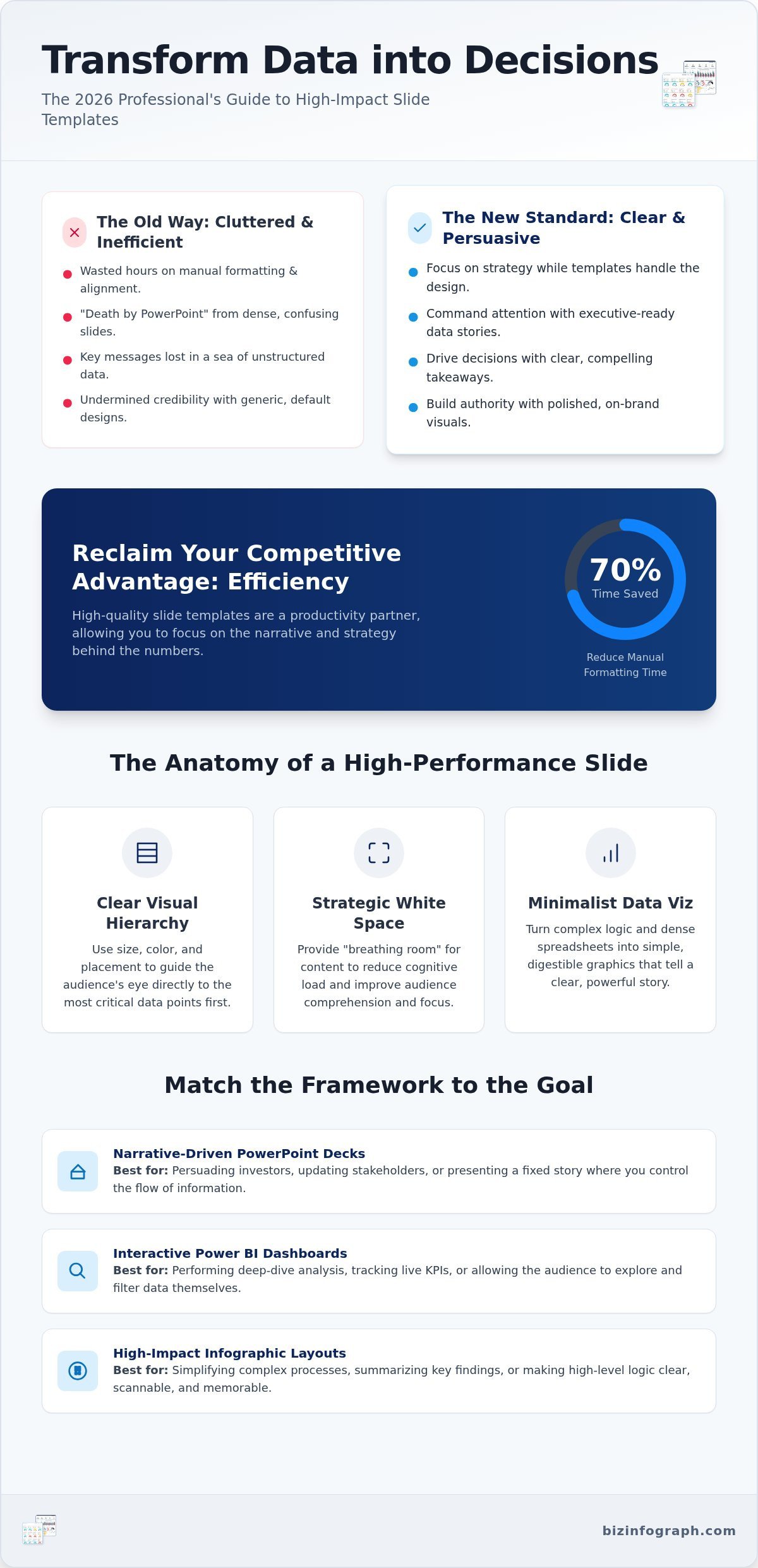
Efficiency is your competitive advantage in a fast-paced corporate world. Industry experts report that using high-quality slide templates can reduce manual formatting time by up to 70%. Instead of wrestling with alignment tools and pixel-perfect spacing, you can focus on refining your narrative and strategy. This isn’t just about saving time; it’s about the psychology of executive decision-making. Aesthetics aren’t superficial. They’re a shortcut to credibility. In high-stakes environments, a clean, sophisticated layout reduces the mental friction required to process your insights, making leadership more likely to trust your conclusions.
The Evolution of Presentation Standards
By 2026, the bar for corporate visuals has moved significantly. We’ve moved past the era of generic clip art and endless, text-heavy bullet points. Modern standards demand functional design where every element serves a specific purpose in the story. Using high-quality business presentation templates allows you to meet these expectations effortlessly. These tools are designed to be “best-in-class,” helping you transition from merely decorating a slide to creating a high-performance communication tool that empowers your audience to see the “why” behind the “what.”
Overcoming “Death by PowerPoint”
We’ve all sat through decks that felt like an endurance test. Over-cluttered slides are the primary culprit of this exhaustion, often referred to as “Death by PowerPoint.” Professional templates solve this by enforcing strict cognitive load management. They guide the viewer’s eye exactly where it needs to go, ensuring your key message isn’t lost in the noise. To maintain engagement, these frameworks prioritize:
- Clear Visual Hierarchy: Using size and color to highlight the most important data points.
- Strategic White Space: Providing “breathing room” so the audience doesn’t feel overwhelmed.
- Minimalist Data Visualization: Turning complex logic into simple, digestible graphics.
By limiting the amount of information per slide and focusing on high-impact takeaways, you ensure your audience walks away with a clear understanding of your goals and a high level of confidence in your expertise.
Navigating the Template Landscape: From Infographics to Data Dashboards
Choosing the right slide templates requires a strategic understanding of your specific communication goals. Are you persuading investors, updating stakeholders on a project, or performing a granular analysis of market trends? Each scenario demands a specific framework. While many platforms offer “pretty” designs, true professional templates focus on functionality. For instance, PowerPoint infographic templates are essential for simplifying complex logic that would otherwise get lost in a sea of text. By categorizing your needs into pitch decks for persuasion, status reports for alignment, and data deep-dives for evidence, you ensure your visuals support rather than distract from your message.
Understanding the difference between static and dynamic templates is equally vital for your workflow. Static templates work best for presentations where the narrative is fixed, while dynamic frameworks allow for interactive elements that can be updated as data changes. Maintaining a consistent structure across these formats isn’t just about branding; it’s about reducing the cognitive effort required for your audience to switch between different departmental reports. When every team uses a unified system, the focus stays on the data, not the design. This consistency builds trust and makes your organization look like a cohesive, high-performing unit.
Infographic-Centric Slide Design
Many professionals struggle to visualize time-based data without it looking like a cluttered list. This is where timeline infographic templates become your secret weapon. They transform chronological events into sleek, easy-to-follow journeys. Beyond timelines, infographics excel at showing hierarchies and relationships without the need for manual drawing. When you need to map out multi-step workflows and operational sequences, a dedicated process infographic template gives you the structured visual framework to turn complex procedures into clear, actionable roadmaps. By adhering to fundamental design principles for slides, you can use professional iconography to bridge communication gaps in global teams. Icons provide an immediate, universal context that transcends language barriers, making your deck accessible to a cross-cultural audience and ensuring your message lands exactly as intended.
Data-Heavy Business Frameworks
Financial reporting and market analysis require a different level of precision. You can’t afford for your numbers to be illegible or misinterpreted. Professional frameworks for data-heavy slides prioritize clarity over decoration. They integrate charts that tell a story, highlighting trends and anomalies rather than just dumping raw figures. To maintain legibility in dense data sets, use high-contrast color palettes and bold typography for key metrics. If you want to see how these elements come together in a professional setting, you can explore specialized infographic solutions designed for high-stakes reporting. These frameworks ensure that even the most complex financial models remain clear and actionable for leadership, helping you shine in every meeting.
Choosing Your Toolset: PowerPoint vs. Excel vs. Power BI Templates
Which tool will make your data shine today? Choosing between a presentation and a dashboard isn’t just about personal preference; it’s about the complexity of your data and the specific needs of your audience. While slide templates are the undisputed champions for narrative-driven storytelling, they aren’t always the right choice for granular, day-to-day monitoring. You need to match the tool to the task to ensure your message lands with maximum impact.
PowerPoint remains the best choice for high-level summaries and executive persuasion. It allows you to control the pace of information, ensuring your stakeholders follow your logic step-by-step. However, when you need to perform deep-dive analysis or complex financial modeling, Excel dashboard templates provide the analytical muscle you require. Excel is the gold standard for ad-hoc analysis, handling smaller datasets with unparalleled flexibility and ease of use.
For organizations managing massive datasets across multiple departments, Power BI dashboard templates offer a more robust solution. As of August 2026, Power BI can handle datasets of 400 GB or more and refresh up to 48 times a day on higher tiers. While sharing features require a subscription of $14 per user per month, the ability to automate report refreshing is a game-changer for large-scale operations. This makes it ideal for real-time visualization where manual updates would be impossible.
The Synergy of Integrated Reporting
Think of your Excel dashboards as the “engine” that powers your slide templates. You don’t have to choose just one tool. Many high-performing teams use Excel for the heavy lifting of data calculation and then export those refined charts into PowerPoint for the final presentation. This integrated workflow streamlines the transition from raw data to a finished narrative while maintaining total data integrity. By keeping your analysis in Excel and your storytelling in PowerPoint, you ensure every figure in your deck is backed by a solid analytical foundation.
Software Compatibility and Version Control
Software updates shouldn’t break your hard work or slow down your progress. When you invest in professional templates, ensuring compatibility across various Microsoft 365 versions is a top priority. A common frustration is the “broken link” syndrome, where complex data connections fail after a software patch or a change in file location. Professional frameworks mitigate this risk by using standardized naming conventions and robust data mapping. This is why we emphasize the value of free lifetime updates. It ensures your assets remain functional as the software landscape evolves. You deserve tools that grow with your business, providing a seamless experience whether you’re presenting on a desktop or a mobile device.
Practical Execution: How to Customize Slide Templates for Maximum ROI
Owning a premium asset is only half the battle. To truly shine in front of your audience, you must know how to tailor your slide templates to reflect your unique data and brand identity. Start by auditing your information. Does your data describe a sequence, a location, or a comparison? Choosing between a timeline, a map, or a chart is your first strategic decision. Once the format is set, apply a consistent color palette that aligns with your corporate branding. This visual unity builds instant recognition and trust with your stakeholders, making your conclusions feel inevitable rather than just suggested.
Don’t fall into the trap of over-explaining your work. Simplify your narrative by sticking to one key takeaway per slide. If a layout requires a paragraph of text, it’s a prime candidate for a high-impact infographic. For multi-step procedures and operational workflows, using a process infographic template ensures your audience can follow each stage of a complex sequence without getting lost in dense explanations. Finally, perform the “back of the room” test. If your smallest font isn’t legible from the rear of a conference hall, you’re losing half your audience. Accessibility isn’t an afterthought; it’s a requirement for effective leadership. By following these steps, you ensure your deck is both beautiful and functional.
Customizing for Brand Alignment
Consistency is the hallmark of a global leader. You can use Master Slides to enforce global changes across your entire deck in seconds, ensuring every slide follows your specific font and margin rules. This saves hours of manual effort. Incorporate your corporate logos and brand-specific typography without disrupting the underlying grid of the template. For those managing ongoing projects, interactive excel dashboard templates play a vital role. They allow you to maintain a branded analytical environment that feeds directly into your presentation, keeping your visuals and your data perfectly in sync.
Visual Storytelling Best Practices
Every slide needs a clear focus. Decide whether you’re presenting a “Hero Image” to evoke emotion or a “Hero Data Point” to prove a fact. Visual Hierarchy is the arrangement of elements to imply importance. Use this principle to create a logical flow that guides your audience through the Problem, the Analysis, and the Solution, ultimately landing on a clear call to action. This structured approach ensures your presentation isn’t just a collection of facts, but a persuasive journey that drives results. If you’re ready to transform your next deck into a high-performance asset, explore our collection of business presentation templates to start building your narrative with confidence.
Elevate Your Performance with Biz Infographs’ Premium Solutions
Biz Infographs stands apart because our tools are crafted by data visualization experts who understand the nuances of business logic. We don’t just provide “pretty slides.” We offer high-quality frameworks that prioritize clarity, impact, and accuracy. When you use our slide templates, you transition from being a simple presenter to an expert facilitator who commands the room. You’ll find that your audience isn’t just looking at your data; they’re finally understanding your vision. Our focus is on helping you turn a common professional frustration into a source of personal pride.
A major frustration in the corporate world is the constant cycle of software updates and shifting design trends. We solve this by offering free lifetime updates. When you invest in our solutions, you’re securing a long-term asset that evolves alongside the latest versions of Microsoft 365. This commitment to professional support means you’ll never have to worry about your decks becoming obsolete or your data links breaking during a critical project. You get the assurance of a global leader with the approachability of a dedicated mentor.
The Productivity Partner Model
Think of our assets as your “Productivity Partner.” Our primary goal is to reduce your manual effort so you can dedicate your energy to high-level strategy and deep-dive analysis. Instead of fighting with pixel alignments, you’ll be refining your insights. By accessing our diverse library of PowerPoint, Excel, and Power BI assets, you empower your entire team to produce consistent, high-end results. This uniformity ensures that every report, whether it’s a financial dashboard or a project status update, maintains the same “best-in-class” standard that leadership expects.
Getting Started with Your Next Deck
Finding the perfect framework for your specific industry shouldn’t be a chore. Whether you’re in finance, marketing, or operations, our categorized library makes it easy to locate the right tool for your specific use case. Our simple download-and-use workflow is designed for immediate impact, allowing you to transform your raw data into a polished narrative in minutes. It’s time to stop struggling with default layouts and start using tools that make you look like the expert you are. Ready to shine? Browse our professional infographic template ppt designs today and experience the relief of effortless, high-performance design.
Take Command of Your Professional Narrative
Your data is too valuable to be hidden behind cluttered, default designs. By choosing strategic frameworks, you’ve learned how to bridge the gap between raw analysis and executive decision-making. Whether you’re simplifying complex logic with infographics or leveraging professional-grade Excel and Power BI integration, your goal is clear: maximum data impact with minimal manual effort. High-quality visual frameworks aren’t just a time-saving tool; they’re your secret weapon for building authority and trust.
It’s time to stop fighting with formatting and start focusing on your strategy. Empower your next presentation with professional slide templates and enjoy the peace of mind that comes with free lifetime updates. You don’t have to settle for uninspiring decks when you have the insights; now you have the tools to make them shine. Step into your next meeting with the confidence of an expert facilitator. Your audience is waiting for a story only you can tell.
Frequently Asked Questions
What are the benefits of using professional slide templates over default ones?
Professional templates provide structured frameworks that enhance authority and clarity. Unlike default options, these assets are designed for minimal manual effort and high-quality data visualization. They help you avoid “Death by PowerPoint” by enforcing cognitive load management and a clear visual hierarchy. This ensures your key metrics are the focal point, allowing you to shine in front of leadership while saving hours on formatting.
Can I use these templates in both PowerPoint and Google Slides?
While our primary focus is on PowerPoint Infographic Templates, most of our designs are highly compatible with Google Slides. You can typically upload the .pptx files directly to your Drive. However, for the best experience with advanced features like automated charts or complex animations, we recommend using the native Microsoft environment. This ensures all interactive elements and data links function perfectly during high-stakes presentations.
How do I ensure my data stays updated in an Excel-linked slide template?
You can maintain data integrity by using our high-quality Excel spreadsheet dashboard integration. When you link your Excel charts to your presentation, any changes made in the spreadsheet will reflect in your slides. This creates a seamless workflow from raw data to final narrative. It’s an efficient way to manage recurring reports without the need for manual copy-pasting, keeping your KPIs accurate and up-to-date automatically.
What is the difference between an infographic template and a standard slide?
Infographic templates prioritize visual storytelling over text-heavy bullet points. While a standard slide might list facts, an infographic uses timelines, hierarchies, and relationships to simplify complex logic. These slide templates are built by data visualization experts to guide the viewer’s eye through a logical flow. They transform boring lists into engaging graphics, making dense information much easier for executive audiences to process and remember.
Are these templates compatible with the latest version of Microsoft 365?
Yes, all our digital assets are fully compatible with the latest version of Microsoft 365, including PowerPoint, Excel, and Power BI. We design our frameworks to work seamlessly across the entire Microsoft ecosystem. Whether you’re using desktop or cloud-based versions, you’ll experience robust performance. This compatibility ensures that your visuals remain sharp and your automation features function correctly regardless of your specific software environment.
How do professional templates help with brand consistency?
Professional templates use Master Slides to enforce global changes across your entire deck. This allows you to apply corporate fonts, logos, and color palettes instantly. By using a unified system, every department produces consistent, high-end results that align with your corporate identity. This uniformity builds trust with stakeholders and presents your organization as a cohesive, high-performing unit where every visual asset meets a “best-in-class” standard.
Do I need advanced design skills to use Biz Infographs templates?
You don’t need any specialized design background to produce professional-grade results. Our slide templates are designed for minimal manual effort, featuring a simple download-and-use workflow. We act as your “Productivity Partner,” providing the expert design frameworks so you can focus entirely on your strategy and analysis. Even if you aren’t a software expert, you’ll find our assets intuitive and easy to customize for any business use case.
What happens if the software updates?
We provide free lifetime updates to ensure your assets never become obsolete. If Microsoft releases a significant software patch or a new version of 365, we update our library to maintain full compatibility. This means your one-time investment continues to deliver value for long-term projects. You’ll always have access to the latest design trends and data management tools, protecting your workflow from the “broken link” syndrome often found in older files.
2 replies on “Master Your Narrative: The 2026 Guide to Professional Slide Templates”
[…] is equally vital for maintaining your authority. Your chosen slide templates should align seamlessly with your corporate branding to maintain a polished, professional finish. […]
[…] dive later. To ensure your next deck is perfectly tailored for impact, browse our collection of professional slide templates and start your journey toward effortless, high-quality […]