

What if an interactive chart needs just one thoughtful control, not a complicated dashboard? Interactive charts in Excel can let colleagues explore the view they need, but choosing the right feature and connecting it to well-structured data can feel like the tricky part. If the workbook changes or someone else opens it, you also want the chart to keep working rather than become another thing to troubleshoot.
Don’t add controls just for show. Start with a clear question the chart should answer, then choose an interaction that makes the answer easier to find. This step-by-step guide shows you how to build a chart that responds to a user’s selection, prepare source data that can grow, and make the result clear and dependable. You’ll compare dropdown-driven charts, PivotCharts, and slicers, learn when each option fits, and find ways to keep the workbook understandable for its next user. Whether you’re building from scratch or considering an Excel chart template to save formatting time, you’ll have a practical path to a polished, maintainable result.
Key Takeaways
- Learn what makes a chart genuinely interactive, and distinguish user-controlled views from charts that simply refresh with new data.
- Connect a dropdown selection to a helper range so interactive charts in Excel display the view a user chooses.
- Compare dropdown charts, PivotCharts, and slicers to find the right fit for your data, audience, and maintenance needs.
- Use a practical checklist to keep chart sources, controls, labels, and workbook behavior clear as data changes.
- Decide whether to build from scratch or start with an Excel resource, and what to check before choosing a template.
What Makes an Excel Chart Interactive, and When Do You Need One?
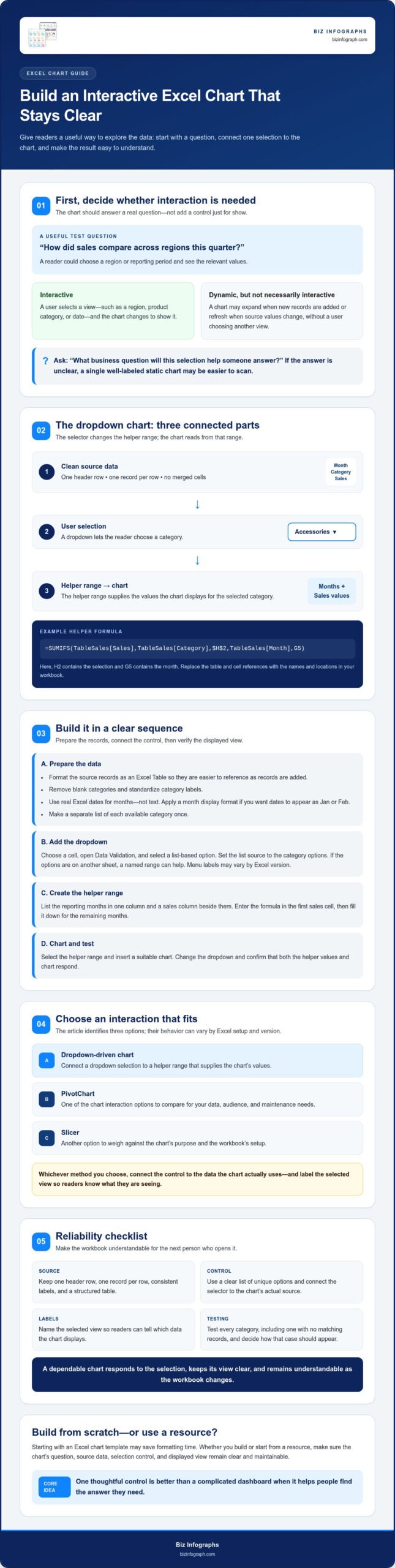
An interactive Excel chart changes its displayed view in response to a user’s selection, allowing them to explore data without rebuilding the chart. For example, a viewer might ask, “How did sales compare across regions this quarter?” They could select a region or reporting period and see the relevant values.
That’s different from animation, which changes a visual over time, and from a chart that simply refreshes when its source values change. A chart that expands as new records are added is dynamic, but not necessarily interactive: the user hasn’t selected a different view. A chart can do both. In either case, design it so the information is easy to interpret, following sound principles of data and information visualization.
What can users control in an interactive Excel chart?
Users can filter by a meaningful field, such as region, product category, or date. Depending on the workbook setup, a selection can change the data range feeding the chart, show or hide a series, or filter a summarized view. For example, a sales chart might let a manager choose “North” or “South” and display monthly sales for that region.
Dropdowns, PivotCharts, and slicers offer different ways to select a view, and their behavior can vary by Excel setup and version. Whichever you use, connect the control to the data the chart actually uses, then label the selected view so readers know what they’re seeing.
When is an interactive chart more useful than a static chart?
Use interaction when people need to explore several useful views of the same dataset, such as comparing sales by region or switching between reporting periods. A control can reduce the need for multiple similar charts and let readers investigate relevant differences themselves.
Keep the chart static when there’s one clear takeaway to communicate. A single, well-labeled chart may be easier to scan than one with an extra control. Before adding an interactive feature, ask: What business question will this selection help someone answer? If the answer isn’t clear, the control may be decoration rather than useful functionality. Build around the question, then choose only the interaction that makes the answer easier to find.
How to Build an Interactive Chart in Excel with a Dropdown
A dropdown-driven chart needs three connected parts: clean source data, a selector, and a helper range that supplies the chart’s values. In this example, the chart shows monthly sales for a selected product category. The sample records use the headers Month, Category, and Sales, with consistent category labels such as Accessories and Equipment.
Prepare the source data and selection list
- Organize the records. Use one header row, one record per row, and no merged cells. Select the data and format it as an Excel Table. This makes the source easier to reference as records are added.
- Check the values. Remove blank categories, standardize labels, and make sure months are real Excel dates rather than text. Apply a month display format if you want dates to appear as Jan or Feb.
- Create the options. In a separate area, list each available category once. A short list of unique values makes the dropdown easier to use and helps prevent mismatched labels.
Connect the dropdown to the chart and test it
- Add the selector. Choose a cell for the dropdown, open Excel’s Data Validation settings, and select a list-based option. Menu labels may vary by Excel version. Set the list source to your category options. If they’re on another sheet, a named range can help.
- Build the helper range. In a nearby area, list the reporting months in one column and add a sales column beside them. In the first sales cell, enter a formula such as
=SUMIFS(TableSales[Sales],TableSales[Category],$H$2,TableSales[Month],G5), where H2 contains the selection and G5 contains the month. Fill the formula down for the remaining months. Replace the table and cell references with the names and locations in your workbook. The functions available may depend on your Excel version. - Create and verify the chart. Select the helper range and insert a suitable chart. Microsoft’s guide explains how to create a chart in Excel. Change the dropdown selection and confirm that both the helper values and chart respond. Test every category, including one with no matching records, and decide how that case should appear.
The selector sets the chosen category, the helper range calculates its values, and the chart visualizes those results. This simple connection is the foundation of many interactive charts in Excel. If you’d rather spend less time formatting, downloadable Excel charts can provide a starting point. Check compatibility and included functionality before choosing a resource.
Dropdown Chart, PivotChart, or Slicer: Which Excel Method Fits?
Choose a control based on how people need to explore the data. A dropdown-driven chart is a focused option for a few predefined views. PivotCharts suit analysis organized through a PivotTable, while slicers provide visible filter buttons for supported PivotTable or PivotChart setups. The right fit depends on your data structure, your audience, and how much workbook maintenance you’re prepared to handle.
| Method | Setup effort | User experience and flexibility | Maintenance |
|---|---|---|---|
| Dropdown-driven chart | Moderate; requires a selector and a linked chart source, often a helper range. | Compact and direct for choosing one item or view. | Check formulas and helper ranges when the source or options change. |
| PivotChart | Requires a suitable PivotTable and chart setup. | Useful for exploring grouped or summarized data. | Refresh and verify the PivotTable and chart as source data changes. |
| Slicer | Requires a compatible PivotTable or PivotChart setup. | Offers visible, clickable filters and can support multiple connected summaries when configured. | Check connections and filter behavior as workbook elements change. |
When should you use a dropdown-driven chart?
Choose a dropdown when the audience needs a small, predefined set of views, such as selecting a department or product category. It keeps the chart focused and works well when a visible filter panel would take up too much space. Label the selector clearly, for example, “Choose a region.” Helper ranges and formulas allow flexibility, but they add elements to maintain. If the option list or source structure changes, review the links and test each selection.
When do PivotCharts and slicers make more sense?
Use a PivotChart when your data suits PivotTable-based grouping, such as summarizing sales by region, product, and month. Add slicers when users would benefit from visible filter buttons rather than a dropdown. Slicers work with supported PivotTable or PivotChart configurations, and availability and behavior can vary by Excel version and object type. Confirm that the workbook supports the connections and filters you need before sharing it.
Whichever method you choose, test the workbook in the Excel environment your audience will use. Change selections, refresh the source where relevant, and confirm the chart still communicates its current view. Also consider users who may rely on assistive technology. Clear labels and an alternative way to understand the data support accessible interactive charts. Testing helps ensure interactive charts in Excel are useful and dependable.
Make Interactive Excel Charts Reliable, Clear, and Easy to Share
A chart can work perfectly on its creator’s computer and still confuse someone opening it for the first time. Before sharing, check both the data connection and the user experience: can a colleague change a selection, understand the result, and open the workbook in their Excel environment?
Excel Tables can help source data expand as you add records, but don’t assume every formula, helper range, or chart reference automatically includes them. Confirm that your formulas and chart source use the Table or otherwise account for new rows. PivotTable-based charts may also need a refresh to reflect changes.
Make the chart self-explanatory. Use a specific title, include units such as dollars or units sold where relevant, and keep the legend and control labels clear. A first-time viewer should be able to tell what the chart shows and what a selection changes without needing a separate explanation.
What should you test before sharing the workbook?
Use this handoff checklist in the Excel version and environment your recipient is expected to use. Features and behavior can vary across versions, so test the actual workbook rather than relying only on how it appears on your computer.
- Test every selection. Try each dropdown option or slicer choice. Check for missing categories, unexpected blanks, and values that don’t match the selected view.
- Add a representative row. Enter a new record in the source, then confirm that relevant formulas, the chart range, and the chart respond as intended. Refresh a PivotTable if the setup requires it.
- Review the presentation. Check titles, units, legends, labels, and control instructions for readability. Look for formula errors and make sure the selected view is clear.
- Reopen the workbook. Save, close, and reopen it in the intended sharing environment. Verify that the controls and charts still behave as expected.
How can you troubleshoot a chart that does not update?
Trace the connection one step at a time. First, confirm that the control changes the intended helper cell or filters the correct PivotTable. Next, inspect the helper formulas, category labels, and chart source range. If the source uses a PivotTable, check whether it needs a refresh. A blank or unexpected result may point to inconsistent labels or missing data. A control that isn’t available or behaves differently may indicate a version or object limitation.
Check these possibilities before changing the design. Review current Excel documentation for the feature, then test a small change in a copy of the workbook. This makes troubleshooting more precise and helps protect the version you plan to share. A careful check makes interactive charts in Excel dependable tools, not just polished visuals. If you want to spend less time formatting, explore Excel charts and dashboard templates, and verify compatibility and included functionality before choosing a resource.
Choose Your Next Step: Build from Scratch or Start with an Excel Resource
You’ve mapped out the interaction your chart needs. Now choose the most practical way to create it. Building from scratch gives you direct control over the data structure, formulas, and appearance. A downloadable Excel resource may reduce setup and formatting effort, especially if its layout and functionality already suit your goal. The right choice depends on your available time, how much customization you need, and how closely the resource fits your workbook.
If you’re comparing pre-built options, this guide to Excel dashboard templates can help you decide what to look for.
How do you evaluate an Excel chart template?
Start with the decision the chart should support. A layout designed for a concise trend may not suit a detailed category comparison, and a control is useful only if your audience can understand what it changes. Before selecting a template, check:
- Audience and purpose: Does the chart make the key comparison or trend easy to see?
- Data structure: Can your workbook’s fields, categories, and date formats fit the template’s expected source?
- Editable elements: Can you adjust the labels, chart elements, and other parts you need to tailor?
- Compatibility and functionality: Verify current Excel compatibility and documented features. Don’t assume an interactive control is included just because the resource contains a chart.
A close fit can save formatting time. If the source layout or required interaction differs substantially, building from scratch may be easier to maintain than adapting a template.
When should you consider a dashboard template instead?
A single chart is often enough to answer one focused question. Consider a dashboard template if you need to bring several metrics or views together so readers can review them in one place. Dashboard layouts add decisions about how to group information and which comparisons deserve emphasis. For broader planning, explore this guide to interactive Excel dashboard guidance.
Whether you build from scratch or adapt a resource, make sure the final setup serves the question, fits your data, and works in the Excel environment where it’ll be used. If you want a starting point that can reduce design effort, explore Excel chart resources and review each option’s compatibility and included functionality. With those requirements clear, you can choose a practical, polished, and manageable path to interactive charts in Excel.
Turn Your Data into a Clear, Useful Chart
The strongest interactive charts in Excel start with a clear question and use only the controls that help readers answer it. A dropdown can handle a focused selection, while PivotCharts and slicers can support broader exploration when they fit your data and Excel setup. Whichever method you choose, clean source data and a quick test of selections, updates, and workbook behavior make the result more dependable.
Build from scratch when you want full control over the structure and interaction. If you’d rather spend less time formatting, compare downloadable resources against your needs and confirm compatibility and included features before choosing. Biz Infographs offers downloadable Excel charts and Excel dashboard templates, with free lifetime updates.
Ready to explore a starting point for your workbook? Explore Excel charts and dashboard resources. Choose the approach that fits your data, test it in the environment where it’ll be shared, and create a chart your audience can use with confidence.
Frequently Asked Questions
How do you make a chart interactive in Excel?
Connect a user control to the data that feeds the chart. For a simple approach, create a dropdown with Data Validation, use its selected value in a formula or lookup to populate a helper range, then build the chart from that range. When the selection changes, the helper values and chart respond. The exact formula and available controls can vary by Excel version, so test the finished workbook in its intended environment.
Can you make an Excel chart update automatically when data changes?
Yes, if the chart’s source is set up to include changing data. Formatting the source as an Excel Table can help its structured range expand as you add records, but verify that the chart and any helper formulas actually reference that expanding source. A PivotChart may need its PivotTable refreshed. Automatic updates from changed source values aren’t the same as user-controlled interaction, such as filtering the chart by region.
What is the difference between a PivotChart and a regular Excel chart?
A PivotChart is built from PivotTable data and is designed to visualize grouped or summarized results. Its filters and fields work with the connected PivotTable, making it useful for exploring dimensions such as region, product, or period. A regular chart uses a selected data range or helper range and doesn’t depend on a PivotTable. Choose based on your data structure and how users need to filter or summarize it.
Do you need macros to create interactive charts in Excel?
No. You can create many interactive charts in Excel without macros by combining built-in controls, formulas, helper ranges, PivotTables, PivotCharts, and slicers where supported. For example, a Data Validation dropdown can select a category while formulas update the chart’s helper range. Macros may suit specialized automation, but they add another component to maintain and may affect how a workbook behaves for recipients. Start with built-in features if they meet the need.
Which Excel chart interaction method is easiest for beginners?
A dropdown-driven chart is often a manageable starting point when users need to select from a short, fixed list. The basic setup is a selector, a helper range that responds to its value, and a chart linked to that range. Keep the choices and labels clear, then test each option. If your source is already organized in a PivotTable, a PivotChart or slicer may be more convenient than building helper formulas.
Why is my Excel chart not changing when I select a dropdown option?
Check that the dropdown selection is connected to the helper cell or formula that supplies the chart data. Confirm the formula uses the correct cell reference and matches the category labels in the source exactly. Then verify that the chart points to the helper range, not the unfiltered source. If the chart relies on a PivotTable, refresh it where needed. Also check for blank results, formula errors, or version-specific behavior.
Can interactive Excel charts work in every version of Excel?
Not necessarily. Basic charts and some control methods may be available across many Excel versions, but supported features and their behavior can differ by version, platform, and workbook setup. Test slicers, formulas, and other interactive elements in the environment recipients will use. Before sharing, open the workbook there if possible, try each control, and confirm the charts display correctly. Check current Excel documentation if a specific feature isn’t available.