

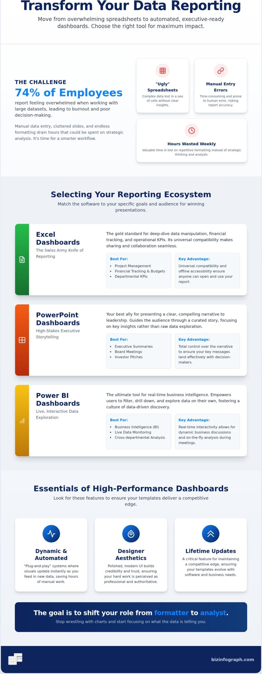
Did you know that 74% of employees report feeling overwhelmed when working with large datasets? According to a 2026 study by Luzmo, the sheer volume of information often leads to professional burnout rather than clear decisions. You’ve likely felt that same frustration, spending late nights on manual data entry and formatting, only to produce reports that fail to impress the executive suite. It’s exhausting to watch your hard work get lost in a sea of “ugly” spreadsheets and cluttered slides.
You deserve a reporting process that builds your professional confidence instead of draining your energy. We believe that high-quality design should be accessible to everyone, which is why we’ve curated this guide to help you transform complex data into professional visual insights instantly. By using the best downloadable dashboard templates for Excel, PowerPoint, and Power BI, you can stop wrestling with software and start delivering impact.
We’ll explore how to implement “plug-and-play” solutions that automate your data visualization and save you hours of manual work every week. From choosing the right platform to mastering executive-ready aesthetics, this guide provides everything you need to shine in front of your audience and reclaim your time.
Key Takeaways
- Learn how to transition from exhausting manual data entry to automated, “plug-and-play” reporting systems that reclaim your weekly work hours.
- Discover the specific strengths of Excel, PowerPoint, and Power BI to ensure you select the ideal ecosystem for your specific executive audience.
- Identify the essential features of high-performance downloadable dashboard templates, including dynamic charts and modern UI principles that update instantly.
- Master a simple two-step implementation process for auditing your data sources and mapping raw information into professional frameworks seamlessly.
- Understand why lifetime updates and designer-grade aesthetics are critical for maintaining a competitive edge in the fast-paced 2026 business landscape.
The Strategic Value of Downloadable Dashboard Templates in 2026
A dashboard template isn’t just a pretty file; it’s a pre-configured data visualization framework designed to organize complex information into actionable insights. As defined in the context of a Dashboard (computing), these tools provide a consolidated view of key performance indicators (KPIs) to help users monitor progress at a glance. In 2026, the strategic value of these tools lies in their ability to bridge the gap between raw data and executive-level decision-making without the need for advanced coding skills.
We’re seeing a massive shift away from manual, static reporting toward automated “plug-and-play” systems. Why waste hours on tedious cell-by-cell entry? High-impact downloadable dashboard templates act as a productivity partner, allowing you to feed in raw data and watch the visuals populate instantly. This isn’t just about convenience; it’s about accuracy. Manual entry is prone to human error, but a templated ecosystem ensures your formulas remain intact and your outputs stay consistent across every report you generate.
Professional aesthetics directly influence how your leadership team perceives your expertise. When a report looks polished and sophisticated, it builds instant credibility and trust. Think of the ROI: hiring a custom designer for a single dashboard can cost thousands, while a professional template offers the same high-end feel for a fraction of that cost. You’re effectively trading a small one-time investment for dozens of hours saved every month, which is a trade every smart professional should make.
Moving Beyond Static Reports
Static PDFs are relics of the past. Modern interactive templates facilitate real-time business discussions by allowing users to filter data and drill down into specifics during a live meeting. This interactivity relies heavily on the psychology of color and layout. We use strategic color palettes to highlight urgent trends and clean layouts to reduce cognitive load on the viewer. Dashboards transform raw numbers into a compelling narrative by visually connecting disparate data points into a cohesive story of business performance.
Efficiency as a Competitive Advantage
Middle management often carries a heavy “reporting burden” that eats into strategic planning time. Standardizing your reporting across departments with downloadable dashboard templates eliminates the confusion of different formatting styles. It creates a universal visual language for your organization. When you stop worrying about whether a chart is aligned or if the font is correct, you finally have the mental space to focus on what the data is actually telling you. That shift from formatter to analyst is exactly where your true professional value lies. To support your growth in these areas, you might find the digital ebook products from DigiFlow to be a valuable addition to your professional library.
Which platform will actually help you win the room? Choosing between Excel, PowerPoint, and Power BI isn’t just about technical preference; it’s a strategic decision based on your audience’s needs. A high-quality introduction to data visualization teaches us that the medium often shapes the message. If you select the wrong ecosystem, even the most brilliant insights can fall flat. By matching your goals to the right software, you ensure your downloadable dashboard templates work as hard as you do.
Excel Dashboards: The Swiss Army Knife of Reporting
Excel remains the gold standard for project management, financial tracking, and departmental KPIs. It’s the ultimate tool for deep-dive data manipulation because almost every professional already knows how to navigate a spreadsheet. One of its greatest strengths is universal compatibility and offline accessibility. You can work on your report during a flight or send an Excel file to a client across the globe, and they can open it instantly without needing a specific cloud subscription. For those ready to level up their skills, exploring interactive excel dashboard templates can turn a standard sheet into a powerful, automated reporting engine that feels like custom software.
PowerPoint and Power BI: Presentation vs. Exploration
PowerPoint is your best ally for high-stakes executive storytelling. When you have twenty minutes to convince a board of directors, you don’t want them getting lost in live data filters; you want a curated narrative that highlights key wins. PowerPoint templates excel at monthly reviews where the “why” matters more than the “how.” On the other end of the spectrum, Power BI is built for enterprise-level exploration. It handles massive datasets and live integrations from multiple sources with ease. While the learning curve for Power BI is significantly steeper than Excel or PPT, it offers unparalleled cross-platform accessibility via mobile apps and web browsers. Using downloadable dashboard templates tailored for these platforms allows you to leverage their power without spending weeks in training.
Which one fits your current project? Most professionals find that a mix of these tools provides the best results. If you want to skip the steep learning curve and start impressing your team today, consider browsing our collection of professional dashboard solutions designed for immediate impact.
Essential Features of High-Performance Dashboard Templates
High-performance templates aren’t just about looking good; they’re about working flawlessly under pressure. When you use downloadable dashboard templates, you’re investing in a system that handles the heavy lifting of data architecture for you. A key feature is the presence of dynamic charts that update automatically as soon as you refresh your data source. This eliminates the risk of presenting outdated figures to your board. According to a study by Luzmo in April 2026, businesses using interactive data visualization tools are 28% more likely to find information quickly than those relying on static dashboards.
Scalability is another non-negotiable trait. Your reporting needs will inevitably grow, and your template should be able to handle larger datasets without slowing down or crashing. High-quality designs allow for easy customization, meaning you can add new categories or KPIs without breaking the underlying formulas. This flexibility ensures your tool remains a long-term asset rather than a temporary fix. It’s about giving you the freedom to adapt as your business evolves, without requiring a degree in data science to make a simple change.
The Importance of Built-in Automation
Automation is the secret sauce of productivity. Features like Power BI slicers and advanced Excel charts reduce the need for manual clicks, allowing you to filter through months of data in seconds. These templates come with pre-set formulas for common business KPIs, which serves as a massive head start. If you’re looking for a baseline of efficiency, our guide on Excel dashboard templates explains how these automated frameworks can transform your daily workflow and eliminate the repetitive tasks that drain your creativity.
Aesthetic Excellence and Lifetime Updates
Visual clarity is just as important as technical accuracy. Following the U.S. Web Design System guidelines, professional templates prioritize accessibility and clean UI to ensure your data is the star of the show. We believe in providing “Free lifetime updates” because the business world moves fast. Software versions change and design trends evolve, but your reports should never look dated. Professional branding on your internal reports builds stakeholder trust, signaling that you value precision and excellence in every detail. It’s about finding that perfect balance where visual pop meets absolute data clarity.
How to Implement and Customize Your Downloadable Dashboard
Ready to see your numbers come to life? Implementation is the bridge between having a tool and having an answer. The process is surprisingly straightforward when you follow a structured approach. By using professional downloadable dashboard templates, you’ve already skipped the hardest part: the architecture. Now, you just need to populate the framework with your unique business data. It’s time to transform that raw information into a source of personal pride.
Follow these five essential steps to get your dashboard up and running in minutes:
- Step 1: Audit for Compatibility. Review your source data to ensure the columns and categories align with the template’s requirements.
- Step 2: Map the Data. Copy and paste your raw information into the designated “Input” or “Data” sheets within the file.
- Step 3: Brand the Visuals. Update the color palette and font styles to match your corporate identity for a custom, high-end feel.
- Step 4: Stress-Test Interactive Elements. Click every slicer, filter, and dropdown to verify that the charts update accurately and instantly.
- Step 5: Finalize the Executive View. Hide any background calculation sheets so your audience sees only the polished, professional results.
Data Cleaning Best Practices
Clean data is the foundation of a reliable report. Before you paste your numbers, take a moment to remove duplicates and ensure every date is in a consistent format. Structured tables are the secret to error-free dashboards; they allow the formulas to expand automatically as you add new rows over multiple reporting cycles. If you keep your data organized, your dashboard will remain a high-performance partner for years to come. It’s a simple habit that prevents “ugly” errors and builds your confidence as a data-driven leader.
Personalizing the Visual Narrative
Your data tells a specific story, and you have the power to make it compelling. Don’t be afraid to adjust chart types if a different visual better represents a specific trend or win. You can easily add corporate logos and thematic colors to make the template feel like a custom-built solution for your firm. For the final presentation layer, many professionals choose to integrate their findings into PowerPoint infographic templates. This creates a seamless transition from deep-dive analysis to high-stakes executive storytelling.
Why spend another weekend wrestling with formatting? You can start delivering executive-ready visuals right now. Explore our full collection of premium dashboard templates and reclaim your work-life balance today.
Elevate Your Reporting with Biz Infographs Solutions
Why continue the exhausting struggle of manual formatting when you can command the room with excellence? Biz Infographs stands as a global leader in professional visualization because we understand that your time is your most valuable asset. We don’t just provide files; we offer a high-quality path to success that transforms a common professional frustration into a source of personal pride. By choosing our downloadable dashboard templates, you’re adopting a modern, effective way of working that positions you as the expert your organization needs.
One of our most significant commitments to your success is our “Free lifetime updates” promise. In a fast-paced market where software versions and design trends shift rapidly, your tools should never fall behind. This assurance means your reports will always maintain a polished, sophisticated air, regardless of how technology evolves. You’re not just buying a template; you’re gaining a long-term productivity partner that helps you transition from a “data gatherer” to a strategic storyteller who influences high-level decisions.
The Biz Infographs Advantage
Every product in our curated library is expertly designed to balance aesthetic excellence with functional logic. Whether you’re managing Sales targets, tracking HR metrics, analyzing Finance reports, or overseeing a PMO, our frameworks are built to handle your specific industry needs. We’ve done the heavy lifting of data architecture so you can focus on the insights that matter. If you’re looking to dive deeper into enterprise-level tools, our Power BI dashboard templates buying guide provides the strategic roadmap you need to master live data integration.
Join the Community of High-Impact Professionals
You’re in good company. Thousands of professionals have used our tools to reclaim their weekly work hours and earn the executive buy-in they deserve. Our users frequently report a newfound sense of relief and professional confidence after implementing our “plug-and-play” solutions. The process is designed for immediate impact; with a simple digital download, you can begin your transformation today. Don’t let another reporting cycle pass with “ugly” spreadsheets that fail to represent your true potential. It’s time to shine in front of your audience and build the professional legacy you’ve worked so hard for.
Ready to experience the difference that world-class design can make? Explore the Biz Infographs Template Library Today and take the first step toward effortless, high-impact reporting with our premium downloadable dashboard templates.
Master Your Data Narrative Today
You’ve seen how the right framework can turn a chaotic spreadsheet into a strategic asset. By moving away from manual formatting and embracing automated downloadable dashboard templates, you reclaim your most valuable resource: time. Whether you choose the deep-dive capabilities of Excel, the storytelling power of PowerPoint, or the live integration of Power BI, your reporting now serves as a reflection of your professional excellence. It’s no longer about just gathering data; it’s about leading the conversation with clarity and confidence.
As professional data visualization experts, we ensure every design is built for high-stakes environments where first impressions matter. Our solutions are trusted by global business leaders and come with free lifetime updates to keep your reports looking modern as software evolves. You don’t have to be a designer to produce world-class visuals when you have a productivity partner in your corner. Take the final step toward professional relief and start delivering results that build your legacy.
Empower your data and shine in your next meeting; explore our professional templates now!
Frequently Asked Questions
What are the best downloadable dashboard templates for Excel?
The best downloadable dashboard templates for Excel are those that combine high-end aesthetics with built-in automation. At Biz Infographs, we offer specialized options for HR metrics, Sales tracking, and Finance. These aren’t just static sheets; they’re productivity partners that use pre-set formulas to update charts instantly. Look for designs that prioritize a clean UI and follow modern data visualization principles to ensure your reports always impress executive leadership.
Can I customize the colors and logos in these templates?
Yes, you have complete control over the visual identity of your reports. Every template we provide is designed for easy customization, allowing you to swap out default colors and fonts for your corporate branding. Adding your company logo takes just a few seconds. This flexibility ensures your dashboards look like custom-made assets while saving you the cost and time of hiring a graphic designer. It’s the perfect way to build professional pride.
Do I need advanced technical skills to use a Power BI template?
You don’t need to be a data scientist or a coder to excel with our Power BI tools. While Power BI has a steeper learning curve than Excel, our templates act as an expert facilitator by providing the underlying architecture for you. You simply map your data to the existing fields. This “plug-and-play” approach allows you to leverage enterprise-level analytics without spending weeks in software training sessions.
Are these dashboard templates compatible with Mac and PC?
Yes, our templates are built for universal compatibility across both Mac and PC platforms. Since they utilize standard Microsoft 365 applications like Excel and PowerPoint, you can work seamlessly regardless of your operating system. This is a significant advantage for global teams who need to share files across different hardware environments. You won’t have to worry about broken formulas or distorted visuals when sending your reports to colleagues or clients across the world.
What is the difference between a dashboard and an infographic?
The primary difference lies in their function and interactivity. A dashboard is a real-time data visualization tool used for monitoring KPIs and making operational decisions. In contrast, an infographic is a storytelling asset designed to explain a specific concept or narrative through static visuals. While dashboards are dynamic and update as your numbers change, infographics are typically used for one-off presentations or educational handouts where the data story remains fixed for the audience.
How do lifetime updates work for digital templates?
We provide free lifetime updates on all our downloadable dashboard templates to ensure they never become obsolete. As Microsoft releases new versions of Office or as design trends evolve, we refresh our files to maintain peak performance and modern aesthetics. When an update is released, you can simply download the latest version from your account at no extra cost. This promise keeps your reporting toolkit current in a fast-paced business market.
Can I integrate these templates with live data sources?
Yes, our Power BI templates are specifically designed for live data integration from multiple sources like SQL, cloud services, and web APIs. Our Excel dashboards also support dynamic data refreshing when you link them to external tables or databases. This capability allows you to move away from manual entry and toward real-time monitoring. It’s an essential feature for professionals who need to make fast, data-driven decisions based on the most current information available.
Are there free dashboard templates available for testing?
We focus on providing premium, professional-grade tools to ensure you receive a robust, error-free system that a free file simply can’t match. Each product page includes detailed screenshots and descriptions so you know exactly what you’re getting before you buy. Investing in a high-quality template ensures you receive the built-in automation and designer aesthetics required for executive-level reporting. It’s a small investment that pays off in dozens of saved work hours.