

Why are you still spending three hours manually drawing arrows and boxes in PowerPoint when your stakeholders are only giving you three minutes to make your point? It’s exhausting to watch a brilliant strategy get lost in a cluttered slide that looks more like a technical manual than a roadmap. You want to feel confident and prepared, not frustrated by the search for a professional process infographic template that actually fits your data. We know that your time is better spent leading your team than struggling with design tools that weren’t built for high-stakes business communication.
Mastering workflow visualization is about more than just aesthetics; it’s about clarity and impact. In this guide, you’ll discover how to choose the right tools to transform complex data into actionable insights that stick. Research shows that using infographics can lead to 84% higher information retention compared to text-only content. We’ll show you how to eliminate manual design fatigue, ensure brand consistency across every department, and build a repeatable framework that earns immediate stakeholder buy-in. It’s time to stop drawing and start delivering results with visuals that make you the most persuasive person in the room.
Key Takeaways
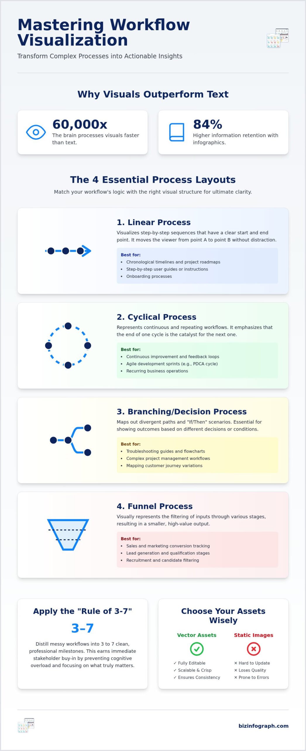
- Stop overwhelming your audience with “death by bullet points” and learn why the brain processes visuals 60,000 times faster than text.
- Identify the four essential layouts to match your specific workflow, whether you’re mapping a chronological timeline or a continuous feedback loop.
- Discover how to select a premium process infographic template that ensures consistent branding and total editability for your entire presentation deck.
- Apply the “Rule of 3-7” to distill messy workflows into clean, professional milestones that earn immediate stakeholder buy-in.
- Learn why vector-based PowerPoint assets provide a strategic advantage over static AI-generated images when it’s time to make last-minute updates.
Why Standard Slides Fail to Explain Complex Business Processes
Have you ever sat through a presentation where the “workflow” was just a list of twelve bullet points? It’s a common professional struggle that leads to immediate disengagement. Cognitive load theory suggests that our brains are simply not wired to process heavy text while listening to a speaker. In fact, research indicates that the human brain processes visuals roughly 60,000 times faster than text. When you force your audience to read through dense paragraphs, you aren’t just boring them; you’re actively creating a barrier to understanding. Standard slides often fail because they treat visual space as a storage container for text rather than a tool for communication.
There is a fundamental difference between a temporary slide and a high-impact infographic poster. A slide often acts as a teleprompter for the speaker; however, a true infographic stands alone as a piece of visual communication. To understand the depth of this medium, one might ask, What is an infographic in a professional context? It’s a blend of data, narrative, and design that guides the viewer through a journey. Manual process design often fails because it lacks this narrative flow, resulting in a “spaghetti” of arrows and boxes that confuse rather than clarify your message.
The High Cost of Poor Process Visualization
Poorly visualized workflows carry a heavy price tag. Think about the hours lost to follow-up emails and “quick calls” just to clarify what was supposed to be explained in the meeting. When your visuals are cluttered or inconsistent, it subtly diminishes your professional authority. You want to be seen as the expert facilitator, not the person who made the project more confusing. Choosing a premium process infographic template helps you avoid these pitfalls by providing a structured layout that prioritizes clarity over clutter. A clear roadmap visual provides a psychological sense of relief for teams. It gives them a “big picture” view that reduces anxiety and helps everyone move in the same direction with confidence.
Moving from Information to Insights
To transform a messy workflow into a clear strategic asset, you must move beyond simple information delivery. You need to decide if your goal is to educate a new hire, persuade a board member, or document a technical requirement. This is where a professional process infographic template becomes your best productivity partner. By using a pre-designed structure, you ensure that visual hierarchy is already baked into your presentation. This guides the viewer’s eye naturally from one milestone to the next. High-quality business presentation templates serve as the foundation for this modern reporting style, allowing you to shine without spending half your day fighting with PowerPoint alignment tools.
The 4 Essential Layouts for Every Process Infographic Template
Choosing a design based purely on aesthetics is a trap that often leads to confusing visuals. A truly effective process infographic template must align with the underlying logic of your workflow. If the visual structure doesn’t match the data’s movement, your audience will struggle to follow the narrative, no matter how modern the colors look. Professional clarity starts with selecting one of these four foundational layouts.
- Linear Processes: These are the workhorses of business visualization, perfect for step-by-step instructions or chronological timelines. They move the viewer from point A to point B without distraction.
- Cyclical Processes: Use these to visualize continuous improvement, feedback loops, and recurring workflows like the PDCA (Plan-Do-Check-Act) cycle. They emphasize that the end of one cycle is the catalyst for the next.
- Branching/Decision Processes: These handle “If/Then” scenarios by mapping out divergent paths. They’re essential for troubleshooting guides or complex project management workflows.
- Funnel Processes: Ideal for tracking conversion stages, lead generation, or resource filtering. They visually represent how a large volume of inputs is distilled into a specific, high-value output.
Selecting the right structure shouldn’t feel like a chore. When you use a high-quality process infographic template, the logical framework is already built-in, allowing you to focus on the content rather than the alignment of arrows and boxes.
Matching Your Workflow to the Right Visual Structure
Context determines whether you should choose a horizontal or vertical linear path. Horizontal layouts are best for standard slides with five steps or fewer, while vertical paths are superior for mobile-friendly content or more detailed, text-heavy workflows. For sustainable business models, circular diagrams are incredibly powerful because they visually reinforce the concept of a closed-loop system. A branching process acts as a roadmap for operational clarity by visualizing complex decision trees where every “If/Then” scenario has a clear, pre-defined outcome. Matching the visual to the logic ensures your team spends less time asking questions and more time executing the plan.
Advanced Structures: Matrix and Pyramid Layouts
Sometimes your data requires more than a simple path. Matrix infographics allow you to show process intersections, such as comparing “Resource Cost” against “Project Impact.” Pyramid structures are the go-to choice for hierarchical workflows or priority-based steps where the foundation supports every subsequent stage. To choose between these, follow the “Golden Rule” of process design: the simplest layout that accurately represents the data is always the most persuasive. If you can’t explain why a step is there, it doesn’t belong on the slide. Using these advanced structures helps you transition from just sharing information to providing deep, actionable business insights.
Strategic Advantages of Using Professional Infographic Templates
Why spend half your morning fighting with PowerPoint’s alignment tools when you could be refining your strategy? Many professionals fall into the trap of using AI tools to generate static images, but these often fail in a corporate setting because they lack editability. A vector-based process infographic template provides a level of control that AI simply can’t match. You can change the text, swap out icons, and adjust colors to fit your brand guidelines in seconds. This flexibility ensures your visuals remain a professional asset rather than a rigid design obstacle.
Consistency is the hallmark of high-performing teams. When every department uses a different style for their workflows, it creates a disjointed experience for stakeholders. By adopting a unified set of digital assets, you maintain a cohesive “look and feel” across your entire deck. This professional polish allows you to mimic the work of a high-end design agency without the associated costs or lead times. It’s about transforming a common source of frustration into a streamlined, repeatable success story.
Template vs. Manual Design: The ROI of Professional Assets
Think about the last time you manually drew a flowchart. If you calculate your hourly rate against the three hours spent nudging boxes, the “free” manual approach becomes incredibly expensive. Professional assets eliminate this hidden cost by providing pre-set color palettes and optimized font hierarchies. You don’t need to be a designer to produce a best-in-class visual; you just need the right foundation. Plus, with free lifetime updates, your process infographic template library stays current with the latest design trends, ensuring your presentations never look dated or amateurish.
The Flexibility of Best-in-Class Digital Assets
Business processes are rarely static. A workflow that has five steps today might have seven steps next quarter. Best-in-class templates are built with this reality in mind, allowing you to add or remove milestones without losing alignment or visual balance. This adaptability is crucial for maintaining a high-performance reporting rhythm. You can easily integrate these visuals with data-heavy elements from Excel dashboard templates to create a comprehensive narrative. Whether you’re presenting via a remote screen share or in a high-stakes boardroom, these slide templates ensure cross-platform compatibility and a crisp, professional finish every single time.
How to Transform a Messy Workflow into a Clean Visual
Are you struggling with a “spaghetti” diagram that has arrows crossing every which way? It’s a common professional headache, but you don’t have to stay stuck in design limbo. Transforming a cluttered workflow into a high-impact visual is a strategic process that begins long before you open a slide deck. By following a structured approach, you can turn a confusing technical manual into a persuasive roadmap that earns immediate stakeholder buy-in. It’s time to move from manual tinkering to expert facilitation.
To achieve professional clarity, follow these five essential steps:
- Distill to Milestones: Apply the “Rule of 3-7.” If your process has more than seven steps, group them into core milestones to avoid overwhelming the viewer.
- Assign Visual Anchors: Give every stage a specific icon or metaphor. This allows for rapid recognition and helps the audience “anchor” the information in their memory.
- Match the Gravity: Select a process infographic template that mirrors the natural direction of your data, whether it’s a horizontal timeline or a vertical hierarchy.
- Use Strategic Color: Don’t just pick colors you like; use them to tell a story. Use bold shades for bottlenecks and calming tones for successful outcomes.
- The Squint Test: Step back and squint at your screen. If the primary path isn’t clear at a glance, your design is still too noisy.
The Art of Information Distillation
Executive-level summaries require you to be a ruthless editor of your own data. You must remove the “noise” and redundant sub-steps that don’t contribute to the primary narrative. Focus on writing punchy, action-oriented labels that start with a verb, such as “Validate,” “Execute,” or “Optimize.” White space is the intentional absence of content that serves as a visual buffer, preventing your audience from feeling overwhelmed by data density. This “breathing room” is what separates a cluttered slide from a best-in-class business visual.
Enhancing Clarity with Icons and Typography
Consistency is your greatest ally when building a visual language. Using a unified icon set ensures that your presentation feels like a cohesive product rather than a collection of random images. When it comes to text, choose sans-serif fonts that remain legible even on large-format infographic posters. If your workflow is strictly chronological, utilizing timeline infographic templates can provide the perfect specialized structure for project-specific milestones. For a deeper dive into building boardroom-ready slides from scratch, explore our comprehensive guide on mastering the infographic template PPT to transform complex data into stunning visual narratives. Ready to elevate your next presentation? Select your professional process infographic template today and transform your complex data into a clear, actionable success story.
Biz Infographs: Empowering Your Next High-Impact Presentation
Why spend your nights fighting with alignment tools when you could be mastering your narrative? At Biz Infographs, we act as your productivity partner, providing the high-end digital assets you need to shine in front of any audience. We believe that high-quality design shouldn’t be a luxury reserved for those with graphic design degrees. By choosing a professional process infographic template from our collection, you’re adopting a more modern and effective way of working. It’s about transforming a tedious chore into a genuine competitive advantage that sets you apart from the competition.
Our commitment to excellence extends across a wide range of professional tools. We don’t just stop at individual slides; we offer a comprehensive ecosystem of digital assets designed for global business impact. Our offerings include:
- PowerPoint Infographic Templates: Vector-based assets that offer total editability and professional polish.
- Excel Dashboard Templates: Tools that turn raw data into visual stories without the manual struggle.
- Power BI Templates: High-performance layouts for those who need deep analytical insights.
- Automation Templates: Streamlined solutions to help you reclaim your most valuable resource: time.
We’ve built these products with a “no-design-skill-required” promise. You don’t need to worry about font hierarchies or color palettes because our experts have already done the heavy lifting. You simply bring your data, and we provide the framework to make it impactful.
Why Global Professionals Choose Biz Infographs
Global leaders trust us because we maintain a “best-in-class” standard that generic free alternatives simply can’t match. Every PowerPoint slide we create is designed for maximum business impact and sophisticated aesthetics. We also understand that business processes evolve, which is why we offer free lifetime updates for all purchased templates. This ensures your visual library remains cutting-edge year after year. Consider the relief of a project manager who realized their workflow changed ten minutes before a major pitch. Instead of panicking, they used our template to swap milestones and update icons in seconds, saving the presentation and winning the contract. That’s the confidence we deliver.
Ready to Shine in Your Next Meeting?
The path to a professional presentation is shorter than you think. Our “Download, Edit, Present” workflow is designed for the busy professional who needs results now. You don’t have to settle for cluttered, text-heavy slides that lose your audience’s attention. It’s time to embrace a more polished, sophisticated way of communicating your most complex workflows. Take the first step toward becoming a more persuasive and effective communicator today. Transform your presentations with Biz Infographs today!
Master Your Workflow Visualization
You’ve seen how standard, text-heavy slides can drain the energy from a room and stall your project’s momentum. By choosing a professional process infographic template, you’re not just making a slide pretty; you’re building a clear roadmap that earns stakeholder buy-in. We’ve explored how matching your data’s logic to the right layout transforms confusion into clarity. Whether you’re mapping a linear timeline or a complex decision tree, the right visual foundation allows you to focus on leading rather than drawing.
Biz Infographs is your productivity partner in this journey. Our digital assets are trusted by professionals worldwide for high-stakes data visualization. Every purchase includes free lifetime updates, ensuring your presentations always meet a best-in-class standard. Stop wasting hours on manual design and start delivering the impact your strategy deserves. Browse Professional Infographic Templates at Biz Infographs and experience the relief of a perfectly executed presentation. You’ve got the vision; we’ve got the tools to help you shine.
Frequently Asked Questions
What is the best format for a process infographic template?
PowerPoint is the most effective format for a process infographic template because it offers vector-based editability. This means you can resize arrows and icons without any pixelation. While Excel is great for data management, PowerPoint allows you to create a more persuasive narrative for stakeholders. It’s the standard for high-impact business presentations where clarity and professional aesthetics are the top priority for the speaker.
Can I use these infographic templates in both PowerPoint and Google Slides?
Yes, you can easily use these assets across both platforms. Most professional templates are created as .pptx files, which are natively supported by Google Slides. You simply upload the file to your drive and start editing. While some very specific PowerPoint animations might require minor adjustments, the core visual structure and branding will remain consistent across both presentation environments.
How many steps should a process infographic ideally have?
The ideal range for a single slide is between three and seven steps. This follows the cognitive “Rule of 3-7” which prevents audience fatigue. If your workflow is more complex, it’s better to group smaller tasks into high-level milestones. This approach ensures your audience can grasp the entire journey at a glance without getting bogged down in the technical minutiae of every sub-step.
Do I need graphic design software like Photoshop to use these templates?
No, you don’t need any specialized design software or technical training to use our templates. We’ve built these assets specifically for busy professionals who use standard Office tools like PowerPoint and Excel. You can edit text, swap icons, and move shapes using the interface you already know. It’s a “no-design-skill-required” solution that empowers you to create agency-level visuals in just a few minutes.
What is the difference between a process infographic and a flowchart?
A flowchart is a technical document meant for deep documentation of every decision point and sub-task. In contrast, a process infographic is a strategic communication tool designed for persuasion and high-level understanding. It uses icons, color theory, and visual hierarchy to tell a story. While a flowchart might be used for a technical manual, an infographic is what you use to earn stakeholder buy-in.
How do I choose between a linear and a circular process layout?
Choose a linear layout for chronological workflows that have a clear beginning and end, such as a project timeline. A circular layout is the best choice for recurring workflows or continuous improvement cycles like the PDCA model. If your process repeats itself or feeds back into the first step, the circular diagram visually reinforces that sustainability and ensures your audience understands the ongoing nature of the work.
Can I customize the colors of the templates to match my brand?
Absolutely. Every element in our templates is fully customizable. You can change the fill colors of shapes, the stroke of the arrows, and the font styles to align perfectly with your corporate brand guidelines. This ensures that your presentation looks like a custom-made product rather than a generic slide. It’s an easy way to maintain professional consistency across every department in your organization.
Why should I buy a template instead of using the free ones in PowerPoint?
Generic free templates often lack the specialized logical structures, such as funnels or matrix layouts, needed for complex business data. When you buy a professional process infographic template, you gain access to best-in-class design quality and free lifetime updates. Our templates are designed specifically for high-impact presentations, helping you save hours of manual work while ensuring your visuals look sophisticated and modern in front of any global audience.