

How much time did you waste last week manually cleaning data just to build a report that nobody actually read? It’s a common frustration for professionals who know their data holds immense value but struggle to present it in a way that truly resonates. When your spreadsheets look unprofessional and stakeholders cannot interact with the numbers themselves, your hard work often goes unnoticed. By implementing high-quality interactive excel dashboard templates, you can bridge the gap between raw data and strategic insight. These tools don’t just save time; they position you as a high-performance productivity partner who delivers clarity in a world of complexity.
You deserve a reporting process that’s as sophisticated as the decisions it supports. We’ll show you how to move beyond static charts and embrace a three-layered strategic engine that balances data integrity with professional aesthetics. In this 2026 guide, we explore how to automate updates, utilize the latest Microsoft 365 AI features like Copilot, and build boardroom-ready visuals that drive faster business results. Get ready to reclaim your schedule and elevate your professional authority through the power of elite data storytelling.
Key Takeaways
- Learn the “Secret Sauce” of professional reporting by separating data, logic, and presentation to ensure your reports scale as your business grows.
- Discover how premium interactive excel dashboard templates bridge the gap between basic spreadsheets and advanced data science without requiring complex coding or manual effort.
- Master the “5-Second Rule” and professional color theory to ensure your stakeholders grasp key trends and critical insights instantly.
- Streamline your 2026 workflow by implementing one-click refresh capabilities that eliminate repetitive manual entry and keep your data current.
- Evaluate the build versus buy calculation to maximize your professional time and focus your energy on high-impact strategic decision-making.
The Evolution of Excel Dashboards in 2026: From Static to Strategic
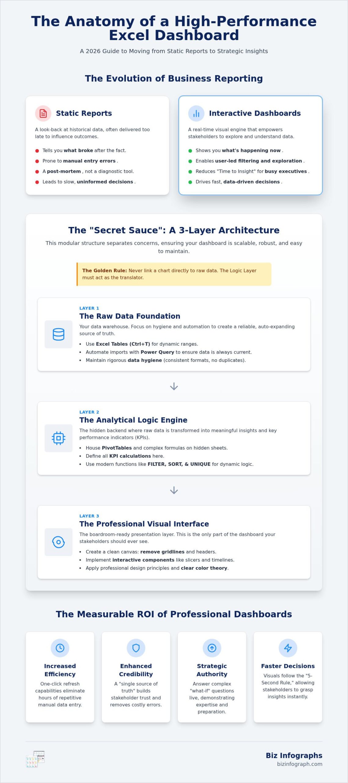
The landscape of data management shifted significantly in 2026. We’ve moved away from the “look back” culture of historical reporting and entered the era of real-time strategic insight. Today, a professional’s value is measured by how quickly they can turn a mountain of data into a clear decision. Understanding what a business dashboard is helps clarify this shift. It’s a single-page decision-making interface that puts the user in control. Excel stays on top because it provides the flexibility to pivot quickly without needing a dedicated IT department, especially with the 2026 integration of AI tools like Copilot. An Excel dashboard is a dynamic tool for stakeholder engagement that empowers every person in the room to see the same truth at the same time.
Report vs. Dashboard: Knowing the Difference
A static report is a post-mortem; it tells you what broke after the fact. In contrast, a dashboard tells you what is happening right now. The key differentiator is interactivity. When you use interactive excel dashboard templates, you give your audience the power of user-led filtering. They can toggle between views, isolate specific variables, and explore the data intent on their own terms. This shift dramatically reduces the “Time to Insight” for busy executives. Instead of reading a ten-page PDF, they interact with a visual engine that highlights exactly where the business stands in real-time.
The Business ROI of Professional Data Visualization
The return on investment for high-quality data design is immediate and measurable. By centralizing your data logic, you eliminate the manual entry errors that plague traditional spreadsheets. This creates a “single source of truth” that everyone can trust. Beyond the numbers, there’s a powerful branding element at play. Presenting “best-in-class” visual assets during a meeting changes the room’s energy. It allows you to answer complex “what-if” questions live, demonstrating a level of preparation and expertise that commands respect. High-quality interactive excel dashboard templates make this professional excellence accessible, regardless of your technical background.
The Three-Layer Architecture of a High-Performance Dashboard
Building a dashboard that breaks the moment you add new data is a professional nightmare. The three-layer model is the foundation of professional reporting because it creates a modular system where changes in one area don’t destroy the others. This separation of data, logic, and presentation is the “Secret Sauce” that ensures your work remains scalable and robust for years to come. Amateurs often mix these elements on a single sheet, but pros know that a clear boundary is essential for long-term stability. Follow the Golden Rule: never link a chart directly to raw data. Instead, let the logic layer act as the translator between your records and your visuals. Using high-quality interactive excel dashboard templates allows you to implement this architecture instantly without starting from scratch.
Layer 1: The Raw Data Foundation
Layer 1 is your data warehouse. You must use Excel Tables (Ctrl+T) because they create dynamic, auto-expanding ranges. This means your dashboard grows automatically as you paste in new monthly figures or sales records. Focus on rigorous data hygiene; inconsistent date formats or duplicate entries will ruin your credibility. Before building your visuals, it’s essential to find duplicates in Excel and remove redundant records to ensure your foundation is truly reliable. A key technique for locking in clean, consistent entries is to create a drop down list in Excel using data validation, which prevents typos and standardizes your input layer from the start. In 2026, we lean heavily on Power Query to pull data directly from cloud sources or external databases. This automates the import process and ensures your foundation is always current and error-free without manual copying and pasting.
Layer 2: The Analytical Logic Engine
Layer 2 is the analytical engine where you transform raw rows into meaningful insights. Use the “Hidden Sheet” strategy to house your PivotTables and complex helper formulas. This keeps the backend tidy and protected from accidental edits by stakeholders. Define your KPIs here using the specific math that drives your visual indicators. Modern Excel functions like FILTER, SORT, and UNIQUE allow you to build dynamic logic that updates instantly when users interact with your slicers. This layer does the heavy lifting so your presentation layer stays fast and responsive.
Layer 3: The Professional Visual Interface
Layer 3 is your professional visual interface. This is the only part your stakeholders should ever see. Remove gridlines, row headers, and column letters to create a polished, application-style experience. A consistent layout grid is vital to guide the executive’s eye to the most important metrics first. By following data visualization best practices, you ensure that every chart serves a specific strategic purpose rather than just filling space. Integrate navigation menus with simple hyperlinks to make moving between different data views intuitive and fast. If you’re ready to elevate your reporting, consider using pre-built Excel dashboard templates that already have this expert architecture baked in.
Essential Interactive Components for Dynamic Reporting
Interactivity isn’t just a “nice to have” feature; it’s the bridge that connects a stakeholder’s curiosity to your data’s intent. In 2026, the standard for professional reporting requires a one-click refresh workflow that eliminates the manual drudgery of the past. By using elite interactive excel dashboard templates, you transform a passive spreadsheet into an active conversation. You’re no longer just showing numbers; you’re facilitating a discovery process that leads to faster, more confident business decisions. Slicers are the primary tool for user-led data exploration, allowing anyone to filter complex datasets without touching a single formula.
Slicers and Timelines: The Interactive Core
To create a truly unified user experience, you must connect multiple PivotCharts to a single Slicer. This global filtering ensures that when a manager selects a specific region or product line, every visual on the page updates in perfect harmony. Timeline Slicers add another layer of sophistication by allowing users to scrub through fiscal years and quarters with a simple slider. Don’t settle for the default grey buttons. Customize your Slicer design to match your corporate branding, ensuring your dashboard feels like a proprietary software tool rather than a standard office document.
Advanced Charting and Visual Indicators
Professional dashboards in 2026 go far beyond the basic bar chart. Bullet graphs are often superior to traditional gauges because they convey more information in less space, showing actuals against targets and performance ranges simultaneously. For high-density reporting, use Sparklines to provide context and historical trends right inside a single cell. Conditional formatting remains a powerhouse for “at-a-glance” status updates. Use data bars and icon sets to highlight outliers or critical KPIs, allowing executives to spot trouble areas in seconds without reading a single digit.
AI-Driven Insights and 2026 Automation
The most significant shift this year is the integration of AI-driven pattern recognition. Use Excel’s “Analyze Data” feature to automatically surface trends or anomalies that you might have missed during manual review. You can now integrate AI prompts to generate executive summaries directly from your dashboard data, saving hours of drafting time. This level of automation is why modern interactive excel dashboard templates are so valuable for busy professionals. By structuring your data correctly now, you’re also future-proofing your work for an eventual transition to Power BI dashboard templates as your organization’s needs scale.
Professional Design Principles for Maximum Data Clarity
Can your CEO glance at your report and know exactly what to do next? If the answer’s no, your design might be obscuring your data rather than highlighting it. Professional reporting relies on the “5-Second Rule,” which dictates that a stakeholder should understand the primary trend of any visual within five seconds of looking at it. Achieving this requires a deep understanding of the “Data-to-Ink Ratio,” where you maximize the proportion of ink used to display actual data while stripping away decorative elements that add no value. By using elite interactive excel dashboard templates, you can implement these high-level design standards without needing a degree in graphic design. Your goal’s to signal authority and ensure readability at every level of the organization.
Choosing the Correct Chart Type
Selecting the wrong visual is the fastest way to confuse your audience. Use line charts for time-based trends and bar charts for categorical comparisons. While pie charts are popular in casual settings, they’re often the wrong choice for professional accuracy because the human eye struggles to compare the relative sizes of angles. Instead, consider using combo charts to show the relationship between two different metrics, such as total revenue and profit margin percentage, on a single axis. This provides a multi-dimensional view that drives deeper strategic conversations during high-stakes meetings.
Eliminating Dashboard Clutter
Clutter’s the enemy of insight. White space isn’t “empty” space; it’s a powerful tool that prevents information overload and guides the user’s focus. Remove non-functional elements like gridlines, 3D effects, and heavy borders that distract from the numbers. Effective labeling means placing context directly where the user’s looking, rather than forcing them to hunt for a distant legend. When you strip away the noise, your data finally has the room it needs to tell a compelling story. This clean aesthetic is what separates a standard spreadsheet from a best-in-class decision engine.
Designing for Your Specific Audience
A one-size-fits-all approach rarely works in professional environments. An Executive View should focus on big-picture KPIs and overall business health, while an Operational View needs to provide the granular detail required for daily management. In 2026, you must also account for mobile-ready design, ensuring your layouts are optimized for tablets and remote presentations. Accessibility is equally critical; always use color-blind friendly palettes to ensure every stakeholder can interpret your findings accurately. If you’re ready to transform your reporting today, you can download professional Excel dashboard templates that already incorporate these elite design principles.
Maximizing Business Efficiency with Professional Dashboard Templates
In 2026, the most successful professionals don’t just work harder; they work smarter by leveraging high-performance tools. The “Build vs. Buy” calculation’s clear: building a sophisticated, boardroom-ready interface from scratch can easily consume 30 to 40 hours of your time. When you value your professional expertise, that’s a massive investment that could be better spent on high-level strategy. High-quality interactive excel dashboard templates bridge the gap between a standard user and a data scientist. They provide the advanced logic and visual polish you need to command respect without requiring you to write a single line of complex code. You’re getting a “best-in-class” foundation that you can tailor to your specific data in minutes.
Why Professionals Choose Pre-Made Dashboard Templates
Speed’s the most immediate benefit. Moving from raw data to a finished report in minutes rather than days allows you to respond to market changes in real-time. Consistency’s equally important. By using a standardized template, every department in your organization speaks the same visual language, which eliminates confusion during cross-functional meetings. You gain access to advanced logic, including automated charts and dynamic arrays, that would take years to master on your own. It’s about having a productivity partner that ensures your work always meets a premium, global standard. For revenue-focused teams, a dedicated sales dashboard template can dramatically cut the hours spent on manual reporting and help your team focus on driving results instead of wrestling with data.
Implementing Biz Infographs Solutions
Deploying these tools is a straightforward process that yields immediate results. You can start by mapping your existing data to Excel dashboard templates for rapid deployment across your sales, HR, or finance teams. For the ultimate executive presentation, combine your Excel analysis with PowerPoint infographic templates and pair your insights with business presentation templates that ensure your data narrative is as compelling as the numbers behind it. This ensures total brand alignment across all your reporting tools, making your insights look as professional as they are accurate. With free lifetime updates, your reporting suite will stay current with every new Microsoft 365 release.
Next Steps: Elevating Your Reporting Workflow
Transform your workflow today by setting up a recurring reporting schedule with your new automated templates. Spend a few minutes training your team to use the interactive Slicers so they can perform their own self-service analysis. This empowers others while freeing you up for more critical tasks. You’ve seen how interactive excel dashboard templates can revolutionize your data storytelling and professional authority. Don’t let another week pass with “ugly” or manual reports holding you back. Explore our professional Excel dashboard collection today and start shining in front of your audience.
Elevate Your Data Storytelling Today
You’ve seen how the right architecture and design can transform raw data into a strategic engine. By mastering the three-layer model and applying professional visual standards, you’re no longer just reporting the past; you’re shaping the future. High-quality interactive excel dashboard templates give you the power to present with confidence and speed. You’ve learned that separating data from logic ensures scalability, while elite design principles like the 5-second rule guarantee your insights are understood instantly by every stakeholder.
Why spend dozens of hours building from scratch when you can deploy a best-in-class solution in minutes? Biz Infographs has been trusted by global professionals for over a decade to provide high-impact, business-ready tools. When you choose our designs, you get more than just a spreadsheet; you get a productivity partner committed to your success. Our collection includes free lifetime updates to keep your reporting current with the latest 2026 software releases. It’s time to reclaim your schedule and shine in front of your audience. Download Professional Excel Dashboard Templates and start your transformation now. You have the skills and the tools to lead with clarity.
Frequently Asked Questions
What version of Excel do I need for interactive dashboards in 2026?
You’ll achieve the best results using Microsoft 365 Apps Version 2608 or later. While standalone versions like Office 2024 and Office 2021 support core features, the subscription model provides the latest AI enhancements and security updates released in August 2026. These modern versions ensure that all dynamic arrays and advanced visual components in your interactive excel dashboard templates function perfectly across Windows, macOS, and web platforms.
Do I need to know VBA or coding to use these templates?
No coding or VBA knowledge is required to use professional templates. Modern dashboard design relies on built-in Excel features like Slicers, PivotTables, and Power Query to handle interactivity and data processing. This approach makes high-end reporting accessible to everyone, regardless of technical skill level. You can focus on your business strategy and data storytelling while the pre-built logic handles the complex calculations and visual updates behind the scenes.
How do I make my Excel dashboard update automatically when data changes?
Automation is built into the architecture of professional interactive excel dashboard templates. By housing your records in Excel Tables (Ctrl+T), the dashboard logic automatically recognizes new rows as you add them. You simply click “Refresh All” on the Data tab to update every chart and KPI instantly. For even more efficiency, you can use Power Query to pull data directly from external files or cloud sources without manual copying.
What are the most common mistakes in Excel dashboard design?
The most frequent error is “information overload” caused by trying to fit too much data onto a single screen. Professionals also often struggle with “rainbow fatigue” by using too many distracting colors instead of a focused corporate palette. Other mistakes include using imprecise visuals like 3D charts or pie charts for complex comparisons. Sticking to the “5-Second Rule” and maintaining a high data-to-ink ratio will help you avoid these common pitfalls.
Can I share my interactive dashboard with people who do not have Excel?
Yes, you can share interactive versions of your work using Excel for the Web via OneDrive or SharePoint. Recipients can view and use Slicers to filter data directly in their web browser without needing a local Excel installation. For static presentations, you can export your dashboard to a PDF or embed it into PowerPoint infographic templates. However, the browser-based sharing method is best for maintaining the full interactive experience.
How do Excel dashboards compare to Power BI for business use?
Excel remains the global gold standard for local data control, rapid prototyping, and flexibility. It’s often the preferred choice for department-level reporting where you need to pivot quickly without IT intervention. Power BI is an excellent companion for enterprise-wide automation and massive datasets. Many professionals start with Excel to refine their KPIs and logic before scaling up to Power BI dashboard templates as their organizational needs and data volume grow.
How many KPIs should I include on a single dashboard screen?
Aim for a maximum of 4 to 6 high-level KPIs on your primary dashboard view. This limitation ensures that your stakeholders can identify critical trends within five seconds without feeling overwhelmed. If you have more metrics to track, it’s better to create multiple focused views or use a menu system to navigate between different categories. Quality always beats quantity when you’re trying to drive fast, confident business decisions.
Are these templates compatible with Mac versions of Excel?
Yes, all modern templates are fully compatible with Excel for Mac, including the latest August 2026 updates. Core interactive features like Slicers, PivotTables, and advanced formulas work seamlessly across both Windows and macOS. This cross-platform compatibility ensures that your reports look and function exactly the same for every member of your team, regardless of their hardware. You can share your files with confidence knowing the visual integrity remains intact.
17 replies on “Mastering Interactive Excel Dashboard Templates: The 2026 Professional Guide”
[…] now include that new item without any further clicks. This automation is a cornerstone of building interactive excel dashboard templates that remain functional as your data scales over time. If your list isn’t updating, […]
[…] foundation for excellence. Your ability to deliver precision is what allows you to effectively use interactive excel dashboard templates. Without clean data, even the most sophisticated visual tool becomes a “garbage in, garbage […]
[…] Leverage Pivot Tables to summarize thousands of rows of data in seconds. This allows you to pivot between different views, such as regional performance or product category health, without rewriting a single calculation. Additionally, using “Named Ranges” makes your formulas much easier to read and manage; instead of looking at complex cell references, you’ll see intuitive names like “Monthly_Revenue”. This level of organization is what separates a basic spreadsheet from a professional reporting system. To dive deeper into these high-performance features, explore our guide on Mastering Interactive Excel Dashboard Templates. […]
[…] utilizing interactive excel dashboard templates, you bridge the gap between manual effort and high-end automation. You get the benefit of […]
[…] your formulas incredibly easy to read and manage. It’s a standard practice when building interactive excel dashboard templates because it allows your reports to scale. When you add new data to the bottom of your list, your […]
[…] business niches like HR, Finance, and Sales. You can save hours of manual labor by utilizing interactive Excel dashboard templates that sync perfectly with your slides. This synergy allows you to focus on high-level strategy while […]
[…] that require advanced filtering or real-time updates, consider integrating your visuals with interactive excel dashboard templates. This allows you to maintain professional aesthetics while handling complex, fluctuating datasets […]
[…] without disrupting the underlying grid of the template. For those managing ongoing projects, interactive excel dashboard templates play a vital role. They allow you to maintain a branded analytical environment that feeds directly […]
[…] without needing a specific cloud subscription. For those ready to level up their skills, exploring interactive excel dashboard templates can turn a standard sheet into a powerful, automated reporting engine that feels like custom […]
[…] your interactive excel dashboard templates provides a level of customization freedom that SaaS platforms often restrict behind expensive […]
[…] visualization is the bridge between raw numbers and executive buy-in. By utilizing interactive excel dashboard templates, you can instantly filter your views by sales representative, region, or product line. This level […]
[…] in the boardroom starts with the right foundation. We invite you to explore our full library of interactive excel dashboard templates to build a complete, high-performance reporting ecosystem. The download and implementation process […]
[…] immediately see where they need to intervene. For those ready to elevate their skills, exploring interactive excel dashboard templates can provide the advanced structure needed for truly professional […]
[…] operations. If you need to perform complex financial tracking or manage detailed project timelines, interactive excel dashboard templates are your best friend. They allow for rapid ad-hoc analysis and row-level calculations that other […]
[…] without endless horizontal scrolling. If you’re managing multiple workstreams, exploring interactive excel dashboard templates can provide a holistic view across different projects. Always ensure your template is formatted to […]
[…] or data types. As your business grows, you’ll need to manage increasing data volumes within interactive excel dashboard templates by optimizing your Power Query steps or archiving legacy records. Maintain strict version control […]
[…] Visual presentation directly influences decision clarity. Top-tier workbooks feature clean summary cards, refined typography, and purposeful data palettes that isolate key borrowing metrics at a glance. They take full advantage of modern Excel features like dynamic arrays, ensuring your visuals function smoothly without slow load times or broken macros. To learn how visual hierarchy accelerates data comprehension, explore Mastering Interactive Excel Dashboard Templates: The 2026 Professional Guide. […]