

Why are you still spending hours nudging pixels and manually aligning text boxes when your real value lies in the strategy behind the data? It’s a common struggle for high-performers; you have the insights, but the “Death by PowerPoint” trap of endless bullet points keeps your best ideas from landing. You need high-impact PowerPoint infographic templates that do the heavy lifting for you, allowing you to present with the confidence of a global leader. You deserve a presentation that looks as sophisticated as your analysis, without the midnight formatting sessions that drain your productivity.
We’ve all been there, feeling the pressure to make complex data look “clean” while the clock ticks down to a major meeting. Using these professional tools isn’t just about aesthetics; it’s about reclaiming your time and ensuring your message drives real decisions. In this 2026 professional guide, you’ll learn how to transform raw numbers into executive-ready visuals that capture attention and hold it. We’ll walk through the essential frameworks for high-impact storytelling, show you how to eliminate manual alignment forever, and provide the roadmap to becoming the most effective communicator in any boardroom.
Key Takeaways
- Understand why it’s more effective to trade bullet points for visual storytelling to reduce executive cognitive load and drive faster decisions.
- Discover how to select the right PowerPoint infographic templates for operational workflows, project roadmaps, and complex data narratives.
- Identify the technical benchmarks of premium templates, including vector-based scalability and corporate-grade color accessibility.
- Master the art of rapid customization to align visuals with your corporate brand identity while integrating live Excel data seamlessly.
- Learn the long-term benefits of a unified visualization ecosystem that offers lifetime updates to keep your presentations ahead of the curve.
Why Business Professionals are Trading Bullets for Infographics in 2026
The days of reading from a slide are over. In the modern boardroom, time is the most expensive commodity, and your audience’s attention is the hardest currency to earn. High-performing leaders are increasingly ditching the standard bulleted list in favor of PowerPoint infographic templates that tell a story at a glance. It’s a shift from merely presenting data to facilitating a decision. When you provide a visual framework, you aren’t just showing numbers; you’re providing a roadmap for action.
The Psychology of Data Visualization
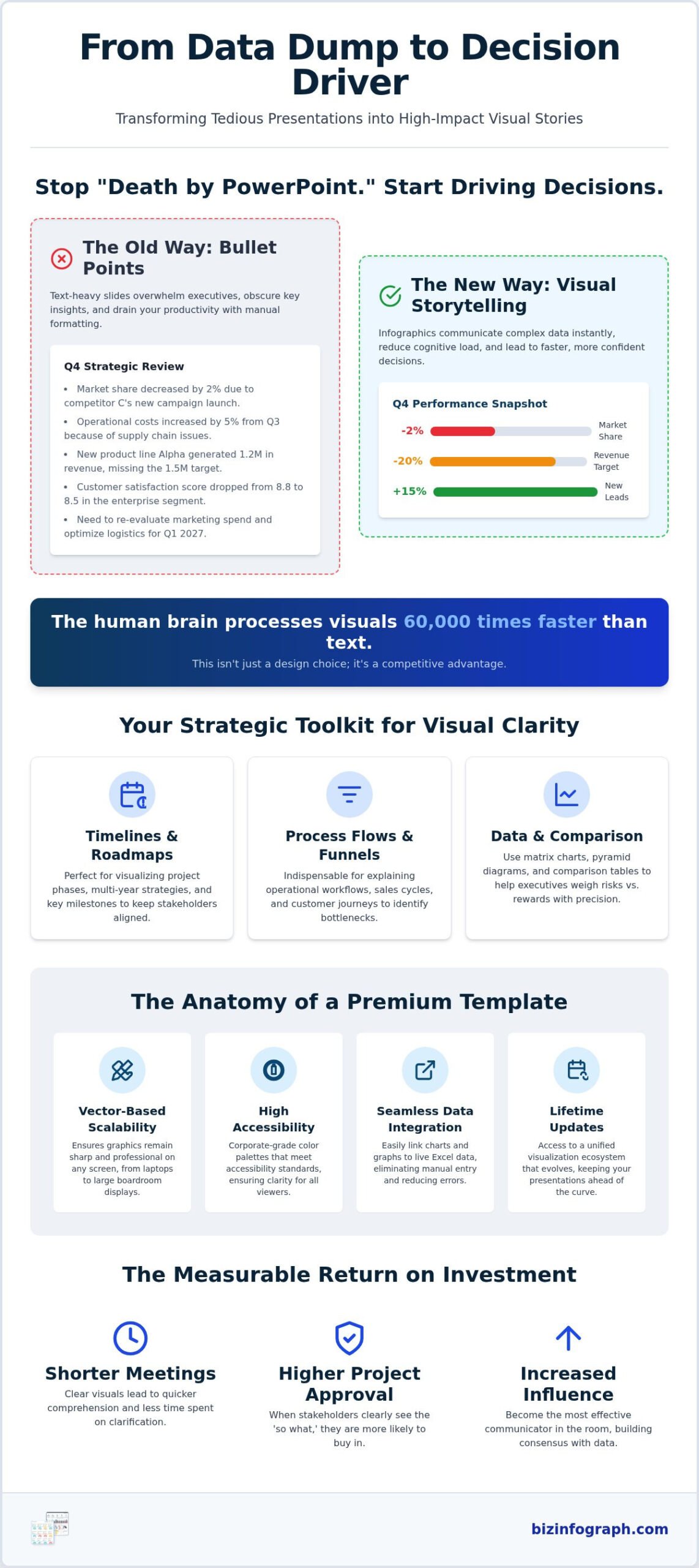
Why does visual storytelling work so effectively? It’s rooted in biology. The human brain processes visual information significantly faster than plain text, often cited as up to 60,000 times faster. This isn’t just a fun fact; it’s a competitive advantage. In 2026, “visual literacy” is no longer optional for managers. It’s a core competency. To understand the foundation of this shift, one might ask, What is an infographic? At its heart, it’s a blend of data, design, and narrative that reduces cognitive load. By using professional templates, you ensure your slides serve as communication tools rather than mere decoration. You’re helping the executive brain categorize, prioritize, and retain information without the fatigue of reading dense paragraphs.
Overcoming “Death by PowerPoint”
We’ve all sat through presentations that felt like an endurance test. Usually, these decks suffer from three fatal flaws: information overload, lack of visual hierarchy, and a failure to highlight the “so what.” You can spot a slide that needs a visual makeover whenever you see a list of more than four bullets or a complex process described entirely in prose. These are the prime candidates for PowerPoint infographic templates. By converting these sections into workflows or comparison charts, you move from reporting past data to recommending future actions. This transition creates a measurable ROI. Clearer visuals lead to shorter meetings, fewer follow-up questions, and a significantly higher rate of project approval. You’re not just making things look “clean”; you’re building a bridge between raw data and executive consensus. For a deeper dive into achieving this transformation, our guide on mastering visual storytelling with an infographic template for PowerPoint walks you through the exact techniques top professionals use in 2026.
Essential Types of PowerPoint Infographic Templates for Business
Don’t treat your slides as a blank canvas for art. Treat them as a strategic toolkit for clarity. Choosing the right visual assets means matching the structure to your specific business objective. Whether you’re mapping a global supply chain or presenting a quarterly KPI dashboard, the layout dictates how quickly your audience understands the message. Effective data visualization supports communication by removing ambiguity and highlighting the path forward for stakeholders.
Strategic Timelines and Roadmaps
Project managers often struggle with “milestone clutter” when presenting long-term plans. A linear timeline is your best friend for sequential project phases, while circular timelines suit recurring annual cycles or iterative agile sprints. For multi-year roadmaps, avoid granular details and focus on “big rock” objectives. To see how leading professionals structure these visuals for maximum boardroom impact, explore these timeline infographic examples for visualizing business growth that turn complex milestones into clear, actionable roadmaps. High-quality PowerPoint infographic templates allow you to scale these visuals without losing clarity, ensuring your five-year plan remains professional and easy to follow.
Process Flows and Funnel Diagrams
Strategic planning requires a different lens altogether. SWOT analysis frameworks and comparison charts help executives weigh risks against rewards with visual precision. Beyond the standard layouts, consider these specialized visual tools to enhance your deck:
- Pyramid Diagrams: Perfect for showing foundational layers of a corporate strategy or hierarchy of needs.
- Matrix Charts: Use these for categorizing complex data sets into four actionable quadrants.
- Radial Maps: Ideal for illustrating relationships between a central core idea and its supporting components.
Similarly, hierarchical charts provide a clean view of corporate structure, which is essential during mergers or reorganizations. For those who need to report on live metrics, data-driven dashboard slides turn raw figures into digestible KPI snapshots. If you’re looking to upgrade your current deck, exploring a professional collection of PowerPoint infographic templates can save you hours of manual formatting while delivering a polished, executive-ready result.
Evaluating Template Quality: Professional vs. Generic
Does your presentation maintain its integrity when projected onto a 100-inch boardroom screen? Many generic options rely on low-resolution images that blur as soon as they’re scaled. High-quality PowerPoint infographic templates are built on a foundation of technical rigor that ensures your brand authority remains intact. Choosing a professional asset isn’t just about aesthetics; it’s about ensuring your data remains accurate and legible across every possible viewing environment. For a curated look at the best options available today, our roundup of high-impact infographic PowerPoint presentation templates for 2026 highlights the top-tier designs that help you command authority in the boardroom while cutting your build time dramatically.
Scalability and Vector Graphics
Resolution independence is the hallmark of a premium template. Professional designs use Scalable Vector Graphics (SVG) and native PowerPoint shapes rather than static PNG or JPEG files. This allows you to resize any element without losing a single pixel of clarity. When you use fully editable shapes, you can maintain strict brand consistency by adjusting stroke weights and corner radiuses to match your corporate style guide perfectly.
Data-Driven vs. Decorative Elements
You must distinguish between templates that are merely “artistic” and those designed for business intelligence. Generic templates often feature locked graphics where the bars or segments don’t actually correspond to real values. Professional PowerPoint infographic templates prioritize data integrity, allowing you to input specific percentages or figures that the visual elements reflect accurately. This prevents the “visual lying” that occurs when a 20% growth bar looks twice as large as it should.
Beyond the graphics themselves, consider the “pixel-perfect” alignment that defines an executive-ready deck. Professional templates utilize built-in grids and guides to ensure every icon and text box sits in its logical place. This precision signals a level of care and detail that mirrors your own work ethic. If things are slightly off-center, your audience might focus on the formatting error instead of your strategic insights.
Technical compatibility is the final piece of the evaluation puzzle. Ensure your chosen toolkit supports the standard 16:9 widescreen aspect ratio used in modern offices, while remaining backward compatible with older software versions. Color theory also plays a vital role in corporate environments. Premium assets are designed with accessibility in mind, utilizing high-contrast palettes that remain readable even for audience members with color vision deficiencies. By checking these technical benchmarks, you move from just “making a slide” to engineering a professional communication asset.
How to Customize Your Infographic Templates for Maximum Impact
Owning a high-quality asset is only half the battle. To truly shine, you must tailor your PowerPoint infographic templates to fit your unique business narrative. Customization shouldn’t be a chore that takes hours. With the right approach, you can transform a professional layout into a branded masterpiece in minutes. This process ensures your presentation feels like a bespoke creation rather than a generic download.
Bridging the Excel to PowerPoint Gap
Efficiency peaks when your data flows seamlessly between applications. Many professionals waste time re-typing numbers, which introduces the risk of human error. Instead, leverage the power of linked objects. When you copy a chart from Excel and use the “Link Data” paste option in PowerPoint, your infographic becomes a living document. Any update in your spreadsheet reflects instantly in your slide deck. This is a game-changer for recurring monthly reports where speed and accuracy are non-negotiable. It maintains the technical rigor of your financial data while providing the visual punch of a premium infographic. To ensure your underlying data is equally polished, pairing your slides with professional Excel dashboard templates creates a seamless, end-to-end reporting workflow that saves hours every week.
Visual Hierarchy and Brand Alignment
Does your slide deck scream your brand’s name? You can match your corporate identity in just two clicks by utilizing PowerPoint’s “Theme Colors” feature. By setting your primary and secondary brand colors in the master slide, every element in your PowerPoint infographic templates will update automatically. Beyond color, pay close attention to your typography. Choose clean, sans-serif fonts for body text to ensure maximum legibility on large screens. Style should never come at the cost of readability.
For organizations looking to extend this level of professional design across all their digital touchpoints, Viss Digital offers specialized services to build cohesive and impactful brand identities.
Embrace the “Rule of Three” to keep your audience focused. Limit each slide to three main points or visual clusters. This prevents the cognitive overload discussed earlier and forces you to prioritize your most impactful insights. Use whitespace strategically; it’s not “empty” space, but a tool to direct the eye toward your most important data points. Finally, enhance your message with professional icons that represent your industry. Avoid cluttered clip art and stick to minimalist, monochromatic icons for a sophisticated finish.
Before you finalize your deck, perform a quick legibility check from the back of the room. If your data isn’t clear at a distance, it won’t land in the boardroom. Ready to start building? You can browse our professional PowerPoint infographic templates to find the perfect foundation for your next high-stakes presentation.
Elevate Your Toolkit with Biz Infographs Professional Templates
Why struggle with mismatched designs and broken data links when you can adopt a cohesive visual strategy? Biz Infographs doesn’t just provide a one-off download; we offer a robust ecosystem designed for the modern professional. Our PowerPoint infographic templates are engineered to work in harmony with our Excel dashboards and Power BI tools, ensuring your data maintains a consistent, high-end aesthetic across every platform you use. It’s about moving beyond the “struggle” of manual design and stepping into the role of a high-performance strategist.
A Complete Business Intelligence Solution
True professional clarity comes from a unified visual language. When your PowerPoint slides match the technical register of your Excel charts and Power BI reports, you establish instant authority. This synergy is a core feature of our toolkit. For advanced users, our templates support seamless Power BI integration, allowing you to transition from deep-dive data exploration to executive-level storytelling without losing visual continuity. You aren’t just buying a slide; you’re investing in a system that ensures your insights are always presented with “best-in-class” quality. This consistency builds trust with stakeholders, as they recognize the polished, professional standard you bring to every meeting.
Design trends and software capabilities evolve rapidly, but your toolkit shouldn’t become obsolete. We include lifetime updates with our products because we’re committed to being your long-term productivity partner. Whether it’s a shift in corporate aesthetic or a new technical requirement in Microsoft Office, you’ll always have access to the latest versions of your PowerPoint infographic templates. This commitment to excellence has helped thousands of professionals save 10 or more hours of manual formatting per presentation. Imagine what you could achieve with an extra day of strategic thinking every time a major deadline approaches. Our users report significant improvements in audience engagement and a noticeable reduction in the time spent on “pixel-pushing.”
Empowering Your Professional Journey
We believe that high-quality design should be accessible to everyone, regardless of their technical skill level. Our role is to be your expert facilitator, providing the premium tools you need so you can focus on the thinking that drives business growth. When you walk into a boardroom with a Biz Infographs deck, you carry the confidence of a global leader. You’ve traded the frustration of “Death by PowerPoint” for a source of personal pride. It’s time to stop fighting with your software and start shining in front of your audience. Transform your next presentation with Biz Infographs and experience the relief of a truly professional workflow.
Secure Your Seat at the Boardroom Table
You’ve seen how visual storytelling transforms dry data into a strategic narrative that executives actually remember. By moving away from text-heavy slides and adopting professional PowerPoint infographic templates, you reclaim your most valuable asset: time. You no longer need to spend hours on manual alignment or tedious formatting. Instead, you can focus on the high-level insights that drive business growth and establish your authority as a leader.
It’s time to join the 25,000+ professionals worldwide who use our tools to deliver high-impact business storytelling. With free lifetime updates included, your toolkit will always stay ahead of the curve. Experience the relief of a streamlined workflow and the pride of a polished, executive-ready deck. Browse Professional PowerPoint Infographic Templates today and start making every slide count. You have the data; now give it the visual platform it deserves to truly shine.
Frequently Asked Questions
How do I insert an infographic template into an existing PowerPoint presentation?
You can easily integrate your new slides by using the “Reuse Slides” feature or simply copying and pasting the specific slide into your deck. When pasting, choose “Keep Source Formatting” to ensure the professional design remains intact. This allows you to blend high-impact visuals into your current project without starting from scratch. It’s a fast way to upgrade a standard presentation with PowerPoint infographic templates that command attention.
Are these infographic templates compatible with Google Slides and Keynote?
Yes, you can use these templates in Google Slides and Keynote by importing the standard .pptx files into those applications. Most visual elements and text boxes will transfer seamlessly, though some advanced PowerPoint-specific animations might require minor manual adjustments. This flexibility ensures you can present confidently across different platforms while maintaining a consistent, high-quality look for your business data and strategic narratives.
Can I edit the colors and fonts of the infographic templates to match my brand?
Every element is fully customizable to align with your corporate identity in just a few clicks. You can change colors, fonts, and icon styles using the standard PowerPoint formatting tools or the Slide Master for global changes. This ensures your presentation looks like a bespoke creation tailored specifically for your brand, rather than a generic download. It’s the perfect way to maintain professional consistency across all your executive communications.
Do I need advanced graphic design skills to use professional PowerPoint templates?
No design experience is required to create stunning visuals with our professional toolkit. These templates are built with a “plug-and-play” mindset, allowing you to simply click and type your data into pre-arranged frameworks. We handle the complex alignment and color theory so you can focus entirely on your message. It’s an empowering solution for busy professionals who need elite results without the learning curve of complex design software.
What is the difference between a static infographic and a data-driven PowerPoint chart?
A static infographic requires manual adjustment of shapes, while a data-driven chart is linked to an underlying data sheet for automatic updates. Our PowerPoint infographic templates often feature data-driven elements that reflect changes instantly when you update the numbers in the associated Excel table. This technical rigor ensures your visualizations are always accurate and saves you from the frustration of manual resizing or pixel-pushing during last-minute updates.
How do I ensure my infographic looks good on both a laptop and a large projector screen?
Stick to vector-based graphics and a standard 16:9 widescreen aspect ratio to ensure perfect scaling across all devices. Since our professional templates use native PowerPoint shapes and SVG icons, they remain crisp and clear even when projected onto massive boardroom screens. Avoid using low-resolution raster images, which can blur and undermine your brand authority. This technical foundation ensures your work looks polished whether viewed on a small monitor or a massive stage.
Can I use these templates for commercial client work?
Yes, you are encouraged to use these templates for your professional client presentations and consulting projects. They are specifically designed to help you deliver “best-in-class” value and establish instant credibility with your stakeholders. By using high-quality frameworks, you provide a more sophisticated service to your clients while significantly reducing your own billable hours spent on manual slide formatting. It’s a win for both your productivity and your professional reputation.
How often are the Biz Infographs template collections updated?
We update our collections regularly to reflect the latest design trends and the evolving technical requirements of modern business software. As a customer, you receive lifetime updates at no additional cost, ensuring your visual toolkit never becomes obsolete. This commitment to being your productivity partner means you’ll always have access to the most innovative ways to visualize your data and shine in front of your audience, regardless of how design standards change.
18 replies on “High-Impact PowerPoint Infographic Templates: The 2026 Professional Guide”
[…] To maintain a consistent corporate brand, you can easily match your data visualizations with our PowerPoint infographic templates. This cross-platform consistency builds trust with stakeholders and ensures your message remains […]
[…] between deep-dive analysis and executive storytelling. You can easily transition your findings into PowerPoint infographic templates to create a cohesive brand experience. This ensures that whether your audience is looking at a live […]
[…] An infographic is a cognitive tool that increases information retention by up to 65%. When you use PowerPoint infographic templates to explain complex workflows or supply chain logistics, you’re making it easier for your […]
[…] of thumb, try to limit yourself to five or seven key milestones per slide. This allows you to use PowerPoint infographic templates that prioritize white space. Clean margins and balanced layouts aren’t just […]
[…] “pretty” designs, true professional templates focus on functionality. For instance, PowerPoint infographic templates are essential for simplifying complex logic that would otherwise get lost in a sea of text. By […]
[…] that top section. To add extra flair to your qualitative data, you can supplement your numbers with PowerPoint infographic templates. This ensures your presentation remains engaging even when you aren’t showing a live grid. […]
[…] firm. For the final presentation layer, many professionals choose to integrate their findings into PowerPoint infographic templates. This creates a seamless transition from deep-dive analysis to high-stakes executive […]
[…] stakeholders process complex social trends up to 60,000 times faster than plain text. By utilizing PowerPoint infographic templates, you build immediate brand credibility during client pitches or internal reviews. This visual […]
[…] by official business plan guidance while keeping the data digestible. For your execution plan, use timeline infographics to map out project milestones. This turns a vague promise into a concrete roadmap of […]
[…] you even open a spreadsheet, your template should define whose data needs are being met. Using PowerPoint infographic templates helps set a professional visual tone from the very first slide. This immediate aesthetic quality […]
[…] frequently find yourself presenting data in the boardroom, these tools integrate seamlessly with PowerPoint infographic templates. This combination ensures your visual narrative remains consistent from the raw data sheet to the […]
[…] seconds. When auditing a template, check the slide master for infographic flexibility. High-quality PowerPoint infographic templates are built to allow for rapid data entry without breaking the layout. If you find yourself manually […]
[…] you can achieve real-time updates with a single click. This automation is a cornerstone of our PowerPoint infographic templates, ensuring that the numbers on your screen always match your source files. This level of data […]
[…] visualize how internal strengths connect to external opportunities. Utilizing specialized PowerPoint infographic templates allows you to tell a story rather than just listing […]
[…] and internal project updates where narrative flow is paramount. By leveraging specialized PowerPoint Infographic Templates, you can significantly boost audience engagement. The focus here is on “punchy,” […]
[…] high-impact visuals that highlight competitive differentiators instantly. By using professional PowerPoint infographic templates, you can move away from cluttered tables and toward layouts that make your value proposition the […]
[…] takeaway using high-contrast callout containers and clear narrative callouts. Utilizing pre-built PowerPoint infographic templates enables team members to deliver polished, boardroom-ready visuals rapidly without wrestling with […]
[…] key takeaways, not entire blocks of copy, and stick to a small number of readable type styles. A PowerPoint infographic template can help maintain a consistent visual system across slides, so the PESTLE analysis feels like part […]