

In 2026, a slide deck cluttered with bullet points isn’t just boring; it’s a liability that costs you executive buy-in. You’ve likely spent hours manually resizing shapes and tweaking colors, only to have your data look dry and unconvincing. It’s frustrating when you have the insights, but the design fails to communicate the “why” behind the numbers. We agree that your time is better spent on strategy than on struggling to find infographic powerpoint presentation templates that actually fit your specific KPIs.
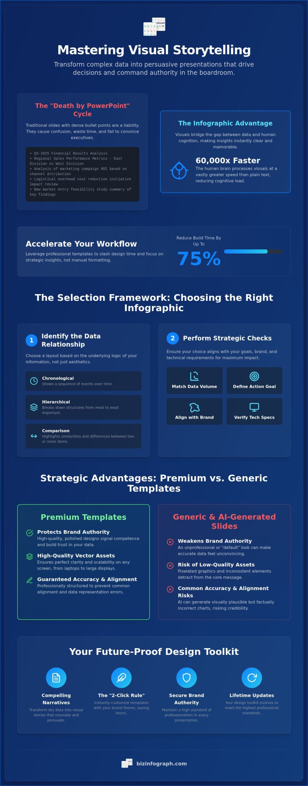
This guide will help you master the art of visual storytelling and transform complex data into persuasive business presentations. By leveraging professional, best-in-class designs, you can reduce your build time by as much as 75% and ensure your insights drive real decision-making. We’ll preview the top-tier templates for the year ahead, showing you how to command authority in the boardroom while saving hours of manual effort. It’s time to stop struggling with dry slides and start delivering results that make you shine as a productivity leader.
Key Takeaways
- Transform dry data into compelling visual narratives by choosing layouts that bridge the gap between complex numbers and human cognition.
- Match your specific data relationships to the perfect visual density using a strategic selection framework designed for boardroom impact.
- Protect your brand authority by opting for high-quality, vector-based assets that avoid the common accuracy and alignment risks of raw AI-generated slides.
- Save hours of manual design work with the “2-Click Rule” to instantly customize infographic powerpoint presentation templates with your unique brand theme.
- Secure a future-proof design toolkit with lifetime updates that ensure your business-specific visualizations always meet the highest professional standards.
Why Infographic PowerPoint Presentation Templates are Essential in 2026
In 2026, raw data is no longer a competitive advantage; the ability to interpret it is. We’ve moved past the era where simply having the numbers was enough to win a boardroom. Today, executives are drowning in information, making static bullet points a significant barrier to engagement rather than a tool for clarity. If your audience has to work to understand your slide, you’ve already lost their attention. This is where What is an infographic? becomes a vital question for every professional. At its core, an infographic is the strategic bridge between complex, fragmented data and human cognition.
Professional design does more than just look good; it closes the “Trust Gap.” When you present data using high-quality infographic powerpoint presentation templates, you’re signaling competence and authority. A polished, cohesive visual validates the integrity of your numbers, while a messy or “default” slide can make even the most accurate data feel unconvincing. By establishing a clear visual hierarchy, you guide the viewer’s eye to the most critical insights first, which drives faster, more confident decision-making in high-pressure corporate environments.
The Science of Visual Data Processing
Your brain is hardwired to prioritize imagery. Research shows the human brain processes visual information approximately 60,000 times faster than plain text. In a 20-minute presentation, this speed difference is the margin between an audience that’s inspired and one that’s exhausted. By using infographics, you’re actively reducing the “cognitive load” on your stakeholders. Instead of forcing them to decode long sentences, you’re giving them a mental map that’s easy to navigate. In 2026, visual storytelling is a core business competency, turning you from a mere messenger into an expert facilitator who knows how to make data stick.
Breaking the ‘Death by PowerPoint’ Cycle
The biggest mistake professionals make is confusing “decorative” graphics with “functional” infographics. A decorative graphic is just “fluff” that takes up space; a functional infographic actually explains the data. Standard slides often fail because they lack a logical framework, leading to cluttered layouts that confuse the viewer. You don’t have to be a designer to avoid this trap. Starting with professional infographic powerpoint presentation templates provides a pre-built structural integrity that ensures your message remains the hero. It’s about working smarter, not harder. By leveraging these frameworks, you save hours of manual formatting while ensuring your slides meet a global, best-in-class standard every time you step into the room.
The Selection Framework: Choosing the Right Infographic for Your Data
Selecting a design based purely on aesthetics is a common trap that leads to confusing presentations. To truly command the room, you must choose your layout based on the underlying logic of your information. Start by identifying the logical relationship within your data. Is it a chronological sequence, a hierarchical breakdown, or a direct comparison? Once you’ve defined the relationship, you can move through a strategic selection framework that ensures your message remains the priority.
- Match Data Volume: High-density data requires clean, expansive layouts. Low-density data thrives in bold, centered graphics.
- Define the Action Goal: Are you trying to persuade stakeholders to pivot, or are you simply troubleshooting a process? Your goal dictates whether you use an aggressive funnel or a steady flowchart.
- Align with Brand Identity: Ensure the template’s geometric style complements your corporate guidelines.
- Verify Technical Specs: Always confirm the aspect ratio and software compatibility before you start customizing.
Matching Data Types to Visual Structures
Context is everything. While a timeline infographic is perfect for documenting historical milestones, a roadmap is the superior choice for outlining future strategic goals. Roadmaps emphasize the “how” and “where,” making them essential for project kickoffs. For sales and marketing teams, funnel diagrams are indispensable because they visually represent where prospects drop off in the conversion cycle. If you’re performing a competitive analysis, swap your static tables for comparison charts. These visuals make the “winner” immediately obvious, which is a core tenet of effective infographic powerpoint presentation templates.
Visualizing KPIs and Metrics
Executive dashboards rely on speed. Gauge charts and indicators are the gold standard here because they communicate performance against a target in a single second. When building these slides, prioritize the “Data-Ink Ratio.” This means removing every non-essential line or shadow that doesn’t contribute to the meaning. Following data visualization best practices ensures your audience focuses on the insights, not the decorations. If you’re working with complex datasets, look for infographic powerpoint presentation templates that allow you to integrate Excel-based insights directly. This synergy keeps your data accurate and your design professional. To find a layout that fits your specific business logic, you can explore the curated collections available for every industry.
Strategic Advantages: Premium Templates vs. Generic and AI-Generated Slides
While AI-powered presentation tools can generate a first draft from a text prompt in seconds, they often introduce the “AI Hallucination” risk. This happens when the software prioritizes aesthetics over data accuracy, leading to charts that look impressive but misrepresent your KPIs. In a high-stakes boardroom, a single misplaced data point can destroy your credibility. Premium infographic powerpoint presentation templates solve this by providing a human-verified structure that respects effective data visualization principles, ensuring your insights remain both accurate and ethical.
The technical integrity of your deck is just as vital as the content. Generic or free templates are frequently built with “hacked” shapes rather than clean master slides. This makes rebranding a nightmare. Premium assets utilize theme colors and vector-based scalability, meaning your graphics stay crisp even on a massive conference room screen. You won’t waste hours fixing broken formatting or hunting for high-resolution icons because the framework is designed for efficiency from the start. Additionally, using premium templates ensures your corporate decks are legally compliant globally, avoiding the licensing pitfalls associated with “free” assets found on the web.
Why Design Quality Affects Your Credibility
Psychologists call it the “Halo Effect.” When your audience sees a pixel-perfect, professional slide, they subconsciously extend that perception of quality to your data and your expertise. Contrast this with distorted generic options that use inconsistent iconography. A 50-slide deck requires a unified visual language to keep the audience focused. If your symbols change style halfway through, you’re creating a subtle distraction that pulls attention away from your message. High-end consulting firms don’t settle for “good enough” graphics because they know that professional aesthetics are a prerequisite for trust. To maintain this high standard across all your corporate displays, you can discover Zoney for flexible digital signage solutions that ensure your insights always look their best.
The Synergy of Human Strategy and AI Efficiency
Customization Masterclass: Turning a Template into a Brand Asset
Transforming a generic layout into a powerful brand asset doesn’t require a design degree. It requires strategy. Most professionals waste hours manually changing the color of every individual circle and line. You can bypass this struggle by using the “2-Click Rule.” High-quality infographic powerpoint presentation templates are built with native theme integration. By navigating to the Design tab and selecting your corporate color palette, every vector element in the deck updates instantly. This ensures your slides look like they were custom-made by an agency, rather than assembled from a kit. Speed is the ultimate luxury in a high-performance environment, and these shortcuts allow you to focus on your narrative rather than the formatting.
Effective iconography goes beyond simple decoration. To maintain your authority as an expert facilitator, replace generic symbols with industry-specific vectors. If you’re presenting a supply chain audit, don’t settle for a basic “box” icon. Use a specific logistics vector that resonates with your audience. Typography follows a similar logic. Boardroom engagement drops when executives have to squint. Ensure your hierarchy is clear by using bold, sans-serif fonts for your data points. A good rule of thumb is to keep your primary insights at a minimum of 24 points to guarantee legibility from the back of the room. Handling the numbers requires precision, so when importing data from Excel, use the “Embed” or “Link Data” features. This keeps your infographic’s layout intact while ensuring your charts reflect the most current figures.
Maintaining Brand Consistency Across Teams
Consistency is the foundation of corporate trust. When different departments use varying styles, it dilutes the brand’s professional air. Distributing standardized templates as a “Corporate Standard” ensures that every deck leaving your office carries the same sophisticated vibe. You can lock key brand elements, such as logo placement and footer styles, while still allowing team members the flexibility to update data and icons. This unified messaging turns every presentation into a cohesive brand statement, reinforcing your position as a global leader in your field.
Advanced Formatting Techniques
For those managing complex infographic layers, the “Selection Pane” is your secret weapon. It allows you to toggle the visibility of different groups, making it easy to edit overlapping elements without moving them. You can even create interactive elements by using invisible “Hotspot” shapes that link to specific data slides, turning a static infographic into a clickable dashboard. If your presentation needs to live beyond the screen, export your slides as high-resolution PDFs. These make for impressive physical handouts or digital posters that maintain their crispness and detail. To start building your own high-impact decks, explore our professional library of templates designed for modern business workflows.
Elevate Your Presentations with Biz Infographs’ Professional Library
Biz Infographs isn’t just a template provider; it’s a productivity partner designed for high-performance teams. We understand that your time is your most valuable asset. That’s why our ecosystem extends beyond basic slides to include Excel Dashboard Templates and Power BI Templates, creating a unified workflow for your data. When you invest in our infographic powerpoint presentation templates, you aren’t just buying a one-off file. You’re gaining access to a living library that evolves with business trends. Our “Free Lifetime Updates” guarantee means you’ll never have to present with an outdated design again. Whether you need precise timeline infographic examples for visualizing business growth, conversion funnels, or complex process maps, our expertly curated collections ensure you have the right tool for every boardroom scenario.
The Power of Integrated Data Visualization
The real magic happens when your data sources talk to each other. One of the biggest frustrations for professionals is the hours spent on manual data transcription. Biz Infographs solves this by creating a seamless synergy between our Excel-based insights and your final presentation deck. You can build your analysis in a specialized Excel chart and transition it directly into a polished PowerPoint slide without losing formatting integrity. This integrated approach doesn’t just save time; it eliminates the human error often associated with copy-pasting complex figures. Explore our full range of PowerPoint Infographic Templates to see how this workflow can revolutionize your next project.
Why Professionals Choose Biz Infographs
Founders, marketers, and consultants globally rely on our assets because they are built for real-world business problems. We don’t just create “pretty” pictures; we provide solution-oriented frameworks that help you command authority. While competitors might offer a high volume of generic slides, we focus on the specific quality standards required for high-end consulting and executive reporting. It’s about more than just making a deck; it’s about transforming your data into a strategic competitive advantage. By using our professional-grade assets, you’re adopting a modern way of working that lets you shine in front of your audience while we handle the heavy lifting of design.
Master the Future of Visual Communication
The 2026 boardroom demands more than just numbers; it requires a narrative that drives action. By moving beyond static slides and adopting a strategic selection framework, you ensure your message isn’t just heard; it’s understood. High-quality infographic powerpoint presentation templates provide the structural integrity and high-end aesthetics needed to close the “Trust Gap” and command authority in every meeting. You now have the roadmap to leverage theme colors for instant rebranding and match your data’s logic to the perfect visual structure.
It’s time to stop spending hours on manual formatting and start focusing on the insights that drive results. Our library is expertly crafted for business data and used by 25,000+ professionals worldwide to maintain a best-in-class standard. With free lifetime updates, your toolkit will never fall behind the curve. Upgrade Your Presentations with Professional Infographic Templates. Step into your next meeting with the confidence of a global leader. You already have the data; now give it the impact it deserves.
Frequently Asked Questions
What is the best infographic template for a business pitch deck?
The most effective pitch decks prioritize roadmaps and comparison charts to tell a story of growth and competitive advantage. You should choose templates that highlight your market vision and key milestones clearly. These visuals build immediate investor confidence by translating complex market data into a persuasive narrative that bullet points simply can’t achieve.
Can I use these infographic templates in Google Slides or Keynote?
You can use these infographic powerpoint presentation templates in Google Slides or Keynote by uploading the .pptx file directly to those platforms. While they are optimized for the Microsoft ecosystem, the core vector shapes remain editable. Just keep in mind that advanced Excel-linking features or specific PowerPoint animations may function most reliably within native Microsoft software.
How do I customize a PowerPoint infographic template without design skills?
Customizing a professional template is effortless when you leverage the native PowerPoint Theme Colors. With just two clicks, you can update the entire color palette to match your brand. Our templates use drag and drop placeholders and vector assets, so you can resize elements or swap icons without worrying about pixelation or complex formatting struggles.
Are infographic templates compatible with the latest version of Microsoft 365?
Yes, our templates are fully compatible with the latest version of Microsoft 365. They are built to utilize modern features like the Selection Pane and advanced grouping for easier layer management. This ensures a fast and efficient workflow whether you are working on the desktop application or the web-based version of the software.
What is the difference between a static slide and an infographic template?
A static slide usually relies on text-heavy bullet points that often lead to information overload. An infographic template uses a “data-first” design to create a visual hierarchy. It guides the viewer’s eye to the most important insights first, transforming dry information into a strategic tool that drives faster decision-making in the boardroom.
How do I ensure my data remains accurate when using a pre-made template?
To maintain total accuracy, utilize the data-linking features to connect your infographic shapes directly to your Excel source files. This eliminates the risk of manual transcription errors. Because our templates follow professional visualization logic, the charts are designed to represent your figures ethically and accurately without distorting the scale or impact of your KPIs.
Do I need a subscription to access Biz Infographs templates?
No subscription is required to use our library. We provide a lifetime access model that serves as a superior alternative to recurring monthly fees. Once you acquire a template, it is yours to keep forever. You will also receive free lifetime updates, ensuring your toolkit stays current with the latest business design trends without any additional costs.
Can I use these templates for commercial client work?
Yes, you can absolutely use these infographic powerpoint presentation templates for commercial client deliverables. They are specifically designed for consultants and agency leaders who need to provide high-end, professional reporting. Using these assets allows you to maintain a global, best-in-class standard for your clients while significantly reducing the time you spend on manual design work.