

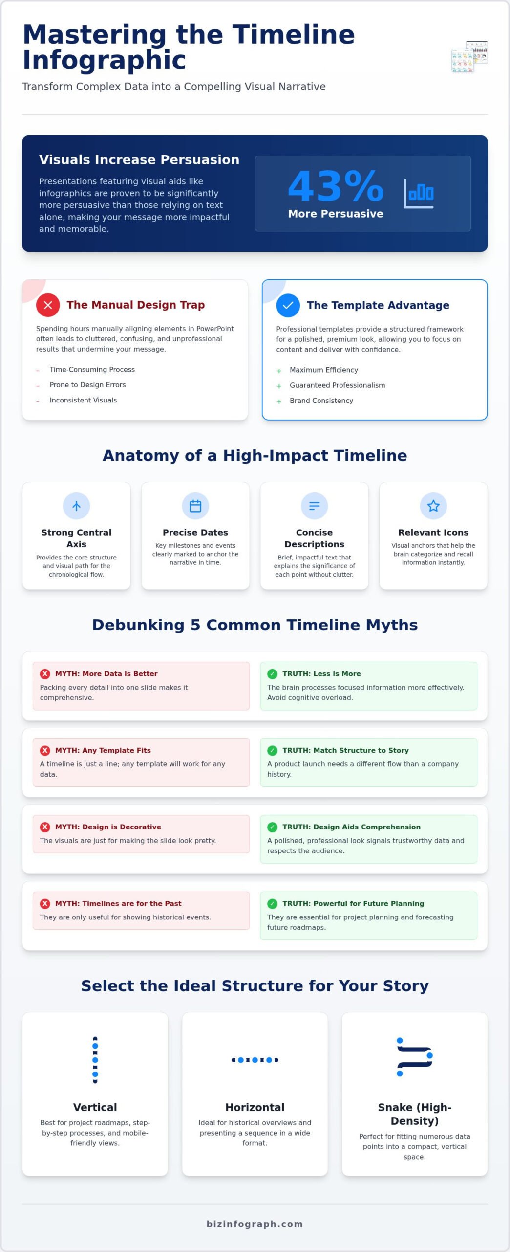
Did you know that presentations featuring visual aids like infographics are 43% more persuasive than those relying on text alone? Despite this, many professionals still find themselves trapped in a cycle of manual design, spending hours nudging boxes and arrows in PowerPoint only to end up with a cluttered slide that confuses the audience. It’s a common frustration to have a brilliant story to tell but lack the tools to visualize it with the precision it deserves. You need a solution that reflects your expertise without the technical headache.
We understand that your time is valuable and your reputation depends on clarity. This strategic guide will show you how to master the timeline infographic template to transform complex chronological data into a compelling visual narrative. You’ll discover how to choose professional frameworks that fit your specific data points perfectly, ensuring your message is both impactful and easy to digest. We’ll preview 2026’s most effective design trends, including premium minimalism and modular structures, so you can reduce your design time and step into your next meeting with total confidence.
Key Takeaways
- Learn why “less is more” when presenting complex data and how to debunk common myths that lead to cluttered, confusing designs.
- Discover how to select the ideal structure for your story by choosing between horizontal, vertical, or high-density “snake” layouts within a professional timeline infographic template.
- Master the art of visual storytelling using strategic color gradients and iconography to create clear anchors that guide your audience through time.
- Gain a technical edge by leveraging native PowerPoint features that allow for seamless Excel data integration and sophisticated animation control.
- Transform your chronological data into a source of professional pride with polished visuals that increase engagement and persuasiveness in every meeting.
What is a Timeline Infographic Template and Why Does it Matter?
Have you ever sat through a presentation where a project roadmap was just a series of bullet points on a plain white slide? It’s hard to follow, and even harder to remember. A timeline infographic template solves this by acting as a strategic visual roadmap. It’s a structured representation of a chronological sequence of events that turns dry data into a compelling story. By moving away from static text lists, you’re not just showing dates; you’re providing a high-impact narrative that helps your audience visualize progress and understand the “why” behind the “when.”
The shift toward visual storytelling is more than just a design trend. It’s a necessity for clarity in a fast-paced business environment. When you use a professional template, you’re adopting a standardized framework that ensures consistency across your entire organization. This level of polish suggests authority and expertise, making your data more persuasive to stakeholders. Understanding What is a Timeline Infographic is the first step in moving from basic information sharing to true expert facilitation. It’s about giving your data the professional stage it deserves.
The Core Components of a High-Impact Timeline
A truly effective timeline isn’t just a line with some text. It relies on four essential pillars: precise dates, concise descriptions, relevant icons, and a strong central axis. These components work together to guide the viewer’s eye through the sequence without causing cognitive overload. The central axis provides the structure, while icons act as visual anchors that help the brain categorize information instantly. The narrative flow of a timeline is the intentional visual path created to lead an audience through a chronological sequence with clarity and purpose. When these elements are balanced, your audience can grasp years of progress in just a few seconds.
Why Businesses Prefer Templates Over Manual Design
Why do top-tier professionals choose a timeline infographic template over manual design? The primary benefit is the massive reduction in technical frustration. Manually aligning boxes, arrows, and text in PowerPoint is a time-consuming task that often leads to cluttered, unprofessional results. Templates offer pre-aligned structures that guarantee a clean, premium look every time. By leveraging high-quality business presentation templates, you ensure that your brand remains consistent across different departments and projects. This approach minimizes design errors and allows you to focus on the strategic content of your meeting. It’s the difference between struggling with software and confidently leading a room.
Debunking 5 Common Myths About Timeline Infographics
Are you holding back your best insights because of outdated design assumptions? Many professionals struggle with cluttered slides because they believe a “good” infographic must be packed with every available detail. This approach actually works against you. To truly shine as an expert facilitator, you need to move past these common misconceptions and embrace a more strategic way of visualizing time.
The first myth is that more data points lead to a better infographic. In reality, less is often more. Research on Designing for Impact shows that the brain processes information more effectively when it’s not overwhelmed. If you force twenty milestones into a single timeline infographic template, you’ll lose your audience by the third point. Similarly, don’t assume any template works for any data. A product launch roadmap requires a different visual flow than a decades-long company history. You must match the structure to the story you’re telling to maintain clarity and authority.
Another dangerous myth is that online editors are always superior. While cloud tools are popular, they often fail to meet the security and reliability standards required in high-stakes corporate environments. Design isn’t just decorative; it’s a tool for comprehension. A polished, professional look signals that your data is trustworthy and that you’ve put in the effort to respect your audience’s time. Finally, remember that timelines aren’t just for looking backward. They’re incredibly powerful for project planning and future forecasting, helping stakeholders visualize the path to success in 2026 and beyond.
The Danger of the “Overstuffed” Timeline
Cognitive load is the silent killer of great presentations. When a slide is too busy, your audience spends more energy trying to decode the layout than listening to your message. As a rule of thumb, try to limit yourself to five or seven key milestones per slide. This allows you to use PowerPoint infographic templates that prioritize white space. Clean margins and balanced layouts aren’t just “pretty”; they’re functional choices that keep the focus on your most critical data points.
Online vs. Native Templates: The Security Reality
In today’s corporate landscape, data integrity is paramount. Uploading sensitive project roadmaps or proprietary financial timelines to a third-party cloud editor can pose significant security risks. This is why native PowerPoint and Excel files remain the industry standard. They offer total offline reliability and keep your data where it belongs: on your secure internal systems. If you’re looking for a high-performance solution that doesn’t compromise on safety, exploring a professional template collection designed for native software is the smartest move for any productivity partner.
Choosing the Right Timeline Structure for Your Project Data
How do you choose the perfect timeline infographic template when every project has a different pulse? Selecting the right layout isn’t just about aesthetics; it’s a strategic decision based on your data’s volume and the screen real estate available. You wouldn’t use a hammer to turn a screw, and you shouldn’t use a cramped horizontal line to tell a ten-year success story. Your choice of structure dictates how quickly your audience understands your message.
When dealing with high-density information that exceeds a few simple points, the “Snake” or “Z-pattern” becomes your most valuable asset. This layout winds across the slide; it maximizes space without sacrificing readability. It’s the ultimate tool for complex project roadmaps where every milestone counts. Beyond the layout, consider the “emotional arc” of your story. Are you showing a steady climb through chronological steps, a complex coordination of tasks via a Gantt view, or a series of major wins using a milestone-only view? Each perspective serves a specific strategic goal. If your project also involves recurring processes or repeatable workflows, pairing your timeline with a dedicated process infographic template can help you visualize complex workflows alongside your chronological milestones.
Horizontal Timelines for Short-Term Milestones
Horizontal layouts are the gold standard for 16:9 presentation slides. Use them for quarterly updates, 5-step process maps, or simple product launches. Because the eye moves naturally from left to right, these designs feel intuitive and fast. To avoid eye strain, keep your descriptions punchy. If your text starts to look like a novel, you’ve likely outgrown this structure. These templates are designed to help you shine during quick-fire meetings where clarity is king.
Vertical Timelines for Detailed Historical Context
If you’re documenting a rich company history or a multi-year project log, go vertical. This orientation allows for longer text descriptions without cluttering the visual field. Verticality is also ideal for mobile-first viewing; users naturally scroll down. These designs are excellent for infographic posters or printed reports where depth is more important than speed. It’s the professional choice for providing a comprehensive legacy without overwhelming the viewer.
Designing for Impact: How to Customize Your Timeline Template
Once you’ve selected your timeline infographic template, the next step is moving from a generic layout to a customized strategic tool. Professional design isn’t just about looking good; it’s about signaling hierarchy and intent. You can use color gradients to represent time progression; shifting from a soft blue for past events to a deep navy for future goals subconsciously signals a journey toward a bold destination. This type of thoughtful customization transforms a standard slide into a premium presentation that commands attention from the start.
Typography and white space are your best allies in maintaining professional standards. Use bold, sans-serif fonts for dates to make them pop, while keeping descriptions in a lighter weight for easier reading. Don’t be afraid of white space. It’s not “empty” space; it’s a functional breathing room that prevents visual noise and keeps the audience focused on your most critical milestones. When you master these small adjustments, you stop being a user of templates and start being an expert facilitator of information.
Visual Hierarchy and the “Three-Second Rule”
Your audience shouldn’t have to work to understand your slide. The “Three-Second Rule” states that a viewer should grasp the core theme and direction of your timeline within three seconds of seeing it. You achieve this by using visual anchors. Visual anchors are distinct graphic elements, such as icons or bold shapes, that immediately catch the eye and establish a clear reading path through the data. When you use larger icons for major milestones and smaller ones for minor updates, you’re training the audience’s brain on what to prioritize first.
Color and Branding Consistency
Consistency builds trust. Adapting your template to match corporate brand guidelines ensures that your presentation feels like an integrated part of the company’s voice. In a business setting, different palettes trigger different responses; blue often signals stability, while green can represent growth or financial health. Use these psychological cues to reinforce your data’s message. If you’re managing data-heavy timelines that require advanced filtering or real-time updates, consider integrating your visuals with interactive excel dashboard templates. This allows you to maintain professional aesthetics while handling complex, fluctuating datasets with ease.
Ready to elevate your next project roadmap? Explore our professional PowerPoint infographic templates to start designing with total confidence today.
The Strategic Advantage of Professional PowerPoint Timeline Templates
Why settle for generic browser tools when you can have the precision of native software? Using a professional timeline infographic template within PowerPoint gives you unparalleled control over how your story unfolds. Unlike cloud-based editors that often offer limited motion paths, native templates allow you to utilize sophisticated Morph transitions and custom animations to reveal milestones one by one. This keeps your audience focused on the current point rather than reading ahead; it’s a small but critical detail that separates a good presenter from a true expert facilitator.
Data integration is another area where native files outperform the competition. You can link your timeline directly to Excel data, ensuring that as your project dates shift, your visual representation updates automatically. This eliminates the risk of manual entry errors and keeps your roadmap accurate to the minute. In a high-stakes meeting, having a future-proof design that supports lifetime updates means your 2026 strategy remains relevant and polished, no matter how many times the plan evolves. You’re not just presenting data; you’re managing a live strategic asset that reflects your commitment to excellence.
Efficiency Meets Professionalism
Think of Biz Infographs as your ultimate productivity partner. We know that manually drawing lines and aligning icons is a drain on your creative energy. By providing a library of pre-designed, best-in-class assets, we save you hours of manual labor that would be better spent on high-level strategy. This efficiency doesn’t come at the cost of quality; every template maintains a polished, sophisticated air that mirrors the high-end standards of global business leaders. You aren’t just buying a slide; you’re investing in a toolkit that allows you to shine in front of stakeholders. It’s about feeling the relief of a job well done while projecting the confidence of a seasoned specialist who understands the nuances of data design.
Ready to Transform Your Next Presentation?
The journey from data chaos to visual clarity starts with a single decision. You’ve seen how the right structure, color theory, and technical framework can turn a simple list of dates into a powerful strategic narrative. Don’t let your hard work be buried in a cluttered, unprofessional slide. It’s time to embrace a more modern and effective way of working that prioritizes both impact and security. Upgrade your presentations with professional timeline infographic templates and experience the pride of knowing your visuals are as sharp as your insights.
Transform Your Vision Into a Strategic Narrative
You’ve seen how a professional timeline infographic template can turn a cluttered list of dates into a high-impact story. By choosing the right structure, whether it’s a sleek horizontal line for quarterly wins or a detailed vertical layout for historical context, you ensure your message is heard. Mastering visual anchors and color gradients isn’t just about design; it’s about leading your audience through your data with the authority of an expert facilitator.
Leveraging native PowerPoint and Excel files provides the security and animation control that browser-based tools simply can’t match. This approach saves you hours of manual labor while maintaining the polished, sophisticated standards your stakeholders expect. It’s time to stop struggling with alignment and start focusing on your strategy. You’ve got the insights; now give them the visual stage they deserve.
Are you ready to shine in your next meeting? Download Professional Timeline Infographic Templates today and benefit from business-grade designs with free lifetime updates. Our collection is fully compatible with PowerPoint, Excel, and Power BI, giving you the flexibility to work exactly how you want. Take pride in your presentations and watch your engagement soar.
Frequently Asked Questions
What is the best format for a timeline infographic template?
The ideal format depends on your end goal. For boardroom presentations, a 16:9 PowerPoint timeline infographic template is best because it fits modern screens perfectly. If you’re managing complex logs, an Excel-based structure allows for better data organization. Native files ensure your information remains secure on your own hardware, providing a professional edge that online tools often lack. Choosing a high-quality digital download allows you to maintain total control over your final output.
How many events should I include in a single timeline slide?
Stick to a maximum of five to seven key milestones per slide. Including too many events creates cognitive overload and confuses your audience. If your project has dozens of dates, it’s better to use a multi-slide approach or a “snake” layout to maintain clarity. This strategy preserves essential white space and keeps the focus on your most critical strategic goals. Your objective is to facilitate understanding, not just list every single detail.
Can I edit these timeline templates in both PowerPoint and Google Slides?
Yes, you can edit these templates in both platforms. While they are specifically designed for PowerPoint to leverage advanced animations and transitions, they are fully compatible with Google Slides. Keep in mind that some high-end features, like the Morph transition, work best within the native PowerPoint environment. Regardless of the software you choose, the professional design standards remain intact, allowing you to present with confidence across different technical setups.
Are these templates compatible with Excel for data-driven timelines?
Absolutely. Biz Infographs specializes in Excel Dashboard Templates and Excel Charts that integrate seamlessly with your data. You can link your spreadsheet data directly to your visuals, ensuring your timeline updates automatically as your project dates change. This level of automation reduces manual errors and saves hours of design work. It’s the perfect solution for professionals who need to manage fluctuating project roadmaps without sacrificing visual quality or precision.
Do I need advanced design skills to use a timeline infographic template?
You don’t need any specialized graphic design experience to achieve professional results. These templates act as a standardized framework, handling the complex alignment and spacing for you. You simply download the file and plug in your specific milestones. This “Productivity Partner” approach allows you to focus on your strategic content while the template ensures a polished, sophisticated look that makes you shine in front of your stakeholders and peers.
Why should I choose a native template over an online infographic maker?
Native templates offer superior data security and offline reliability. Unlike online makers, your sensitive corporate data stays on your local machine rather than being uploaded to a third-party cloud. You also gain much better control over animations and transitions, which are essential for high-impact storytelling. Plus, with free lifetime updates from Biz Infographs, your designs remain future-proof without the recurring monthly subscription fees associated with many online infographic platforms.
What are the most common mistakes to avoid when creating a timeline?
The most frequent error is overstuffing the slide with too much text. Avoid using tiny fonts that your audience can’t read from the back of the room. Another mistake is ignoring color theory; using clashing colors can distract from your message. Don’t forget to match the structure to your story. Using a simple horizontal line for a complex, multi-year history often leads to a cluttered design that fails to convey your authority. If you want to build a stronger foundation for all your presentations, exploring professional slide templates designed for data storytelling can help you avoid these pitfalls from the start.
How do I ensure my timeline is accessible to all audience members?
Focus on high color contrast and legible typography to ensure everyone can follow your story. Use bold headers for dates and clear icons that act as visual anchors. If you’re sharing the file digitally, remember to add alt text to your images for screen reader compatibility. These small but impactful adjustments make your timeline infographic template more inclusive and professional, showing your audience that you value clarity and accessibility for every single participant.