

What if your most important data point is getting lost in the chart meant to explain it? Choosing the right visual for a comparison or trend can be tricky, and crowded labels or colors can make a slide harder to follow. It’s also reasonable to worry that simplifying a chart might change what the data actually says. Strong PowerPoint data visualization makes a decision easier to understand without losing the context that keeps it credible.
This guide shows you how to match chart types to your message, reduce clutter, and build slides with a clear takeaway. You’ll learn how to highlight an insight while preserving essential details, and how to bring finished visuals into polished slides with less repetitive design work. PowerPoint infographic templates can help with that final slide-building stage, while the analysis and visual choices remain yours.
Key Takeaways
- Start with the audience’s question, then choose a visual that makes the answer easy to see.
- Match chart types to the relationship you need to show, such as comparison, trend, composition, distribution, or relationship.
- Keep PowerPoint data visualization clear and credible with readable titles, consistent units, restrained color, and enough whitespace.
- Use a five-step workflow to move from a focused question and checked data to a visual, a polished slide, and a final review.
- Once your message and visual are settled, infographic templates can reduce repetitive layout work without replacing sound data judgment.
PowerPoint Data Visualization Starts With the Question Your Slide Must Answer
Before opening PowerPoint or choosing a chart, ask what your audience needs to understand. Are they comparing results, spotting a change, or deciding where to focus next? Start with that question. It gives the slide a clear purpose and helps you avoid adding visuals simply because the page feels empty.
PowerPoint data visualization means presenting information visually so an audience can understand a finding. A chart, diagram, or other graphic earns its place when it makes a specific point clearer than text alone. Decoration may make a slide look polished, but it cannot replace evidence or a clear message.
Effective data visualization turns evidence into a clear visual answer without changing what the evidence says. That principle connects slide design to the broader Principles of Data and Information Visualization, including how visual choices shape the way people interpret information. Keep the finding visible, and make sure the graphic supports it rather than competing for attention.
Turn the audience’s question into a slide takeaway
Imagine a team reviewing monthly sales across several regions. The audience may need to know which region grew fastest, not see every figure in the spreadsheet. Ask what they should compare, understand, or decide after viewing the slide. Then write a headline that answers the question, such as “North region led monthly growth,” instead of a generic label like “Sales by Region.”
Give the main takeaway visual priority. If a secondary detail matters, such as the reporting period or an unusual dip, include it as supporting context or explain it elsewhere. This creates a simple reading path: the audience sees the conclusion, checks the visual evidence, then absorbs the context. A focused slide helps people follow your reasoning without searching through competing messages.
Check whether the data can support the message
Before shaping the visual, identify what’s being measured, the units, the time period, and the data source. For example, “revenue increased” is hard to interpret without knowing the comparison period and whether the values are in dollars, thousands, or another unit. Put these details on the slide or in a clear source note so the audience understands what the numbers represent.
Keep observed results separate from interpretation and recommendation. “Sales fell in March” describes a result; “a campaign change caused the decline” proposes an explanation that needs supporting evidence. If the data leaves out a relevant comparison, covers only part of a time series, or contains an unexplained anomaly, flag that context before presenting a conclusion. A credible takeaway is one the evidence can genuinely support.
Choose a PowerPoint Chart Type That Fits the Data
Once you know the point you need to make, match the visual to the relationship in your data. A chart can look striking and still confuse viewers if it asks them to read the wrong pattern. In PowerPoint data visualization, choose for the data structure and takeaway, not novelty: use a visual that fits the relationship you want people to see.
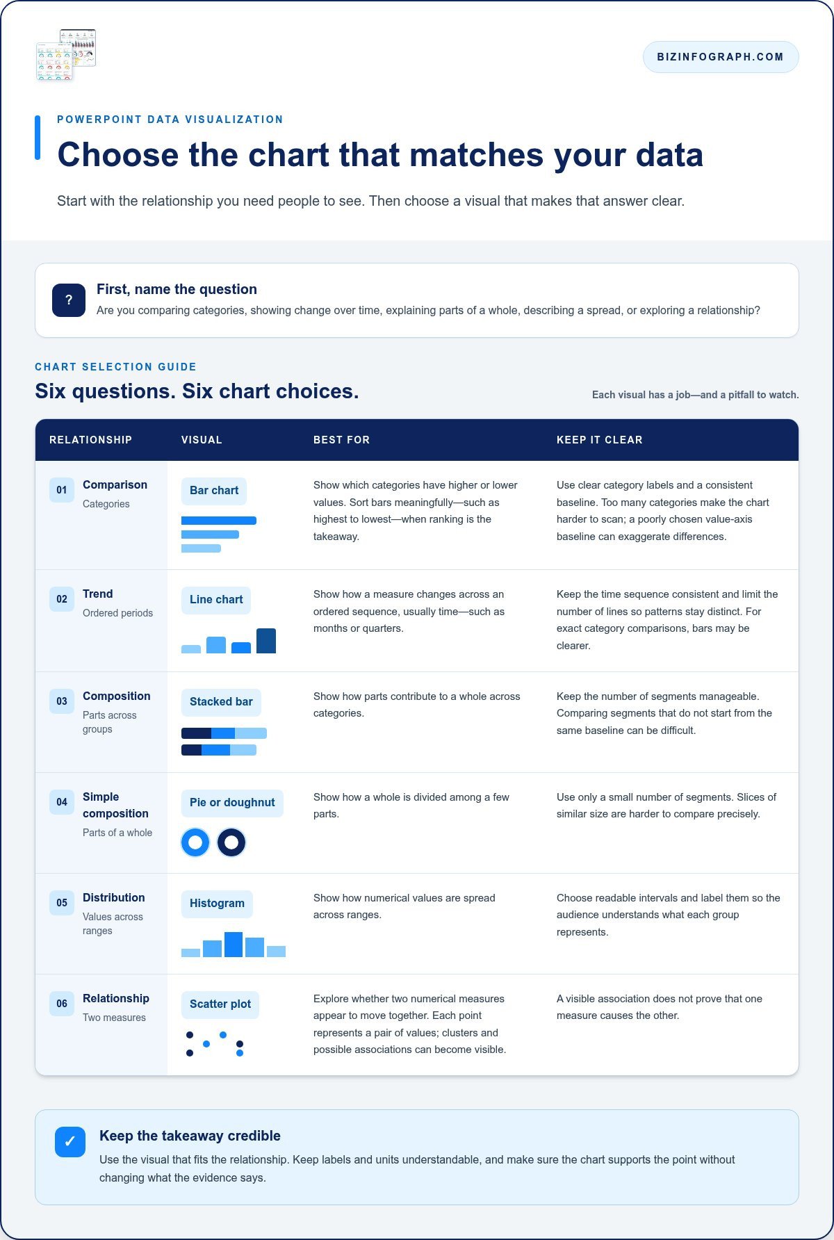
Use this quick guide to narrow your options. Each chart type answers a different kind of question and has a common pitfall to avoid.
- Comparison, bar chart: Which categories have higher or lower values? Use clear category labels and a consistent baseline. Too many categories can make the chart hard to scan.
- Trend, line chart: How does a measure change across ordered periods, such as months or quarters? Keep the time sequence consistent and limit the number of lines so the patterns remain distinct.
- Composition, stacked bar: How do parts contribute to a whole across categories? This works best when the number of segments is manageable. Comparing segments that don’t start from the same baseline can be difficult.
- Simple composition, pie or doughnut: How is a whole divided among a few parts? Use only a small number of segments, since slices of similar size are harder to compare precisely.
- Distribution, histogram: How are numerical values spread across ranges? Choose readable intervals and label them so the audience understands what each group represents.
- Relationship, scatter plot: Do two numerical measures appear to move together? Each point represents a pair of values, making clusters and possible associations visible without proving that one measure causes the other.
Use bars and lines for comparisons and trends
For category comparisons, bar charts make it easy to scan values and rank items. Sort bars in a meaningful order, such as highest to lowest, when ranking is the takeaway. Keep category names legible. If labels become cramped, simplify the set or give long labels more room. Check that the value axis starts at an appropriate baseline, especially because bar lengths can otherwise exaggerate small differences.
Use a line chart when the horizontal axis represents an ordered sequence, usually time. A line connects observations to reveal direction and changes in pace. Too many series can turn the slide into a tangle, so show only the lines needed to support the point. If the audience needs exact comparisons between categories rather than a pattern over time, bars may be clearer.
Show composition, distribution, and relationships carefully
Stacked bars reveal how components contribute to totals across groups, but numerous segments make the visual harder to interpret. Reserve pie and doughnut charts for simple part-to-whole views, not precise comparisons among many similar slices. For distributions, a histogram groups values into ranges. For relationships between two numerical measures, a scatter plot shows how paired observations are positioned.
Before settling on a chart, check that the audience can read the axes, units, categories, and any grouping. If the visual needs a long explanation to decode, try a simpler form or reduce what’s shown. Once you’ve chosen the chart, a PowerPoint infographic template can streamline the slide layout while leaving data interpretation and chart selection to you.
Make PowerPoint Data Visualizations Clear Without Distorting the Story
A polished slide should make evidence easier to understand, not make a result seem larger, smaller, or more certain than it is. Strong PowerPoint data visualization balances clarity with honest context: the audience should see the finding and understand how the chart represents the underlying values.
Before presenting, use this accuracy check: verify every label, unit, scale, and source before you share the slide. Then review design choices that could skew interpretation, such as truncated axes, inconsistent scales between charts, excessive decimal places, or decorative effects that obscure comparisons. A bar chart with a compressed vertical axis, for example, can make a modest difference look dramatic. For a line chart, a narrower range may help show small changes, but label the scale clearly and avoid implying a bigger shift than the values support.
Use color, labels, and hierarchy to guide attention
Use color consistently to carry meaning. If blue represents one region on a slide, don’t use it for a different region in the next chart. Use an accent color to emphasize the key series or comparison, and keep supporting data visually quieter. Too many bright colors compete for attention and make it harder to see which value matters most.
Direct labels can help viewers identify a value or series without repeatedly checking a legend. Use them when they fit beside the data and remain readable at presentation size. If labels overlap or crowd the chart, reduce them or use a simple, clearly ordered legend. Check text and data colors against their backgrounds, and don’t rely on color alone to distinguish categories. Labels, patterns, or line styles can provide another visual cue.
Give the chart room to breathe. Remove decorative shadows, heavy borders, and gridlines that don’t help the audience estimate values. Keep the title prominent, make units easy to find, and leave enough whitespace around labels to keep each element legible.
Keep context visible and interpretation honest
Show the time period, units, and any definitions needed to interpret the measure. If “active users” excludes some account types, for instance, define the term or make the exclusion clear in a note. A source label helps viewers understand where the figures came from and distinguish reported data from an estimate.
Keep scales comparable when placing charts side by side. If each chart uses a different axis range, label it clearly and consider whether the comparison remains fair. Order categories consistently when that helps people scan across visuals. Finally, separate commentary from plotted values: an annotation can explain a spike or mark a target, but it shouldn’t look like another data point. Make the evidence and your interpretation easy to distinguish.
Build and Review a PowerPoint Data Visualization in Five Steps
A repeatable workflow makes it easier to move from raw figures to a slide people can understand. Treat your PowerPoint data visualization as a sequence of decisions: clarify the purpose, check the evidence, choose a visual, design the slide, and review it before presenting.
- Frame the question. Write down what your audience needs to learn or decide. Turn the answer into a takeaway headline, such as “Renewals rose in the second half of the year,” rather than a broad topic label like “Renewal performance.” If you can’t state the takeaway clearly, refine the question before building the chart.
- Check the data. Confirm the measure, source, units, time period, and any definitions that affect interpretation. Remove measures that don’t help answer the slide’s question, but keep access to the underlying source so you can verify figures or provide more detail if needed. Don’t let a simplified slide hide relevant context.
- Select the visual. Choose a chart based on the comparison or pattern the audience needs to see. Use a bar chart to compare categories, a line chart to show change over time, or another form suited to the data relationship. Keep the visual focused on the takeaway instead of squeezing an entire report onto one slide.
- Design the slide. Place the takeaway headline where viewers can find it quickly, then give the chart enough space to read. Add clear labels, units, and only the notes needed to interpret the result. Reduce unrelated text and visual elements. Supporting context should clarify the evidence, not compete with it.
- Review before presenting. Check values against the source, then confirm that dates, units, labels, and scales are accurate. Look for inconsistencies with other charts in the deck, such as different color meanings or mismatched formatting. View the slide at presentation size, where small labels and crowded details are easier to spot.
Finish with a quick comprehension test. Ask a colleague to look at the slide briefly, then describe its main takeaway. If they focus on a secondary detail, misread a label, or can’t tell what the chart shows, revise the hierarchy or simplify the visual. This feedback reveals whether the headline, chart, and supporting context work together as intended, not just whether the slide looks polished.
For a final design pass, keep visual elements consistent with the rest of your presentation while giving the key finding room to stand out. Once your analysis and chart choice are settled, explore PowerPoint infographic templates to reduce repetitive layout work and shape a polished slide around your insight.
PowerPoint Data Templates for Insight and Impact
Once your message, data, and visual choice are in place, a downloadable infographic template can help with the final slide-building stage. Instead of arranging every shape and text box from scratch, you can focus on fitting the evidence into a clear layout. A template can reduce repetitive design work, but it can’t determine whether your conclusion is supported by the data. That judgment remains yours.
Choose a template that supports the content
Start with the chart or information you need to present, then look for a layout that gives it enough room. A category comparison needs space for readable names and values. A process graphic needs a clear sequence. A slide with several data points may need distinct sections rather than one crowded panel. If the layout forces tiny labels or makes the visual secondary to decoration, it isn’t serving the message.
Prioritize hierarchy. The headline should lead, the data should be easy to scan, and supporting notes should remain visible without competing for attention. Adapt the wording, colors, and context to your audience and purpose while keeping units and source information intact. Biz Infographs PowerPoint infographic templates offer a starting point for shaping clear, polished slides. Treat the design as a framework, not a fixed answer: adjust it to fit the evidence and preserve the details viewers need to interpret it accurately.
Consistency also matters across a presentation. Reusing a coherent visual style can help slides feel connected, while each chart still needs to suit its data. If you’re building a wider business deck, business presentation templates can offer ideas for a consistent look beyond a single data slide. Keep the design system supportive, not restrictive. Clarity comes first.
Explore related PowerPoint and reporting resources
Choose resources based on the task. For a PowerPoint slide, focus on a layout that supports the finding and makes its context legible. If your work extends to dashboard-based reporting, Power BI dashboard templates offer a separate format for exploring information. A reporting template and a presentation template serve different purposes, so choose according to where the audience will work with the information.
Biz Infographs PowerPoint infographic templates are design resources for communicating analyzed information, not substitutes for choosing an appropriate visual, checking the source, or validating the takeaway. The templates include free lifetime updates. Use a template as a starting point, then apply the principles in this article to keep every visual clear, useful, and faithful to the data.
Put Your Next Data Slide to Work
Your next presentation is a chance to make a complex finding easier to act on. Let the audience’s needs guide you, and make each visual support a message that is clear, useful, and faithful to the evidence. With a thoughtful approach to PowerPoint data visualization, you can spend less time wrestling with slide layouts and more time preparing to present your insight with confidence.
When your analysis is ready, a well-chosen template can help you shape the slide without taking over the data decisions. Biz Infographs offers downloadable designs and free lifetime updates to support your presentation work.
Frequently Asked Questions
Can I create data visualizations in PowerPoint without using Excel?
Yes. You can create a chart in PowerPoint and enter its values in the data worksheet that opens with it. This works well for a small, self-contained visual, such as comparing quarterly figures in a one-off presentation. For larger datasets or calculations, prepare and validate the data in a spreadsheet first, then bring the relevant values into your slide. The best workflow depends on where the data is maintained and how often it changes.
How do I update a chart in PowerPoint when the source data changes?
The steps depend on how the chart was added. If its data is embedded in the presentation, select the chart and use the option to edit its data, then revise the values in the worksheet. If it’s linked to an external workbook, update the source file and refresh the chart link in PowerPoint. Before presenting, check that the displayed values and labels reflect the intended data, especially if the file has moved or been renamed.
Is it better to use a PowerPoint chart or an infographic for business data?
Use a chart when viewers need to compare values, follow change over time, or inspect a numerical relationship. An infographic can work better when the goal is to explain a process, combine a few related facts, or guide viewers through a sequence. For example, a chart can show monthly costs, while an infographic can outline the steps behind a budgeting process. Choose the format that makes the evidence easiest to understand, not the one with more decoration.
Can I animate a chart in PowerPoint without distracting my audience?
Yes. Keep animation restrained and use it only when revealing information in stages helps viewers follow your explanation. For example, reveal one series at a time while discussing a comparison instead of adding multiple animated effects. Use the same simple transition throughout and avoid fast movement, sound, or decorative motion. Preview the slide in presentation mode, and make sure the complete chart remains understandable if the animation doesn’t play as expected.
How can I make PowerPoint charts easier for screen-reader users to understand?
Give the chart a concise, descriptive title and add alternative text that explains its main point, not just that it’s a chart. Include a text summary of important values or trends nearby, since a visual alone may not communicate every detail. Use clear labels and strong contrast, and don’t rely on color as the only way to distinguish series. Check slide reading order so the title, chart description, and supporting text make sense when read aloud.
What is the best way to export a PowerPoint chart for use outside a presentation?
For a chart that needs to appear in a document or web page, save or copy it as an image when preserving its slide appearance matters more than editing. Choose a format suited to the destination, then inspect the exported result for legibility, cropped labels, and readable text at its intended size. If someone needs to revise the figures, share the presentation or source data instead of relying on a flat image, which doesn’t retain editable chart values.
Can a PowerPoint data visualization template be adapted to my own brand?
Usually, yes. You can adapt a PowerPoint data visualization template by applying your presentation’s fonts, colors, logo, and wording, then checking that chart labels and source notes remain readable. Keep enough contrast between text and background, and reserve accent colors for meaningful distinctions in the data. Biz Infographs offers downloadable PowerPoint infographic templates as design resources. Review the template elements and tailor the layout to your content and brand standards.
Explore Biz Infographs’ PowerPoint infographic templates to give your next data slide a polished starting point.