
What if your most confident business recommendation is actually based on a statistical fluke? Most professionals feel a pang of anxiety when presenting data volatility, especially when the difference between a “sample” and a “population” feels like a guessing game. You’re not alone if you’ve stared at a spreadsheet wondering whether to use STDEV.S or STDEV.P while the clock ticks toward a major presentation.
Learning how to calculate standard deviation in excel shouldn’t feel like a high-stakes math exam. It’s actually the secret to transforming raw numbers into a professional story about consistency and risk. By mastering this single metric, you move from just reporting numbers to providing the kind of deep insight that drives executive decisions and builds personal pride in your work.
This guide ensures you master the exact formulas and professional visualization techniques to measure volatility and build high-impact reports. We’ll explore the latest 2026 Microsoft 365 updates, including AI-powered Copilot assistance and dynamic arrays. You’ll walk away with a time-saving workflow that eliminates manual errors and makes your data look as premium as your insights.
Key Takeaways
- Discover how to treat standard deviation as a “consistency score” that reveals hidden risks and opportunities within your sales and production KPIs.
- Learn exactly how to calculate standard deviation in excel using a streamlined, step-by-step workflow that eliminates manual calculation errors.
- Master the critical distinction between STDEV.S and STDEV.P to ensure your statistical models are accurate and ready for executive review.
- Transform dry math into compelling visual stories by creating professional bell curves and data distribution charts that captivate your audience.
- Save hours of manual design time by integrating your analysis into high-quality Excel dashboard templates that handle the heavy lifting for you.
Understanding Standard Deviation in a Professional Business Context
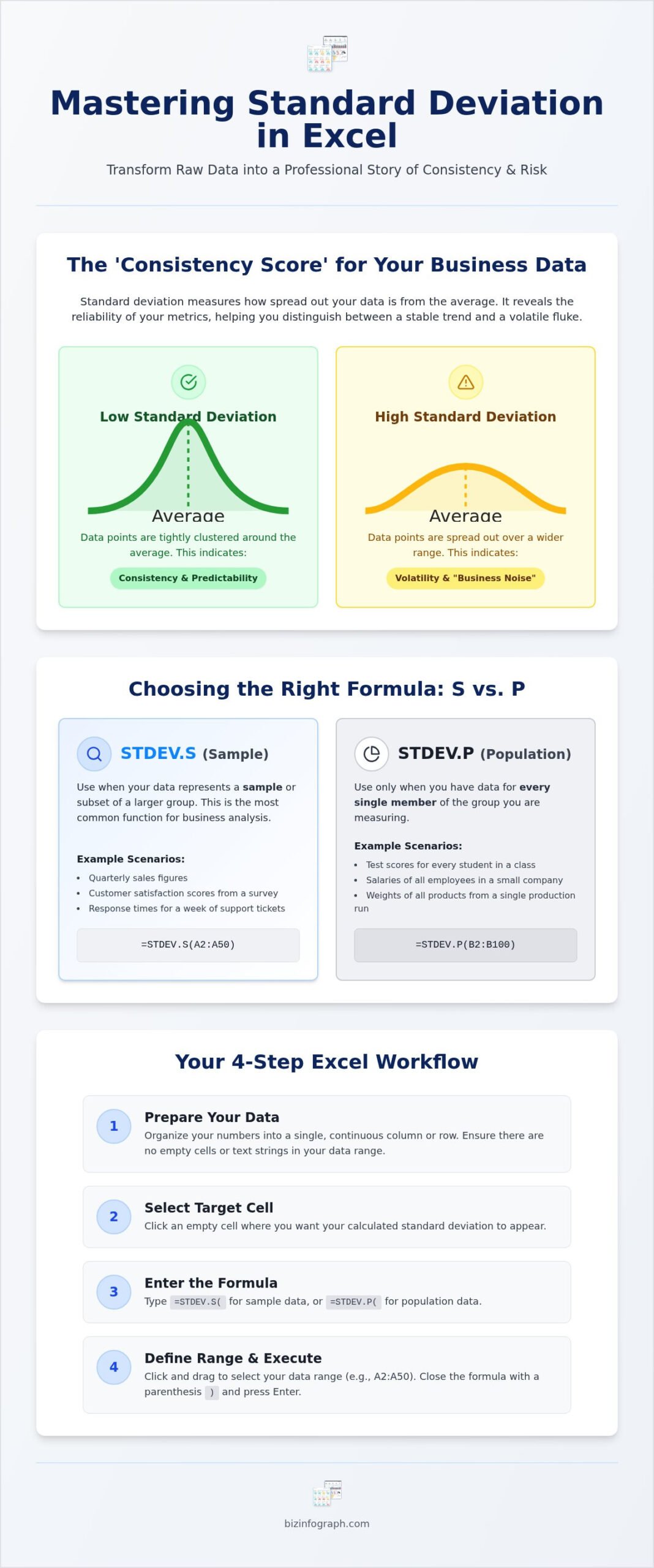
Imagine presenting your quarterly sales report. The average looks great, but your CEO asks, “How reliable is this number for next month?” This is where the math meets the boardroom. Standard deviation acts as the “consistency score” for your business data. While the mean, or average, gives you a central point, standard deviation reveals how much your actual results stray from that center. If your average sales are 100 units but your data points swing between 10 and 190, your average is a fragile metric. Knowing how to calculate standard deviation in excel allows you to identify these outliers in sales or production before they become systemic failures. Standard deviation serves as a vital tool for measuring volatility in business forecasting, allowing leaders to quantify the reliability of their future projections.
Why Businesses Use Standard Deviation in 2026
In 2026, data isn’t just about what happened; it’s about what will happen next. Financial departments use this metric for rigorous risk assessment in reporting and investment analysis. High-impact reporting requires more than just a summary. It requires a deep dive into the stability of your revenue streams. If an investment’s returns fluctuate wildly, the deviation is high, signaling a risky bet that might need a different strategic approach. In manufacturing, it remains the gold standard for quality control. A tight deviation in part dimensions ensures every product meets strict specifications, reducing waste and boosting profit margins. Marketing teams also leverage it to understand customer behavior. Are your purchase patterns steady, or do they swing wildly based on seasonal noise? Identifying these patterns helps you allocate ad spend with surgical precision.
Low vs. High Standard Deviation: What the Numbers Tell You
A low standard deviation is often a reason to celebrate. It indicates process stability and means your data points are clustered closely around the average. In a service delivery context, it suggests your team is providing a consistent experience every single time, which is the foundation of brand loyalty. On the flip side, a high standard deviation signals business “noise.” It tells you that your process is unpredictable and that the “average” might be a misleading representation of reality. It forces you to ask why your results are so scattered. Executives use these insights to decide where to invest resources or where to tighten operational controls. When you master how to calculate standard deviation in excel, you provide the clarity needed to distinguish between a minor hiccup and a major trend. This level of analysis transforms you from a data entry clerk into a strategic partner.
Step-by-Step: How to Calculate Standard Deviation in Excel
Ready to turn your raw numbers into actionable intelligence? The process is simpler than it looks, but professional results require a clean starting point. Begin by organizing your data into a single, continuous column or row. Ensure there are no empty cells or text strings within your range, as these can disrupt the calculation. Once your data is prepped, select the target cell where you want your result to appear. This is where you’ll build your “consistency score” and gain the confidence to present your findings to any stakeholder.
To begin the calculation, type the equals sign followed by the function name. If you’re working with a sample of your total data, you’ll use the most common method. Learning how to calculate standard deviation in excel involves selecting your data range immediately after opening the parenthesis. You can click and drag across your cells or type the range manually, such as (A2:A50). Close the formula with a final parenthesis and hit enter. You’ve just replaced guesswork with statistical certainty.
Using the STDEV.S Function for Sample Data
The syntax for this function is straightforward: =STDEV.S(number1, [number2], …). In most business scenarios, you aren’t looking at every single transaction in company history; you’re looking at a specific time frame or a subset of clients. This makes STDEV.S your default choice for high-impact reporting. It’s a precise tool designed for real-world applications where data is often a snapshot rather than a total population. STDEV.S uses the “n-1” method to mathematically account for sample bias, providing a more conservative and realistic measure of volatility.
Automating Calculations with Named Ranges
If you want to save hours of manual effort, start using named ranges. Instead of typing “A2:A500” every time, you can name that specific group of cells “MonthlySales” through the Formulas tab. This makes your formulas incredibly easy to read and manage. It’s a standard practice when building interactive excel dashboard templates because it allows your reports to scale. When you add new data to the bottom of your list, your named range can update automatically, ensuring your standard deviation calculation remains accurate without you ever rewriting a single line of code.
Mastering these steps is the first move toward creating best-in-class reports. To truly elevate your presentation, consider using professional Excel dashboard templates that integrate these calculations into stunning, ready-to-use visuals. This approach ensures your math is perfect while your design remains sophisticated and impactful.
STDEV.S vs. STDEV.P: Choosing the Correct Statistical Model
Choosing the wrong formula is like using a map of the wrong city. You’ll get a result, but it won’t lead you to the right destination. Most professionals struggle with the choice between STDEV.S and STDEV.P because technical definitions are often too abstract. In a professional business context, the “Population” represents every single data point that exists for a specific category, while the “Sample” is just a representative slice. Using the population formula on a sample leads to an underestimated risk profile, which can be disastrous during financial audits or forecasting. You need to be certain about your data’s scope before you commit to a calculation.
To bridge this gap, think of a “Decision Matrix” for your reporting. Ask yourself: Do I have every single piece of data that could possibly exist for this metric? If you’re looking at last year’s finalized payroll, the answer is yes. If you’re looking at customer satisfaction scores from a survey sent to 10% of your database, the answer is no. This distinction is the foundation of high-impact reporting. When you understand how to calculate standard deviation in excel using the right model, you protect your professional reputation and ensure your visualizations tell an honest story.
The Population Powerhouse: STDEV.P
You should reach for STDEV.P when you have the complete story. For example, if you’re analyzing the final 2025 annual sales results for a specific branch, you aren’t guessing about missing transactions. You have the entire population. This function is more precise because it doesn’t need to account for the “unknowns” that come with partial data. The syntax is simple: =STDEV.P(range). Use this for population-wide analytics where every entry is verified and accounted for. It provides a clean, exact measure of dispersion that reflects the total reality of your dataset without any statistical padding.
The Sample Specialist: STDEV.S
Most business reports actually require STDEV.S. Whether you’re conducting market research or analyzing a month’s worth of customer surveys to represent a year, you’re working with a subset. This function provides a “buffer” for uncertainty by using a slightly different denominator in its math. It’s a safer, more realistic approach when you’re making inferences about a larger group based on a smaller one. Before you run this, ensure your data is accurate. Learning finding duplicates in excel is a critical first step to ensure your sample isn’t skewed by repeated entries. Once your data is clean, mastering how to calculate standard deviation in excel using the sample model ensures your reporting remains grounded in statistical reality. This choice transforms a simple spreadsheet into a sophisticated analytical tool.
Transforming Raw Math into Professional Data Visualizations
A single number, no matter how accurate, rarely tells the full story to a room full of stakeholders. If you tell your board that the standard deviation of monthly revenue is $12,000, you’ll likely be met with blank stares. They need to see what that volatility looks like in relation to your goals. Visualizing your data distribution turns abstract math into a tangible narrative about stability and risk. Once you’ve mastered how to calculate standard deviation in excel, your next step is to bridge the gap between raw calculation and executive insight.
You can also use conditional formatting to make your spreadsheet interactive. By setting rules to highlight cells that fall more than two standard deviations away from the mean, you create an automated early-warning system. This allows your team to spot anomalies in sales or production at a glance, turning your report into a high-impact decision-making tool. It’s about moving from reactive reporting to proactive management.
Building the Standard Deviation Bell Curve
The bell curve, or normal distribution, is the ultimate tool for showing where your results actually live. You can create this by using the NORM.DIST function to calculate the probability density for each data point. When you plot these values on a scatter chart with smooth lines, you provide a clear visual of your “consistency score.” A tall, narrow curve suggests high precision, while a flat, wide curve signals high volatility. To make your chart pop, apply professional infographic styles with clean fonts and muted corporate colors. This ensures your data looks as premium as the insights you’re delivering.
Visualizing Risk with Error Bars
Error bars are the most direct way to show standard deviation on a standard bar or line chart. They provide a visual “buffer zone” around your data points, showing the range of expected outcomes. To add them, select your chart, go to Chart Design, and choose “Error Bars” from the Add Chart Element menu. Customize these by selecting “Standard Deviation” or by linking them to your specific calculated cells for maximum accuracy. For a clean, corporate look, keep the bar thickness thin and the end caps subtle.
These visuals are particularly powerful when exported into PowerPoint infographic templates for your executive decks. Instead of presenting a dry table, you’re presenting a sophisticated risk analysis. If you want to skip the manual design process entirely, you can use pre-built Excel dashboard templates that come with these professional visualizations already integrated. This allows you to focus on the strategy while the template handles the heavy lifting of data design.
Streamlining Your Analysis with Professional Excel Dashboards
Why settle for a basic spreadsheet when you can command the room with a world-class report? Building complex data visuals from scratch often feels like a second full-time job. You’ve done the hard work of crunching the numbers, but now you face the daunting task of making them look presentable for an executive review. Most professionals get stuck here, sacrificing their evenings to align borders and adjust color palettes. Professional templates remove this friction by handling the heavy lifting of data design, providing a pre-built framework where your math instantly transforms into a high-impact narrative.
Integrating your consistency scores into a financial dashboard excel template ensures your volatility metrics aren’t just isolated figures. Instead, they become part of a holistic view of your business health. When your standard deviation sits alongside revenue trends and profit margins, it provides the necessary context for strategic pivots. Knowing how to calculate standard deviation in excel gives you the raw data, but these sophisticated templates give you the stage to present it with authority.
The Benefit of Using Professional Templates
Consistency is the hallmark of a global leader. Using professional templates ensures that every report you produce maintains a polished, corporate aesthetic that mirrors your brand’s excellence. You’ll save hours of formatting time during recurring business reviews, allowing you to focus on the “why” behind the numbers rather than the “how” of the design. These tools are built to be engagement-ready, ensuring your audience stays focused on your insights. By adopting a standardized design language, you eliminate the “manual struggle” and replace it with a seamless, automated workflow that boosts your productivity and your professional reputation.
Scaling Your Data Design with Biz Infographs
Ready to move beyond a single formula and build a full-scale automated reporting tool? Biz Infographs offers a wide range of Excel spreadsheet dashboard templates designed specifically for the modern professional. These aren’t just static files; they are dynamic assets that evolve with your needs. When you choose our templates, you gain access to free lifetime updates for 2026 and beyond, ensuring your reporting stays ahead of the latest software trends. You don’t need to be a graphic designer to create best-in-class visuals. With a few clicks, you can master how to calculate standard deviation in excel and display it within a sophisticated dashboard that makes you shine in front of any audience. It’s time to transform your data into a source of personal pride.
Elevate Your Data Storytelling for 2026 and Beyond
Mastering statistical volatility is no longer a niche skill; it’s a requirement for any professional who wants to lead with confidence. You’ve learned how to distinguish between sample and population data to ensure your risk profiles are accurate. You’ve also seen how to turn dry numbers into compelling visual narratives using bell curves and error bars that capture attention in the boardroom.
Understanding how to calculate standard deviation in excel is just the beginning of your journey toward best-in-class reporting. To truly shine in your next presentation, you need to combine this mathematical precision with high-end design. Why spend hours on manual formatting when you can use a solution that automates the heavy lifting?
Our specialized templates offer professional design quality and automated data visualization to make your work stand out. You’ll also benefit from free lifetime updates to keep your reports current and impactful. Explore Professional Excel Dashboard Templates and start building reports that command respect. You have the tools and the knowledge to transform your data into a source of personal pride. Go ahead and make your next report your best one yet.
Frequently Asked Questions
What is the difference between STDEV.S and STDEV.P in Excel?
STDEV.S is designed for a sample, while STDEV.P is for an entire population. If you’re analyzing a subset of data to infer trends about a larger group, STDEV.S is your best choice because it uses the “n-1” method to account for potential bias. Use STDEV.P only when you have every single data point for the category you’re measuring, such as total annual revenue for a specific, closed fiscal year.
How do I calculate standard deviation in Excel for a specific range?
You can learn how to calculate standard deviation in excel for a specific range by typing `=STDEV.S(` into your target cell and then selecting your data. You can either click and drag your mouse over the desired cells or manually type the range, such as B2:B100. Always remember to close the parenthesis before hitting enter. This simple process ensures your volatility metrics are accurately captured within your professional reports.
Why is my standard deviation formula returning an error?
Errors like #DIV/0! usually occur if your data range contains fewer than two numeric values, as the formula requires at least two points to measure spread. If you see #VALUE!, your range likely contains hidden text or non-numeric characters that the function can’t process. Double-check your data for consistency or use the “Clean” function to remove invisible characters that might be disrupting your statistical analysis.
Can I calculate standard deviation in Excel if my data includes text or logical values?
Standard functions like STDEV.S ignore text and logical values entirely. If you need to include these, use STDEVA or STDEVPA, which treat text and “FALSE” as 0, and “TRUE” as 1. However, for most professional business dashboards, it’s better to clean your data first. Removing non-numeric entries ensures your standard deviation reflects actual performance metrics rather than being skewed by placeholder text or logical flags.
What does a high standard deviation indicate about my business data?
A high standard deviation signals that your data points are spread far from the average, indicating significant volatility or unpredictability. In a sales context, this might mean your revenue is inconsistent, with extreme highs and lows rather than steady growth. High values often represent business “noise” that requires further investigation. Identifying these patterns helps you make more informed executive decisions and adjust your forecasting models for better reliability.
How do I add standard deviation bars to an Excel chart?
First, create a standard bar or line chart from your data. Navigate to the “Chart Design” tab, click “Add Chart Element,” and select “Error Bars.” From the fly-out menu, choose “Standard Deviation.” For a more professional look, you can format these bars to match your corporate branding. This visual representation allows stakeholders to see the “consistency score” of your data immediately without reading raw numbers.
Is there an easy way to calculate standard deviation without typing the formula?
You can view the standard deviation instantly by selecting a range of cells and looking at the status bar at the bottom of your Excel window. If it’s not visible, right-click the status bar and check “Standard Deviation.” For a more permanent solution, using pre-built Excel dashboard templates allows you to see these metrics automatically updated. This saves you from typing complex formulas every time your raw data changes.
Which standard deviation function is best for financial risk modeling?
STDEV.S is typically preferred for financial risk modeling because it provides a more conservative estimate of risk by accounting for sample uncertainty. In 2026, many professionals also use AI-powered features like Microsoft Copilot to assist with formula generation for complex models. Using the sample-based function ensures you aren’t underestimating potential volatility when making high-stakes investment or budgeting recommendations for your organization.