

What if your next board meeting started with absolute clarity instead of a debate over which spreadsheet holds the correct numbers? It’s a common struggle for leaders who find themselves drowning in manual updates and inconsistent reporting across different departments. You’ve likely felt the frustration of presenting data that looks cluttered or unprofessional when you need to be at your most persuasive. We understand that your time is better spent on strategy than on fighting with formatting.
The good news is that you don’t need to be a design expert to create world-class reports. By choosing the right executive dashboard template, you can transform complex data streams into a single source of truth that empowers your entire leadership team. This article will show you exactly how to achieve that professional-grade look while saving significant time through pre-made, high-impact visuals. You’ll move from a state of data overload to a position of confident, informed leadership.
We’ll walk through 15 strategic examples tailored for the 2026 business landscape, covering everything from AI-powered trend analysis to seamless Excel and Power BI integrations. You’ll learn how to bridge the gap between raw numbers and decisive action, ensuring you always shine in front of your audience as a true productivity partner.
Key Takeaways
- Learn how to distill overwhelming organizational data into high-level KPIs that provide instant strategic clarity for your leadership team.
- Discover how to build a comprehensive “CEO Command Center” that monitors profitability and market share using a professional executive dashboard template.
- Explore specialized reporting styles for finance and sales leaders to track liquidity, revenue pipelines, and conversion efficiency with ease.
- Master essential design features like visual hierarchy and interactivity to transform cluttered spreadsheets into polished, board-ready presentations.
- Evaluate the strengths of Excel and Power BI to choose the most efficient platform for your specific data visualization and automation goals.
What is an Executive Dashboard Template? Defining Strategic Clarity
High-level leadership isn’t about knowing every single transaction; it’s about seeing the big picture clearly through the noise of daily operations. An executive dashboard template acts as a specialized visual tool that distills complex organizational data into high-level KPIs. Its primary purpose is clear: it enables C-suite leaders to monitor business health at a single glance without getting lost in the weeds. By focusing on these core “North Star” metrics, you align every departmental effort with the company’s most critical strategic goals. Within the broader context of a Dashboard (computing), the executive version is the most refined. It functions as a strategic decision-framework that ensures every leadership choice is anchored in organizational alignment and long-term growth.
The Difference Between Operational and Executive Views
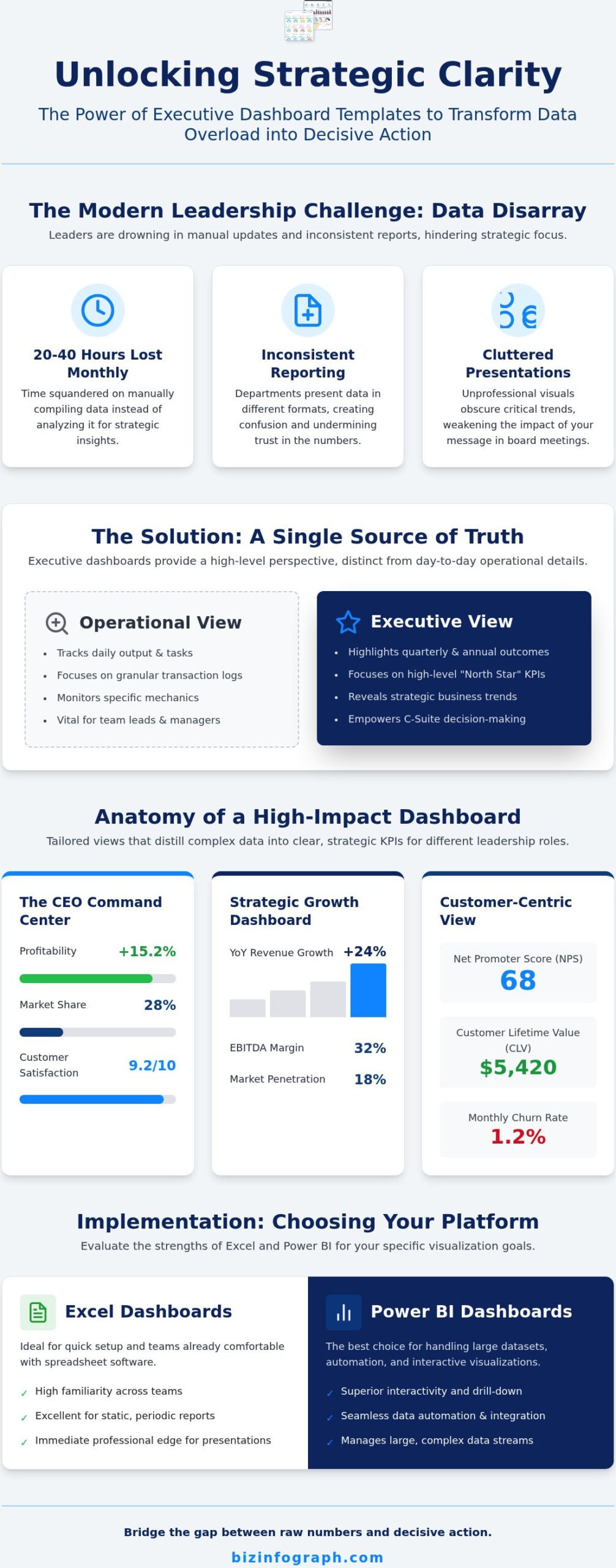
Managers and team leads often get stuck in the specific mechanics of daily tasks. While operational dashboards are vital for tracking daily output or inventory levels, executives require a more elevated perspective. You need summary-level data that highlights quarterly and annual outcomes rather than granular transaction logs that can overwhelm your focus. Looking at every line item doesn’t just waste time; it obscures the high-level trends that actually drive your business forward. To set a proper strategic foundation for your data visualization, you can follow this high-impact dashboard guide. It helps you distinguish between what’s merely interesting and what’s truly impactful for the C-suite.
Why Your Leadership Team Needs a Dedicated Template
Building reports from scratch is a massive drain on your most valuable resource: time. Industry professionals often spend between 20 and 40 hours every month manually compiling data into presentations. It’s a tedious process that often leads to errors and inconsistent formatting. Using a professional executive dashboard template eliminates this struggle and allows you to focus on analysis rather than assembly. It provides immediate consistency across your organization. When the marketing team and the finance department use the same sophisticated format, communication becomes seamless. This uniformity creates a “single source of truth” that builds immense confidence during board meetings. When your visuals are polished and board-ready, you project professional competence and authority that makes your insights impossible to ignore.
The CEO Command Center: High-Level Performance Examples
A CEO’s time is their most precious asset. You don’t need to see every email sent or every support ticket closed. You need the strategic cockpit that guides the entire enterprise. This high-level view filters out the daily noise, allowing you to focus on the signals that truly matter. By using a professional executive dashboard template, you can ensure your attention remains on high-level profitability, market share, and long-term customer satisfaction.
Success isn’t just about reviewing the past. It’s about predicting the future. Trend lines play a vital role here, moving your leadership style from reactive to proactive. When you can see a trajectory before it hits a plateau, you have the power to course-correct with confidence. This foresight is what separates a manager from a true visionary leader.
The Strategic Growth Dashboard
This view is designed for the high-stakes environment of investor relations and board meetings. It provides the “Big Picture” by focusing on three critical areas: Year-over-Year (YoY) Revenue Growth, EBITDA, and Market Penetration. These metrics tell the story of your company’s health and scalability in a language that stakeholders understand. To make an impact, use clean, high-contrast gauges for target-vs-actual performance. This visual hierarchy allows anyone to see instantly if the company is hitting its marks. If you’re looking to upgrade your reporting, exploring Excel dashboard templates can provide that immediate professional edge your board expects.
The Customer-Centric Executive View
Revenue is often just a byproduct of organizational health. To understand the sustainability of your growth, you must look at the customer. This dashboard focuses on Net Promoter Score (NPS), Customer Lifetime Value (CLV), and Churn Rate. It reminds leadership that a high-performing company is one that keeps its promises to its users. A great design tip for this view is to use heat maps. These visuals show geographic customer growth or satisfaction levels at a glance, highlighting which regions are thriving and which need strategic intervention. By tracking these health metrics within an executive dashboard template, you move beyond simple accounting and into true market leadership.
Strategic Dashboards for Finance and Sales Leaders
Finance and Sales are the twin engines of any enterprise. While the CEO monitors the overall flight path, the CFO and VP of Sales must manage the engine room with precision. Choosing a professional executive dashboard template allows these specialists to move beyond simple data entry into true strategic oversight. Finance dashboards serve as the vital signs of the business, focusing heavily on liquidity and capital efficiency. Meanwhile, sales executive dashboards track the health of the revenue pipeline and conversion efficiency to ensure the company hits its targets. Using professional excel dashboard templates remains the gold standard for financial accuracy because they combine the flexibility of a spreadsheet with the power of high-end visualization. A well-structured finance dashboard significantly reduces month-end reporting stress by providing real-time visibility into closing figures throughout the month.
The CFO Financial Health Dashboard
A CFO’s primary responsibility is balancing growth with stability. You need to ensure the company remains solvent while pursuing aggressive market expansion. To achieve this, your dashboard must highlight Operating Cash Flow, the Quick Ratio, and Gross Profit Margin. These metrics provide a clear picture of whether you have the “dry powder” needed for upcoming investments. For the most effective board presentations, use waterfall charts to explain cash flow variances. They offer a sophisticated way to show exactly how your cash position changed from one period to the next, turning a complex ledger into an easy-to-follow narrative.
The Sales Leadership Pipeline View
Sales leaders don’t just look at what was sold yesterday; they look at what will be sold next quarter. This foresight is critical for identifying future revenue gaps before they become current crises. Your dashboard should prioritize Weighted Pipeline Value, Sales Cycle Length, and your Win/Loss Ratio. By monitoring these, you can spot if the top of your funnel is drying up or if deals are stalling in the middle stages. Integrating your CRM data with a sales dashboard template excel allows for rapid visualization without the need for expensive, custom-coded software. It empowers you to lead with data, ensuring your sales team remains focused on the highest-value opportunities that drive the “North Star” metrics of the business.
Essential Features of a 2026 Executive Dashboard Template
Leadership is about storytelling through data, not just listing numbers in a grid. As your expert facilitator in data design, we know that a truly effective executive dashboard template must be built for immediate impact. The most successful leaders follow the “5-second rule”: if you can’t understand the current status of your strategic goals in under five seconds, the dashboard is too cluttered. This level of clarity allows you to move from observation to action without wasting mental energy on interpretation.
Strategic design starts with a clear visual hierarchy. You should always place your most critical “North Star” metric in the top-left corner of the screen. This placement aligns with the natural F-pattern scanning that human eyes follow when reading digital content. Beyond this primary view, interactivity is a non-negotiable feature for modern reporting. It allows you to drill down from a high-level organizational view into specific regions, departments, or product lines. This depth ensures you have the answers ready before the questions are even asked during a board meeting.
Color Theory and Scannability
Professional palettes do more than just look sophisticated; they serve as a silent communication layer. Semantic coloring uses red, amber, and green to signal performance status instantly, allowing you to identify trouble spots at a glance. However, the most underrated element of a high-end dashboard is white space. It prevents executive cognitive overload by giving the eye a place to rest and separating distinct data sets. Current design trends for 2026 favor minimalist, high-contrast layouts that prioritize data points over decorative elements, ensuring your message remains the focal point.
Automation and Data Integrity
Trust is the foundation of any leadership team. You can’t make bold decisions if you’re worried about manual entry errors or outdated figures from last week. Automated template links are essential for maintaining “one version of the truth” across every department. By connecting your data sources directly to your report, you eliminate the risk of human error and save dozens of hours every month. When you invest in a professional executive dashboard template, you also gain the advantage of lifetime updates. This means your reporting infrastructure stays modern and compatible with the latest software versions as technology continues to evolve. Choosing the right tools ensures you always shine in front of your audience while maintaining the highest standards of data integrity.
Implementation Strategy: Choosing Your Dashboard Platform
Selecting the right platform for your data is just as critical as the metrics you choose to track. You don’t need to commit to expensive, over-engineered enterprise software that requires months of specialized training and high subscription fees. Instead, leverage the power of the tools your team already knows and trusts. Excel remains the most accessible and flexible tool for financial and operational reporting, offering unmatched speed for ad-hoc analysis. For organizations that require interactive, large-scale data visualization, Power BI is the clear industry leader. Finally, PowerPoint is your essential tool for turning dashboard data into high-stakes executive presentations. By integrating PowerPoint infographic templates with your live data, you can create a seamless flow from the spreadsheet to the boardroom.
Excel vs. Power BI for Executive Reporting
The choice between these two powerhouses often depends on your specific reporting needs and technical comfort. Excel offers a low learning curve and remains the go-to for leaders who prefer file-based sharing and deep-dive financial modeling. Power BI has a more moderate learning curve but excels in cloud-based sharing and automated data refreshing. It allows your team to access insights via secure links from any device, ensuring everyone stays on the same page. A high-quality executive dashboard template should adapt to your specific ecosystem, whether you’re staying in the familiar world of spreadsheets or moving toward advanced business intelligence. For a deeper dive into making the right choice, consult our Power BI dashboard templates buying guide.
The Build vs. Buy Decision for 2026
In the competitive landscape of 2026, efficiency is your greatest competitive advantage. Spending 40 hours building a custom executive dashboard template from scratch is a poor use of executive time that could be spent on high-level growth strategy. Professional, ready-to-use templates offer a 10x ROI by providing immediate design excellence and verified data integrity. You deserve a solution that lets you shine in front of your audience without the technical headache of manual formatting or broken formulas. Our expert-designed tools are built to transform your reporting workflow from a source of frustration into a point of professional pride. Explore the Biz Infographs library of professional dashboard templates today and take command of your data with absolute confidence.
Command Your Data: Lead with Strategic Clarity
Are you ready to stop fighting with spreadsheets and start leading with absolute clarity? Transforming your data into a strategic asset doesn’t require an army of analysts or a massive software budget. By implementing a professional executive dashboard template, you’ve seen how easy it is to align your leadership team around a single source of truth. You can now move from reactive reporting to proactive strategy, ensuring your “North Star” metrics are always front and center.
Whether you prefer the flexibility of Excel, the interactive power of Power BI, or the high-stakes impact of PowerPoint, the right tools are within your reach. Our high-quality designs are used by professionals globally to save time and eliminate reporting stress. With free lifetime updates included, your reporting infrastructure will always stay modern and effective. It’s about more than just numbers; it’s about the confidence that comes from best-in-class visualization.
Take the next step in your professional journey and shine in front of your board. Download Professional Executive Dashboard Templates Now and experience the relief of world-class business visualization. You have the vision; we provide the clarity to make it a reality.
Frequently Asked Questions
What is an executive dashboard template?
An executive dashboard template is a pre-formatted visual tool that summarizes complex business data into high-level performance indicators for leadership. It provides a structured framework for tracking strategic goals without requiring any manual design work or technical expertise. By using a professional template, you ensure that your reporting remains consistent, polished, and focused on the metrics that drive organizational growth. It’s essentially a strategic cockpit that empowers decision-makers to act with confidence.
What KPIs should be included in a CEO dashboard?
A CEO dashboard should focus on the “Big Picture” metrics that reflect the overall health of the enterprise. Essential KPIs include Year-over-Year (YoY) Revenue Growth, EBITDA, and Net Promoter Score (NPS). You should also track market share and customer churn rates to understand long-term sustainability. These high-level indicators allow a CEO to monitor performance at a glance and identify exactly where strategic intervention is needed most to drive results.
Can I create a professional executive dashboard in Excel?
Yes, you can absolutely create world-class dashboards using Excel. It remains the most flexible tool for financial and operational reporting across the globe. With professional-grade Excel dashboard templates, you can transform standard spreadsheets into sophisticated visual reports that are ready for any board meeting. You don’t need complex, expensive software to achieve high-impact results; you just need a well-designed template that handles the heavy lifting of data visualization for you.
What is the difference between an operational and a strategic dashboard?
Operational dashboards track daily activities and short-term tasks, such as current inventory levels or daily sales volume. Strategic dashboards focus on high-level outcomes and long-term goals, like quarterly profitability or annual market penetration. While operational views help managers handle the “now,” strategic dashboards empower the C-suite to plan for the “next.” They provide the summary-level data necessary for informed, forward-looking leadership decisions that align with the company’s core mission.
How often should an executive dashboard be updated?
The update frequency depends on your organizational needs, but most leadership teams review strategic dashboards on a weekly or monthly basis. While some metrics like sales revenue might be updated daily for real-time visibility, high-level KPIs like EBITDA are typically reviewed monthly. The goal is to provide a consistent rhythm of reporting that allows leaders to spot trends without becoming overwhelmed by daily fluctuations in the data streams.
Do I need Power BI to create a high-impact dashboard?
While Power BI is a leader for large-scale, interactive data visualization, it isn’t a strict requirement for high-impact reporting. You can achieve professional-grade results using Excel or PowerPoint infographic templates. Power BI is excellent for teams that need cloud-based sharing and automated data refreshing across massive datasets. However, many executives find that a well-structured executive dashboard template in Excel provides more than enough clarity and flexibility for their specific needs.
What are the benefits of using a pre-made dashboard template?
Using a pre-made executive dashboard template saves you dozens of hours that would otherwise be spent on manual design and formatting. It ensures professional consistency across all departments and significantly reduces the risk of human error in your reporting. You gain immediate access to best-in-class data visualization practices, allowing you to shine in front of your audience. It’s an efficient way to adopt a modern, high-performance reporting style without starting from scratch.
How many metrics should be on a single executive dashboard screen?
You should aim for a maximum of 5 to 9 key metrics on a single screen to maintain absolute clarity. This follows the “5-second rule,” ensuring that a leader can understand the status of the business almost instantly. If you include too many data points, you risk cognitive overload and dilute the impact of your most important “North Star” metrics. Focus on quality over quantity to ensure your dashboard remains a powerful decision-making tool.
One reply on “15 Strategic Executive Dashboard Template Examples to Drive Results in 2026”
[…] teams. For leaders who need to present with absolute clarity in the boardroom, exploring strategic executive dashboard template examples can help you identify the right layout to empower your entire leadership team. When you use the […]