Introduction to Sales Team Dashboard Power BI
What Is a Sales Team Dashboard Power BI and Why It Matters
A Sales Team Dashboard Power BI is a visual reporting solution that helps businesses monitor team results, pipeline progress, and customer trends in one place. Instead of reviewing scattered spreadsheets and static files, teams can use one dynamic dashboard to understand performance faster. A strong power bi sales dashboard turns raw numbers into useful visuals, helping leaders get an at-a-glance understanding of what is happening. This matters because a modern sales team needs more than simple reports. It needs a practical business intelligence tool that supports data-driven decisions, improves accountability, and gives a clearer overview of sales performance.
How a Sales Dashboard Supports Better Sales Analysis and Reporting
A good Sales Dashboard improves sales analysis by organizing the most important sales data into a single, structured reporting view. It allows businesses to compare actual sales, pipeline activity, conversion rates, and targets without having to search through several files. A well-built analysis dashboard makes it easier to understand patterns, review trends, and identify weak spots early. It also improves the quality of reports for sales teams because the focus shifts from compiling data to interpreting it. When leaders use visual reporting, they can move faster from information to action and make better, more informed decisions.
Why Businesses Use a Sales Team Dashboard Power BI Template
Many companies choose a Sales Team Dashboard Power BI template because it saves time and offers a proven structure for reporting. A well-made sales dashboard template includes KPI cards, trend charts, pipeline visuals, and performance comparison sections that can be reused across reporting periods. This is useful for teams that want a standardized layout without designing everything from scratch. A reusable template also supports stronger consistency across the organization. Since many businesses already work with recurring monthly and weekly reports, a template-based approach makes it much easier to scale reporting and maintain a more disciplined performance review process.
Core Benefits of Sales Team Dashboard Power BI
Improving Sales Performance Visibility with a Power BI Sales Dashboard
A power bi sales dashboard improves visibility by putting the most important performance indicators into one easy-to-read report. Managers can monitor actual sales, quota progress, team output, and pipeline health without switching between different tools. This level of clarity is important because it helps leadership identify problems earlier and act faster. A strong sales dashboard power bi setup can reveal whether results are improving, which regions are performing well, and where support is needed. Better visibility leads to better sales discipline, stronger coaching, and more focused performance review across the sales organization.
How Sales Analytics and Sales Analysis Support Better Decisions
Strong sales analytics and thoughtful sales analysis help teams move beyond reporting history and into decision-making. By reviewing trends in revenue, conversions, and customer activity, leaders can see what is driving growth and what is slowing progress. This kind of analysis helps businesses identify the most useful tactics, allocate time better, and improve their strategy. A dashboard built for data-driven management gives teams the confidence to act on evidence rather than assumption. That is why sales analytics matter so much. They turn reports into decision tools and help managers make more accurate and more timely choices.
Using Power BI Service for Interactive Team Reporting
Power BI Service adds important value because it makes reporting more accessible, collaborative, and interactive. Teams can publish a power bi report, share it with the right users, and access updated information without sending files back and forth. This improves communication and speeds up reporting cycles. A report published in the service becomes part of a broader system of dashboards and reports that can support both management and frontline users. When teams combine Power BI Desktop and Power BI Service, they gain stronger control over performance reporting and make it easier for everyone to review up-to-date data.
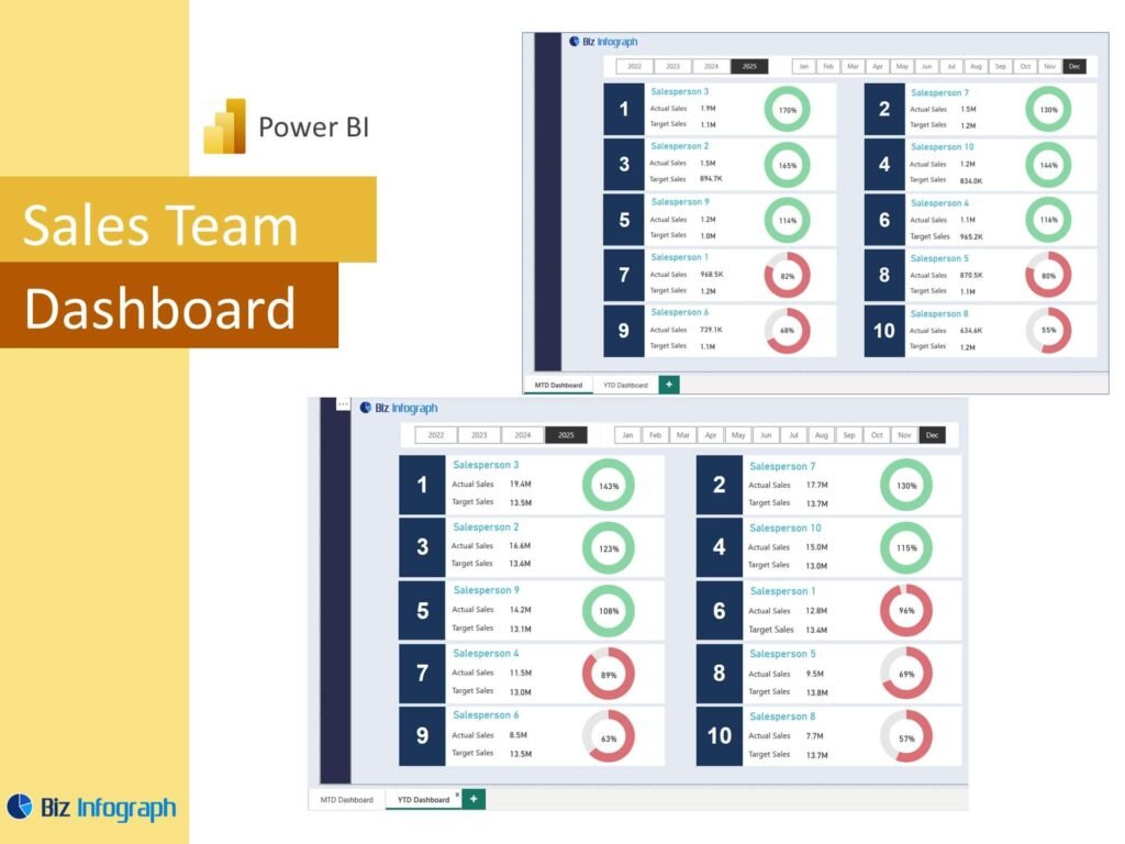
Key Metrics in a Sales Team Dashboard Power BI
Tracking Actual Sales, Sales Conversion, and Sales Performance
A useful Sales Team Dashboard Power BI setup must track core outcomes such as actual sales, sales conversion, and broader sales performance indicators. These measures show how effectively the team is moving opportunities through the funnel and turning effort into revenue. They also provide a quick way to compare team results with expectations. Strong kpis such as win rates, close value, and target attainment help make performance easy to understand. A dashboard that clearly displays these measures helps managers identify which areas are performing well and which need coaching or more focused action.
Measuring Budget vs Actual Sales and Team Achievement
A strong dashboard should compare budget vs actual sales so the team can see whether it is meeting expectations. This is important because performance should be reviewed against targets, not just in isolation. When actual revenue is measured alongside budget, managers can understand how close the team is to its goals and where gaps need attention. It is also helpful to display actuals, achievement percentages, and YTD trends. A well-designed report makes this easy by placing target and result visuals together. This supports better sales planning and improves accountability across teams, territories, and individuals.
Monitoring Sales Customer Trends, Inquiry Analysis, and Recurring Revenue
Beyond revenue, a modern dashboard should monitor sales customer patterns, inquiry analysis, and recurring revenue where relevant. Customer trends help businesses understand buying behavior, repeat patterns, and segment value. Inquiry analysis can reveal whether lead flow is strong, weak, or inconsistent. For companies with subscription or service models, recurring revenue is a critical measure of stability and growth. These metrics add depth to the dashboard because they show not only what was sold, but also how sustainable the sales process is. This creates a more comprehensive view of performance and supports better long-term planning.
Sales Team Dashboard Power BI Features
How Sales Team Dashboard Power BI Excel Supports Reporting
Many businesses begin with spreadsheets, so a strong Sales Team Dashboard Power BI excel workflow often starts with organized Excel inputs. Teams may use microsoft excel or excel files as source tables for sales results, targets, customer data, or activity logs. When the source is clean, Power BI can transform it into a more advanced reporting solution. This approach is especially useful for businesses moving from a sales dashboard in excel to a more visual and scalable platform. Power BI keeps the familiarity of Excel-based preparation while adding stronger analysis, interaction, and data visualization capabilities.
Building a Power BI Report with Template and Dashboard Examples
A good power bi report becomes easier to build when teams learn from dashboard examples, a template gallery, and other proven layouts. Reviewing power bi dashboard examples and power bi sales dashboard examples helps businesses understand how to structure KPI cards, trend charts, pipeline views, and team comparisons. This reduces trial and error and helps improve the quality of the final design. It also helps teams understand how to organize summary and detail views effectively. Learning from examples is one of the easiest ways to create a more practical and more professional reporting solution.
Using ZoomCharts and Strong Visual Design for Better Analysis
Tools like ZoomCharts can make a dashboard more interactive and easier to explore, especially when users want drill-down capability and better data navigation. Combined with strong visualization, they help users move from high-level summary into specific details quickly. Clear charts, good spacing, and consistent labels matter because the goal is not only to display data, but to make the report easier to interpret. A well-designed dashboard may use a column chart for comparisons, a line chart for trends, and KPI cards for summaries. Good visual design improves reporting quality and helps teams use the report more effectively.
Sales Management and Pipeline Reporting
Using a Sales Pipeline Dashboard for Sales Management Visibility
A sales pipeline dashboard gives managers visibility into opportunity flow, stage movement, and future revenue potential. It is one of the most useful tools in sales management because it shows where deals are building, where they are slowing down, and whether pipeline volume is healthy enough to support future targets. A good pipeline view may also include weighted pipeline values and stage counts. These measures help leaders understand risk and forecast more realistically. When pipeline visibility is strong, teams can focus on improving execution before missed targets become major performance problems.
Connecting CRM Data with a Power BI Dashboard for Better Team Oversight
Connecting crm data to a dashboard improves oversight because it links customer activity, opportunity progress, and team actions into one report. A strong CRM-linked dashboard can show lead sources, follow-up history, conversion stages, and account trends in a way that static files cannot. It also reduces manual work and improves reporting accuracy. When teams combine CRM information with revenue and activity data, they get a stronger understanding of the full sales process. This helps leaders coach more effectively, improve accountability, and keep the sales team aligned around measurable and trackable actions.
Creating a Sales Performance Dashboard and Performance Report for Ongoing Review
A sales performance dashboard is valuable because it provides a structured way to review results regularly. It can support daily, weekly, and monthly performance review by showing core key metrics, trends, and comparison views. A formal performance report built on dashboard visuals is especially useful for managers who need consistent updates for meetings or executive review. It allows the team to compare progress over time, spot weak areas, and keep attention on outcomes. Ongoing review is important because performance improvement depends on regular monitoring, not just end-of-period summaries.
Industry and Business Use Cases
Sales Team Dashboard Power BI for B2B Sales and SaaS Reporting
A Sales Team Dashboard Power BI report is especially useful for B2B sales and SaaS businesses because these models often involve longer deal cycles, multiple touchpoints, and recurring revenue patterns. In these environments, managers need to track pipeline movement, customer inquiries, stage progression, and subscription performance in one place. A dashboard can help measure the health of the full sales process while also highlighting renewals and account growth. This kind of reporting is important because B2B and SaaS decisions often depend on forward-looking performance, not just current revenue totals.
Using Sales Dashboard Reporting for Retail Supply Chain and Marketing Campaign Analysis
Sales dashboards also support industries like retail supply chain and teams that need to connect selling activity with a marketing campaign. In retail environments, managers may need visibility into customer demand, product movement, and inventory-linked performance. In campaign-driven businesses, the dashboard can show whether promotions are generating leads and whether those leads are turning into revenue. This broader use case makes the dashboard more strategic because it links commercial performance with other parts of the business. A good report helps users connect campaign results, customer activity, and product movement more clearly.
Applying Dashboard Insights to Car Sales Analytics Power BI and Other Business Models
Industry-specific reporting is another strength of Power BI. For example, car sales analytics power bi reporting may include sales by model, dealership performance, inquiry follow-up, finance conversion, and regional trends. Other industries may adapt the same structure for different products or sales models. The value comes from being able to tailor the dashboard while still keeping a strong performance framework. Whether the business sells vehicles, subscriptions, retail products, or services, the same dashboard principles apply. Good reporting turns business-specific data into insight and helps teams improve strategy within their own operating context.
Dashboard Design and Practical Use
Exploring Dashboard Examples and Template Gallery Ideas
Reviewing dashboard examples and ideas from a template gallery is a practical way to improve report design. These examples help teams see how to organize KPI cards, charts, filters, and pipeline views in a way that is easy to understand. Learning from power bi dashboard examples reduces the chance of cluttered layouts and improves usability. It also helps new users understand what a strong dashboard should look like. Examples can guide choices around layout, visual hierarchy, and page structure. For many teams, this is one of the fastest ways to create a better report.
Building a Mobile Sales Dashboard for Better Access and Monitoring
A mobile sales dashboard improves access by allowing managers and teams to monitor performance from phones or tablets. This is especially helpful for leaders who travel, field teams that work remotely, or organizations that want quick access during meetings. A good mobile design focuses on the most important summaries and avoids overcrowding the screen. It should still show the most critical KPIs and high-level trends clearly. A strong mobile design matters because quick access to performance information supports faster reactions and helps managers stay connected to results throughout the day.
How to Adapt a Sales Team Dashboard Power BI Template to Business Needs
Every business has different reporting needs, so adapting a Sales Team Dashboard Power BI template is essential. Some teams may care most about daily sales, others about pipeline health, win rates, recurring revenue, or regional results. The template should be flexible enough to include those priorities. Good customization may involve changing visuals, adding filters, or connecting new data sources such as sql databases, CRM tools, or Excel-based activity logs. The more closely the dashboard reflects actual business questions, the more useful it becomes. Customization turns a generic template into a real management tool.
Conclusion
Why a Sales Team Dashboard Power BI Template Is a Practical Reporting Tool
A Sales Team Dashboard Power BI template is practical because it combines structure, flexibility, and scalability in one reporting format. It helps teams move beyond raw data and create a clearer reporting process that supports regular review and stronger analysis. Templates save time, improve consistency, and make it easier to build repeatable dashboards. They also help businesses organize multiple report needs into one solution, whether shared as published reports or internal pbix files. For organizations that want better reporting without starting from zero each time, a template-based dashboard is a smart option.
Final Thoughts on Using a Sales Dashboard for Team Performance and Sales Analysis
A well-designed Sales Dashboard helps businesses understand team results, pipeline movement, customer activity, and overall revenue performance more clearly. It supports interactive dashboards, improves visibility, and helps leaders make data-driven decisions with greater confidence. Whether the team is reviewing actual sales, working in Power BI Service, or preparing reports in Power BI Desktop, the real value lies in turning data into action. When reporting is clear, interactive, and aligned with business needs, it becomes much easier to support better coaching, better planning, and stronger sales performance over time.
For ready-to-use Dashboard Templates: