
Introduction to Revenue Budget vs Actual Dashboard Power BI
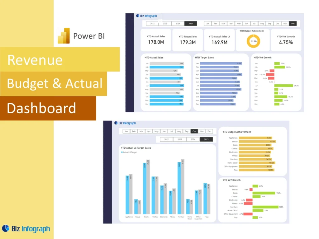
What Is a Revenue Budget vs Actual Dashboard Power BI and Why It Matters
A Revenue Budget vs Actual Dashboard Power BI solution is a reporting tool that helps businesses compare planned revenue with actual performance in one place. It gives leaders a clear view of whether revenue is tracking ahead, behind, or close to expectations. A strong dashboard in power bi turns numbers into usable business insight instead of leaving them buried in a spreadsheet or static report. This matters because revenue is one of the most important measures in the business. A clear dashboard supports stronger review, faster response, and more confident financial and operational planning.
How a Finance Dashboard Power BI Supports Revenue Actual vs Budget Reporting
A strong Finance Dashboard Power BI helps organizations review actual vs budget performance more clearly by organizing revenue, forecast, and variance information into one structured report. Instead of checking multiple files, leadership can review one visual summary that shows revenue movement and performance gaps. This improves decision-making because the business can quickly see whether budgeted figures are realistic and whether action is needed. A good dashboard supports not only comparison, but also explanation. It helps users understand what happened, where the variance sits, and what that means for the business going forward.
Why Businesses Use a Revenue Budget vs Actual Dashboard Power BI Template
Many companies choose a Revenue Budget vs Actual Dashboard Power BI template because it provides a repeatable structure for comparing revenue plan and results. A strong template saves time by giving teams a ready format for KPI views, variance summaries, and forecast sections. It also improves consistency because the same logic and layout are used every reporting period. This is especially helpful when finance teams prepare monthly or quarterly reports. A template helps the team focus more on interpretation and less on layout. That makes reporting faster, clearer, and easier to maintain over time.
Core Benefits of Revenue Budget vs Actual Dashboard Power BI
Improving Revenue Visibility with a Dashboard in Power BI
A strong dashboard in power bi improves revenue visibility by bringing target and actual information into one view that is easier to interpret than a static table. It helps businesses monitor current performance, compare plan with reality, and identify where the biggest gaps exist. Better visibility is important because revenue shifts often require quick response. A dashboard helps users see not only totals, but also patterns by time, product, region, or sales line when needed. That makes it a powerful tool for finance and leadership teams that need better oversight of business performance.
How Analysis and Variance Reporting Support Better Business Decisions
Strong analysis and variance reporting are essential because comparing budget to actual numbers is useful only when the business understands the difference and what caused it. A dashboard makes that easier by turning raw revenue comparisons into clear visual signals. This supports more data-driven decisions because leaders are not reacting to assumptions. They are reacting to measurable gaps in performance. Better analysis also helps the business prioritize where to act first. This improves management focus and makes the report more than a summary. It becomes an operational decision tool.
Using Power BI for Forecasting and Actual vs Budget Review
Power BI is especially useful for comparing revenue plan and outcomes because it can combine forecast, budget, and actual values in one flexible report. It helps teams review the current position and future expectations at the same time. This is important because businesses need to understand not only where they stand now, but also where they are likely to finish. A strong Revenue Budget vs Actual Dashboard Power BI report creates that connection clearly. It strengthens planning, helps management respond sooner, and supports more confident financial review throughout the reporting cycle.
Key Metrics in a Revenue Budget vs Actual Dashboard Power BI
Essential Revenue, Budget, Actual, and Variance Metrics to Track
Every Revenue Budget vs Actual Dashboard Power BI report should include the most important measures needed to compare performance clearly. These usually include budget revenue, actual revenue, revenue variance, variance percentage, achievement rate, and current forecast. These are the basic numbers that tell the story of whether the business is meeting expectations. A dashboard should also present at least one strong kpi summary so leadership can review the current position quickly. Clear measure selection is essential because it makes the report easier to interpret and more useful for regular performance management.
Measuring Actual vs Budget Performance with Financial Analysis Views
A strong dashboard should support financial analysis by showing actual vs budget performance in more than one way. It may compare total revenue, period trends, and achievement percentages, while also showing where the largest gaps exist. These views help users understand the size and direction of the performance difference. A good dashboard can also help identify whether the issue is timing, underperformance, or forecasting error. Better financial views improve the usefulness of the report because they turn a simple number comparison into a more meaningful business explanation.
Tracking Forecast, Revenue Trends, and Business Performance Indicators
A useful revenue report should not stop at budget and actual comparison. It should also track forecast movement and broader business indicators that affect revenue performance. These may include sales activity, period trend movement, pipeline-related measures, or product-level shifts depending on the business model. Strong trend reporting helps users understand whether performance is temporarily weak or part of a broader pattern. This is valuable because revenue reporting should support action, not just explanation. A dashboard that combines forecast and trend views becomes much more useful for planning and performance review.
Revenue Budget vs Actual Dashboard Power BI Features
How a Revenue Budget vs Actual Dashboard Power BI Template Simplifies Reporting
A Revenue Budget vs Actual Dashboard Power BI template simplifies reporting by providing a ready structure for budget, actual, and forecast review. Instead of rebuilding visuals and logic every cycle, users can refresh the data and review updated results. This reduces manual effort and supports stronger consistency. Templates also help standardize KPI design and chart placement, which makes reports easier to read over time. For teams that manage repeated revenue reporting, this saves time and lowers the risk of layout inconsistency. It gives the business a more efficient way to manage performance reporting.
Building Better Reports with Data Model, Measure Logic, and DAX
A good dashboard depends on a strong data model, clear measure logic, and well-designed DAX calculations. Revenue reports often need budget, actual, and forecast data to connect properly by period, product, or business segment. Without a strong model, the numbers can become confusing or unreliable. DAX helps calculate achievement percentages, variance, and trend views accurately. This is one of the biggest strengths of reporting within power bi. When the underlying logic is solid, the final dashboard becomes more trustworthy, more flexible, and much more useful for decision-making and regular business review.
Using Charts and Dashboard Design for Clear Actual vs Budget Analysis
Good design matters because even strong numbers lose value if they are hard to read. A useful dashboard should use visuals that make variance and trend interpretation easy. For example, a column chart can compare budget and actual by period, while KPI cards can show summary measures. Clear visualization helps users understand where performance is strong and where it is weak without reading large tables. A well-designed actual dashboard improves communication and makes discussions more productive. Better design turns comparison into insight and helps the report support faster management decisions.
Revenue Reporting and Financial Analysis
Using a Dashboard to Analyze Revenue Budget vs Actual Over Time
A dashboard is especially valuable when it shows how budget and actual revenue compare across several months or quarters. One period may look weak, but a longer view may reveal a recovery trend or a deeper performance problem. This kind of time-based analysis helps businesses understand whether revenue issues are temporary or structural. It also improves planning because leadership can see whether the gap is getting smaller or larger. A strong Revenue Budget vs Actual Dashboard Power BI report makes these patterns easier to identify and supports more thoughtful financial review over time.
How Forecast and Variance Analysis Improve Financial Review
Forecast and variance analysis are useful because they connect current performance with future expectations. A dashboard can show not only how far actual revenue is from budget, but also how likely the business is to close that gap by the end of the period. This improves financial analysis and makes review meetings more practical. Leadership can decide whether a change in forecast is needed, whether an adjustment is required in strategy, or whether the budget itself needs reconsideration. Better variance and forecast visibility creates a much stronger basis for action.
Supporting Better Business Decisions with Revenue Performance Tracking
Revenue performance tracking helps leaders decide where to focus effort, whether in sales, pricing, operations, or forecasting. A good dashboard makes this easier by showing where revenue is beating plan and where it is falling short. This supports stronger decision-making because the discussion is based on measured outcomes instead of assumptions. A dashboard also improves speed because leaders can see the numbers immediately and respond faster. Better tracking creates better accountability, and better accountability leads to stronger management discipline around revenue performance across the organization.
Dashboard Design and Practical Use
Creating Clear Metric Views for Revenue Budget vs Actual Reporting
Clear metric views are essential because leadership usually needs the most important numbers first. A dashboard should present revenue budget, actual revenue, variance, and achievement rate in a simple and visible way. Supporting charts should then explain how those figures are moving over time. Good metric design reduces confusion and helps users understand the story quickly. When the report begins with clear summary views, it becomes easier to move into detail afterward. This is one of the most important parts of creating a useful Revenue Budget vs Actual Dashboard Power BI solution.
Organizing Data Within Power BI for Better Dashboard Analysis
Strong reporting depends on how well the data is prepared. Budget files, actual revenue data, and forecast inputs often come from different systems, including sql sources, exported files, or manual spreadsheet inputs. Organizing that information properly within power bi is essential for accurate reporting. Teams may use power query to clean, shape, and align period-level records before they build measures and visuals. Better organization improves accuracy, reduces confusion, and makes the dashboard much more dependable. Clean data structure is one of the main reasons a revenue report becomes truly useful.
Adapting a Revenue Budget vs Actual Dashboard Power BI Template to Business Needs
Every business tracks revenue differently, so the dashboard should reflect that reality. One company may focus on sales by region, another on product mix, and another on channel or customer performance. A flexible Revenue Budget vs Actual Dashboard Power BI template allows teams to adapt KPI views, trend sections, and chart logic to those needs. This makes the report more relevant and more practical in real decision-making. Good adaptation ensures the dashboard answers the questions the business actually cares about rather than forcing a generic reporting structure on every use case.
Practical Value of Revenue Budget vs Actual Dashboard Power BI
Building a Finance Dashboard Power BI for Revenue and Forecast Review
A strong Finance Dashboard Power BI can combine revenue budget, actual performance, and forecast views into one structured reporting tool. This helps the finance team and leadership review performance more quickly and see how current results affect future expectations. A combined dashboard is especially useful when the business needs regular performance discussion and faster visibility into changing conditions. By bringing these views together, the report becomes more strategic and more useful for planning. It helps management keep focus on the numbers that matter most in financial performance review.
Using Actual Dashboard Views for Smarter Financial Reporting
A clear actual dashboard view improves reporting because it highlights what really happened instead of keeping the report centered only on targets. When actual revenue is shown clearly and compared with budget, users gain stronger understanding of business performance. This is especially valuable for identifying where the company is performing well and where shortfalls are appearing. Better actual views support clearer financial conversations and create stronger accountability. When actual performance is visible and explained well, the report becomes far more useful for management and finance review.
Applying Revenue Budget vs Actual Reporting to Different Business Use Cases
Revenue budget versus actual reporting is useful across many business models, but the dashboard should reflect the way the business operates. A services business may focus more on timing and contract revenue, while a product business may focus more on units, price, and seasonal patterns. Some organizations may also connect the report to cash flow analysis or broader profitability review. A flexible Revenue Budget vs Actual Dashboard Power BI report can support these different use cases while keeping core budget and variance logic intact. That makes it useful across many reporting environments.
Conclusion
Why a Revenue Budget vs Actual Dashboard Power BI Template Is a Practical Reporting Tool
A Revenue Budget vs Actual Dashboard Power BI template is practical because it combines reporting consistency, stronger design, and operational efficiency in one solution. It helps teams refresh data, compare results more easily, and maintain the same KPI logic across periods. Templates also reduce repetitive work and support more dependable financial review. For businesses that need regular revenue tracking, this creates a more reliable reporting process. It allows the team to focus on analysis and action rather than rebuilding the report structure every time a new period is reviewed.
Final Thoughts on Using a Finance Dashboard Power BI for Variance Analysis, Forecasting, and Revenue Performance Tracking
A well-built Finance Dashboard Power BI helps businesses understand revenue performance with more clarity and confidence. It supports better analysis, stronger forecast review, and clearer visibility into actual vs budget movement. With a strong model, good visuals, and clear KPI structure, the dashboard becomes a powerful tool for finance and leadership teams. Better reporting leads to better actions, and better actions help improve revenue outcomes over time. That is what makes a revenue budget versus actual dashboard such a valuable part of modern financial reporting.
For ready-to-use Dashboard Templates: