Introduction to Expense Budget vs Actual Dashboard Power BI
What Is an Expense Budget vs Actual Dashboard Power BI and Why It Matters
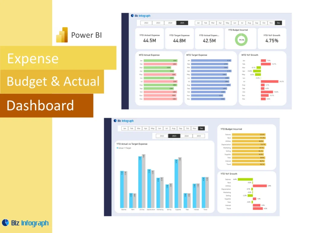
An Expense Budget vs Actual Dashboard Power BI solution is a reporting tool that helps businesses compare planned spending with actual expenses in one visual view. Instead of checking several files, teams can use one dashboard to see whether cost is on track, where variance exists, and which areas need attention. This matters because spending control directly affects cash flow, profitability, and business stability. A well-designed dashboard helps users compare budgeted amounts with actual spending, monitor patterns, and support stronger decision-making. It turns cost reporting into a more practical and more strategic management process.
How a Finance Dashboard Power BI Supports Expense Budget vs Actual Reporting
A strong Finance Dashboard Power BI improves expense reporting by bringing budget, actual cost, and forecast views into one structured format. This makes it easier for managers and finance users to compare what was planned with what really happened. A dashboard also helps teams track and analyze cost movement over time rather than relying on one-time review. This creates a stronger basis for financial analysis and helps leaders understand whether the business is controlling expenses effectively. Better visibility improves accountability and supports faster responses when costs begin to move away from plan.
Why Businesses Use an Expense Budget vs Actual Dashboard Power BI Template
Many companies use an Expense Budget vs Actual Dashboard Power BI template because it gives them a repeatable way to monitor spending without recreating reports each month. A good budget template includes KPI cards, trend charts, category comparisons, and variance views that can be reused easily. This saves time and creates consistency in reporting. It also helps teams standardize the way they evaluate cost performance across functions or departments. For businesses that review spending every month or on a yearly basis, a reusable template is one of the most practical ways to improve reporting efficiency.
Core Benefits of Expense Budget vs Actual Dashboard Power BI
Improving Expense Visibility with a Power BI Financial Dashboard
A power bi financial dashboard improves visibility by putting expense categories, totals, and budget comparisons into one clear report. This helps the business see where spending is aligned with plan and where it is not. Better visibility is important because many expense problems develop gradually through repeated small increases or missed controls. A strong dashboard helps teams identify these patterns earlier. It also makes it easier to review both underspending and overspend conditions, which are equally important in planning. Clear visibility gives management a stronger basis for controlling cost and protecting performance.
How KPIs and Variance Analysis Support Better Expense Decisions
Clear kpis and well-structured variance reporting are essential because they help users understand where budget performance is strong and where it is weak. A dashboard can show the size of the gap between planned and actual cost, highlight variance indicators, and support faster follow-up. These views help teams identify areas that need action and explore the root cause of budget gaps. When finance users have clear KPIs and variance measures in one place, they can make faster and more data-driven decisions about spending control, reallocation, and operational improvement.
Using Power BI for Forecasting, Tracking, and Budget Control
Power BI is useful for expense review because it can combine budget, actuals, and forecast into a single report that supports ongoing control. This allows teams to see not only how much they have spent, but also how current patterns may affect future periods. A dashboard can help users act earlier when spending trends suggest a risk of overspending later. It also improves the quality of the budget control process by connecting planned cost with actual execution. Better forecasting and tracking support stronger financial discipline and more reliable expense management across the business.
Key Metrics in an Expense Budget vs Actual Dashboard Power BI
Essential Budget, Actual Expenses, and Variance Metrics to Track
Every Expense Budget vs Actual Dashboard Power BI report should include the most important spending measures needed for good control. These often include budget, actual expenses, dollar variance, percentage variance, forecast, and achievement against expense targets. A dashboard may also show category totals, trend movement, and selected performance metrics for different functions. These are the core numbers that help users understand whether spending is under control. When the report presents these measures clearly, leadership can review cost performance faster and make more confident decisions about where attention is needed.
Using KPI and Metric Views for Better Expense Analysis
A good dashboard should use clear metric and KPI views so finance users can understand expense performance quickly. For example, summary cards can show total budget, total actual cost, and total variance, while charts can explain category changes. This helps users move from overview into deeper financial analysis more easily. Good KPI design also improves communication because the same cost logic is visible to everyone reviewing the report. When metric views are clear, the dashboard becomes more useful for monthly review, operational discussion, and executive reporting on cost discipline.
Measuring Forecast, Spending Trends, and Financial Performance
A strong dashboard should not stop at budget and actual comparison. It should also show spending trends and expected outcomes through forecast views. This helps the business understand whether current patterns will continue and whether the full period is likely to stay within plan. It also supports broader financial analysis because cost patterns affect profitability, liquidity, and long-term performance. For example, rising cost may weaken gross profit, while poor control over certain items may distort budget expectations. Better forecast and trend reporting improves the usefulness of the dashboard as a forward-looking financial management tool.
Expense Budget vs Actual Dashboard Power BI Features
How an Expense Budget vs Actual Dashboard Power BI Template Simplifies Reporting
A reusable Expense Budget vs Actual Dashboard Power BI template simplifies reporting by giving teams a ready structure for reviewing cost performance. Users can refresh the latest data instead of redesigning visuals and KPI logic each cycle. This improves speed and reduces repetitive work. It also makes reports more consistent across periods, which helps finance teams compare performance more reliably. A good template is especially useful when cost reporting is recurring and involves many departments or categories. It gives teams a more efficient reporting process and supports stronger budget discipline over time.
Building Better Reports with DAX, Calculation Logic, and Dashboard Design
Good expense reporting depends on strong calculation logic and clear visual design. In Power BI, this usually means building measures with DAX that calculate budget, actual, variance, forecast, and trend movement accurately. Strong dashboard design also matters because users need to understand the numbers quickly. Visual choices should support comparison and make the most important signals easy to spot. A strong report combines clean formulas with simple and effective visualization. When logic and design work together well, the dashboard becomes easier to trust, easier to explain, and much more useful for ongoing expense review.
Using Spreadsheet, Excel, and Google Sheets Data for Better Power BI Analysis
Many organizations begin budget reporting in a spreadsheet, excel sheet, or Google Sheets, so Power BI often works best when it can use those familiar sources. Teams may import budget and actual data from excel files or csv files before shaping the model for analysis. This is practical because finance teams already maintain many budget records outside core systems. Power BI improves the process by transforming those inputs into a more useful report. When the data is prepared well, spreadsheet-based sources can support strong reporting and a smoother transition to better expense analysis.
Expense Reporting and Financial Analysis
Using an Actual Dashboard to Compare Budget vs Actual Over Time
An actual dashboard is especially useful when it compares cost performance over several months or across a full yearly cycle. This helps teams understand whether a spending issue is temporary or part of a broader pattern. Looking at actual vs budget movement over time makes it easier to identify departments or categories that consistently perform above or below plan. It also helps the business understand whether expense control is improving. Time-based review gives much better context than one isolated month and makes the dashboard more valuable for budgeting, monitoring, and long-term planning.
How Variance and Financial Analysis Improve Expense Review
Strong variance reporting and financial analysis make expense review much more practical because they help explain what changed and why. A dashboard that shows both dollar and percentage gaps allows teams to identify not only large differences, but also meaningful patterns in spending behavior. Better analysis helps finance users investigate the root cause of variances, whether they come from growth, inefficiency, planning error, or exceptional items. This deeper understanding improves reporting quality and supports more accurate follow-up. Good variance analysis turns the dashboard into a real management tool rather than a simple summary.
Supporting Better Analyst and Planner Decisions with Expense Tracking
A good expense dashboard is useful not only for finance managers, but also for an analyst or planner who needs to understand cost patterns in detail. These users often look for category trends, forecast accuracy, and unexpected movements that affect operational planning. A structured dashboard helps them compare spending with plan more quickly and investigate the reasons behind change. Better expense tracking improves the quality of recommendations they provide and helps align spending with business goals. This makes the dashboard a strong support tool for planning, budgeting, and operational finance work.
Dashboard Design and Practical Use
Creating Clear Format and KPI Views for Budget vs Actual Reporting
A strong expense report depends on a clear format that presents the most important budget and actual measures first. KPI cards should summarize total spending, total variance, and forecast impact, while supporting visuals explain what is driving change. A good dashboard structure helps teams focus on the biggest issues without being overwhelmed by detail. It also improves communication because users can move from summary to explanation logically. A clear format makes the report easier to review in meetings and helps decision-makers see the signals that matter most in cost management.
Organizing Budget Template and Data Sources for Better Dashboard Accuracy
Better dashboard accuracy starts with stronger data organization. Budget records, forecast adjustments, and actual cost data often come from multiple sources, so teams need to combine them carefully. A clean budget template and well-managed data sources reduce the risk of mismatched categories or incorrect totals. Many teams use power query because its transformation capabilities make it easier to clean, shape, and align imported data. Good organization improves reliability and supports stronger trust in the dashboard. When the data model is accurate, the report becomes much more valuable for real financial control.
Adapting an Expense Budget vs Actual Dashboard Power BI to Business Needs
Every business has different reporting priorities, so the dashboard should be flexible enough to reflect those needs. One organization may focus on departmental spending, while another may care more about project costs, cost of goods sold, or functional categories. Some may want a simple tracker, while others need deeper views for forecasting and planning. Adapting the Expense Budget vs Actual Dashboard Power BI report to those goals makes it more relevant and more useful. Customization ensures the dashboard answers the questions the business actually needs answered and supports stronger operational value.
Practical Value of Expense Budget vs Actual Dashboard Power BI
Building a Finance Dashboard Power BI for Expense Control and Reporting
A strong Finance Dashboard Power BI for expense control helps leadership review how money is being spent and whether spending aligns with financial goals. It provides a more disciplined way to compare budget and actual outcomes and gives visibility into trends that may require action. This is useful because expense control is one of the most important parts of profitability and planning. A dashboard also helps teams review how costs connect to broader results such as margin, actual revenue, and working capital. Better reporting supports better finance control and stronger operational accountability.
Using a Tracker, Calculator, and Analytics View for Smarter Expense Monitoring
Some organizations think of expense tools as a tracker, calculator, or simple budget monitor, but Power BI can combine all of those ideas into one more capable report. It can track movement, calculate variance automatically, and provide analytics that reveal patterns behind the numbers. This is far more powerful than static files because users can review summary and detail together. A dashboard that combines tracking and analytics helps teams track and analyze cost more effectively and supports better spending decisions. It becomes a practical tool for both reporting and ongoing monitoring.
Applying Budget vs Actual Dashboard Reporting to Different Business Use Cases
Expense budget versus actual reporting is useful across many kinds of organizations. A manufacturer may focus more on production cost and cost of goods sold, while a consultancy may care more about payroll, overhead, and utilization-related expense. Some businesses may also compare expense with revenue vs budget to understand the broader performance context. The dashboard should reflect those differences while keeping core budget, actual, and variance logic consistent. This makes the report more useful and helps each business apply spending analysis in a way that supports its own priorities and structure.
Conclusion
Why an Expense Budget vs Actual Dashboard Power BI Template Is a Practical Reporting Tool
An Expense Budget vs Actual Dashboard Power BI template is practical because it gives teams a consistent and efficient way to review cost performance. It helps reduce repetitive reporting work, improve accuracy, and maintain the same visual structure across periods. Templates also support stronger comparison because the same calculations and layout are reused each time. For organizations that review expenses regularly, a template-based dashboard creates a more dependable reporting process and improves the quality of financial review. It allows the team to spend less time rebuilding reports and more time interpreting results.
Final Thoughts on Using a Finance Dashboard Power BI for Tracking Budget, Actual Expenses, and Variance
A well-designed Finance Dashboard Power BI helps businesses review actual results, compare them with budget, and understand the reasons behind cost differences. It supports better data-driven review, stronger control over actual spending, and more effective planning for future periods. With clear KPIs, strong variance views, and reliable data preparation, the dashboard becomes a powerful tool for expense management. Better reporting creates better actionable insights, and better insights help teams control spending more effectively and support stronger financial performance across the business.
For ready-to-use Dashboard Templates: