Revenue Budget vs Actual Dashboards in Power BI Template
Introduction to Revenue Budget vs Actual Dashboards
What is a Revenue Budget vs Actual Dashboard in Power BI?
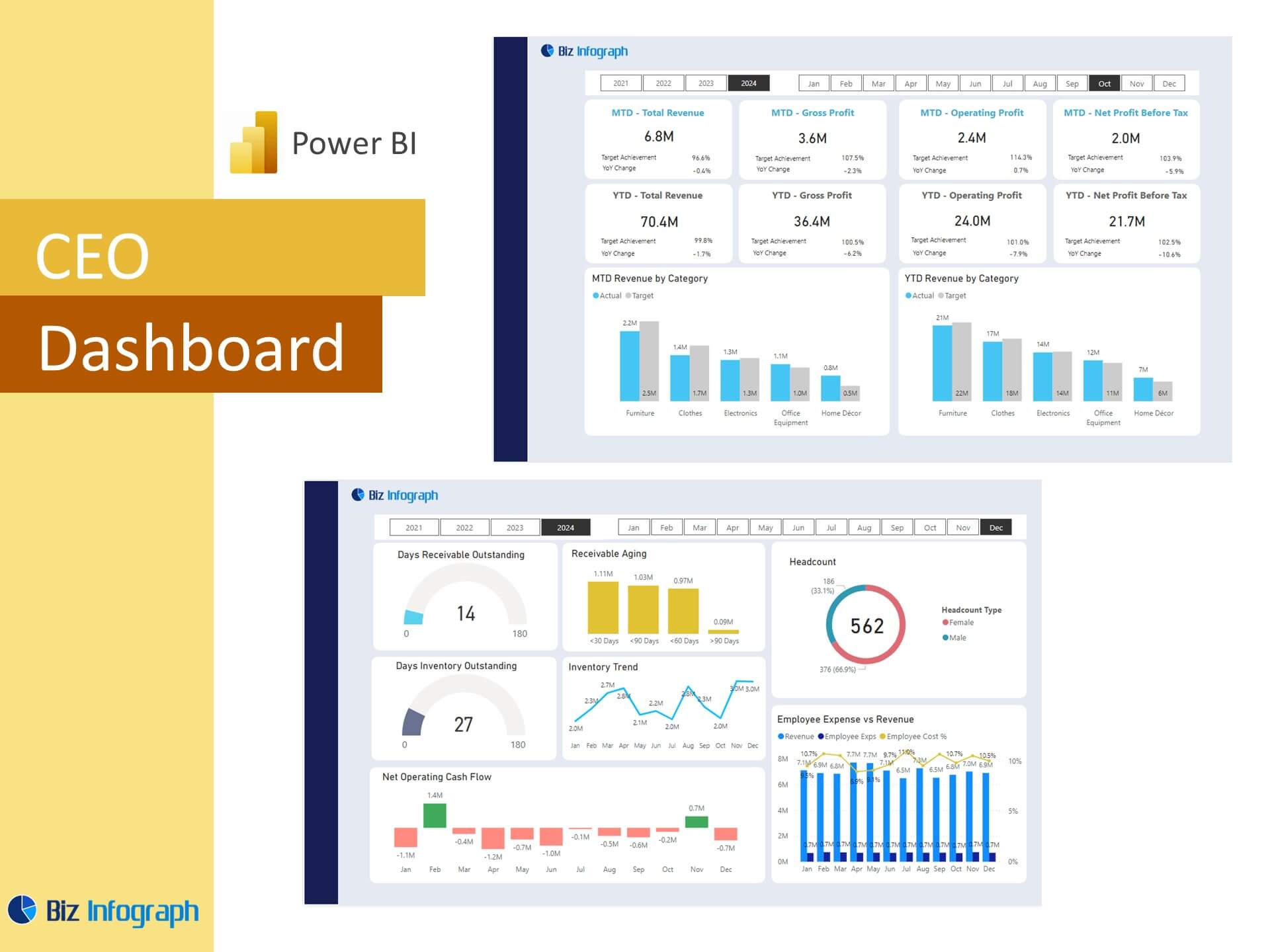
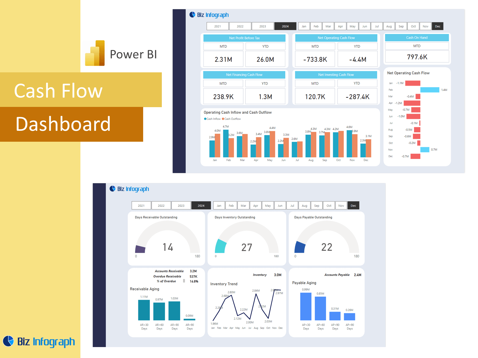
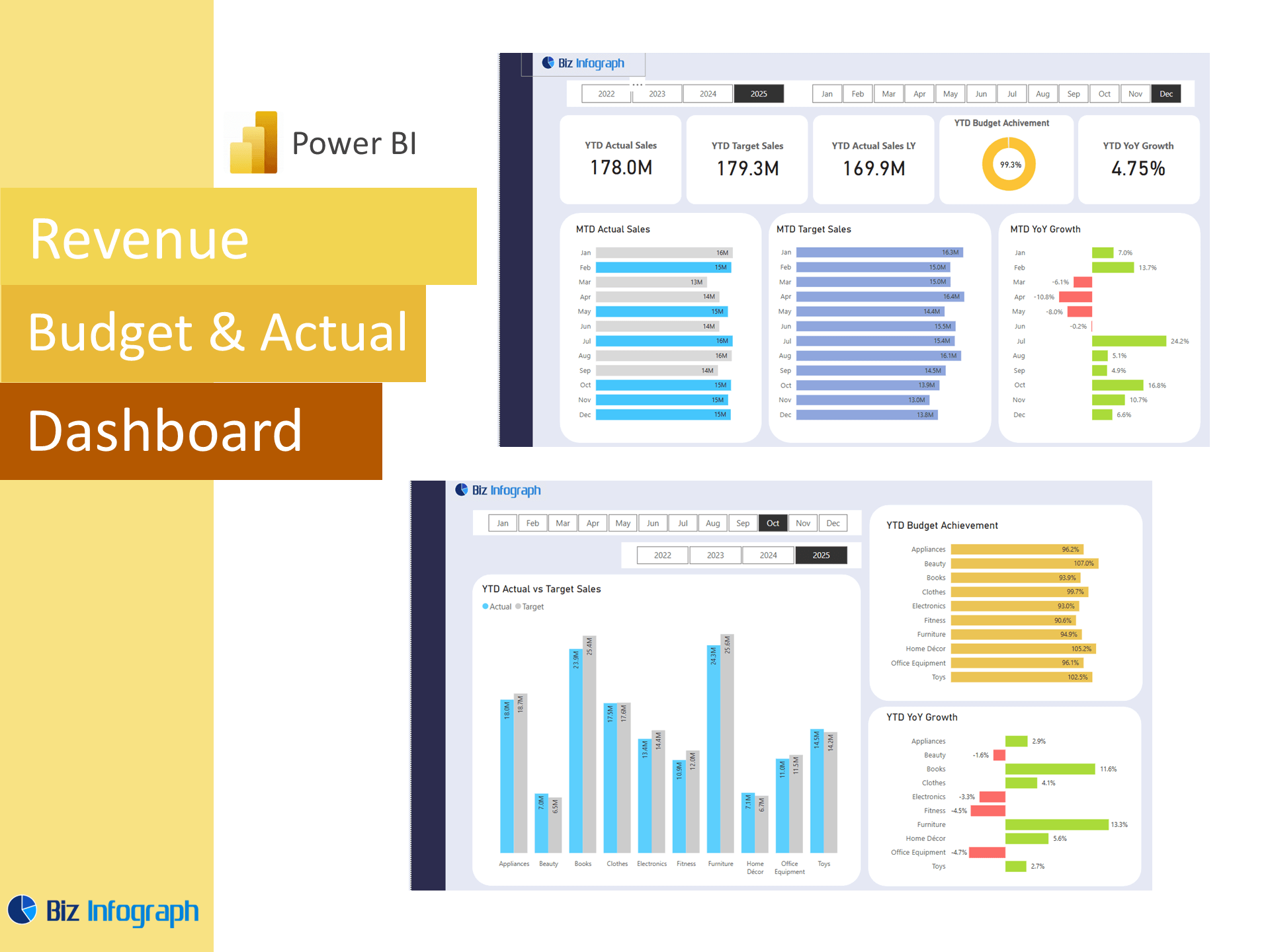
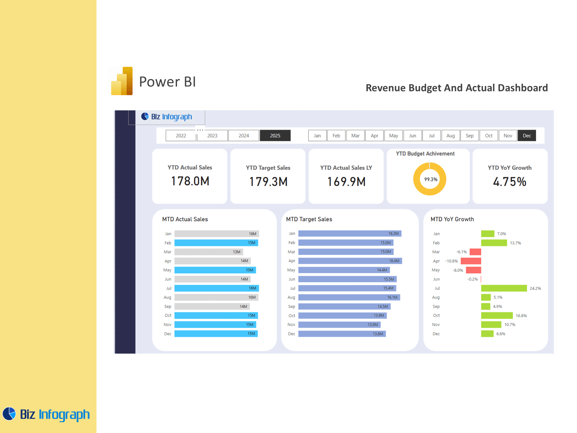
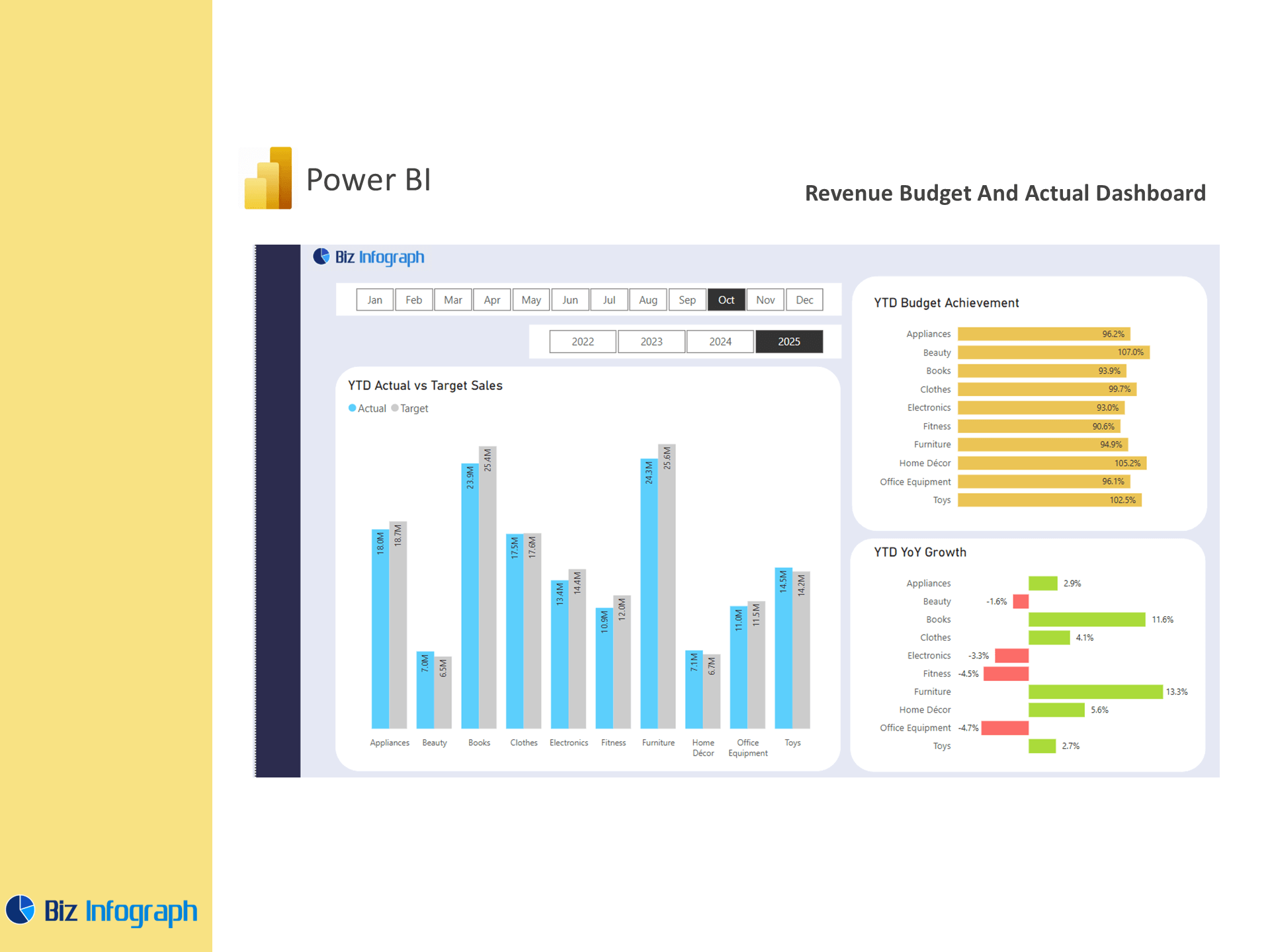
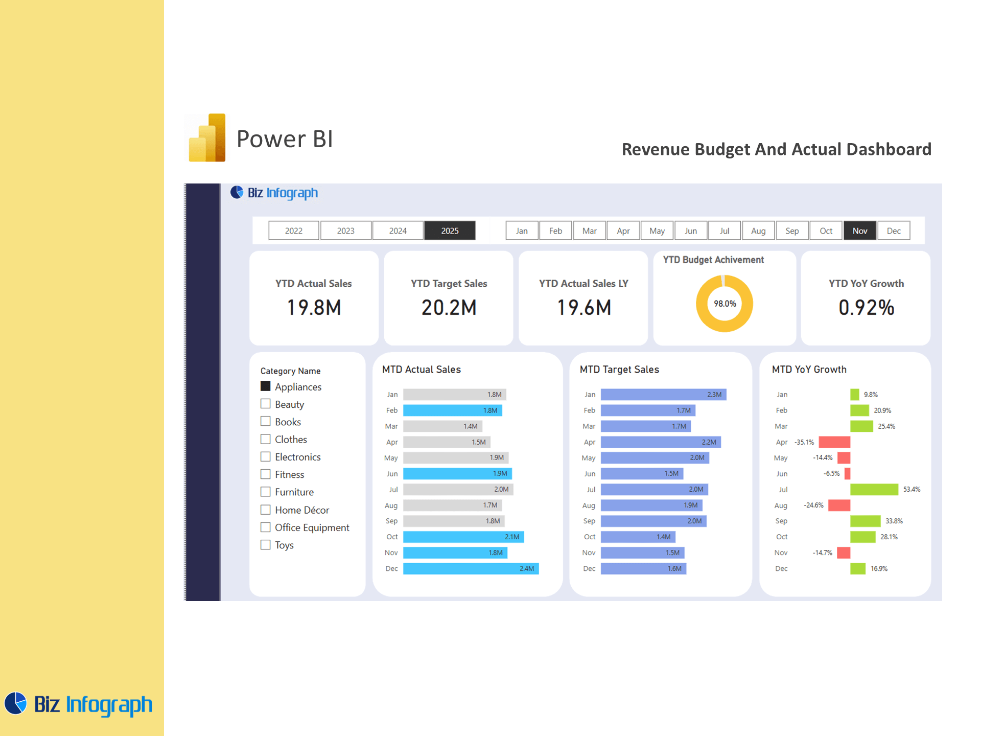
A Revenue Budget vs Actual Dashboard in Microsoft Power BI is a dynamic business intelligence tool that helps organizations monitor revenue performance against budgeted expectations. This dashboard is designed to visualize and compare actual revenue, recurring revenue, and annual recurring revenue against forecasts in real time. Built using a Power BI dashboard template or Power BI report, the dashboard integrates budget data and actual performance data to deliver actionable insights. Whether you're using a custom PBIX file or a download free template, this dashboard offers a centralized view to drive strategic decision-making.
Why Track Revenue Performance vs Budgeted Forecasts?
Tracking revenue vs budget is essential to ensure financial alignment and forecast accuracy. A budget vs actual analysis allows teams to understand actual income and expenses, detect over- or under-performance, and adjust strategy in a timely manner. A revenue dashboard created in Power BI can highlight actual figures vs expectations using visual cues and comparisons that aid quick understanding. Comparing actual vs budget allows for responsive budgeting, Sales performance, enhanced forecasting, and stronger internal controls. With Power BI, users can leverage real-time data to refine forecasts and better manage revenue streams.
Benefits of Using Power BI Dashboards for Revenue Analytics
Power BI offers a wide range of advantages for revenue analytics. It supports integration with multiple data sources like Excel, SQL, and cloud services, and allows for seamless transformations using Power Query Editor. By using a Power BI budget vs actual framework, businesses gain insights into revenue trends, actual sales, and income and expenses over time. The dashboard provides interactive elements such as filters and slicers that help teams explore actual results at various levels. These dashboards reduce manual reporting, promote real-time visibility, and align financial decisions with operational performance.
Key Components of a Revenue Budget vs Actual Dashboard
Essential Key Metrics to Monitor in Revenue Dashboards
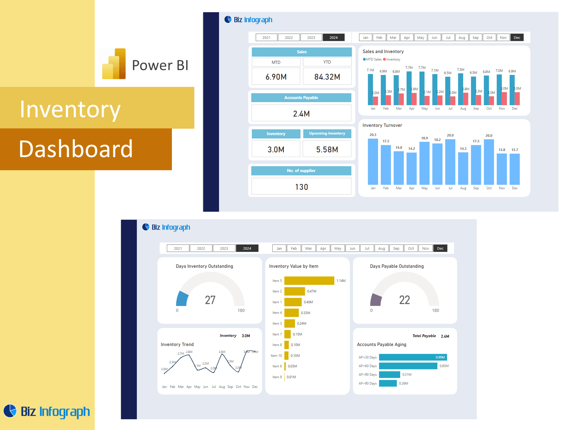
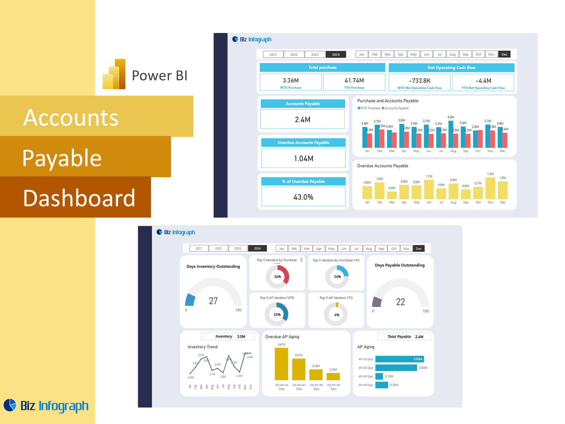
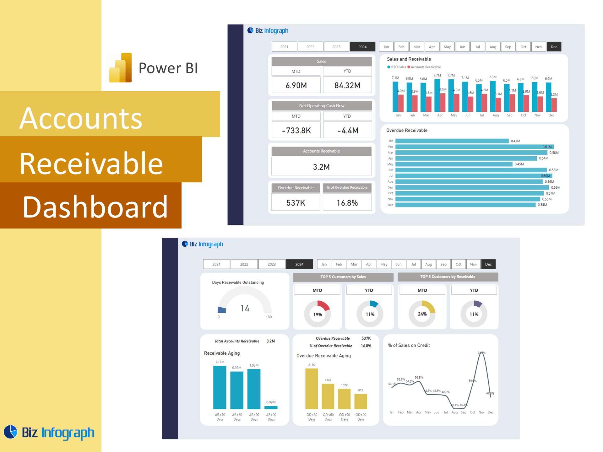
Effective revenue dashboards must include key performance indicators like actual revenue, actual sales, revenue growth percentage, recurring revenue, and monthly or annual comparisons. Other key metrics like revenue per product, customer segment, or region should be incorporated. These KPIs allow finance and sales leaders to evaluate the effectiveness of sales strategies and business performance. A strong performance dashboard also includes variance metrics to highlight gaps between budget data and actual figures, enabling better budget vs actual analysis and timely strategic action.
Designing Dashboards Using DAX and Power BI Templates
To build a robust dashboard, users often start with a Power BI template or Power BI dashboard template, then extend functionality using DAX. These formulas calculate metrics such as Variance = Actual - Budget and Variance % = (Actual - Budget)/Budget. Power Query is used to clean and transform data from multiple systems. By following best practices, such as maintaining a clean data model and using intuitive visual layouts, the dashboard remains efficient and insightful. Whether starting from scratch or customizing a Power BI sales or sales budget vs actual dashboard, strong foundational design ensures consistency and usability.
Incorporating Forecasts, Actual Sales, and Trends Over Time
An effective revenue dashboard should provide insights into trends over time, including forecast comparisons with actual sales and actual revenue. Using line charts, bar graphs, and area visuals, you can show monthly or quarterly performance and variance. Incorporating forecast logic into the dashboard helps teams simulate future performance based on current trends. With Power BI, this analysis becomes dynamic—users can apply filters or interact with this Power BI dashboard to view projections by department, region, or customer. This flexibility supports agile planning and data analysis.
Building the Dashboard in Power BI
Choosing and Customizing a Power BI Template or PBIX File
Starting with a PBIX file or dashboard template saves time and ensures structure. These templates, which you can download free, often include pre-built visuals and measures for tracking actual vs budget performance. They’re highly customizable—users can adjust visuals, colors, and dashboard features to fit branding or reporting standards. Using templates built for sales budget vs actual dashboard or power bi financial scenarios helps standardize key metrics. As your needs grow, you can evolve these templates using Power BI provides features like bookmarks and dynamic tooltips.
Best Practices for Revenue vs Budget Visualization
Designing a clear and functional dashboard involves applying best practices for layout, navigation, and visual formatting. Use color-coded bar charts to show actual vs target performance, gauge charts to highlight variance, and KPI cards for headline figures. Group data logically—monthly trends, product-level details, and top-line comparisons—to ensure quick comprehension. Incorporating interactivity like filters for department or time periods helps personalize views. Good dashboards optimize usability, reduce clutter, and focus on actionable insights that improve planning and decision-making.
Enhancing Dashboards with Power BI Service Integration
Publishing to Power BI Service transforms your report into a collaborative asset. You can schedule updates, share dashboards with key stakeholders, and embed them into team portals. Power BI Service allows access to live dashboards across devices, giving executives and department heads the ability to track actual expenses, actual sales, and performance metrics on demand. Alerts and email subscriptions ensure that changes in revenue trends are communicated proactively. This integration turns your dashboard using Power BI into a real-time decision-support system.
Use Cases and Strategic Applications
Real-World Use Cases for Revenue Budget Dashboards
Use cases for revenue dashboards span across finance, sales, and executive teams. CFOs use them to align actuals with forecasts. Sales leaders use them to understand pipeline quality and revenue contribution. Business units track their revenue generation vs departmental budgets. A bi budget vs actual dashboard becomes central in quarterly reviews, planning cycles, and performance discussions. These dashboards streamline workflows, improve stakeholder visibility, and support accountability.
Comparing Actual vs Budget for Recurring and Annual Revenue
Organizations with subscription models must manage both recurring revenue and annual recurring revenue targets. By comparing actual billing to monthly or yearly goals, finance teams can understand renewal success, customer churn, and expansion trends. These dashboards can break down actual performance data by customer type, product tier, or service plan. The integration of revenue breakdowns into the dashboard allows for precise revenue tracking and forecasting, helping teams maintain stable income flows and react to changes effectively.
Using Revenue Dashboards to Guide Financial Planning and Reporting
Dashboards built in Microsoft Power BI are increasingly used to create a profit and loss view, align with strategic plans, and measure financial performance. By providing a real-time overview of actual income and expenses, businesses can base their financial planning on facts, not assumptions. These dashboards improve communication with stakeholders, reduce reporting cycles, and support long-term profitability through informed decisions. Combined with smart visual storytelling, they make revenue reporting faster, easier, and more impactful.
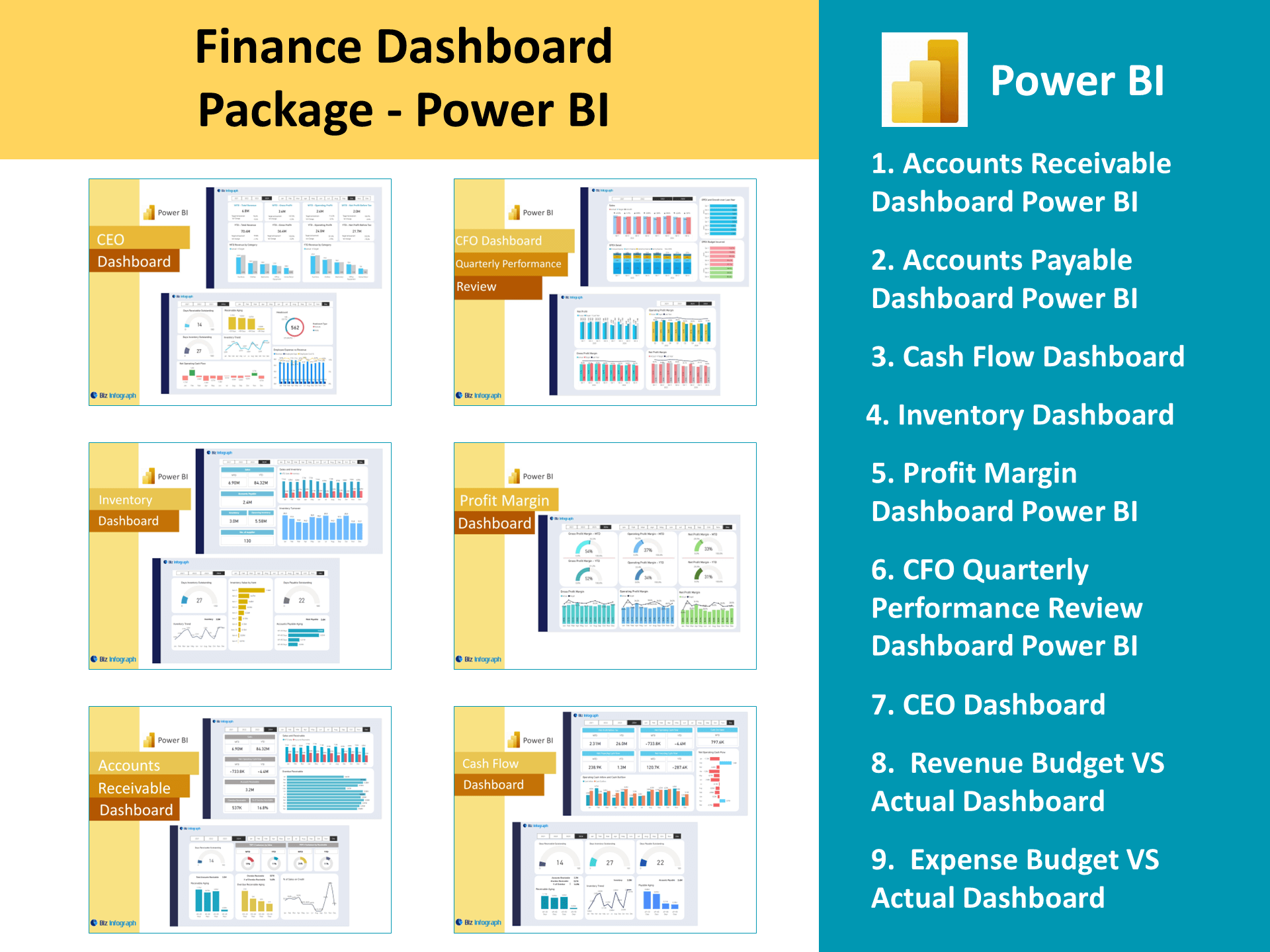
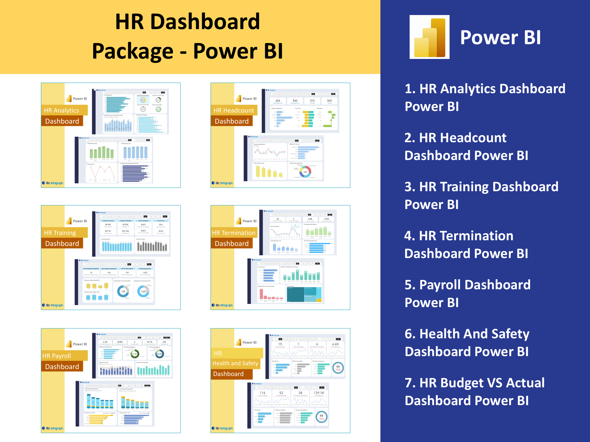
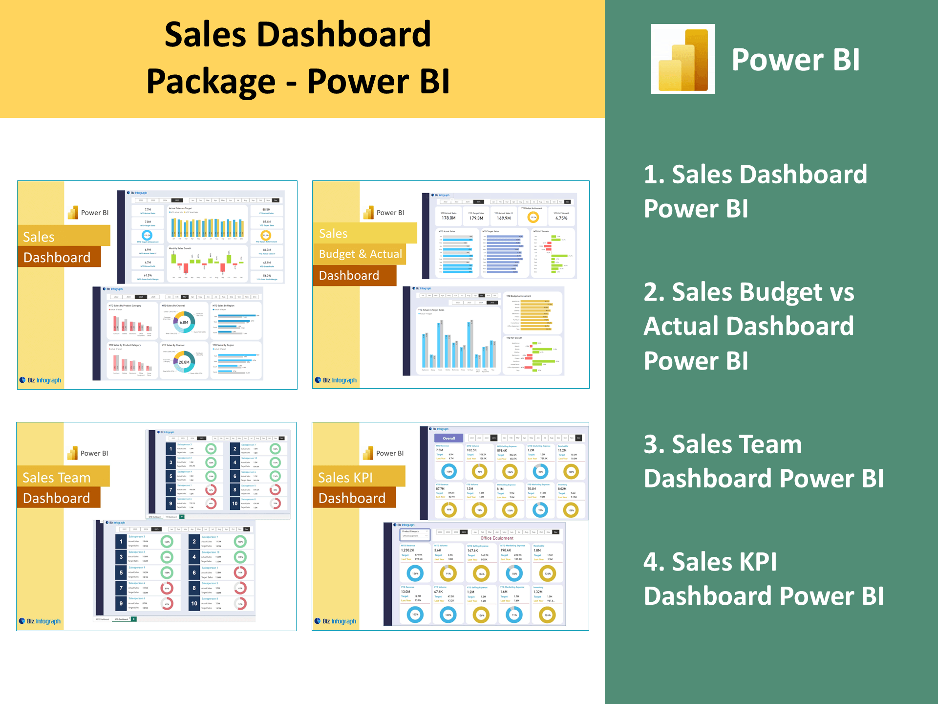
For ready-to-use Dashboard Templates:
- Financial Dashboards
- Sales Dashboards
- HR Dashboards
- Data Visualization Charts
- Power BI – Biz Infograph
- Automation – Biz Infograph