

Did you know that companies leveraging data-driven sales strategies see an average revenue increase of 20%? It’s a powerful statistic, yet many sales leaders still find themselves trapped in a cycle of manual data cleaning and confusing reports that fail to inspire action. You shouldn’t have to master complex DAX formulas just to see your basic growth metrics. If you’ve ever felt the frustration of a board meeting where the visuals didn’t match the scale of your ambition, you’re not alone. Finding the right Power BI sales dashboard template is about more than just aesthetics; it’s about reclaiming your time and transforming your CRM data into a strategic asset that commands respect.
I’ll show you exactly how to select a “plug-and-play” solution that bridges the gap between raw numbers and executive-level clarity. You’ll discover how the best professional templates for 2026 prioritize drill-through logic to highlight underperforming regions or products in seconds. We’ll break down the selection criteria that ensure your reports aren’t just pretty, but are built for high-stakes decision making. From seamless Microsoft Fabric integration to sophisticated design that impresses every stakeholder, this guide is your roadmap to becoming the expert facilitator your team needs to shine.
Key Takeaways
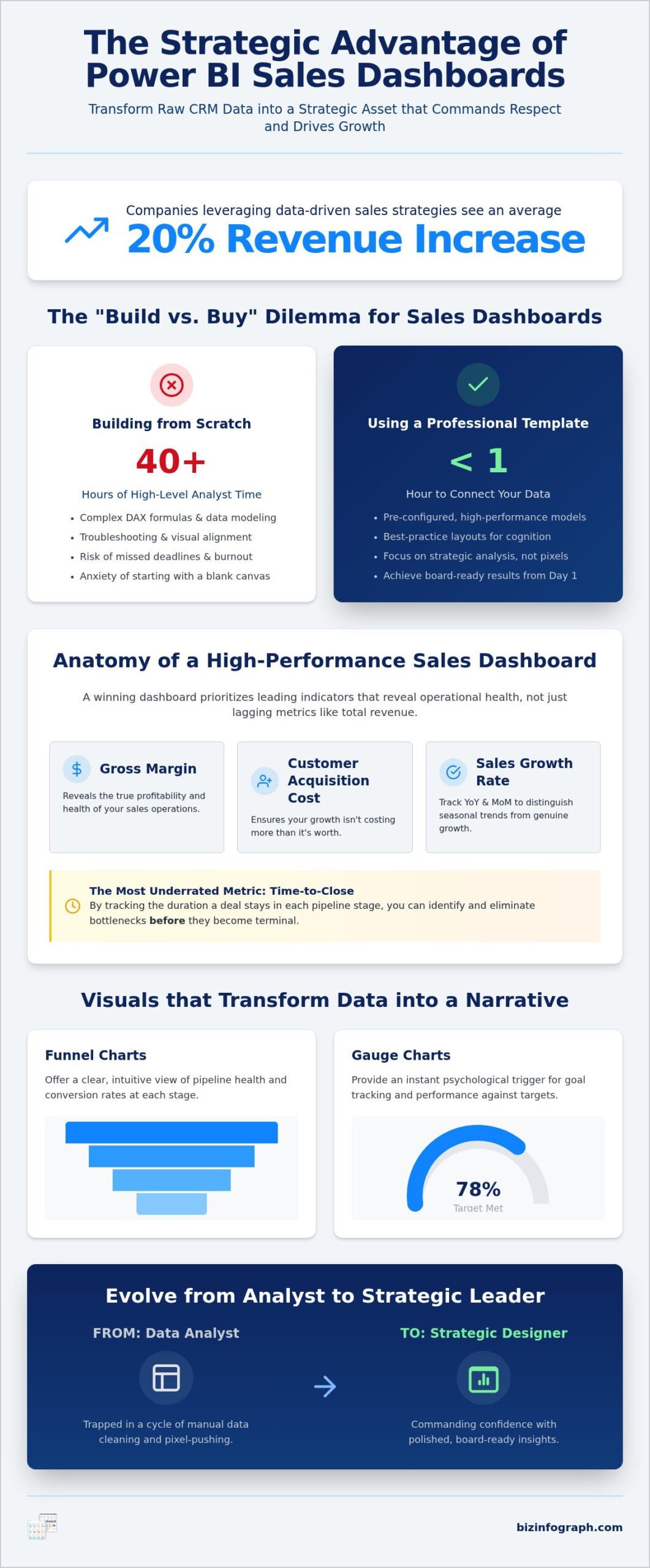
- Understand how a professional Power BI sales dashboard template saves over 40 hours of development time by providing a pre-configured, high-performance data model.
- Identify the essential hierarchy of sales KPIs, from gross margin to the often-overlooked “Time-to-Close” metric that predicts future pipeline health.
- Learn a strategic framework for selecting the ideal template based on your specific sales model, whether you manage high-volume transactions or complex B2B relationships.
- Follow a streamlined implementation guide to audit your data sources and connect your live CRM stream for real-time executive insights.
- Discover how to transform from a data analyst into a strategic designer, using professional aesthetics to command confidence in every board meeting.
The Strategic Value of Power BI Sales Dashboard Templates in 2026
A professional Power BI sales dashboard template is much more than a collection of charts; it’s a fully engineered .pbix file featuring established data models and pre-calculated DAX measures. It represents the pinnacle of efficiency for modern analysts. Instead of starting with a daunting blank canvas, you begin with a structured framework that’s ready to ingest your data. In 2026, the strategic focus has shifted away from simple historical reporting toward real-time CRM integration and predictive forecasting. By adopting a template, you aren’t just buying a report. You’re investing in a decision-making engine that bridges the gap between raw numbers and executive action.
The build versus buy dilemma is usually solved by simple math. Developing a custom sales dashboard from scratch typically consumes 40 or more hours of high-level analyst time. When you factor in data modeling, visual alignment, and troubleshooting, the internal cost is immense. Using a pre-built solution allows you to bypass these hurdles and focus on what truly matters: extracting insights that drive revenue. It eliminates the anxiety of starting from scratch and ensures your reporting structure is sound from day one.
Why Static Spreadsheets are Failing Modern Sales Teams
Manual Excel reporting can’t keep pace with high-velocity sales environments. When figures are trapped in static spreadsheets, they create dangerous data silos where the truth depends on which file you’re looking at. This fragmentation prevents a unified view of the pipeline. Modern teams are moving toward data democratization, where interactive visuals from Microsoft Power BI allow every stakeholder to explore data independently. This accessibility ensures that regional managers and executives stay aligned without waiting for manual weekly updates. It replaces guesswork with a single, verifiable source of truth.
The Time-Saving ROI of Professional Templates
The hidden cost of manual dashboard design often goes unnoticed until a deadline is missed. Professional Power BI dashboard templates provide an immediate framework based on best-practice layouts. These designs are optimized for human cognition, ensuring that the most critical KPIs catch the eye first. By utilizing a Power BI sales dashboard template, you eliminate the trial-and-error phase of report design. You gain a polished, board-ready presentation that mirrors the standards of global leaders. This efficiency doesn’t just save time; it empowers you to spend your energy on strategic analysis rather than pixel-pushing.
Anatomy of a High-Conversion Sales Dashboard: Key KPIs and Visuals
Why do some dashboards lead to immediate growth while others simply gather digital dust? The difference lies in the “Action-to-Data” ratio. A high-performance Power BI sales dashboard template doesn’t just display totals; it organizes data into a strategic hierarchy. While Total Revenue is often the first thing people look for, it’s a lagging indicator that tells you what happened yesterday. To drive tomorrow’s results, your dashboard must prioritize Gross Margin and Customer Acquisition Cost (CAC). These metrics reveal the true health of your operations, ensuring that your sales growth isn’t actually costing you more than it’s worth.
One of the most underrated metrics in any sales environment is “Time-to-Close.” By tracking the duration a deal stays in each stage, you can identify bottlenecks before they become terminal. Implementing advanced Data visualization techniques allows you to transform these numbers into a narrative. For instance, “Gauge Charts” provide an instant psychological trigger for goal tracking, while “Funnel Charts” offer a clear view of pipeline health. If you want to skip the technical setup and jump straight into high-impact analysis, exploring a professional Power BI sales template can provide that immediate executive-level clarity.
Decision-Ready KPIs You Must Track
To keep your team agile, you need to monitor Sales Growth Rate through both Year-over-Year (YoY) and Month-over-Month (MoM) lenses. This dual perspective helps distinguish between seasonal trends and genuine performance shifts. Additionally, tracking Average Deal Size helps you spot when your team is moving up-market or if purchasing power is beginning to wane. Don’t forget to highlight individual Sales Rep Performance. Gamifying this data through clear, comparative visuals encourages healthy internal competition and rewards top performers, turning raw statistics into a motivational tool for the entire department.
Visualizing the Sales Pipeline
Understanding where money is lost is just as important as knowing where it’s made. Waterfall charts are exceptional at visualizing revenue leakage, showing exactly where prospects drop out of your process. To ensure your forecasting is grounded in reality, always use “Probability-Weighted” pipelines that adjust the total value based on the likelihood of closing. Pipeline Velocity is the speed at which leads move through the funnel. By mastering these visuals, you can use “Drill-Down” features to investigate regional underperformance, moving from a global view to a specific city or product line with a single click.
Selecting the Perfect Template for Your Sales Model
Choosing the right Power BI sales dashboard template requires looking beyond surface-level aesthetics. You must evaluate your specific sales methodology. Is your business driven by high-volume, low-value transactions, or complex, long-cycle relationships? This “Volume vs. Complexity” framework is the secret to a dashboard that actually drives results. For B2B organizations, your template should prioritize account-based marketing metrics and long-term relationship value. Conversely, B2C and retail models need to focus on transaction speed, inventory turnover, and sharp seasonal trends. If you’re managing a SaaS business, your visuals must elevate Monthly Recurring Revenue (MRR) and Churn rates to provide a true picture of subscription health.
Don’t settle for a generic layout that forces you to compromise on your strategic goals. A professional template acts as a productivity partner, allowing you to focus on high-level strategy instead of data architecture. By selecting a model that matches your specific funnel logic, you ensure that every visual serves a purpose. This alignment transforms your reporting from a passive chore into an active source of personal pride and professional confidence.
Matching Visual Complexity to Your Audience
Executives and sales managers consume data differently. An executive dashboard should feature “Big Bold Numbers” (BBNs) that provide an instant pulse check on company health. In contrast, operational dashboards require granular detail for daily sales floor management and rep-level coaching. Regardless of the user, every professional template should pass the “Three-Second Rule.” If a viewer can’t identify the primary insight within three seconds, the visual is failing. High-quality designs simplify the complex, making you look like an expert in every board meeting.
CRM Compatibility and Data Connectors
Your dashboard is only as effective as the data feeding it. Before committing, ensure your template offers native compatibility with major platforms like Salesforce, HubSpot, or Microsoft Dynamics. Beyond simple connectivity, the underlying architecture matters. Look for a clean “Star Schema” data model within the template. This technical structure ensures your reports remain fast and responsive as your data grows over time. For those seeking a specialized sales dashboard template tailored for complex B2B needs, focus on how the model handles multi-touch attribution and diverse data streams. This foundation prevents the performance lag that often frustrates users and undermines your insights.
Implementation Guide: From Raw Data to Executive Insights
Connecting your data shouldn’t feel like a chore. While many guides suggest you can just “open and go,” the reality is that a successful Power BI sales dashboard template implementation requires a structured approach to avoid common errors. You begin by auditing your data source for consistency. Are there missing values in your lead source column or inconsistent naming conventions in your product list? Addressing these gaps early prevents skewed results later. Once your data is clean, you can move through the technical setup with confidence:
- Step 1: Audit your data source. Check for consistency and missing values before you begin the import process.
- Step 2: Connect to your live data stream. Establish a direct link between the template and your CRM or database.
- Step 3: Map your unique fields. Align your specific data columns to the template’s pre-defined parameters.
- Step 4: Customize the visual theme. Update colors and typography to match your corporate branding.
- Step 5: Set up Row-Level Security (RLS). Configure permissions so reps only see their own data for privacy and focus.
The mapping phase is where you truly align the tool with your business logic. Whether you call it “Deal Value” or “Opportunity Amount,” ensuring these fields align perfectly is critical for the integrity of your DAX measures. After mapping, customizing the visual theme helps your reports feel like a natural extension of your company’s professional identity. Finally, setting up Row-Level Security ensures that your data remains protected and relevant to every user. If you have unique requirements, you can find a specialized sales dashboard template designed for complex B2B needs that simplifies this entire process.
Avoiding Common Data Mapping Pitfalls
International teams often struggle with inconsistent date formats across different sales regions. A single dashboard might receive data in DD/MM/YYYY and MM/DD/YYYY formats, leading to total chaos in your trend analysis if not corrected during the import phase. Similarly, dealing with multi-currency sales data requires a clear conversion logic to ensure your total revenue figures remain accurate. Data Normalization is the process of organizing data to minimize redundancy. By following these principles, you ensure your Power BI sales dashboard template remains a reliable source of truth, regardless of how complex your global operations become.
Customizing Visuals Without Breaking the Model
You can adjust the look of your reports without touching the underlying data architecture. Use the “Selection Pane” to hide or show specific visual elements depending on who is viewing the report. This allows you to create a cleaner interface for board meetings while keeping granular details available for daily operations. For a sophisticated look, you can change entire color palettes instantly using Power BI JSON themes to match your brand’s aesthetic. Just remember to keep your core DAX measures intact. Changing a chart type is a simple click, but altering the logic behind your sales growth calculation can break the entire report’s integrity.
Elevate Your Reporting with Biz Infographs Power BI Solutions
Are you ready to stop struggling with messy reports and start leading with confidence? Biz Infographs understands that you’re a strategic leader, not just a data processor. Our Power BI sales dashboard template solutions are specifically designed to bridge the gap between technical analyst and visionary designer. We provide the best-in-class visual framework so you can focus on the strategy that moves the needle. This is about more than just numbers. It’s about the personal pride you feel when presenting high-quality work and the relief that comes from knowing your reports are board-ready the moment you connect your data.
We don’t just hand you a file and walk away. Our commitment to your success includes free lifetime updates for every product. As Microsoft releases new features for Power BI, our templates evolve alongside them. This ensures your reporting stays modern, compliant, and high-performing without any extra cost or manual effort on your part. By choosing a professional Power BI sales dashboard template, you’re adopting a more effective way of working that prioritizes impact over administrative busywork.
Why Professional Design Matters for Executive Buy-In
Executives don’t just look at data; they react to how it’s presented. The psychology of color and layout plays a massive role in persuasive business presentations. When your dashboard looks polished and intentional, it builds immediate trust in the underlying figures. Our “Expert Facilitator” approach means we’ve already handled the complex design nuances, from whitespace balance to intuitive navigation. These visuals perfectly complement our business presentation templates, allowing you to maintain a consistent, high-end brand voice across every slide and screen in your presentation deck.
Getting Started with Your Next Sales Dashboard
If you aren’t quite ready for a full Power BI deployment, we offer a robust collection of Excel dashboard templates designed for smaller teams or specialized projects. These tools provide a seamless transition path for your data journey. You can master your data organization in Excel and then upgrade to more advanced visualizations as your reporting needs grow. We provide the support and resources necessary to ensure your final dashboard “shines” in front of your audience. Don’t let raw data hold you back any longer. Transform your sales reporting today and reclaim your status as a productivity partner in your organization.
Master Your Sales Narrative with Executive Precision
You’ve discovered how the right Power BI sales dashboard template bridges the gap between manual data cleaning and high-impact decision making. By focusing on the hierarchy of sales data and selecting a model that aligns with your specific sales methodology, you’re no longer just reporting on the past; you’re actively shaping your future revenue. Professional templates empower you to present with clarity and confidence in every board meeting, ensuring your strategic insights are never lost in a sea of confusing spreadsheets or broken formulas.
Join over 10,000 professionals worldwide who trust Biz Infographs to elevate their data storytelling. With instant download, ready-to-use designs, and free lifetime updates on all digital assets, you have the tools to shine in front of any audience. It’s time to reclaim your schedule and transform your raw CRM data into a strategic masterpiece. Browse Professional Power BI Sales Templates today and start leading with the authority you deserve. Your journey from data analyst to expert facilitator begins now. We’re here to help you turn complex numbers into your greatest professional asset.
Frequently Asked Questions
How do I connect my CRM data to a Power BI sales template?
You connect your CRM by using the “Get Data” feature in Power BI Desktop. Select your specific platform, such as Salesforce or HubSpot, from the list of native connectors. Once you authenticate your account, you simply select the tables you need and map them to the template’s pre-configured fields. It’s a fast, reliable way to replace sample data with your own live business insights without starting from scratch.
Can I customize the colors and fonts in a pre-made Power BI template?
Yes, you have full creative control over the aesthetic. You can change the visual theme through the “View” tab in Power BI Desktop or by uploading a custom JSON theme file to match your corporate branding perfectly. This flexibility ensures your Power BI sales dashboard template looks like a bespoke internal tool, helping you maintain a polished and professional image in every executive presentation.
Do Power BI sales templates work with the free version of Power BI Desktop?
Absolutely. You can open, edit, and refresh any .pbix template file using the free version of Power BI Desktop. While sharing and automated refreshes usually require a Pro or Premium license, the core design and data modeling work perfectly without any monthly subscription. This makes high-quality templates accessible for individual analysts who want to improve their reporting efficiency and personal impact immediately.
What is the difference between a Power BI dashboard and a Power BI report?
A report is a multi-page document containing detailed, interactive charts and slicers created in Power BI Desktop. A dashboard is a single-page high-level view created in the Power BI Service that “pins” key visuals from various reports. Most professional templates are technically comprehensive reports, providing the deep-dive interactivity you need for thorough sales analysis and tactical decision-making across different regions or product lines.
How often should a sales dashboard be updated for maximum impact?
For high-velocity teams, daily updates are the gold standard for maintaining a competitive edge. If you’re using a Power BI sales dashboard template connected to a cloud CRM, you can schedule automated refreshes to ensure your team always acts on the most current pipeline data. This consistency prevents missed opportunities and keeps your sales strategy agile, allowing you to address underperforming areas before they impact your quarterly targets.
Can I use a Power BI template if I don’t know how to write DAX code?
Yes, that is the primary benefit of using a professional pre-made solution. The complex DAX formulas for Year-over-Year growth, rolling averages, and win rates are already written and tested by experts. You simply connect your data and map the fields to the existing model. You don’t need to be a coder to produce executive-grade insights that look like they were built by a senior data scientist.
Is it possible to share my Power BI sales dashboard with people outside my organization?
Yes, but you must manage security permissions carefully to protect your sensitive data. You can share reports with external users via the “Share” button in the Power BI Service, provided they have a compatible license. Alternatively, you can export your findings to a PowerPoint deck or a PDF for static presentations. This allows you to collaborate with partners or stakeholders while maintaining strict control over your information.
What are the best KPIs to include in a B2B sales dashboard template?
Focus on metrics that reveal relationship health and pipeline efficiency rather than just total volume. Essential KPIs for B2B models include:
- Customer Acquisition Cost (CAC)
- Average Deal Size
- Sales Pipeline Velocity
- Win Rate by Lead Source
- Customer Lifetime Value (CLV)
These indicators help you move beyond simple revenue tracking to understand the long-term profitability and sustainability of your B2B sales efforts.