

What if professional-looking slides depended less on design talent and more on a few repeatable choices? If your deck feels cluttered, choosing fonts and colors seems intimidating, or every slide takes too long to format, you’re not alone. The best presentation design tips for non-designers start with a simple idea: clear hierarchy matters more than decoration. When each slide has one main point and guides the audience’s attention, your message is easier to follow and remember.
You don’t need formal design training or hours of trial and error to build a confident deck. This guide will help you create a consistent visual style, choose readable fonts and colors, organize content into clear layouts, and make information easier to understand. You’ll also learn a repeatable process for designing slides efficiently, with customizable PowerPoint infographic templates as an optional starting point when you want to save setup time. By the end, you’ll have practical choices you can apply across your presentation, so your ideas take center stage.
Key Takeaways
- Start with your audience and the message they need to understand or act on, then shape each slide around that purpose.
- Use a consistent system of type, color, spacing, and contrast to make the most important information easy to spot.
- Apply these presentation design tips for non-designers: remove distractions, group related details, and emphasize the key takeaway.
- Build your deck in a practical sequence, from defining its purpose and outlining ideas to designing and reviewing each slide.
- Use a template as a flexible starting point, replacing sample content and keeping only the layouts that support your message.
Presentation design tips for non-designers: start with the audience and message
Presentation design is the way you arrange text and visuals so people can follow your message. It isn’t a contest to use the most effects or the fanciest software. Strong presentation design tips for non-designers begin before you open a slide editor: identify who’ll be listening, what they already know, and what they need to understand or decide by the end.
That context determines what belongs in the deck. A team that already knows a project’s background may need a concise update on risks and next steps. New stakeholders may need essential context before they can weigh a recommendation. Start with their needs, then shape your material to answer them.
Write the intended takeaway as one standalone sentence. For example: “We should extend the pilot because customer feedback supports a wider rollout.” Use that sentence as a filter for every slide. Evidence, examples, and context should help the audience understand or trust the point. Clarity and consistency will do more for comprehension than decorative elements, animation, or advanced software. Presentation software gives you tools to build and arrange slides, but the message still comes from your planning.
How do you identify the main point of a presentation?
Before choosing a theme or layout, finish this sentence: “After this presentation, I want my audience to…” Keep the ending concrete, such as “approve the revised timeline” or “understand why the forecast changed.” A clear outcome helps you separate essential information from details that are interesting but don’t serve the presentation’s purpose.
Next, list the questions your audience is likely to ask. Include only the ones that help them reach the intended understanding or decision. If you’re recommending a timeline change, explain what changed, how it affects delivery, and what action you propose. Save unrelated project history for another conversation or a reference document. Your takeaway should determine which evidence and examples earn space in the deck.
How much information should go on one slide?
Give each slide one central idea, supported by only the details needed to make it clear. A slide about a schedule might show the key milestones and proposed date change, rather than every task in the project plan. The right amount depends on the idea and the audience, not a rigid word or bullet limit.
Separate content when two points need different explanations, evidence, or audience decisions. Then test each slide aloud: can you explain its point in a short, direct sentence? If the explanation turns into a long chain of “and” statements, the slide may be carrying multiple ideas. Split it, simplify the supporting detail, or move secondary context to speaker notes. This keeps the audience focused on the message you want them to remember.
Build a readable presentation with visual hierarchy, type, and color
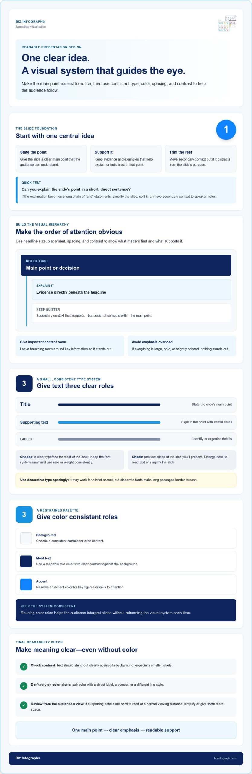
Once your message is clear, guide the audience through it visually. Visual hierarchy is the order in which slide elements attract attention. It helps people see what matters first, what explains it, and where supporting details fit. Create that order with headline size, placement, spacing, and contrast, not advanced design skills or decorative effects.
Start by deciding what the audience should notice first. Give the slide’s main point the strongest position and emphasis, then place supporting information close enough to show how it relates. Leave breathing room around important content. If every element is large, bold, or brightly colored, nothing stands out. These presentation design tips for non-designers are about making deliberate choices and using them consistently from slide to slide.
For a project update, make the key status or decision the headline. Put the evidence directly beneath it, and keep secondary context visually quieter. Harvard Business Review’s How to Make a “Good” Presentation “Great” also explores how choices such as fonts, colors, and images can strengthen a presentation. Treat each choice as a way to support the message, not as decoration for its own sake.
How can beginners choose readable fonts and text sizes?
Choose a clear typeface for most of the deck and keep the font system small. A decorative style can work for a brief accent, but long passages in an elaborate font are harder to scan. Establish a visible difference between slide titles, supporting text, and labels by changing their size or weight consistently.
There’s no single text size that suits every room and screen. Preview slides at the size you’ll present, then enlarge text that’s difficult to read. If labels or supporting details are hard to read from a normal viewing distance, simplify the slide or give that information more space.
How should you use color and contrast on slides?
Choose a restrained palette and give each color a consistent role. For instance, use one color for backgrounds, another for most text, and an accent color for key figures or calls to attention. Reusing those roles helps the audience interpret slides without relearning the visual system each time.
Check that text stands out clearly against its background, especially for smaller labels. Don’t rely on color alone to distinguish categories or signal a change. Pair color with a direct label, a symbol, or a different line style so the meaning remains clear even when colors are hard to distinguish.
- Title: State the slide’s main point.
- Supporting content: Show only what helps explain that point.
- Accent: Highlight a key detail without competing with the headline.
Keep these roles consistent as you build the deck. If you want a ready-made structure to adapt, PowerPoint infographic templates can provide a starting point for polished, consistent slides.
Fix cluttered slides: use visuals, whitespace, and alignment with purpose
A slide can be colorful, animated, and full of images yet still feel hard to follow. Decoration doesn’t automatically make a presentation more engaging. Each element should help the audience understand the point; otherwise, it competes for attention. To edit a busy slide, remove distractions, group related details, then emphasize the takeaway.
A visual belongs on a slide when it clarifies, compares, or supports its point. Before adding an icon, photo, shape, or effect, ask what it helps the audience see. If you can’t name its purpose, leave it out. This test keeps visual choices focused and prevents a slide from becoming a collection of unrelated elements.
Try this three-part edit on an overcrowded slide:
- Remove: Delete repeated wording, decorative elements, and details that don’t support the takeaway.
- Group: Place related labels, figures, or steps together so their connection is clear.
- Emphasize: Make the main conclusion the easiest element to notice.
Whitespace is part of the structure, not an unfinished area that needs filling. Space around a heading or between groups shows where one idea ends and another begins. Alignment does similar work: lining up headings, text, and visuals creates an orderly path for the eye. These presentation design tips for non-designers can turn a crowded slide into a clear one without adding another graphic or effect.
When should you use a chart, image, or diagram?
Pick a visual based on the job it needs to do. Use a chart to compare quantities or reveal a pattern in relevant data, and label it so the audience can grasp the takeaway. Choose an image when it adds useful context or helps people recognize the subject. Use a diagram when relationships, stages, or components are the message. If a visual needs a lengthy explanation to make sense, simplify it or choose another format.
What should you remove from an overcrowded slide?
Start with anything that repeats information already stated in the title, chart, or narration. Remove ornamental shapes and unrelated images next. Then shorten long prose into concise labels while keeping the meaning the audience needs. Don’t cut essential context simply to make a slide look sparse; keep the details that help explain or support the central point.
Finally, check whether the slide is trying to make two different arguments. If one section explains a problem and another recommends a solution, they may need separate slides with distinct purposes. For example, keep the key finding on one slide and its proposed response on the next. As a final check, describe the slide’s takeaway in one sentence and confirm that every remaining element helps deliver it.
Follow a practical presentation design workflow from outline to final review
A repeatable workflow keeps you from polishing slides before you know what they need to say. Draft the narrative first, then choose visuals, colors, and transitions to support it. These presentation design tips for non-designers turn a blank deck into a clear sequence of decisions you can follow from start to finish.
- Define the purpose: Write down what the audience should understand, decide, or do after the presentation.
- Outline the ideas: List the information and evidence needed to reach that outcome.
- Assign one point per slide: Separate the outline into slide-sized ideas, each with a clear role.
- Design the deck: Apply a consistent layout and add only visuals that support the content.
- Review and rehearse: Check the slides on screen, then practice presenting them aloud.
Keep the steps in order. If you start by selecting colors or transitions, you may end up designing around effects instead of shaping a useful story. A consistent starting layout can save setup time. Business presentation templates can help establish a structure you can adapt to your own message. Treat the layout as a framework, not a reason to keep content that doesn’t belong.
How do you turn an outline into a sequence of slides?
Arrange your main ideas in the order the audience needs to understand them. A recommendation might move from the current situation to the evidence, then to the proposed action. Give each slide a short takeaway title that previews its role, such as “Delivery dates are at risk” or “A revised timeline protects the launch.” Read the titles in sequence. If they don’t connect into a coherent story, adjust the order or remove repetition.
What should you check before presenting?
Review the finished deck at the size and format you’ll use to present. Check text legibility, contrast, alignment, spelling, and consistent formatting. Verify that chart labels, sources, and visual details are accurate and easy to interpret. Then rehearse aloud, paying attention to pacing and whether each slide supports what you’re saying rather than forcing you to read blocks of text.
Notice where you pause to explain a crowded slide, repeat an idea, or move too quickly past important evidence. Those moments reveal what needs another edit. Remove anything that slows comprehension, and make sure transitions between slides feel natural. A final rehearsal isn’t just practice for the speaker; it’s a test of whether the deck works as a connected presentation.
Build your next deck with a consistent starting point, then spend your effort refining the message. Explore downloadable PowerPoint infographic templates to simplify slide setup and maintain a polished visual structure throughout your presentation.
Use a presentation template as a shortcut, not a substitute for clear design
A template gives you a head start, not a finished presentation. Its layouts, typography, and visual elements offer structure, but you still need to choose what belongs on each slide and adapt it to your message. Use it as a framework: replace sample content, keep layout patterns that help organize information, and remove anything that distracts from your point.
This is one of the most practical presentation design tips for non-designers: let the content guide the layout, not the other way around. A slide format that works for a comparison may not suit a recommendation or a process. Choose a structure that fits the material, then adapt it to your audience.
How do you adapt a template without making slides feel generic?
Match layouts to the information rather than forcing each idea into the same format. Apply your organization’s colors and visual identity consistently, while keeping text readable and contrast clear. Replace placeholder copy and imagery with accurate, audience-specific material. Before keeping an element, ask whether it reinforces the message or simply came with the template.
When can a ready-made infographic template help?
An infographic layout can make relationships, processes, comparisons, and key facts easier to scan. Select one that suits the information, then remove decorative parts that compete with the takeaway. PowerPoint infographic templates offer a structured visual layout when you want to avoid building every element from scratch.
Biz Infographs’ downloadable PowerPoint infographic templates can reduce manual setup and give a deck a consistent foundation. Adapt the layouts to suit your content, or use the same design principles when starting with a blank slide.
Use this quick adaptation check before finalizing a template-based slide:
- Fit: Does the layout suit the type of information you’re presenting?
- Replace: Have you removed sample text and inserted accurate details for your audience?
- Refine: Do the colors, labels, and visuals support the takeaway?
- Remove: Is any template element present only because it was already there?
Keep the layouts that make your message easier to follow, and skip those that don’t. Explore professional presentation templates for a ready-made starting point you can adapt to your next deck.
Put your next presentation into action
Your next deck is a chance to make your ideas easier to understand and your delivery more confident. Start with one upcoming presentation and make a clear choice for each slide: what should the audience notice, understand, or remember? A simple, repeatable approach can help you spend less time second-guessing design and more time preparing what you want to say.
These presentation design tips for non-designers aren’t about chasing perfection. They’re about making thoughtful choices that help your audience follow your message. If you’d like a polished starting point, downloadable PowerPoint infographic templates can reduce manual setup, and they include free lifetime updates.
Explore professional presentation templates and choose a layout you can adapt to your next idea. Start with your message, make each design choice with purpose, and let your confidence grow with every deck.
Frequently Asked Questions
How do you make a presentation look professional without design skills?
Make the deck feel intentional by using the same visual choices throughout and checking how it looks in the setting where you’ll present. These presentation design tips for non-designers work well for a short project update: use a clean opening slide, consistent headings, and a clear final slide that states the decision or next step. Before presenting, scan the deck in slide-sorter view to spot abrupt changes in style or pacing.
What are the most important presentation design rules for beginners?
Prioritize audience understanding over personal style. Make sure people can tell which information is most important, read the content from a distance, and understand why each element is on the slide. Keep visual choices consistent, but adjust the layout when the content needs a different treatment. A useful test is to ask someone unfamiliar with the topic what they think each slide is saying after a quick glance.
How many words should be on a presentation slide?
There’s no universal word limit; the right amount depends on the slide’s job and how you’ll present it. A title slide may need only a topic and presenter name, while a reference slide may need more detail for later use. For a spoken presentation, keep full explanations in your notes and put only the phrases the audience needs to follow the discussion on screen. Read the slide aloud to find wording you can trim.
Which font is easiest to read in a presentation?
No single typeface is easiest for every audience and display, but familiar, uncomplicated fonts are a reliable starting point. A clean sans serif is often useful for projected text because its letterforms are straightforward at a glance. Avoid using a thin font weight for small labels, and check punctuation and numbers for clarity. Preview your slides on the actual display when possible, since a font that looks crisp on a laptop may feel faint from across a room.
How do you choose colors for a presentation?
Begin with a background and text combination that stays easy to read, then select an accent that suits the subject and feels appropriate for your audience. If your organization has established colors, use them selectively rather than applying every shade to every slide. Test the palette on charts and labels, not just headings. For example, a highlighted bar should remain identifiable through its label or pattern, so the information doesn’t depend on color recognition alone.
Should every presentation slide include an image or graphic?
No. A visual is useful when it makes an idea easier to grasp, gives relevant context, or lets the audience compare information more quickly. A slide with a short quotation, decision, or key sentence may be stronger without an image. Before adding a graphic, consider whether it contributes meaning or simply fills space. If the same point is just as clear without it, leaving the slide uncluttered is a sound design choice.
Are presentation templates useful for people who are not designers?
Yes, a template can make it easier to create a coordinated deck without building every layout from scratch. It’s most useful when you treat it as a flexible framework, not a set of rules: choose formats that suit your content, replace sample material, and remove components that don’t fit. Biz Infographs offers downloadable PowerPoint infographic templates as an optional starting point for people who want structured layouts while creating their own presentations.