Introduction to Healthcare Resource And Operational Efficiency Dashboard
What Is a Healthcare Resource And Operational Efficiency Dashboard and Why It Matters
A Healthcare Resource and Operational Efficiency Dashboard is a reporting solution that helps organizations monitor staffing, capacity, utilization, service flow, and operational performance in one place. In many healthcare settings, leaders need a faster way to understand how resources affect both service quality and cost. A strong dashboard helps turn complex data into actionable insights and gives a clearer picture of efficiency and resource use across departments. This matters because better reporting supports stronger control, improved coordination, and more reliable performance across the broader healthcare sector.
How a Healthcare Dashboard Supports Resource Visibility and Operational Efficiency
A strong healthcare dashboard supports visibility by showing how people, rooms, equipment, and service activity are being used across the organization. This is important because operational efficiency depends on understanding where resources are fully used, underused, or under pressure. A well-built dashboard can connect clinical and operational information in a way that helps managers see what is affecting flow and service delivery. When the report is clear, healthcare teams can act faster, reduce avoidable delays, and make better use of limited resources in day-to-day operations.
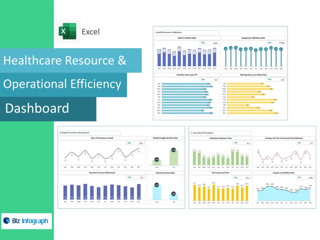
Why Healthcare Organizations Use a Healthcare Resource & Operational Efficiency Dashboard Excel
Many organizations use Healthcare Resource and Operational Efficiency Dashboard Excel because spreadsheet-based reporting is still common in operational review. Excel often serves as a familiar starting point for staffing reports, capacity summaries, cost tracking, and departmental analysis. This makes it practical for teams that need flexibility and a simple reporting format. For many healthcare organizations, Excel-based dashboards also provide a useful first step before expanding into larger reporting environments. A structured Excel dashboard improves consistency, saves time, and supports clearer review of resource and efficiency measures.
Core Benefits of Healthcare Resource & Operational Efficiency Dashboard
Improving Operational Efficiency with an Operational Dashboard
An operational dashboard helps organizations improve performance by highlighting workflow, staffing, service volume, and throughput in one view. This makes it easier to identify where time, resources, or processes are being used inefficiently. Better visibility supports efforts to improve operational efficiency because managers can see where bottlenecks or delays are forming. A good dashboard also supports quicker action and stronger accountability across services. In practice, this means departments can respond sooner to issues affecting productivity, care flow, and the balance between service demand and available resources.
How Integrated Healthcare Dashboards Support Better Decision-Making
Integrated healthcare dashboards improve decision-making because they combine multiple operational and financial views into one reporting environment. Instead of checking separate systems, users can review performance across staffing, service, finance, and utilization together. This makes it easier for healthcare leaders to make informed choices about priorities, capacity, and operational improvement. Better integration also means that the dashboard supports both quick review and deeper analysis. When performance information is connected, leaders can make stronger decisions about resource use, cost control, and service coordination across the organization.
Using a Management Dashboard to Help Healthcare Organizations Improve Performance
A strong management dashboard helps organizations review the most important indicators of service delivery, resource use, and system performance in one place. This is useful because it allows leadership to compare operational pressure, productivity, and financial conditions more clearly. A clear dashboard helps help healthcare organizations focus on the measures that matter most and improve planning. Better management reporting also makes it easier to align departments around the same priorities. When operational visibility improves, organizations are better able to strengthen consistency, improve coordination, and support stronger results across the business.
Key Metrics in a Healthcare Resource & Operational Efficiency Dashboard
Essential Resource and Operational Metrics Every Healthcare Organization Should Track
Every Healthcare Resource And Operational Efficiency Dashboard should include core dashboard metrics that reflect resource use and operational performance clearly. These may include staffing levels, room utilization, throughput, service time, occupancy, wait times, and workload by department. These operational metrics help the organization understand whether resources are supporting demand effectively. A good dashboard should also highlight where inefficiencies are growing or where service is under pressure. Clear metric tracking supports better operational planning and helps the business manage both quality and cost more effectively across departments.
Measuring Capacity, Utilization, Throughput, and Performance Dashboard Indicators
A useful performance dashboard should measure the capacity available, how fully it is used, and how effectively services are moving through the system. These views help leaders understand whether delays are caused by staffing, rooms, equipment, or process issues. Better capacity reporting also supports stronger planning because managers can see where service demand is outgrowing current capability. Good utilization measures improve understanding of how resources are actually being used. Together, these indicators help connect patient outcomes and operational efficiency with the systems and resources required to support care delivery.
Using Clinical Dashboards, Financial Dashboard Views, and Infection Control Dashboard Metrics Together
A strong dashboard becomes more useful when it brings together clinical dashboards, operational views, and financial measures. For example, a service area may look efficient operationally but still create pressure on cost or infection prevention. Bringing in financial dashboards in healthcare alongside an infection control dashboard creates a fuller picture of performance. This helps leaders understand how service quality, operational flow, and spending interact. Better connected reporting supports stronger review of operational efficiency and financial health and helps the organization make better-balanced decisions across departments.
Healthcare Dashboard Types and Use Cases
Understanding the Main Types of Healthcare Dashboards
There are several types of healthcare dashboards, and each one serves a different purpose. Common examples include clinical dashboards, financial dashboards, and operational dashboards. These are often considered the main types of healthcare dashboards because they reflect the major areas leaders need to manage. Understanding these categories helps organizations choose the right reporting design for their needs. A good dashboard strategy starts with recognizing which information belongs in which type of report so the final output stays useful, clear, and relevant to decision-makers across the organization.
Comparing Clinical Dashboards, Financial Dashboard, and Operational Dashboard Reporting
A clinical dashboard focuses more on service quality and care delivery, a financial dashboard focuses on cost and performance, and an operational dashboard focuses on flow, capacity, and resource use. Comparing these views helps clarify how different reporting needs should be handled. This is one reason the three main types of healthcare dashboards matter so much. Each supports different users and decisions. Better comparison also helps organizations determine whether they need one specialized view or a more integrated structure that connects clinical, operational, and financial priorities into one reporting system.
How Integrated Dashboards Combine the Three Main Types of Healthcare Reporting
Integrated dashboards combine information from clinical, financial, and operational areas to create one connected reporting environment. This approach is increasingly important in modern healthcare dashboards because leaders often need to see how service performance, cost, and resource use affect each other. When these views are connected, the organization can make better decisions and understand trade-offs more clearly. Better integration also reduces reporting fragmentation and strengthens coordination across departments. For many organizations, integrated reporting is one of the most practical ways to improve oversight and support system-wide management.
Healthcare Resource & Operational Efficiency Dashboard Features
How Healthcare Resource & Operational Efficiency Dashboard Excel Supports Reporting
Healthcare Resource & Operational Efficiency Dashboard Excel supports reporting by giving users a familiar and flexible format for tracking operations, staffing, and departmental performance. It is especially useful when teams already work with exported reports from operational systems and need a structured way to compare them. Excel can help summarize workload, service flow, and resource use in a practical visual format. For organizations that are still building broader reporting capabilities, Excel-based dashboards offer a manageable solution that improves clarity and helps standardize performance review across the business.
Building an Effective Healthcare Dashboard with Strong Metric Views and Design
An effective healthcare dashboard depends on strong structure, useful metric choices, and clear design. The best dashboards begin with the most important KPI summaries, then offer supporting detail in a logical order. This makes the report easier to use and improves how quickly managers understand the situation. A well-designed dashboard also reduces clutter and helps highlight where action is needed. When dashboard structure is strong, it becomes easier to compare departments, track trends, and improve communication. Better design leads to better usability and stronger operational value.
Why Integrated Healthcare Dashboards Improve Visibility Across Departments
Integrated healthcare dashboards improve visibility because they combine data from several functions into one report. This may include staffing, patient flow, cost, utilization, and selected quality measures. Better integration helps teams understand how one department’s performance affects another and makes cross-functional issues easier to identify. It also supports more coordinated action because managers are looking at a shared reporting framework. In organizations where departments are closely connected, integrated dashboards help reduce reporting silos and improve how leaders manage service flow, cost, and resource use across the full operation.
Practical Value of Healthcare Resource And Operational Efficiency Dashboard
How a Healthcare Dashboard Example Helps Structure Better Reporting
A good healthcare dashboard example helps teams understand how to organize reporting in a more practical and useful way. Strong examples show where KPI summaries should sit, how operational detail should be structured, and how to balance simplicity with enough depth for management review. Learning from examples reduces clutter and improves report usability. It also helps teams see what works in real settings. For organizations trying to improve reporting, examples can speed up design decisions and create a stronger foundation for operational and resource monitoring.
Supporting Better Management Decisions with Healthcare ERP and Integrated Dashboards
A strong dashboard becomes more valuable when it can connect with systems such as healthcare ERP and other operational tools. This helps users bring together staffing, service, finance, and utilization data into one report. Better system connection improves reporting speed and reduces manual effort. It also supports better management decisions because leaders can see how resource use and cost interact. When dashboards work well with core systems, they become a more powerful management tool and help the organization act with stronger accuracy and confidence.
Using a Performance Dashboard to Help Healthcare Improve Resource Allocation and Efficiency
A performance dashboard helps organizations improve resource allocation by showing where workloads are high, where capacity is underused, and where performance is lagging. This helps teams decide how to assign staff, space, and support more effectively. Better visibility into efficiency and resource use also helps reduce waste and strengthen service delivery. A good dashboard helps empower healthcare leaders and managers to act earlier and with better evidence. This leads to better operational planning, better service flow, and stronger overall performance across healthcare services.
Dashboard Design and Reporting Value
Learning from Healthcare Dashboard Example Layouts and Types of Dashboards
Studying healthcare dashboard example layouts can help organizations improve report structure much faster. Good examples show how to arrange summary KPIs, trend sections, resource views, and operational analysis in a practical order. They also help clarify the value of different types of dashboards and when each one is most useful. Better understanding of layout and report type improves design quality and reduces unnecessary complexity. This makes the final dashboard easier to use and better aligned with the real information needs of managers and teams.
Creating an Effective Healthcare Dashboard for Resource and Operational Monitoring
Creating an effective healthcare dashboard means building around the questions leaders and teams actually need answered. The dashboard should clearly show capacity, utilization, staffing, service flow, and operational pressure in a way that supports action. It should also be easy to review quickly during daily or weekly management meetings. A good structure helps users compare trends, identify weak points, and respond faster to change. Better monitoring supports better coordination and helps organizations improve both resource use and operational consistency across the wider service environment.
Addressing Healthcare Dashboard FAQs Through Better Dashboard Structure and Reporting
Many healthcare dashboard faqs come down to the same issues: which metrics should be shown, how much detail is needed, and how different departments should use the report. Better dashboard structure helps answer these questions by making the report easier to understand and more useful in practice. When the layout is clear and the KPI logic is strong, users spend less time asking how to read the dashboard and more time using it. Better design therefore improves both reporting quality and adoption across the organization.
Conclusion
Why Healthcare Resource & Operational Efficiency Dashboard Excel Is a Practical Reporting Tool
Healthcare Resource & Operational Efficiency Dashboard Excel is practical because it gives organizations a familiar, flexible, and structured way to manage reporting. It helps standardize metrics, reduce repetitive report work, and improve operational review across departments. Excel-based dashboards are especially useful for teams building reporting maturity or working with multiple exported data sources. They create a strong starting point for more disciplined management reporting and can support better visibility into resource use, operational flow, and service performance across the organization.
Final Thoughts on Using a Healthcare Resource & Operational Efficiency Dashboard with Integrated Healthcare Dashboard Reporting Features
A well-built Healthcare Resource & Operational Efficiency Dashboard helps organizations connect resource planning, operational monitoring, and performance review in a more useful way. By using integrated healthcare dashboards, teams can see how capacity, staffing, cost, and service flow interact. This helps healthcare professionals to make better decisions and helps healthcare dashboards help leaders coordinate across departments more effectively. Better reporting supports stronger operational decision-making, improved service consistency, and more confident management across the broader healthcare organization.
For ready-to-use Dashboard Templates: