Introduction to Sales Budget vs Actual Dashboard Power BI
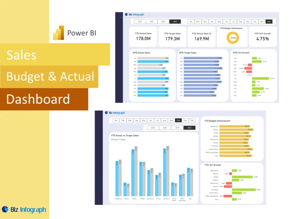
What Is a Sales Budget vs Actual Dashboard Power BI and Why It Matters
A Sales Budget vs Actual Dashboard Power BI solution is a reporting system that compares planned sales with actual sales in one place. It helps businesses understand whether revenue is meeting expectations and where gaps need attention. A strong budget vs actual dashboard makes it easier to review actual numbers, budgeted figures, and the difference between them without depending only on a spreadsheet. Because it is a visual tool, it gives users a faster way to understand performance. This matters because companies need a clear view of results if they want to stay aligned with financial goals and take action quickly.
How a Sales Dashboard Supports Budget vs Actual Reporting
A good Sales Dashboard supports actual vs budget reporting by bringing sales and budget information together in one view. Instead of checking several files, teams can review the sales amount, target values, and variances in one report. This makes it easier to compare sales against plan and understand whether the business is on track. A well-built dashboard also helps users see trends over time, not just a single month. When managers can review actual results and budget side by side, they can make faster and more accurate judgments about performance and next steps.
Why Businesses Use a Sales Budget vs Actual Dashboard Power BI Template
Many businesses use a Sales Budget vs Actual Dashboard Power BI template because it saves time and creates a repeatable reporting structure. A reliable dashboard template includes core sections such as KPI summaries, trend charts, variance views, and detailed analysis pages. This means users do not have to rebuild the same report every month. A reusable power bi template also supports standardization, which makes comparison easier across periods and teams. For businesses that want consistent reporting and quicker insights, a ready structure offers a practical way to monitor performance and support stronger planning.
Core Benefits of a Budget vs Actual Dashboard
Improving Budget Visibility with a Sales Budget vs Actual Dashboard
A sales budget vs actual dashboard improves visibility by placing budgeted sales, actuals, and differences into one organized report. This gives leaders a comprehensive overview of how revenue is performing relative to expectations. Better visibility helps businesses understand where targets are being met and where they are not. It also helps users identify whether the issue is broad or limited to one product, team, or region. Because the dashboard presents performance clearly, businesses can plan accordingly and manage revenue more effectively. This visibility is one of the main reasons companies adopt a budget vs actual dashboard.
How Variance Analysis Supports Better Sales Decisions
Variance analysis is the core of a strong budget report because it explains the difference between the plan and the result. It helps businesses identify variances between budgeted figures and actual results, so managers can prioritize the areas needing attention. If one team is slightly below target and another is far behind, the response should be different. A good dashboard makes these differences easy to understand through numbers and charts. This allows leaders to take corrective action earlier, improve planning, and make more informed decisions based on measurable outcomes instead of assumptions.
Using Analytics to Compare Budget, Actuals, and Actual Sales
Strong analytics improve the value of a Sales Budget vs Actual Dashboard Power BI report by turning simple comparisons into useful insight. Instead of only showing totals, analytics help users review how actual sales are trending, how actuals compare with prior periods, and where performance is improving or weakening. This type of comparing actual performance with budget helps businesses understand patterns more clearly. It also supports data-driven decisions because users can look deeper into the reasons behind the numbers. With the right analysis, the dashboard becomes more than a report. It becomes a management tool.
Key Metrics in a Sales Budget vs Actual Dashboard Power BI
Essential Key Metrics for Budget, Actuals, and Variance Tracking
Every Sales Budget vs Actual Dashboard Power BI report should include the most important key metrics needed for performance monitoring. These commonly include budget sales, actual sales, dollar variance, percentage variance, target achievement rate, and trend movement. These kpis help businesses understand whether revenue is above, on, or below plan. A dashboard with strong KPI structure provides a more useful summary and supports faster review. Clear kpi cards at the top of the dashboard are especially effective because they display the most important performance measures immediately and help leadership understand the current position quickly.
Measuring Actual Sales Against Budget Targets
A useful dashboard should clearly compare actual sales with sales targets so that users can see both the result and the gap. This kind of actual vs budget review helps businesses understand how close they are to their plan and whether the achievement rate is acceptable. It also helps explain whether lower performance comes from weak demand, lower volume, or delayed closing. A clear view of actual numbers against targets makes it easier to evaluate sales performance and communicate expectations during reviews. It gives the business a solid basis for performance management and future forecasting.
Comparing Budget vs Actual by Product, Region, and Team
Breaking performance into segments is one of the most valuable parts of a dashboard. A strong sales budget vs actual dashboard should compare results by product, region, and team so users can see where the business is strong and where it is under pressure. Overall revenue may look acceptable while one region or product line is missing plan badly. This is why detailed segmentation matters. By showing actual sales, budgeted sales, and variance at different levels, the dashboard provides a more comprehensive view and supports better action planning for each part of the business.
Sales Budget vs Actual Dashboard Power BI Features
Key Components of an Effective Actual Dashboard
The key components of an effective actual dashboard include KPI cards, variance visuals, trend lines, filters, and drill-down detail. A good dashboard should summarize performance clearly at the top, then provide deeper views for products, teams, or periods below. It should also include a clean graph or chart structure so users can compare results quickly. A well-designed dashboard balances summary and detail without overwhelming the user. Strong visuals, clear labels, and easy navigation are essential. These core elements help transform raw data into useful insight and make the dashboard practical for regular review.
How Sales Budget vs Actual Dashboard Power BI Excel Supports Reporting
Many businesses start with Excel files, so a good Sales Budget vs Actual Dashboard Power BI excel workflow often begins with structured budget and sales sheets. A clean spreadsheet source helps make the final report more reliable because the data is easier to shape and connect. Budget lines, actual revenue, and other fields should be organized consistently for reporting. When Excel is prepared well, Power BI can turn those inputs into clear visuals much more easily. This is especially useful for businesses that already manage budget data and sales data in Excel but want stronger reporting and visualization.
Why a Sales Budget vs Actual Dashboard Power BI Template Saves Time
A Sales Budget vs Actual Dashboard Power BI template saves time because it provides a tested layout for visuals, calculations, and report sections. Teams can refresh the data instead of rebuilding the report from the beginning each month. This improves efficiency and supports more consistent review. It also helps users focus more on interpretation than formatting. A strong power bi template can serve as the base for multiple teams or periods, making it easier to scale reporting. For many businesses, this repeatable structure is one of the most useful benefits of a template-based approach.
Best Practices for Building the Dashboard
Best Practices for Structuring a Budget vs Actual Dashboard in Power BI
The best best practices for a budget vs actual dashboard begin with keeping the layout simple and logical. Summary measures should appear first, followed by trends, segment analysis, and detailed tables. Filters should be easy to understand and limited to useful dimensions such as period, region, or product. A strong design also requires efficient data preparation, so users can trust the output. A report built with clarity and discipline becomes easier to maintain. When teams follow good structure, the dashboard becomes more readable, more accurate, and more useful for monthly performance review.
Designing Clear Views for Actuals, Variance, and KPI Tracking
Clear dashboard views are critical because users need to interpret performance quickly. A good report should separate actuals, budget, and variance in a way that is visually obvious. This may include kpi cards, clustered charts, tables, and comparison visuals. The goal is to help users understand the difference between performance measures without confusion. Good design also means showing precise numbers where needed while using visuals to highlight larger patterns. A clean structure makes it easier to review monthly results, identify problem areas, and explain performance clearly during business meetings.
Using Power BI Visuals for Better Budget Comparison and Analysis
Power BI visuals are powerful because they turn numbers into a story that users can understand faster. A graph can show monthly performance movement, while bar charts can compare teams, regions, or products. Slicers and drill-down features allow users to explore results more deeply. When the dashboard uses strong visualization, it becomes easier to identify trends, compare targets, and see where performance is changing. This is one reason Power BI is such a useful business intelligence tool. Well-chosen visuals improve usability and make the dashboard far more effective for management reporting.
Business Use Cases for Sales Budget vs Actual Reporting
How Sales Teams Use a Sales Budget vs Actual Dashboard for Performance Review
Sales teams use a sales budget vs actual dashboard to review progress against sales targets and monitor whether teams are delivering the results expected. The dashboard helps managers compare individual or regional performance with budget and identify where follow-up is required. It also helps track whether the gap between plan and result is narrowing or increasing. This makes team reviews more objective because the discussion is based on actual results and measurable variance. A practical dashboard supports stronger accountability and gives sales managers a clearer basis for coaching and action.
Supporting Management Decisions with Budget vs Actual Analysis
Management benefits from budget analysis because it helps leaders see whether the business is on course and whether assumptions remain realistic. A dashboard that compares planned sales with real results supports faster action and better resource decisions. Leaders can use this information to adjust sales priorities, update the forecast, or change spending decisions. In many cases, strong reporting prevents problems from getting worse because weak performance is seen early. When businesses rely on data-driven reporting instead of assumptions, they can make stronger decisions and improve both commercial and financial control.
Using a Sales Dashboard for Ongoing Sales and Budget Monitoring
A Sales Dashboard is useful not only for month-end review but also for ongoing performance monitoring. With regular updates, the business can review revenue progress throughout the period rather than waiting until the end. This improves responsiveness and allows earlier intervention. A dashboard that combines sales and budget information in one place helps the company stay focused on priorities and monitor progress continuously. Because users can see trends over time, they gain better context for short-term performance. Ongoing monitoring strengthens discipline and helps the business respond more effectively as conditions change.
Customization and Practical Value
How to Adapt a Sales Budget vs Actual Dashboard Power BI Template to Business Needs
Every business tracks performance differently, so customization is important. A company may want views by territory, salesperson, product category, or customer type depending on how it manages revenue. A flexible Sales Budget vs Actual Dashboard Power BI template allows teams to adapt visuals and metrics to match their own reporting priorities. This makes the dashboard more relevant and easier to use in real meetings. Strong customization ensures that the dashboard reflects actual business questions rather than generic reporting. When the report fits the business, it becomes more practical and more valuable as a management tool.
Adding Business-Specific Key Components and KPIs
Some businesses need more than standard sales measures. They may want to include cost of goods sold, margin, customer segment performance, or actual expenses alongside revenue and budget. Adding these business-specific key components makes the dashboard stronger because it shows not just revenue attainment, but broader financial performance. A company may also want custom kpis tied to strategic goals. Including these measures helps leaders understand performance from different angles and supports better planning. Custom metrics make the dashboard more relevant to the business model and provide stronger insight for decision-making.
Turning Budget vs Actual Insights into Better Sales Planning
The value of a dashboard comes from action. A strong budget vs actual dashboard should help the business learn from current performance and use those lessons in future planning. When leaders can identify variances, understand the reasons, and track improvement, they can build better targets and stronger forecasts. These actionable insights help teams refine assumptions, reallocate effort, and improve budget quality. Over time, a dashboard supports more realistic planning because it connects expectations with actual delivery. This turns reporting into a practical tool for stronger sales execution and smarter budgeting.
Conclusion
Why a Sales Budget vs Actual Dashboard Power BI Template Is a Practical Reporting Tool
A Sales Budget vs Actual Dashboard Power BI template is practical because it provides a repeatable way to compare plan and performance. It combines budget, actuals, and variance into one visual report that is easy to update and review. It also reduces manual work and improves reporting consistency across periods. Whether the data comes from Excel, databases, or other data sources like ERP systems, a good template helps users focus on insights rather than formatting. For businesses that want clear and efficient reporting, this type of template is a strong solution.
Final Thoughts on Using a Sales Dashboard for Budget vs Actual Comparison
A well-built Sales Dashboard for budget comparison gives businesses the structure they need to review revenue performance clearly and act quickly. It brings together budget data, actual sales, and variance in a format that supports discussion and decision-making. Whether shared in meetings, exported as a pbix solution, or discussed in groups like the Microsoft Fabric Community, the real value lies in how it helps teams understand results. When businesses use the dashboard consistently, they improve planning, strengthen performance control, and build a more reliable path toward their financial goals.
For ready-to-use Dashboard Templates: