Introduction to Sales Dashboard Power BI
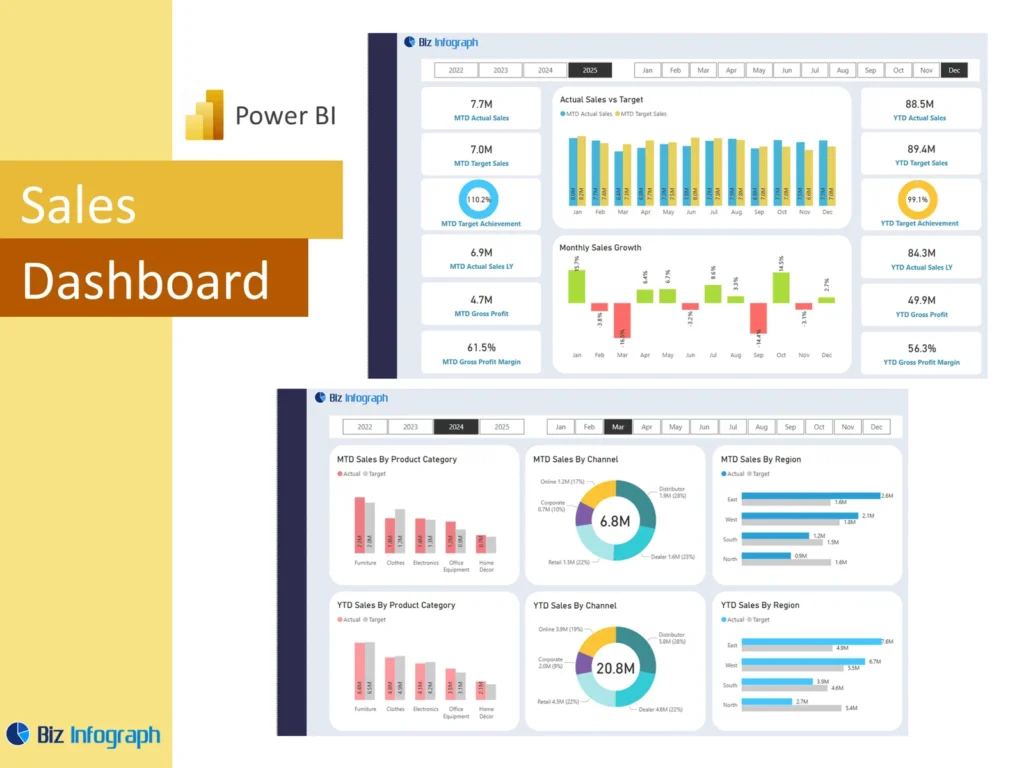
What Is a Sales Dashboard Power BI and Why It Matters
A Sales Dashboard Power BI is a visual reporting solution built to help businesses monitor revenue, pipeline, customer activity, and team results in one place. A strong sales dashboard in Power BI turns raw sales data into a practical analysis dashboard that leaders can review quickly. It helps companies understand trends, compare targets with results, and manage the full sales process more effectively. Since modern teams need faster reporting and clearer visibility, many businesses now use Power BI to create dashboards that support planning, review, and performance improvement. This makes it an important tool in modern business intelligence and performance management.
How a Sales Dashboard Supports Better Sales Analysis and Reporting
A good Sales Dashboard improves sales analysis by organizing data into charts, KPIs, trend lines, and summary visuals that are easier to understand than raw spreadsheets. It helps teams review overall sales, compare periods, monitor sales conversion, and evaluate pipeline movement. Because the dashboard tracks performance clearly, it becomes easier for teams to focus on the right priorities. A well-designed dashboard also supports regular reporting by giving leaders one place to review results. This helps businesses reduce manual reporting work and improves the speed of decision-making for both sales managers and executives.
Why Businesses Use a Sales Dashboard Power BI Template
Many businesses prefer a Sales Dashboard Power BI template because it gives them a structured starting point for building reports faster. A ready-made power bi dashboard template can include KPI cards, trend charts, regional analysis, and pipeline views without having to build everything from scratch. This saves time and helps teams follow stronger best practices in layout and reporting. A practical template also makes it easier to standardize reports across the company. For organizations that want a scalable and visual reporting solution, templates help simplify design and improve reporting consistency for every sales team.
Core Benefits of Sales Dashboard Power BI
Improving Sales Visibility with a Power BI Sales Dashboard
A power bi sales dashboard improves visibility by giving teams one place to review revenue, activity, and opportunity data. It can show actual sales, target progress, customer trends, and regional performance in a single report. This is useful because leaders no longer need to open separate files to understand what is happening. A clear dashboard helps sales managers and sales directors identify gaps, review progress, and take quicker action. Since the dashboard shows important patterns at a glance, it improves awareness across the business and supports a more disciplined approach to monitoring results.
How Analytics and Data Visualization Support Better Decision-Making
Strong analytics and clear data visualization turn raw numbers into useful business insight. In a Sales Dashboard Power BI solution, charts, KPI cards, comparison visuals, and trend views help users understand what is working and what is not. This matters because the goal of reporting is not just to display data, but to help teams make data-driven decisions. A well-built dashboard highlights changes in revenue, conversion, pipeline, and customer behavior. These actionable insights help leaders adjust plans quickly, coach better, and improve performance across the business with more confidence and less guesswork.
Using Microsoft Power BI for Interactive Sales Reporting
Many businesses choose Microsoft Power BI because it allows them to create dynamic and visual reports that are easier to explore than static spreadsheets. With filters, slicers, drill-downs, and responsive visuals, interactive Power BI reporting supports better team analysis and quicker answers during meetings. A strong power bi report can help leaders move from a summary view into detailed performance review within seconds. Since Power BI provides flexibility and scalability, it is well suited for organizations that want better reporting without depending on multiple disconnected reports. This is why many teams use Power BI for sales management and strategy.
Key Metrics in a Sales Dashboard Power BI
Essential KPIs for Sales Overview and Performance Tracking
Every Sales Dashboard Power BI setup should include the most important key metrics needed to manage performance clearly. These often include revenue, close rate, pipeline value, number of deals, average deal size, and target attainment. These performance metrics create a useful sales overview and help leaders see whether the team is moving in the right direction. A good dashboard may also place cards at the top for quick access to the most important KPIs. This design approach improves readability and helps leaders understand performance without scrolling through detailed visuals.
Measuring Actual Sales, Sales Conversion, and Sales Customer Trends
A strong dashboard should track actual sales, conversion rates, and sales customer trends together. These measures help businesses understand not just how much was sold, but how effectively the team is moving prospects through the funnel. Reviewing sales conversion alongside revenue gives better insight into the health of the sales funnel and overall execution. Customer trends may include repeat buying behavior, acquisition activity, or segment performance. When these measures are shown metrics side by side, leaders can understand performance more clearly and identify where changes in process or strategy may be needed.
Using Budget vs Actual Sales and Financial Performance Metrics
A useful Sales Dashboard Power BI report should connect sales activity with broader financial performance. This is where budget vs actual sales analysis becomes valuable. It helps businesses compare planned outcomes with real results and review whether the team is meeting expectations. A dashboard may also include margin, profitability, and other power bi financial measures that show the quality of sales performance, not just quantity. By linking sales and finance views, leaders gain a better understanding of business health. This helps them evaluate both revenue generation and efficiency across the reporting period.
Power BI Sales Dashboard Features
How a Power BI Dashboard Template Simplifies Reporting
A good power bi template simplifies reporting by giving businesses a reusable structure for charts, KPIs, filters, and report pages. Instead of spending time designing every report from the beginning, teams can start with a proven layout and focus on their business logic. A power bi dashboard template also improves consistency because similar teams can report in the same format. This helps leadership compare results more easily. For organizations working with recurring reports, templates save time, reduce errors, and help you build better reports that are more practical for regular review and performance analysis.
Building a Power BI Report with Strong Data Model and Visualization Design
A powerful dashboard begins with a strong data model and clear visual structure. In Power BI Desktop, teams often connect tables, define relationships, and organize calculations to support accurate analysis. A thoughtful model makes the dashboard faster, cleaner, and easier to maintain. Good dashboard design also matters because a report should be easy to read and logically structured. Charts should match the question being answered, and visuals should support interpretation rather than confuse users. When a report combines strong modeling with clear data visualization, it becomes more valuable for both management and daily operations.
Best Practices for Creating an Interactive Power BI Sales Dashboard
Strong best practices in dashboard design include keeping layouts simple, using consistent colors and labels, and showing the most important numbers first. A useful interactive dashboard should include filters for date, region, product, or salesperson so users can explore performance easily. Good design also means avoiding clutter and focusing on visuals that support decisions. In many cases, the most effective dashboards include summary metrics first, followed by detail pages for deeper analysis. When teams apply good practices, the dashboard becomes more useful for meetings, easier to understand, and better suited for long-term business reporting.
Sales Analysis and Reporting Use Cases
Sales Overview and Management Dashboard for Every Sales Team
A management-focused Sales Dashboard provides a high-level sales overview that helps leaders monitor team performance, target progress, and trend movement. This kind of management dashboard is useful for every sales unit because it supports both daily review and strategic planning. It can include revenue summaries, top products, quota progress, and regional results in one place. Because the dashboard offers a complete summary view, it helps managers respond faster to issues and communicate more clearly with leadership. It also supports stronger alignment across the sales team by keeping everyone focused on common goals.
Sales Pipeline Dashboard and CRM Dashboard for Tracking Opportunities
A sales pipeline dashboard is essential for tracking open deals, stage movement, and forecast quality. It helps teams understand how opportunities move through the pipeline and where deals are getting delayed. A connected crm dashboard can go further by linking customer records, activity history, and opportunity status into one report. This combination improves visibility into the full sales process and supports better follow-up decisions. When pipeline and CRM views work together, businesses gain stronger control over opportunity management and can forecast future performance with greater confidence and more consistent reporting quality.
Using an Analytics Dashboard for B2B Sales and Sales Conversion Review
An analytics dashboard is especially useful for B2B sales, where deal cycles are often longer and more complex. It can help teams analyze qualification, stage progression, opportunity size, and conversion by region or account type. By focusing on sales conversion, the dashboard supports a deeper understanding of where performance is strong and where friction exists in the process. This is critical for businesses that want to improve closing rates and shorten decision cycles. A strong analysis view makes it easier to identify gaps, improve coaching, and refine strategy based on measurable patterns rather than assumptions.
Dashboard Examples and Template Ideas
Learning from Power BI Sales Dashboard Examples and Dashboard Example Layouts
Reviewing power bi sales dashboard examples helps businesses understand how effective reports are structured. A good dashboard example can show how to organize summary KPIs, region analysis, sales trends, and pipeline views in a clear layout. Looking at proven designs reduces trial and error and helps teams choose visuals that fit their reporting needs. These examples also show how to arrange filters, comparisons, and detail sections so that the report remains easy to use. For teams trying to improve their design, examples provide practical inspiration and help speed up report development.
Reviewing Power BI Dashboard Examples and Examples of Power BI Dashboards
Studying broader power bi dashboard examples and other examples of power bi dashboards can help teams identify ideas they can adapt for sales reporting. Some reports may focus on finance, operations, or marketing, but they still offer useful lessons in visual structure, layout balance, and user interaction. Looking at dashboard examples across industries can improve report quality because it expands the team’s understanding of what works. A strong sales report can benefit from design patterns used in many business functions, especially when the goal is to create simple, useful, and visually engaging reports.
Choosing the Best Sales Dashboard Power BI Template for Business Needs
The right Sales Dashboard Power BI template depends on the business model, reporting goals, and data available. Some organizations may need a simple revenue and target report, while others require regional analysis, pipeline views, and financial integration. The best template is the one that supports the questions leaders ask most often. It should also work well with the chosen data source and be easy to maintain over time. A practical template improves speed, reduces design effort, and helps the business build a stronger reporting system that matches its actual needs and management style.
Customization and Business Value
How to Use Power BI to Create a Sales Dashboard for Different Business Goals
To create a dashboard that truly supports business performance, teams need to align the report with their actual objectives. Some businesses focus on growth by region, others on margin, product mix, or pipeline quality. The dashboard should reflect these priorities through its KPIs, visuals, and report pages. This is one reason many teams learn how to use Power tools more effectively and use Power BI beyond basic charts. A customized report makes the dashboard more relevant to leadership and helps ensure the data supports the decisions that matter most to the organization.
Adapting a Sales Dashboard Power BI Excel Source for Better Reporting
Many businesses begin with Excel data, so a strong Sales Dashboard Power BI excel setup often starts by improving that source structure. Teams may use Power Query to clean and shape the data before modeling it inside Power BI. In some cases, Power Pivot may also have been used in the earlier reporting process. By preparing the Excel file properly and choosing the right data source structure, teams can build more accurate and flexible dashboards. Cleaner input data leads to better visuals, stronger calculations, and a more dependable reporting system overall.
Building an Executive Dashboard with Interactive Power BI Insights
An executive dashboard in Power BI is designed for decision-makers who need fast access to critical performance information. It often includes total revenue, sales by region, target attainment, top customers, and summary comparisons. Because Power BI enables interaction, leaders can move from a high-level summary to deeper analysis when needed. A strong executive view dashboard highlights what matters most and helps leaders identify top performers, weak regions, or major trends quickly. This makes it easier to guide planning, review performance, and hold productive business discussions supported by visual and reliable information.
Conclusion
Why a Sales Dashboard Power BI Template Is a Practical Reporting Tool
A Sales Dashboard Power BI template is a practical reporting solution because it combines structure, flexibility, and visual clarity. It helps teams connect their data, monitor performance, and review trends without rebuilding reports each time. Since a strong power bi dashboard provides useful insights in a reusable format, it saves time and supports better reporting discipline. Templates also make it easier to scale reporting across departments or business units. For companies that want consistent reporting and stronger analysis, a template-based Power BI dashboard offers a dependable and professional solution.
Final Thoughts on Using Microsoft Power BI for Sales Analysis and Performance Monitoring
A well-designed Sales Dashboard Power BI solution helps businesses turn data into decisions. It supports sales analysis, improves visibility into targets and conversion, and makes reporting more useful for leaders and teams. Whether the company is reviewing sales by region, customer performance, pipeline trends, or even niche views like car sales analytics power bi, the value comes from clear design and strong data structure. With the right setup, Microsoft Power BI can support smarter planning, better monitoring, and stronger outcomes across the full sales function.
For ready-to-use Dashboard Templates: