

What if your annual report’s most important results were the easiest parts to miss? Dense tables and competing charts can make strong performance hard to scan, while a poorly matched visual can blur the point or leave out essential context. An annual report infographic template can help you turn the year’s results into a clear story readers can follow, rather than a collage of data.
A polished report should make numbers easier to understand, not distract from their meaning. Match the visual to the message: use a timeline to show progress, a comparison chart to clarify change, or a concise KPI summary to spotlight key results. Accuracy and context matter as much as appearance.
This guide explains how to identify the story your annual results need to tell, match infographic formats to your main messages, and adapt a template into a cohesive report. You’ll also learn how to check that visuals remain clear and credible alongside the underlying data, while reducing manual design work.
Key Takeaways
- Start with your audience, report objectives, and strongest evidence so every visual supports a central message.
- Choose formats such as timelines, KPI summaries, comparisons, or proportion visuals based on the information you need to communicate.
- Use an annual report infographic template as a flexible starting point, then adapt its labels, colors, typography, and spacing to your brand.
- Review every visual for accuracy, legibility, and context before exporting your report.
- Explore downloadable PowerPoint infographic templates and other visualization resources to reduce manual design work across your report and presentations.
What an Annual Report Infographic Template Should Help Readers Understand
An annual report can bring together financial results, organizational priorities, and a record of progress, but readers may not need every detail at once. The Annual Report Wikipedia overview provides background on common report purposes and contents. An infographic can make selected information easier to follow while leaving the full report available for readers who need more detail.
An annual report infographic template is a reusable visual structure for presenting key report information clearly and consistently. It can organize figures, labels, explanatory text, and visual cues so readers can scan performance and understand how results connect to priorities. The template supports communication; it doesn’t verify data or replace the explanation behind it.
Keep designed shareholder-facing communication distinct from statutory reporting. An infographic may summarize or complement an official report, but it shouldn’t stand in for required disclosures or change the meaning of reported figures. Requirements vary by jurisdiction and applicable framework, so align published visuals with the relevant official documents and review process.
Who uses annual report infographics, and what do they need?
Readers arrive with different questions and levels of familiarity. Before selecting a visual, identify the audience and what they need to understand or decide. This helps you set the right level of detail, terminology, and explanation for someone reading closely or scanning a summary.
- Leadership may want a concise view of progress against strategic priorities and key performance indicators.
- Investors may look for results, year-over-year changes, and the context needed to interpret them.
- Employees may need plain-language links between organizational goals, milestones, and team contributions.
- Customers may be interested in service developments, organizational progress, or impact relevant to their relationship with the company.
- Other audiences, such as partners or community members, may need a focused summary of outcomes that matter to them.
A leadership summary may use familiar internal terms, while a graphic for a broader audience may need definitions and a brief explanation beside the same figure. Design for readers’ knowledge and reading context, not simply for the amount of information available.
Which annual-report information benefits from visual treatment?
Visuals work best when they clarify a pattern, comparison, sequence, or relationship. Choose information with a clear takeaway, then place the explanation and any necessary caveats close to the visual. This helps readers interpret the evidence instead of guessing what a chart is meant to show.
- Performance summaries: Highlight selected results and define each measure and time period.
- Milestones: Use a timeline to show when major initiatives or developments occurred.
- Strategic priorities: Group related goals and progress indicators so their connection is visible.
- Year-over-year indicators: Show comparable periods and explain relevant changes in definitions or scope.
Separate the headline takeaway from supporting detail. A clear title can state the main point, while a nearby note explains a metric, limitation, or change in reporting basis. Readers can scan the message first, then consult the context without losing sight of what the evidence supports.
Plan the Annual Report Story Before Choosing an Infographic Layout
A template can organize information, but it can’t decide what deserves emphasis. Start with the report’s purpose and audience, then build a narrative from evidence. This keeps the annual report infographic template in service of the message instead of letting a striking layout dictate which results make the page.
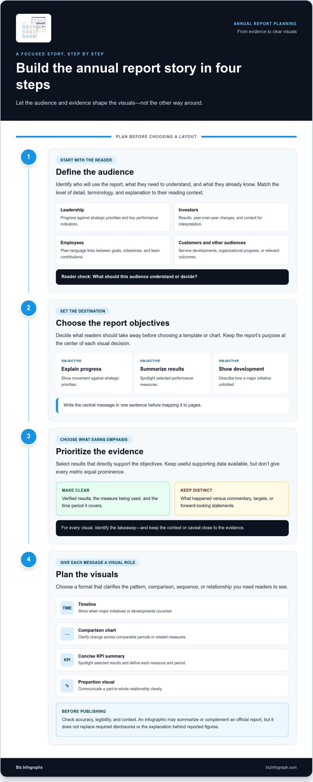
Define the audience, set the report objectives, prioritize the evidence, and only then plan the visuals. Use this sequence to turn a broad set of annual results into a focused story:
- Define the audience. Identify who will use the report and what they already know. A reader familiar with internal performance terms may need less explanation than someone encountering the organization’s measures for the first time.
- Choose the objectives. Decide what readers should understand after reviewing the report. Objectives might include explaining progress on strategic priorities, summarizing results, or showing how a major initiative developed.
- Prioritize the evidence. Select results that directly support those objectives. Keep useful supporting data available, but don’t give every metric equal prominence.
- Plan the visuals. Assign each selected point a visual role, such as showing change over time or comparing related measures. Pair it with a clear takeaway and the context needed to interpret it.
How do you identify the annual report’s key messages?
Begin with the report’s purpose and the audience’s likely questions. Group findings into a few connected themes before mapping them to pages. For example, a theme about strategic progress might combine a milestone, a performance indicator, and a short explanation of what changed. Keep verified results distinct from commentary, targets, and forward-looking statements so readers can tell what happened from what’s planned or projected.
Draft the central message in one sentence. Then test every chart, highlight, and supporting paragraph against it: does this element help readers understand or evaluate the message? If not, revise it, move it to a supporting section, or leave it out. Purdue University’s Data Visualization guidance can help you consider how visual choices shape readers’ interpretation.
How should you prepare data before designing?
Check consistency before opening a design file. Confirm that reporting periods match, units are visible, labels use consistent terms, and definitions stay the same. If you compare years, make sure the measures are genuinely comparable and explain changes in scope or calculation near the visual. Select metrics for the takeaway they support, not simply because they’re available.
For broader presentation planning, the PowerPoint infographic template guide offers ideas for connecting visuals with a presentation’s message. Once your story and evidence are set, downloadable PowerPoint infographic templates provide a structured starting point and can reduce manual design work.
Match Annual Report Data to the Right Infographic Format
Choose a visual by asking what relationship readers need to see: sequence, status, steps, difference, or share of a whole. The best annual report infographic template isn’t necessarily the most decorative. It’s the one that makes information easier to interpret, with accurate scales, plain labels, and enough context to explain the takeaway.
| Report need | Suitable visual | Key caution |
|---|---|---|
| Show milestones in order | Timeline | Use dates or periods consistently; don’t imply events were connected if they weren’t. |
| Summarize a few defined measures | KPI summary | Include units, reporting period, and a clear definition for each measure. |
| Explain stages or linked activities | Process diagram | Show the actual sequence or relationship, not an assumed cause and effect. |
| Compare periods, teams, or categories | Bar chart or comparison panel | Keep measurement bases and time periods comparable; label scales clearly. |
| Show how a whole is divided | Proportion visual | Use categories that make up the same whole and provide values or percentages. |
Which visuals suit milestones, KPIs, and comparisons?
A timeline helps readers follow ordered events, such as an initiative’s launch and later milestones. A KPI summary works for a small set of measures, each with a clear definition and reporting period. Comparison visuals show differences only when categories, periods, and measurement bases align. Avoid treatments that suggest causation or exaggerate a difference the data doesn’t support.
Check axes and scales before styling a chart. A truncated axis, inconsistent intervals, or unlabeled units can make a modest change look dramatic or hide a meaningful pattern. Use titles that describe what’s measured, and place source notes or explanatory context close to the visual. Faithful representation matters more than novelty.
When should a chart give way to a simpler infographic?
Use a concise diagram for strategic pillars, a sequence of activities, or relationships that don’t depend on comparing dense numerical values. If readers need to inspect quantities, trends, or gaps, choose a chart instead. A process graphic can clarify how work flows, but it shouldn’t replace a chart when the question is how results compare.
Proportion graphics are useful when categories form a meaningful whole. A list or labeled diagram may be clearer when they don’t. Make the visual’s purpose explicit: what should readers notice, and what conclusion does the evidence support? If those answers aren’t clear, simplify or choose another format.
Annual reports may also include financial or otherwise regulated disclosures. Their presentation can depend on the applicable jurisdiction and reporting framework, so keep infographic summaries aligned with official disclosures and subject them to the appropriate review. Use the visual as a guide to the information, not a replacement for required detail or context.
Adapt an Annual Report Infographic Template Without Losing Clarity
Once your story and visual format are set, adapt the design to the report’s content and brand standards. Treat the annual report infographic template as a starting structure, not a fixed page that must hold every figure. A thoughtful edit preserves the message while creating a polished, consistent result.
Simplify the visual, but keep the context readers need to interpret its data. Work through the adaptation in order so design decisions don’t get ahead of the content:
- Import the template into your chosen editing workflow and review its layout, text areas, chart elements, and repeated design patterns.
- Replace placeholder content only after key messages are settled. Add approved headings, figures, reporting periods, units, and source notes.
- Adapt the structure to fit the information. Remove unnecessary elements or make room for explanations instead of shrinking text to force content into place.
- Apply brand guidelines consistently. Update colors, typography, labels, and spacing while keeping headings, chart styles, and emphasis patterns coherent across pages.
- Review and export the finished visual in a format suited to its report or presentation, then inspect the exported file for layout shifts, missing text, and legibility.
What should you customize first in a template?
Start with meaning, not decoration. Replace placeholder headings with message-led titles and enter verified figures with their units and periods. Then adjust the layout to fit label lengths and the explanation readers need. If text becomes cramped, simplify the copy or revise the layout; reducing type size until it barely reads weakens the report. Keep repeated colors and visual conventions consistent so readers can recognize related information.
How can you review the finished infographic?
Review both the design and the evidence. Compare every figure with approved source data, then confirm periods, units, labels, definitions, source notes, and footnotes. Check contrast and readability at the size readers will see on screen or in a presentation. Finally, ask someone unfamiliar with the working file to identify the main takeaway and explain what the visual supports. If they have to guess, add context or revise the presentation.
- Legibility: Can headings, labels, and notes be read at the intended viewing size?
- Consistency: Do colors, typography, spacing, and terminology follow the report’s established conventions?
- Context: Are units, periods, sources, and necessary caveats visible near the relevant data?
- Accuracy: Does the visual show only what the underlying evidence supports?
A final proofread can catch inconsistent terms or a misplaced decimal that visual polish won’t reveal. For a structured starting point that reduces manual design work, explore downloadable PowerPoint infographic templates and adapt the visuals to your approved report content.
Build a Cohesive Annual Report with Biz Infographs Templates
Planning, format choices, and accuracy checks provide the foundation. Now bring the visuals together so the report feels like one considered communication, not a collection of unrelated pages. Downloadable PowerPoint infographic templates from Biz Infographs provide presentation-ready visual building blocks that can reduce the manual effort of arranging each element from scratch. Adapt them to your approved content and brand system rather than treating a layout as a finished annual-report design.
How can presentation templates support a consistent report?
Consistency comes from repeating design decisions with purpose. Set a type hierarchy for titles, labels, and notes; apply brand colors consistently; and keep spacing and alignment predictable. These cues help readers recognize related information as they move between sections. The business presentation templates guide offers broader ideas for creating a unified presentation style.
Keep the approved brand system and the meaning of the data intact as you adapt layouts. A color used to distinguish categories should retain that meaning throughout the report, and visual emphasis shouldn’t make a secondary measure appear more important than the evidence warrants. A template can establish structure, but your content and review process preserve accuracy.
- Typography: Use a clear hierarchy and keep labels readable.
- Color: Follow brand guidelines and use color consistently to encode information.
- Spacing: Align related elements and leave enough room for explanatory notes.
- Visual hierarchy: Make the main takeaway easy to locate without hiding supporting context.
What is a practical next step after planning the visuals?
Choose resources that fit the work you’ve planned. PowerPoint infographic templates can help build presentation visuals around report messages, while Excel dashboard templates, Power BI templates, and Excel charts support related data visualization needs. Biz Infographs also offers automation templates. These resources serve different purposes, so select what supports your workflow rather than adding tools that don’t serve the report.
As you adapt an annual report infographic template, preserve approved figures, labels, sources, and explanatory notes. Check that the same visual conventions carry across summary pages and supporting presentation materials. Biz Infographs provides free lifetime updates for its resources.
With the story defined and details reviewed, you can focus on communicating results instead of building every visual from a blank page. Explore Biz Infographs’ PowerPoint infographic templates for a practical starting point and a more efficient way to create report visuals.
Turn Your Report into a Story Readers Can Follow
Your next annual report can do more than present results. It can help readers see what those results mean and where the organization is heading. Keep that purpose in view as you select an annual report infographic template: every design choice should make the message easier to understand without asking readers to guess at the context.
With the narrative planned, you can shape a report that feels clear, credible, and distinctly yours. A consistent visual system helps each page work as part of a larger story, while thoughtful use of data gives readers a reason to trust what they see. You don’t need to build every visual from scratch to achieve a professional finish.
PowerPoint infographic templates, Excel dashboard templates, and Power BI resources can support your next report and related presentations. Biz Infographs also provides free lifetime updates for its resources. Explore Biz Infographs’ infographic templates to give your next report a strong visual foundation.
Frequently Asked Questions
What should an annual report infographic include?
An annual report infographic should include a clear takeaway, relevant measures, reporting periods, units, and enough explanation for readers to interpret the figures. For example, a graphic about revenue might show the current period alongside a meaningful comparison, define what the measure covers, and identify its source. Include a note if the data excludes a business unit or uses a changed definition. The right content depends on the question the visual needs to answer.
How do I choose an infographic template for an annual report?
Choose a template that can accommodate the type and amount of information you need to present, rather than choosing by appearance alone. Check that it has room for readable labels, explanatory notes, and source details, and that its layout suits the report’s intended format, such as a slide or digital page. Test it with a representative visual and realistic text lengths before adapting it, so you can catch cramped areas early.
Can I use PowerPoint to create an annual report infographic?
Yes. PowerPoint can arrange text, shapes, charts, and other visual elements into infographic slides for an annual report or presentation. A downloadable PowerPoint infographic template provides a prepared visual structure that you can adapt to approved content and brand guidelines. Before sharing or exporting, inspect the result on the intended screen size and confirm that labels, notes, and chart elements remain clear.
Which charts work best for annual report data?
The best chart depends on what readers need to compare. Line charts can show change over time; bar charts can compare categories or periods; and proportion charts can represent parts of a clearly defined whole. Use a chart only when the data supports that relationship. For instance, don’t use a stacked bar to imply categories add up to a total if they don’t. Label axes, units, and periods so the comparison is transparent.
How do I make an annual report infographic accessible and easy to read?
Use readable type, strong contrast between text and background, and plain-language labels. Don’t rely on color alone to distinguish categories; add labels, patterns, or another visual cue so the meaning remains clear. Keep notes legible and avoid crowding the graphic with too many measures. For digital reports, provide meaningful alternative text where supported, and check how the infographic reads on a smaller screen as well as at full size.
What is the difference between an annual report infographic and a dashboard?
An annual report infographic is usually a curated visual that communicates selected information to support a report narrative. A dashboard is generally organized for ongoing monitoring, bringing together measures users may review regularly to track performance. A report graphic might summarize a completed period, while a dashboard may help teams examine current indicators. They can present related data, but their purposes and levels of detail differ.
How do I keep an annual report infographic accurate when simplifying data?
Keep a traceable connection between every displayed figure and its approved source. Preserve the measure’s definition, timeframe, and unit, and label any rounding or exclusions that could affect interpretation. Don’t remove unusual results simply because they complicate the story. After editing, compare figures and labels against the source data, then ask a reviewer to check whether the takeaway is supported without assumptions the visual doesn’t explain.