

Why are you still spending hours manually coloring cells when a professional Gantt chart Excel template should be doing the heavy lifting for you? Most project leaders agree that while Excel is an essential tool, its standard bar charts often look unprofessional in high-stakes board meetings. It’s frustrating to watch a complex schedule turn into a cluttered mess that becomes a nightmare to update every time a project date shifts.
You deserve to transform those tedious schedules into high-impact visual timelines that impress stakeholders and save hours of manual design work. This 2026 guide reveals how to adopt a plug-and-play solution that looks premium while automating your date shifting and milestone tracking. We’ll explore the latest visualization standards and show you how to use a schedule that serves as a presentation-ready infographic. It’s time to move beyond the struggle of manual formatting and start using tools that help you shine as a productivity partner. By the end of this article, you will have a clear path to creating world-class timelines that simplify your workflow and elevate your professional presence.
Key Takeaways
- Learn how to eliminate manual cell coloring with automated date calculations that adjust your entire schedule instantly.
- Discover how a premium Gantt chart Excel template transforms raw project data into presentation-ready infographics for high-stakes meetings.
- Understand the hidden financial costs of DIY templates and why investing in a best-in-class asset saves dozens of billable hours.
- Master the art of executive reporting by decluttering your timeline to focus on milestones that matter to stakeholders.
- Implement dynamic progress bars that visually communicate task completion levels without manual formatting errors.
What is a Gantt Chart Excel Template and Why Does it Matter in 2026?
Do you feel overwhelmed by a project schedule that looks like a cluttered list of dates rather than a clear roadmap? A What is a Gantt Chart? is essentially a visual horizontal bar chart used to illustrate a project schedule from start to finish. In 2026, this tool remains the gold standard for project management because it transforms a complex work breakdown structure into a logical, easy-to-read timeline. While many specialized platforms exist, a Gantt chart Excel template is often the superior choice because it combines the power of data automation with a software interface your entire team already understands.
The corporate landscape has shifted significantly. It’s no longer sufficient to simply track progress in a private spreadsheet. Today, project managers are expected to provide strategic visualization that speaks to executives and stakeholders at a glance. A professional template moves beyond basic cell coloring. It functions as a dynamic dashboard that signals project health, identifies bottlenecks, and presents your hard work as a polished infographic rather than a raw data dump.
The Anatomy of a High-Impact Project Timeline
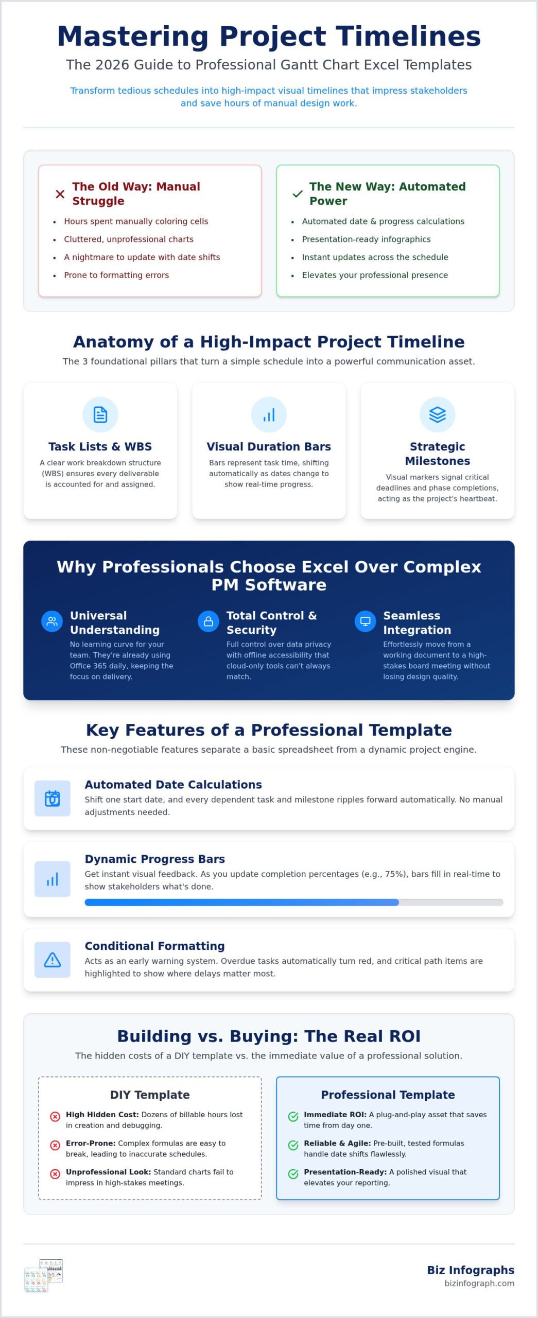
A truly professional project timeline is built on three foundational pillars that ensure clarity and accountability. When these elements work together, your schedule becomes a powerful communication asset:
- Task Lists and WBS: A clear work breakdown structure ensures every deliverable is accounted for and assigned to the right owner.
- Visual Duration Bars: These bars represent the time allocated to each task, shifting automatically as dates change to show real-time progress and dependencies.
- Strategic Milestones: These visual markers signal critical deadlines or phase completions, acting as the heartbeat of your project schedule and signaling overall health.
Why Professionals Choose Excel Over Complex PM Software
Why do industry leaders stick with Excel even as new software floods the market? The answer lies in the latest Microsoft Excel Version 2608 (Build 20326.20132), which offers unparalleled flexibility for modern teams. Team members don’t need to learn a new system because they’re already using Office 365 daily. This eliminates the learning curve and keeps the focus on deliverability. Additionally, using a Gantt chart Excel template ensures full control over data privacy and allows for offline accessibility that cloud-only tools can’t always match. Perhaps most importantly, these timelines integrate seamlessly into business presentation templates, making it effortless to move from a working document to a high-stakes board meeting without losing design quality.
Essential Features of a Professional-Grade Gantt Chart Template
Efficiency is the hallmark of a world-class project manager. When you use a premium Gantt chart Excel template, you aren’t just filling out a spreadsheet; you’re building a dynamic engine that powers your entire project. Unlike static charts that break the moment a deadline slips, professional-grade tools utilize advanced formulas to ensure your timeline remains agile and accurate. This level of automation is critical for strategic project visualization, allowing you to focus on leadership rather than manual data entry.
A best-in-class template must include several non-negotiable features to meet the demands of 2026 corporate environments. First, automated date calculations are essential. When a project start date shifts, every dependent task should ripple forward automatically. Second, dynamic progress bars provide instant visual feedback. As you update task completion percentages, the bars should fill in real-time, giving stakeholders a clear view of what’s done and what’s lagging. To truly elevate your reporting, consider using pre-built Excel dashboard templates that handle these complex formulas for you.
Beyond basic tracking, professional templates use conditional formatting to act as an early warning system. Overdue tasks can automatically turn red, while critical path items are highlighted to show where delays will impact the final delivery date. Finally, customizable color schemes allow you to align the chart with your corporate branding. This ensures that every schedule you share looks like a bespoke piece of collateral designed specifically for your organization.
Milestone Tracking and Deadline Management
Differentiating between a routine task and a critical deadline is vital for project clarity. While tasks represent the work being done, milestones mark the finish line for key phases. Milestones are the pulse-check of any project schedule. A professional template should also feature automated “Days Remaining” counters. This simple addition creates a sense of urgency and relief, helping teams prioritize their efforts without having to calculate dates in their heads.
Interactive Elements and User Experience
User experience is often the difference between a tool that gets used and one that gets ignored. For long-term projects spanning months or years, integrated scroll bars or date pickers allow you to navigate the timeline without endless horizontal scrolling. If you’re managing multiple workstreams, exploring interactive excel dashboard templates can provide a holistic view across different projects. Always ensure your template is formatted to be print-ready. Whether you’re exporting a PDF for a digital report or printing a large-scale version for a war room meeting, the visual integrity must remain sharp and professional.
Building vs. Buying: The Real ROI of Professional Templates
Is your time better spent leadings your team or debugging a spreadsheet? Many project managers fall into the trap of the “Hidden Cost of Free.” While a basic, no-cost Gantt chart Excel template might seem like a bargain, it often carries a heavy price in lost billable hours. Every minute you spend fixing a broken formula or manually adjusting cell colors is time stolen from high-level strategy. When you multiply those minutes across a year-long project, the cost of a “free” tool can skyrocket into thousands of dollars of wasted productivity.
You might think, “I’m an Excel power user; I can build this myself.” While that’s likely true, the real question is whether you should. Professional templates aren’t just about pretty colors. They’re built on a foundation of stress-tested formulas that have been refined across thousands of projects and diverse industries. These “best-in-class” assets handle complex logic that DIY versions often overlook, such as non-working days, variable holiday schedules, and intricate task dependencies. By choosing a professional solution, you’re buying the peace of mind that comes with a reliable, bulletproof engine.
The Design Tax: Why Aesthetics Drive Project Buy-In
Data visualization is rooted in psychology. When you present a cluttered, amateurish chart, stakeholders often feel a subconscious spike in anxiety. They begin to wonder if the project itself is as disorganized as the timeline representing it. Conversely, a clean and sophisticated visual reduces cognitive load and builds immediate trust. A polished Gantt chart reflects a polished project manager. High-quality design signals authority and competence, making it significantly easier to secure executive buy-in and keep your team aligned with the vision.
Scalability and Long-Term Maintenance
Project bloat is a reality in every industry. In the construction sector, for instance, companies like Swiss Build Ltd understand that managing large-scale residential and commercial builds requires precision scheduling and professional-grade oversight to ensure success. A DIY sheet that works perfectly for ten tasks often shatters when you try to scale it to two hundred. Adding new rows, inserting phases, or shifting an entire month of work can cause manual formatting to collapse. Professional templates are engineered for scalability. They handle the addition of data without breaking the layout or requiring a total redesign. Furthermore, when you invest in a premium asset, you typically benefit from lifetime updates. This ensures your tool evolves alongside the latest software versions, such as the 2026 Microsoft Excel updates, without you ever having to rebuild from scratch.
Strategic Reporting: Using Your Gantt Chart for Executive Presentations
How do you turn a complex project schedule into a story that a CEO can understand in thirty seconds? Most project managers make the mistake of presenting their raw working document to stakeholders. This leads to confusion and unnecessary questions about micro-tasks. To succeed, you must transition your Gantt chart Excel template from a tracking tool into a strategic executive summary. This process involves stripping away the noise and highlighting the milestones that actually impact the bottom line.
Strategic reporting is about clarity. While your team needs to see every sub-task, your executive team only cares about major deliverables and potential risks. You can achieve a full project overview by pairing your timeline with high-quality Excel dashboard templates. This combination allows you to present a single source of truth that balances granular detail with high-level performance metrics. It’s about telling a story of progress rather than just listing dates. These tools are fully compatible with the latest Excel Version 2608 (Build 20326.20132), ensuring your visuals remain crisp and professional on any device.
Visual Storytelling with Project Data
To capture the C-suite’s attention, you must identify the “Big Picture” milestones. These are the non-negotiable anchors of your project. Use a simple Red, Yellow, and Green color-coding system to signal risk levels. This allows viewers to scan the chart and immediately identify where their intervention might be needed. Always ensure your “Current Date” line is dynamic and highly visible. This vertical marker provides instant context, showing exactly where the project stands relative to the overall deadline without requiring the viewer to hunt for the current week.
Exporting and Sharing Your Timeline
Presentation matters just as much as the data itself. When you’re ready to share your progress, follow best practices for embedding your Excel charts into PowerPoint. Avoid blurry screenshots by using the “Link Data” or “Paste Special” features to maintain vector quality. If you’re converting to PDF, ensure your Gantt chart Excel template is optimized for a single page. A timeline that spans multiple slides loses its impact and makes it difficult for stakeholders to grasp the project’s flow. For the best results, use professional Excel charts and dashboards designed for high-resolution exports and seamless executive reporting.
Elevate Your Productivity with Biz Infographs Gantt Solutions
Are you ready to stop fighting with your spreadsheets and start leading your projects with absolute confidence? At Biz Infographs, we believe that your time is your most valuable asset. Our philosophy centers on providing premium design for professional results, ensuring that every Gantt chart Excel template we create meets the highest “best-in-class” standards. We don’t just sell files; we provide a clear, high-quality path to success that transforms common professional frustrations into a source of personal pride.
By choosing our solutions, you adopt the role of an “Expert Facilitator” within your organization. You’ll no longer be the person struggling with broken formulas or messy layouts. Instead, you’ll be the leader who delivers polished, insightful timelines that drive projects forward. Our tools are designed to work within a unified ecosystem. This means you can pair your data with our PowerPoint infographic templates to create a seamless flow from deep-dive analysis to high-stakes executive presentations. Join thousands of professionals who’ve ditched manual formatting for good and started focusing on what they do best.
Features of the Biz Infographs Gantt Template
Our templates are engineered to meet the sophisticated corporate standards of 2026 while remaining incredibly easy to use. You don’t need to be an Excel wizard to achieve professional-grade results. Consider these key advantages:
- Modern Aesthetics: Clean, minimalist designs that prioritize readability and stakeholder engagement.
- Zero Learning Curve: Fully automated features that handle the complex logic for you, allowing for immediate “plug-and-play” utility.
- Lifetime Support: Gain peace of mind with lifetime access to updates and support from our team of data visualization experts.
Ready to Shine in Your Next Meeting?
Switching to a professional template provides immediate relief. Imagine walking into your next stakeholder review with a timeline that looks like it was designed by a professional agency. You’ll save hours of manual design work while presenting a schedule that serves as a presentation-ready infographic. This isn’t just about tracking tasks; it’s about elevating your professional presence and ensuring your hard work gets the recognition it deserves. Don’t settle for “good enough” when excellence is just a click away. It’s time to reclaim your schedule and lead with authority. Browse our Professional Excel Gantt Chart Templates today and experience the impact of world-class data design.
Take Control of Your Project Success
You now have the roadmap to move beyond the frustration of manual cell coloring and broken formulas. We’ve explored how a professional Gantt chart Excel template provides the automation and aesthetic quality needed to impress stakeholders in 2026. By choosing a best-in-class solution, you aren’t just saving time; you’re investing in a tool that scales with your ambition and ensures your reporting is always executive-ready.
It’s time to join the ranks of Fortune 500 professionals who rely on these high-performance assets to drive their daily workflows. With an instant digital download and free lifetime updates included, you can start transforming your data immediately. Stop struggling with DIY limitations and step into your role as an expert facilitator who delivers results with style. Download Your Professional Gantt Chart Excel Template Now and start shining in your next board meeting. You have the skills to lead; now you have the tools to match.
Frequently Asked Questions
Can I use a Gantt chart Excel template on a Mac?
Yes, you can absolutely use a Gantt chart Excel template on a Mac. Microsoft Excel for Mac supports the vast majority of formulas, conditional formatting, and chart types found in the Windows version. Biz Infographs designs templates with cross-platform professionals in mind, ensuring your project timelines look identical whether you’re presenting on a MacBook or a Windows laptop. This flexibility allows your entire team to collaborate without worrying about software version conflicts.
How do I add more tasks to a pre-made Gantt chart template?
Adding more tasks is usually as simple as inserting a new row within the data table. In a high-quality template, the visual timeline automatically expands to accommodate new entries. You don’t need to manually redraw bars or fix broken formulas. By entering the task name, start date, and duration, the template does the heavy lifting for you. This automation ensures your project schedule remains accurate and professional as your work breakdown structure grows.
Is a Gantt chart better than a simple task list?
A Gantt chart is significantly more powerful than a simple task list for managing complex projects. While a list only tells you what needs to be done, a Gantt chart illustrates how tasks overlap, how long they take, and which items depend on others. This visual context helps you identify bottlenecks before they delay your delivery. It transforms a static to-do list into a dynamic roadmap that provides clarity for both the team and executive stakeholders.
Can I customize the colors of the template to match my brand?
Yes, you have full control over the aesthetics of your template. You can easily modify the color palette to align with your corporate branding or specific project themes. Most professional templates utilize Excel’s built-in theme settings or conditional formatting rules, allowing you to change the look of the entire timeline with just a few clicks. This ensures your project visuals maintain a best-in-class appearance that reflects your organization’s professional identity during high-stakes presentations.
Do I need advanced Excel skills to use a professional template?
You don’t need advanced Excel skills to benefit from a professional template. These tools are specifically designed as plug-and-play solutions for busy managers. The complex formulas and data structures are hidden behind a user-friendly interface, so you only need to enter basic project information like dates and task names. This allows you to produce expert-level data visualizations without spending weeks learning advanced spreadsheet functions or manual design techniques.
What is the difference between a Gantt chart and a project dashboard?
A Gantt chart is a specific scheduling tool focused on the project timeline and task sequences. In contrast, a project dashboard provides a holistic view of multiple key performance indicators, such as budget status, resource allocation, and overall risk. While the Gantt chart is the heartbeat of your schedule, a dashboard acts as the command center for the entire project. Using them together ensures you have both the granular timeline and the executive-level summary.
How do I handle dependencies in an Excel-based Gantt chart?
Handling dependencies in an Excel-based Gantt chart Excel template is managed through smart formulas. By linking the start date of one task to the end date of another, you create a dynamic chain. When the first task is delayed, all subsequent tasks shift automatically. This logic prevents manual scheduling errors and ensures your project timeline reflects the reality of your workflow. It’s a critical feature for maintaining an accurate and reliable project schedule.
Are these templates compatible with Google Sheets?
While these templates are optimized for the latest version of Microsoft Excel, many of the core features remain functional in Google Sheets. However, some advanced formatting and specific interactive elements may behave differently due to the unique way Google handles spreadsheet logic. To ensure you get the full best-in-class experience and peak performance, we recommend using the templates within the Microsoft Office ecosystem, where they are rigorously tested and supported for executive reporting.