Introduction to CFO Dashboard Quarterly Performance Review Power BI
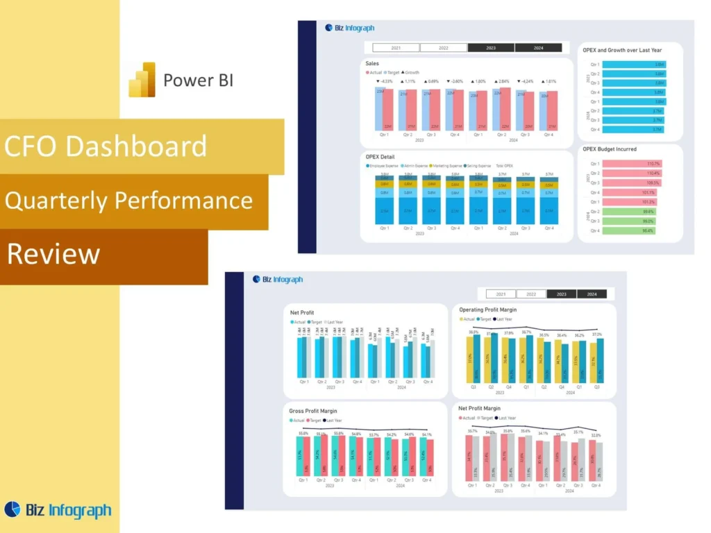
What Is a CFO Dashboard Quarterly Performance Review Power BI and Why It Matters
A CFO Dashboard Quarterly Performance Review Power BI solution is a reporting tool that helps finance leaders review company results in a clear and structured way at the end of each quarter. It brings the most important financial figures, trend views, and business indicators into one place so leadership can understand current results faster. A strong cfo dashboard in power bi helps teams evaluate financial performance without relying on scattered spreadsheets or long manual reports. Because quarterly reviews shape planning and strategic discussions, a dashboard becomes a practical way to improve clarity, speed, and confidence in executive finance reporting.
How a Finance Dashboard Supports Quarterly Financial Performance Review
A strong Finance Dashboard supports quarterly review by organizing key numbers into a format that is easier to interpret than static financial packs. It helps the finance team compare actual outcomes, review changes in performance over time, and identify where the business is ahead or behind expectations. A dashboard is especially useful in monthly or quarterly review cycles because it provides a repeatable reporting structure. It also creates a unified view of financial performance, allowing leadership to connect high-level results with supporting details. This makes performance conversations faster, more focused, and more useful for executive planning.
Why Businesses Use a CFO Dashboard Quarterly Performance Review Power BI Template
Many organizations choose a CFO Dashboard Quarterly Performance Review Power BI template because it gives them a strong starting point for finance reporting. A reusable power bi dashboard template can include KPI cards, trend visuals, summary sections, and comparison pages without requiring a full redesign every quarter. This saves time and improves consistency in reporting. It also helps teams avoid layout mistakes and maintain a professional executive format. Since quarterly reviews happen repeatedly, templates make the reporting process more efficient and more reliable while giving CFOs and finance leaders a better structure for communicating results.
Core Benefits of a CFO Dashboard Quarterly Performance Review Power BI
Improving Financial Visibility with a Power BI Dashboard
A power bi dashboard improves financial visibility by placing revenue, margin, cost, liquidity, and trend measures into one executive report. This helps CFOs and finance teams understand what is happening without switching between multiple files or presentations. Better visibility matters because financial issues often develop gradually across several areas of the business. A dashboard helps users see these patterns sooner. When the business has one visual place to review core financial results, leadership can monitor risks and opportunities more effectively. This makes the quarterly review more valuable and supports clearer executive communication.
How Metrics Support Better Decision-Making for the Finance Team
Well-chosen metrics and key performance indicators are essential because they help the finance team focus on what matters most. A strong dashboard should show profitability, revenue growth, cost control, liquidity, and variance measures in a way that is easy to understand. These measures strengthen decision-making because they allow leaders to compare performance quickly and identify where action may be needed. Instead of working through disconnected reports, the team can review meaningful KPI summaries in one place. This improves the quality of discussions and helps finance leaders prioritize attention more effectively during quarterly reviews.
Using Power BI Financial Reporting for Quarterly Review Efficiency
A strong power bi financial setup improves reporting efficiency by reducing manual work and presenting numbers in a format that leadership can review quickly. Instead of preparing several disconnected presentations, the finance team can maintain one dashboard and update it each quarter. This speeds up preparation and improves reporting consistency. Since bi provides visual structure and filtering, it also makes the report easier to navigate during executive meetings. Better efficiency matters because finance teams often work under tight deadlines. A dashboard helps them spend less time formatting and more time interpreting financial performance and preparing meaningful recommendations.
Key Metrics in a CFO Dashboard Quarterly Performance Review Power BI
Essential Financial Performance Metrics Every CFO Dashboard Should Track
Every CFO Dashboard Quarterly Performance Review Power BI report should include the most important financial measures needed for executive review. These usually include revenue, gross margin, operating expense, profit, working capital, liquidity, and forecast accuracy. These key performance indicators create the foundation for strong quarterly reporting and help CFOs compare current results with prior periods and plan. A well-built dashboard ensures that the most important measures are visible first so leadership can focus on the business quickly. Clear KPI selection makes the dashboard more strategic, more practical, and easier to use in executive discussions.
Using Quarterly KPI and Metric Views for Better Finance Team Insights
Quarterly review becomes much stronger when the dashboard includes focused KPI and metric views that help the finance team interpret results more deeply. These may include quarter-over-quarter movement, profitability ratios, expense changes, and performance against internal targets. Clear KPI views make it easier to understand the significance of the numbers and not just the numbers themselves. They also help the team explain what changed and why. This improves internal analysis and strengthens executive communication because leaders can see the results and the context in the same structured view.
Measuring Business Performance with a Financial Dashboard in Power BI
A strong financial dashboard in Power BI should connect financial results with broader business performance. This can include revenue quality, margin stability, operating efficiency, and even selected non-financial drivers where relevant. The goal is to create a unified view of financial performance that helps leadership understand the business more completely. When results are shown alongside supporting trends, the dashboard becomes more than a reporting tool. It becomes a way to measure how the company is performing overall. This strengthens quarterly review and helps CFOs present a more useful picture of business direction and financial strength.
CFO Dashboard Quarterly Performance Review Power BI Features
How a Power BI Dashboard Template Simplifies Quarterly Reporting
A good power bi dashboard template simplifies quarterly reporting by giving finance teams a structured format they can reuse every quarter. Instead of building each report from the beginning, the team can update the latest data and refresh the visuals. This helps reduce manual effort and shortens reporting preparation time. It also improves consistency because the same KPI layout, trend views, and summary sections appear every period. Since leadership often expects familiar reporting structures, templates make the quarterly review easier to follow and help build a more dependable and professional finance reporting process.
Building a CFO Dashboard in Power BI with Strong Dashboard Template Design
To build a cfo dashboard effectively, the report must balance executive simplicity with enough analytical depth to support discussion. A strong design starts with a summary page, then moves into revenue, expense, profitability, and cash flow sections. A good dashboard template makes this easier by giving the team a practical layout for quarterly analysis. Clear structure improves usability and helps finance leaders present numbers more effectively. When design is well thought out, the dashboard can present complex financial data in a way that is easier to interpret and much more useful during high-level review.
Why Power BI Templates Save Time and Improve Reporting Accuracy
Well-designed power bi templates save time because they reduce repetitive design work and let teams focus on the numbers. They also improve accuracy because the same report logic, visual structure, and KPI calculations are used consistently each quarter. This reduces the risk of reporting inconsistencies and helps leadership compare results with more confidence. Templates are especially useful for recurring reviews because they establish a standard approach to executive reporting. A reliable template gives the finance team a more efficient workflow and makes quarterly review preparation more predictable and easier to manage.
Dashboard Development and Reporting Design
How to Build a CFO Dashboard from Scratch in Power BI
If a company wants to create a dashboard from scratch, the process should begin with defining the business questions the CFO needs answered every quarter. From there, the team can choose the right metrics, prepare the data model, and design the report structure. To build a power bi dashboard effectively, the team should focus first on executive needs, not just data availability. During dashboard creation, it is important to decide what belongs on the summary page and what belongs on supporting detail pages. This approach helps ensure the report remains executive-focused and useful.
Best Practices for CFO Dashboards and Quarterly Performance Reporting
There are several best practices for cfo dashboards that make quarterly reporting more effective. The dashboard should start with a concise executive overview, use consistent definitions, emphasize trend comparison, and avoid visual clutter. It should also highlight the numbers that drive decision-making instead of overwhelming users with excessive detail. One of the most important practices is ensuring the layout matches how leadership thinks about performance. A strong dashboard also supports performance trends analysis so CFOs can explain movement over time, not just current-quarter figures. Good practices improve usability, clarity, and executive confidence in the report.
Using Dashboard Examples and Power BI Dashboard Examples for Better Design
Studying power bi dashboard examples is one of the easiest ways to improve executive reporting design. Good examples show how to organize financial summaries, trend visuals, and supporting analysis pages in a logical and easy-to-read structure. They also help teams understand what a strong summary dashboard looks like in practice. Learning from examples reduces design mistakes and speeds up development. For finance teams building executive reports, examples can provide practical guidance on layout, storytelling, and visual hierarchy. This makes the final dashboard more polished, more strategic, and more effective in quarterly review meetings.
Finance Team Reporting and Quarterly Review Use Cases
How the Finance Team Uses a Performance Dashboard for Quarterly Analysis
A performance dashboard helps the finance team analyze quarterly results in a way that supports both internal review and executive presentation. It can show profit movement, cost control, cash position, and other major indicators in one place. This makes it easier to review the quarter as a whole and spot where the biggest changes happened. A strong dashboard also supports discussions around sales performance and margin contribution if revenue is a major driver of financial change. Better analysis helps the finance team prepare stronger commentary and more useful strategic recommendations for leadership.
Using a Financial Dashboard for Executive Review and Decision-Making
A financial dashboard is especially useful in executive review because it allows CFOs to summarize results quickly while still keeping deeper analysis available. This supports better decision-making because leaders can see the major issues first and then drill into supporting pages if needed. A dashboard also makes it easier to share the dashboard with stakeholders in a format that is easier to review than spreadsheets or long slide decks. Better executive review leads to better follow-up actions and creates more value from each quarterly performance discussion across leadership teams.
Adapting a CFO Dashboard Quarterly Performance Review Power BI to Business Needs
Every organization has different reporting priorities, so a CFO Dashboard Quarterly Performance Review Power BI solution should be adapted to fit the business. One company may focus more on profitability and liquidity, while another may emphasize subscription performance, margin by business line, or operating efficiency. Some businesses may include revenue views supported by sales performance dashboards, while others may need stronger cost or capital views. Adapting the dashboard ensures it remains relevant and helps leadership review the financial issues that matter most to that organization’s specific goals and operating model.
Practical Value of CFO Dashboard Quarterly Performance Review Power BI
How to Use Power BI to Build a Power BI Dashboard for Finance Review
To use power bi well in finance review, the team should begin with clear reporting objectives and well-structured source data. Once those are in place, Power BI can organize the results into an executive-friendly format with a summary section and deeper detail pages. Teams can use power tools such as Power Query Editor to prepare the data and then build visual views for quarterly performance review. This is how power bi facilitates better reporting. It gives finance teams a more practical way to review results and present them clearly to CFOs and executives.
Creating Better Quarterly Reporting with Power BI Financial Insights
Good quarterly reporting depends on more than numbers alone. It depends on the ability to explain what changed, why it changed, and what leadership should do next. A strong power bi financial dashboard supports this by turning financial results into more usable business insight. It can highlight revenue movement, expense pressure, cash flow patterns, and forecast issues in a visual and connected format. Better insight leads to better discussion, and better discussion leads to better action. This is one reason finance teams increasingly rely on Power BI for executive reporting and quarterly performance reviews.
Using a CEO Dashboard Power BI Template Structure for Executive-Level Finance Reporting
Sometimes the structure used in a CEO Dashboard Power BI template can also strengthen CFO reporting because both need a high-level executive summary supported by detailed analysis pages. A CEO-style layout can help finance teams organize the CFO review into summary, trends, drivers, and action areas more effectively. This type of structure works well for executive communication because it emphasizes clarity and decision support. When adapted correctly, it gives the CFO dashboard a more strategic feel and helps leadership absorb the results faster during quarterly review discussions.
Conclusion
Why a CFO Dashboard Quarterly Performance Review Power BI Template Is a Practical Reporting Tool
A CFO Dashboard Quarterly Performance Review Power BI template is practical because it combines efficiency, consistency, and executive focus in one solution. It helps finance teams update reports faster, compare quarter results more reliably, and maintain a familiar structure for leadership. Templates also reduce repetitive report-building effort and improve the quality of executive communication. For organizations that need recurring quarterly performance review, this kind of dashboard creates a dependable reporting framework that supports stronger financial oversight and more disciplined decision-making throughout the business.
Final Thoughts on Using a Finance Dashboard for Quarterly Financial Performance Review
A well-designed Finance Dashboard helps CFOs and finance leaders review quarterly performance with more clarity, speed, and confidence. It supports better visibility into profitability, financial stability, profit margins, cash flow, and performance trends, while also making it easier to explain results to leadership. Because power bi enables businesses to organize financial information into more useful executive views, the dashboard becomes more than a reporting tool. The dashboard provides actionable insights, helps leadership understand financial direction, and ensures that the dashboard remains a valuable part of strategic finance management quarter after quarter.
For ready-to-use Dashboard Templates: