Introduction to Sales KPI Dashboards in Power BI Template
What is a Sales KPI Dashboard in Power BI?
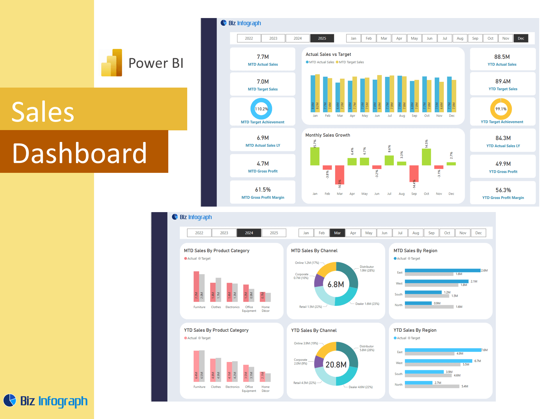
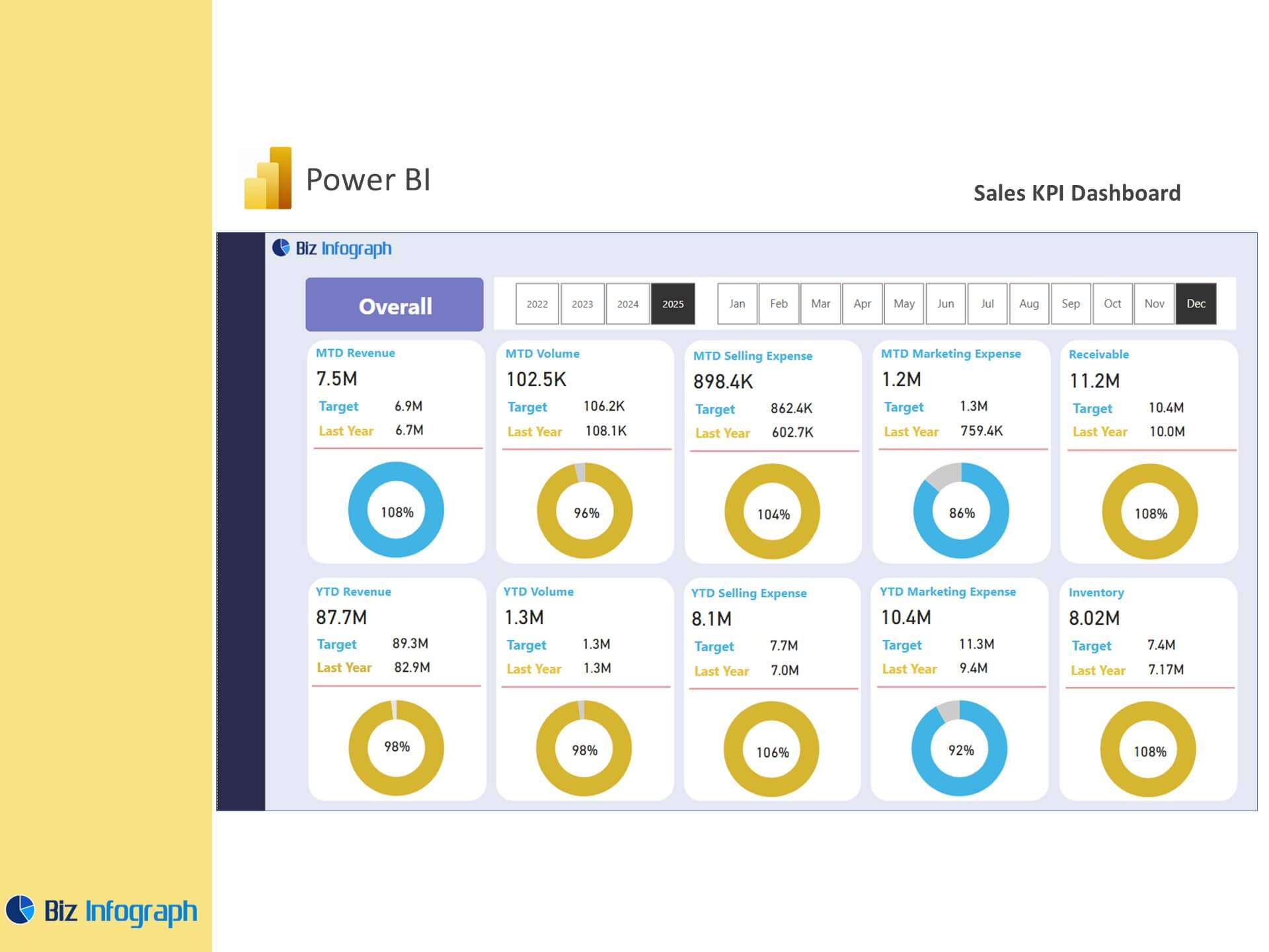
A Sales KPI Dashboard in Power BI is a centralized solution used to monitor, track, and visualize essential sales metrics. Designed with the purpose of the dashboard being to inform strategy and optimize team output, it showcases actual sales, pipeline status, sales growth, and performance against sales targets. Built with Power BI Desktop, it empowers sales managers and analysts to manage and enhance team performance through powerful data visualization. These dashboards consolidate data from CRMs, spreadsheets, and ERPs, and are among the most actionable examples of Power BI dashboards used in modern sales operations.
Why Use a Power BI Template for KPI Dashboards?
Using a Power BI dashboard template significantly reduces the time and complexity required to build a comprehensive kpi dashboard from scratch. These templates include pre-built visuals and calculated fields, offering a fast and reliable starting point for Power BI users. They enable users to easily connect your data, avoiding the need for manual data exports while providing kpis in real-time. Whether tracking total sales, sales leads, or campaign outcomes, free Power BI templates are essential tools that align with best practices in business intelligence. Templates are especially useful for those getting started with Power BI.
Benefits of KPI Dashboards for Sales Teams
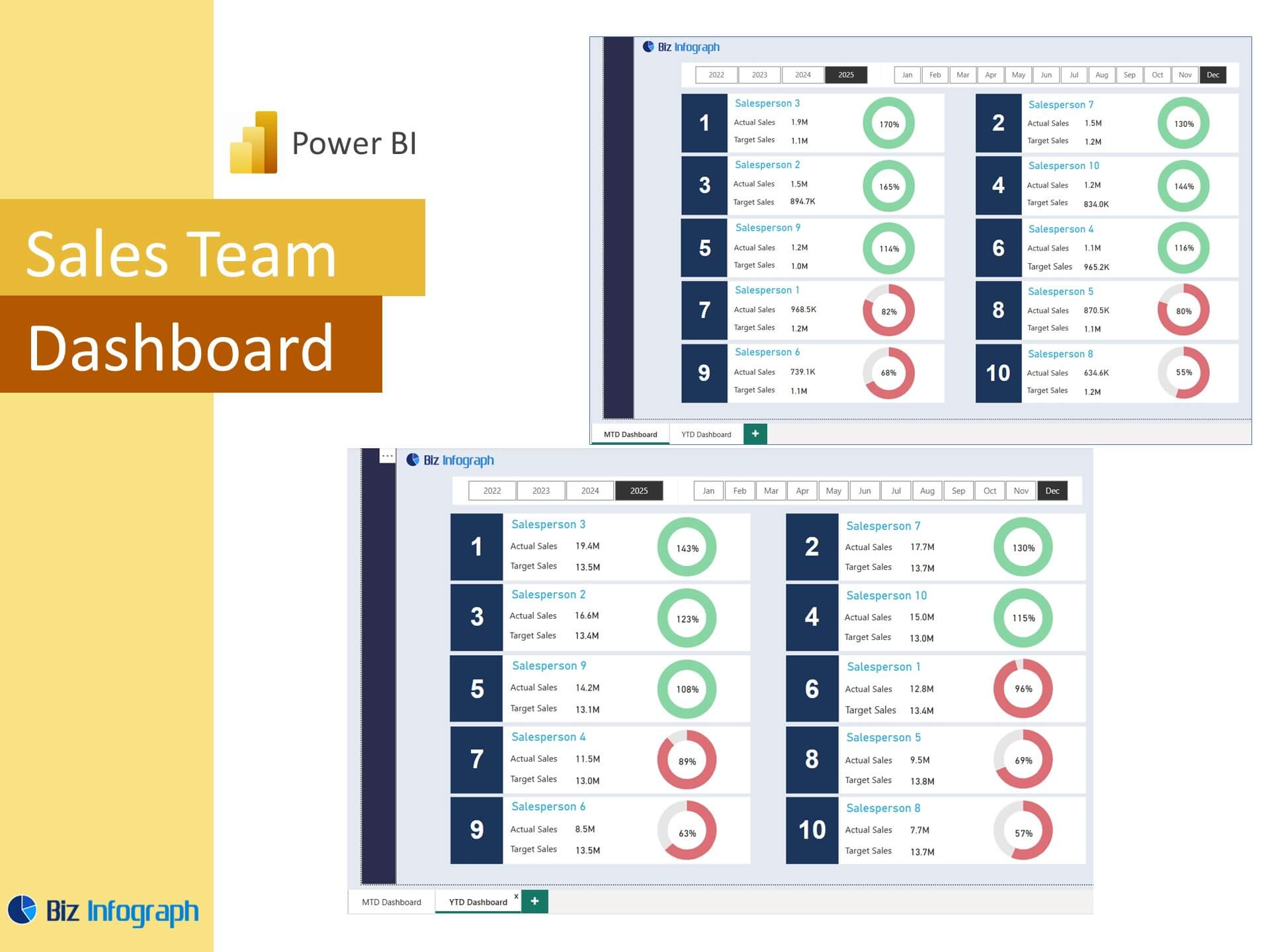
A well-structured KPI dashboard helps sales teams monitor performance, refine their sales efforts, and stay aligned with organizational goals. These dashboards provide real-time visibility into sales representative activities, team-wide quota progress, and conversion efficiency. A good performance dashboard also gives insight into key trends and opportunities, helping sales managers make faster, more effective decisions. Built-in filters and dashboard features allow users to explore data from multiple sources and segments. With its interactive nature, a Power BI sales dashboard boosts collaboration and accountability, reinforcing continuous improvement and strategic alignment.
Core Elements of a Power BI Sales KPI Template
Key Sales KPIs to Include in Your Dashboard
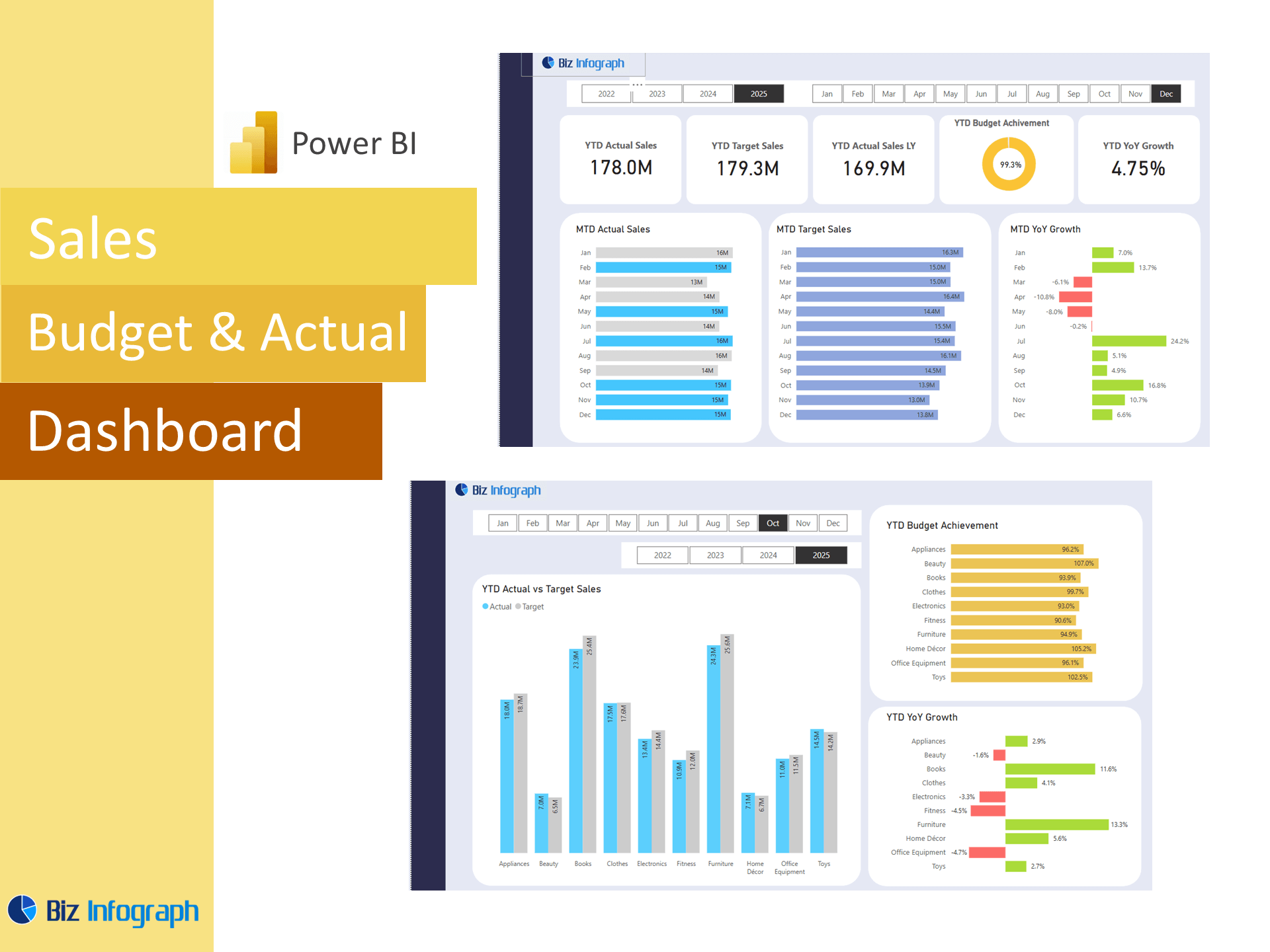
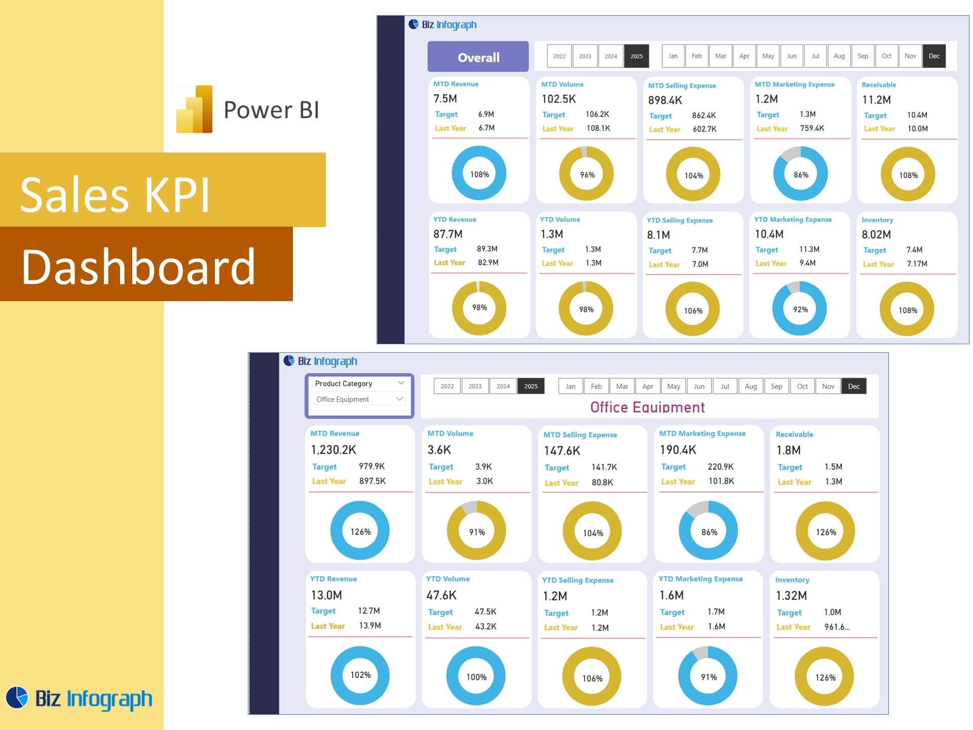
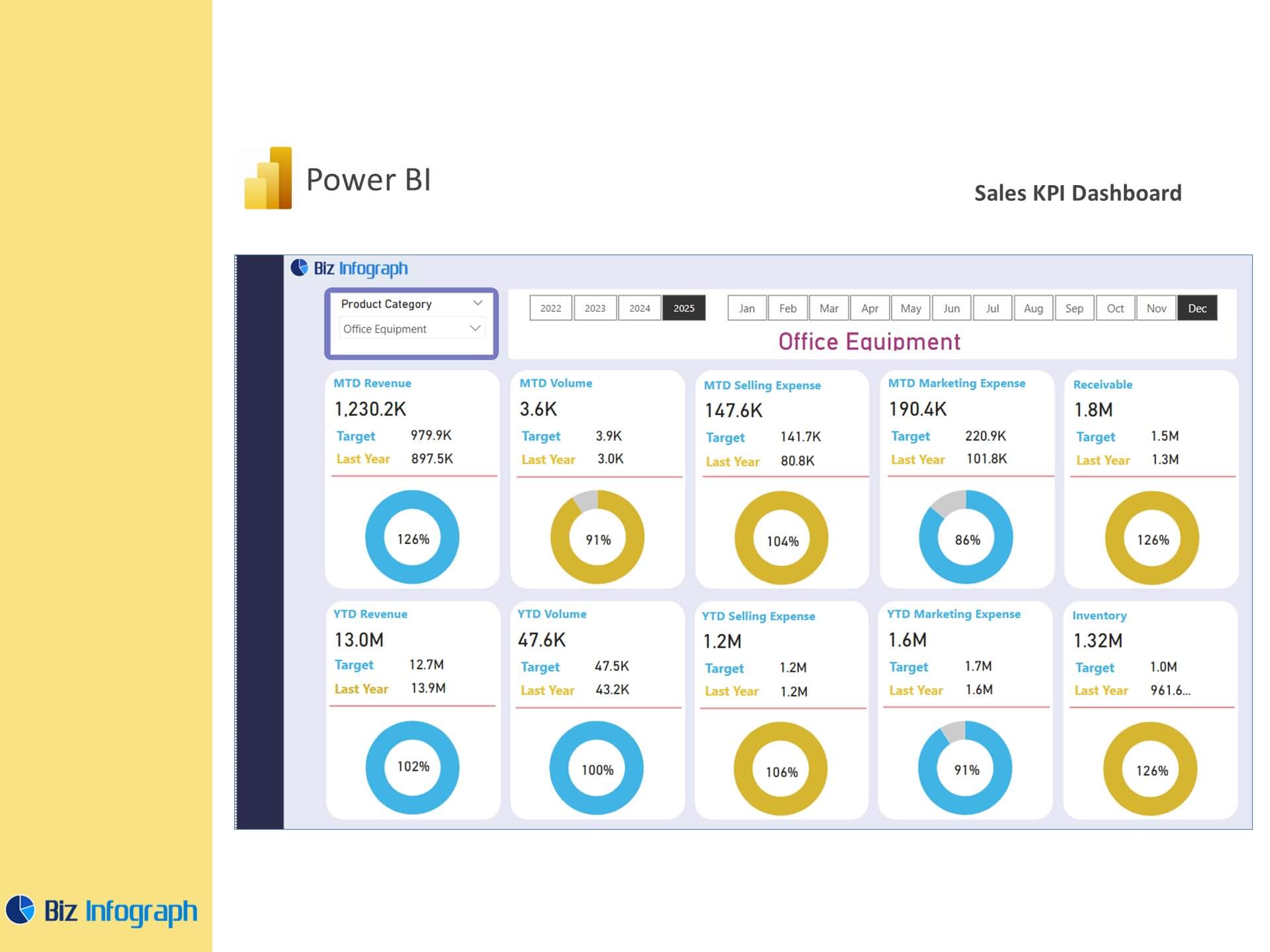
Every impactful kpi dashboard includes core metrics such as actual sales, lead-to-close ratios, deal velocity, customer acquisition cost, and sales growth. These KPIs allow teams to gauge performance relative to set sales targets. Integrating KPIs for both individuals and the entire sales team ensures that progress is visible and aligned. Advanced dashboards may also track engagement with marketing leads, average deal size, or channel performance from a google ads dashboard or social media dashboard. Effective dashboards visualize this complex data in an accessible, actionable format, providing insight into sales pipeline health and rep efficiency.
Dashboard Layout and Visualization Best Practices
Great dashboards are as much about design as they are about data. A strong dashboard layout uses intuitive navigation, clear groupings, and minimal clutter. Place headline metrics such as total sales and deal win rate at the top, while interactive charts below support further data analysis. Incorporate slicers to segment by region, quarter, or product line. Leverage Power BI’s drag-and-drop interface to align visuals like bar graphs, KPI cards, and funnel charts. A smart layout ensures the dashboard offers instant insight while encouraging deeper exploration. The dashboard presents essential findings clearly and supports both operational and strategic reviews.
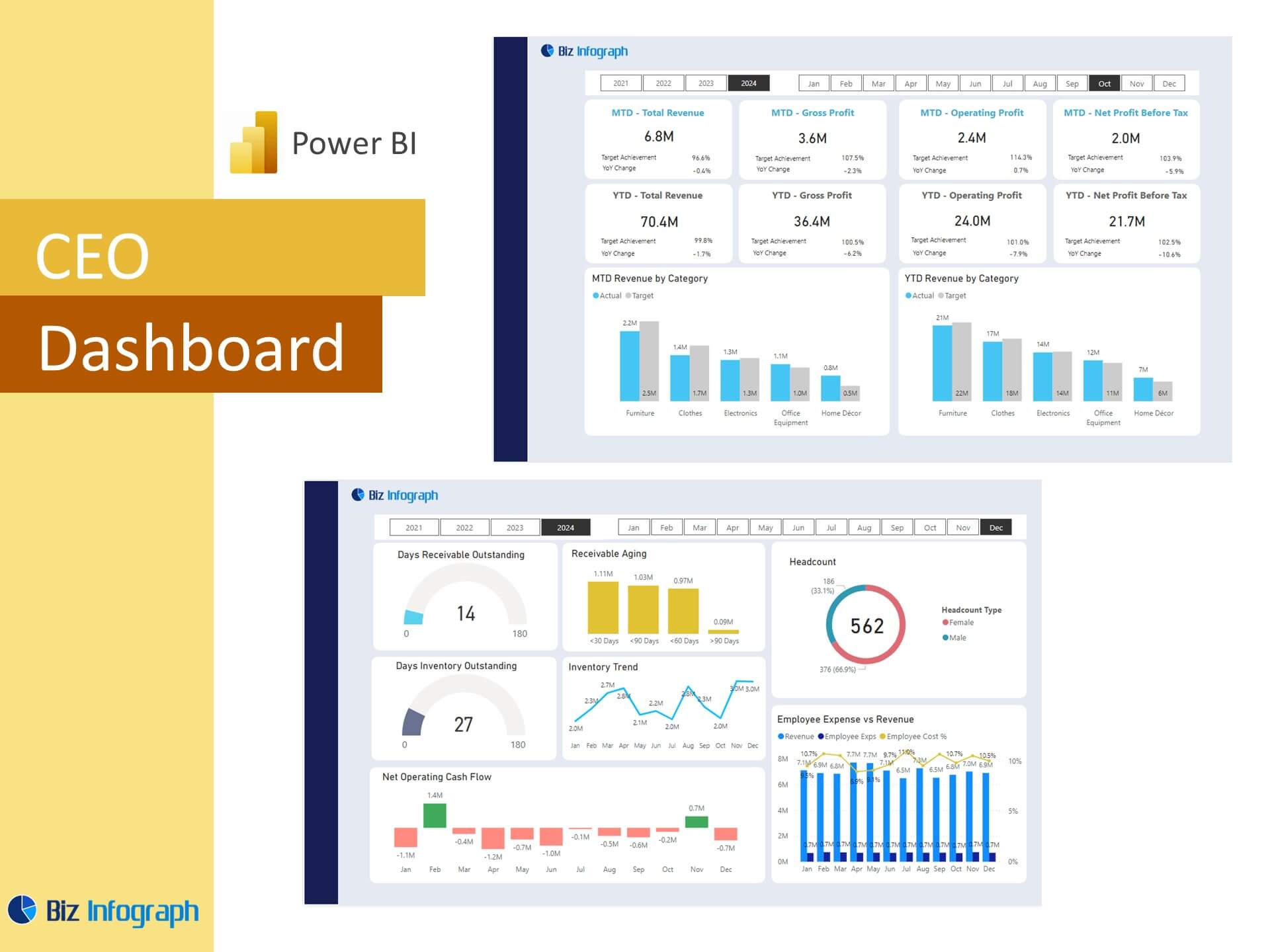
Using Analytics Dashboards to Track Actual Sales
A well-designed analytics dashboard should allow users to compare actual sales against goals and forecasts, as well as past performance. These dashboards often display year-over-year and month-over-month trends to uncover performance gaps. Power BI provides the tools to visualize such differences using conditional formatting and dynamic indicators. Teams can explore data using Power BI through filters, interactive graphs, and exportable views. The dashboard helps sales leaders take corrective action early by identifying underperforming territories or segments. Whether built from scratch or using a dashboard template, this form of analysis is crucial for improving results.
Designing a Performance Dashboard with Power BI
How to Use Power BI Templates for KPI Reporting
To use a Power BI dashboard template, start by selecting a relevant layout from free templates or your internal library. These templates help quickly populate visuals with live data from your data source. Use Power BI Desktop to map source fields to the appropriate visuals and customize measures. Most sales dashboard templates include placeholders for key metrics and charts, reducing setup time. Once loaded, the template allows you to pull data automatically from CRM systems or marketing tools for up-to-date sales performance reporting. These templates are ideal for operational reporting or preparing your next Power BI report.
Customizing Power BI Dashboards for Sales Analysis
Customizing the dashboard means tailoring it to match your business structure, terminology, and goals. Whether you're aligning visual themes with branding or adding new KPIs based on recent sales analysis, Power BI supports deep customization. Incorporate tabs for multiple departments or use role-level security to restrict access. For example, a customer analysis dashboard may be linked with a marketing dashboard to show attribution and pipeline influence. Adding industry-specific elements such as a logistics dashboard or finance dashboard extends the dashboard’s relevance beyond sales. Each customization adds context, making the dashboard provides a comprehensive view across business functions.
Power BI Dashboard Examples Across Departments
Some of the best Power BI dashboard examples combine data across functions for unified reporting. A financial analysis dashboard might pair with a sales KPI dashboard to track cost per sale, while an HR dashboard might tie performance bonuses to individual sales results. Executive dashboards aggregate departmental KPIs into a top-level overview. Marketing teams often use ads Power BI or ads dashboard templates to track lead sources. These examples of Power BI dashboards show how the tool can unify fragmented data streams into one interactive dashboard environment.
Templates for Different Sales and Marketing Scenarios
Sales Dashboard vs. Marketing Campaign Dashboards
While both dashboards track performance, a sales dashboard focuses on leads, opportunities, and revenue, whereas a marketing dashboard emphasizes campaign performance, engagement, and lead generation. Power BI offers the ability to integrate both, giving teams a closed-loop view. This alignment helps sales managers and marketers optimize outreach based on shared metrics. Combining a sales KPI dashboard with a marketing campaign view lets users understand lead quality and conversion paths. These integrated views are invaluable for aligning budget decisions with performance outcomes.
Using Power BI for Customer Satisfaction and Insights
Customer satisfaction metrics such as NPS, support response time, and product feedback can also be added to your insights dashboard. By combining data from survey tools and CRMs, teams can use these insights to improve engagement and retention. Power BI financial and customer analysis dashboards help visualize how satisfaction correlates with renewal rates and upsell potential. This cross-functional approach supports both sales and customer success objectives, reinforcing long-term business value.
Applying Dashboards to Financial and Executive Reporting
Executive dashboards need a concise, high-level format to support fast decision-making. Using Microsoft Power BI, you can build reports that include major sales, finance, and operations KPIs all in one place. A typical finance dashboard or financial performance dashboard includes revenue, margin, and forecasting metrics alongside sales pipeline overviews. Dashboards like these help executives see the big picture while allowing drill-through access to detailed reports. Templates designed for executives ensure that dashboard allows fast reviews with strategic alignment.
Power BI Tools and Services for KPI Dashboards
Integrating Power BI Reports and Power BI Service
Once a dashboard is ready, publish it via Power BI Service to enable access for users across the organization. Use permissions, workspaces, and apps to manage visibility. With real-time data streaming, leaders can make decisions confidently. Sharing dashboards via Microsoft Power BI ensures accessibility via web and mobile, enhancing engagement. You can also embed dashboards in Teams or SharePoint for integrated workflows. This seamless experience boosts productivity and reduces reliance on outdated reports.
Avoiding Manual Data Exports with Automated Templates
One of the key advantages of using Power BI is its ability to automate data workflows. Scheduled refreshes replace manual data exports, keeping dashboards current. Connect to CRMs, ERPs, and marketing tools to ingest data from various sources into one consistent view. Once automated, reports require little upkeep, freeing analysts to focus on high-value data analysis rather than maintenance. This automation also supports scaling insights across larger teams or organizations.
Leveraging Free Power BI Templates for Quick Deployment
Free Power BI templates offer an excellent starting point for teams looking to deploy KPI dashboards quickly. Available from Microsoft and the Power BI community, these templates are optimized for performance and compatibility. Whether you’re tracking sales analytics, operational KPIs, or marketing attribution, there’s likely a ready-to-use report template available. These templates serve as examples of best practices in layout, data flow, and visualization. Starting with a template allows you to focus more on explore data and less on initial build-out, accelerating the time-to-insight for your teams.
For ready-to-use Dashboard Templates:
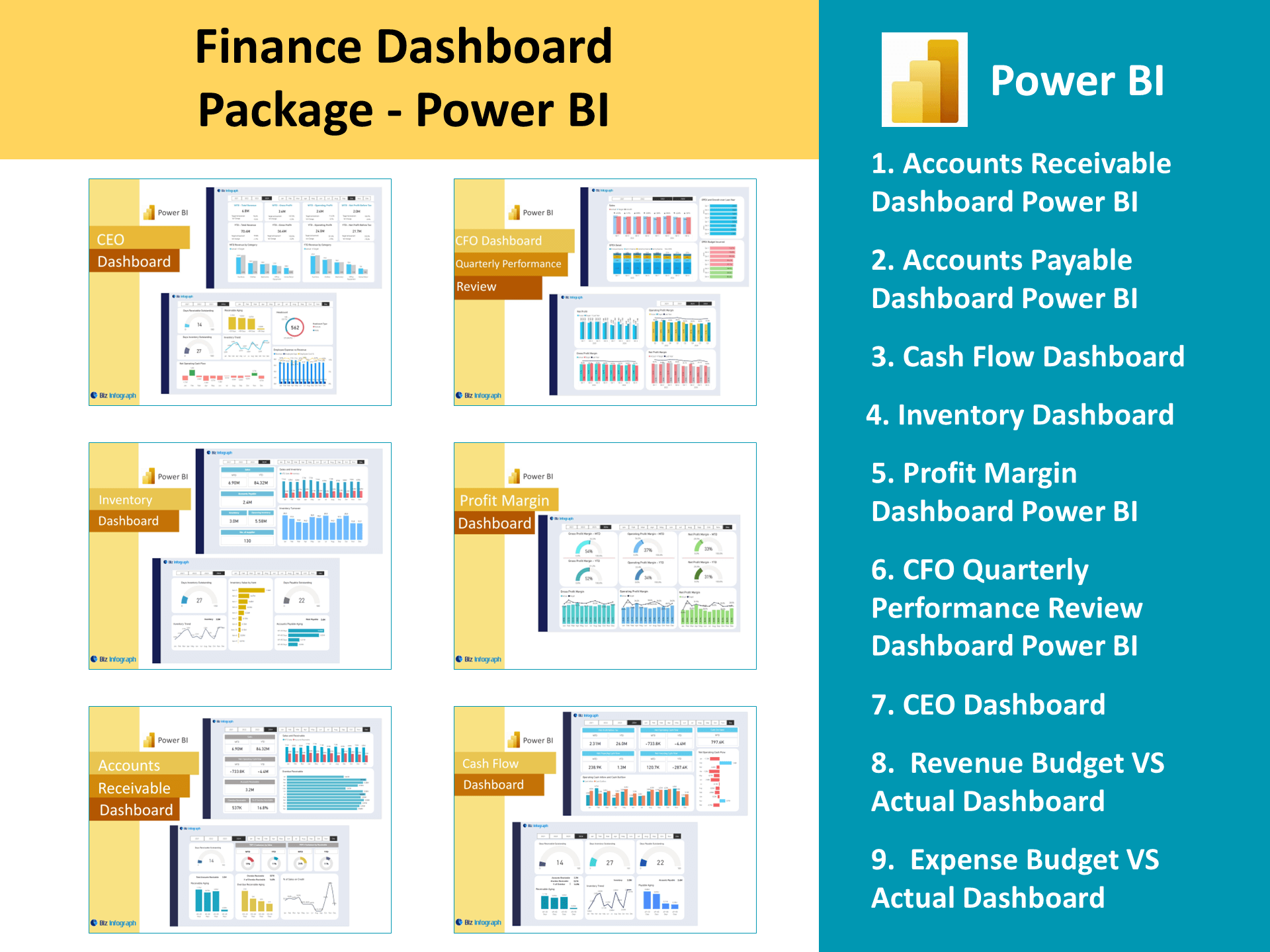
- Financial Dashboards
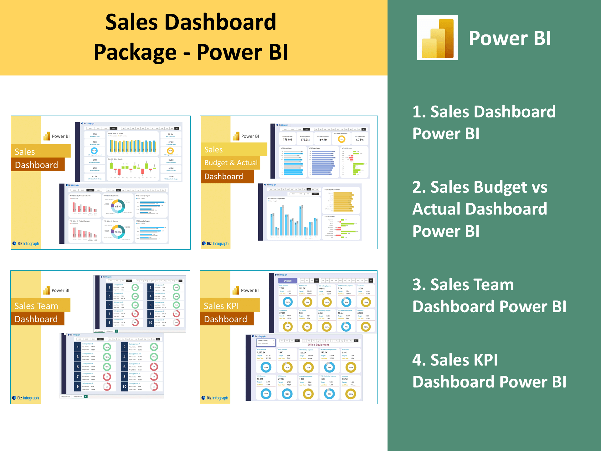
- Sales Dashboards
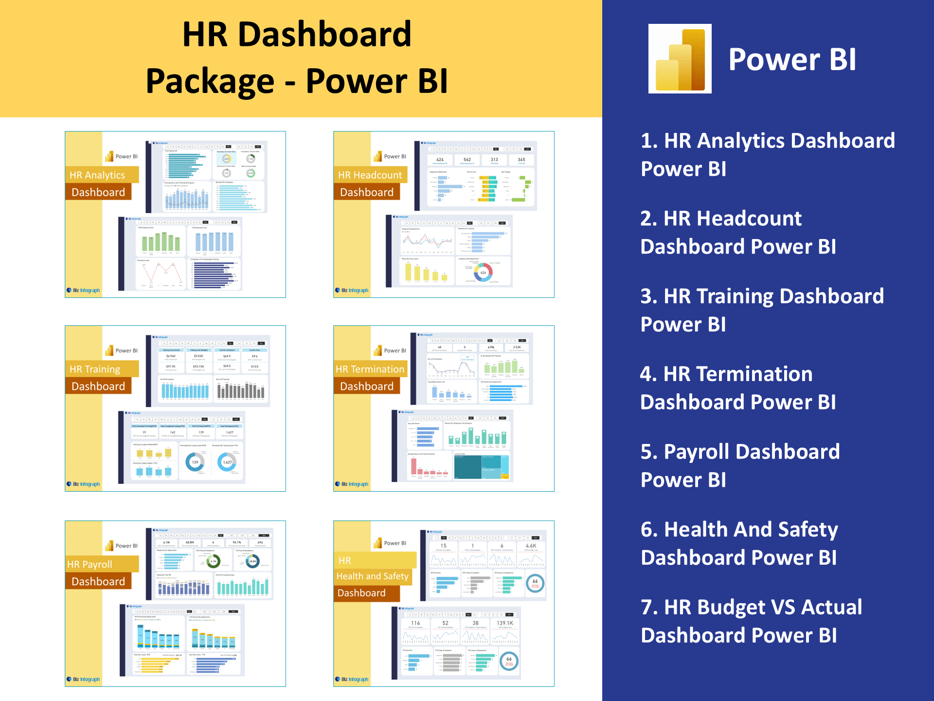
- HR Dashboards
- Data Visualization Charts
- Power BI – Biz Infograph
- Automation – Biz Infograph